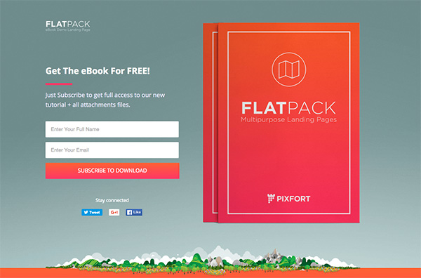
A squeeze page is a type of opt-in email landing page designed to do one single thing: "squeeze" email addresses and other information from prospective subscribers.
Squeeze Page Designs
Squeeze pages typically do not feature a lot of content. Most feature a simple rectangular box filled with offering a free resource, download, audio file, ebook, etc. in exchange for an email address. Pages visually look similar to modal pop-ups or interstitial ads that appear a few seconds after a user lands on a page or when they start to scroll down the page. Most users find ads annoying. The key is to offer a valuable resource to right, target prospects and when you can, at the right time too. Time can be day week and time of day.
Creating a Squeeze Page Offer
Your squeeze page offer is your lure. It needs to present a significant "must-have" resource or, your bait. The best pages target segmented users and depend on knowing what kind of resources they need right now.
Protip: With so much free information available, your offer needs to outclass the competition and stand out from the crowd with your audience. Try to keep the resource content to a usable digital format, preferably something unique your users can't even get from your competitors (this strategy works well for gated content and landing pages too). If and when you can, take a dive into personalization strategies that may help you get further ahead.
Keep a Highly Focused Page
Successful squeeze pages intentionally lack Google Ads and other forms of advertising. They also limit any outbound links except those pointing back to their primary website. What makes a successful squeeze page is the lack of distractions to the user; their sights are set on the offer presented and what to do next.
Protip: The offer should be clear and to the point. Try not to confuse a squeeze page is not a sales page, remember they're opt-in email landing pages. Adding too much text will lose your prospective user and defeat your page's objective. Present your offer clearly and make it apparent that their email address is required to receive it.
Make it Easy to Decline
There's no point in making it hard for people to decline offers. When you do, web users are quick to visit neighboring competitors to get more accessible information. Some squeeze page strategies make it too difficult to leave when users decline to take the offer or resource. Users will close the browser tab or browser itself then start over, looking elsewhere for similar, free resources (making it all the more important to double check your resource against competitor offers).
Wrap Up...
When it comes to creating a rewarding squeeze page brevity is reigns supreme. The average squeeze page contains anywhere from 150 to 450 words, and they're easy; easy to consume and execute the single most important next step, entering an email address.
Last Protip: look towards modules within your content management system. Drupal offers more than few modules to help you like Panels, Custom Landing Page Builder and Squeeze Page modules. Are you considering adding a squeeze page to your content marketing efforts? Share your questions with us!
 (image source)