University of Puget Sound
Overview.
The team at the University of Puget Sound had a clear goal: to modernize their outdated website. The challenge was not only to refresh the design but also to enhance the site’s content management, navigation design, and responsive design for better mobile performance. Their existing site was dark, cluttered, and marred by poor navigation and broken links—issues that not only confused visitors but also hampered conversion rates. With a project brief emphasizing a need for improved design, streamlined content, and enhanced usability, the project was set to turn their digital presence around and truly reflect their mission.
Our diverse team—comprising experts in portfolio management, project management, software architecture, UX/UI design, and more—collaborated to breathe new life into the site. From discovery through delivery, we worked closely with the client, navigating internal tensions between the marketing and acquisition departments, and aligning our strategy with their overarching goals.
What They Needed.
The challenges faced by the University of Puget Sound were multifaceted:
Poor User Experience and Visual Design:
The original site was visually unappealing, with a dark color scheme and confusing layout that did little to inspire engagement or trust.
Navigation Design and Information Architecture Issues:
Broken links, duplicate content, and a cluttered navigation structure made it difficult for users to find the information they needed. The site’s information architecture was disjointed, leaving visitors lost in a maze of content.
Low Engagement and Suboptimal SEO:
Due to its poor UX and design, the website was failing to connect with its core audience—resulting in low engagement, poor SEO performance, and missed opportunities for conversions (notably, prospective students’ enrollments).
Internal Tension and Misaligned Goals:
The organization’s marketing/brand team and acquisition team had differing objectives, creating a disconnect in the website’s purpose. The client needed a unified vision that catered to both sides while enhancing overall user engagement.
In short, the team needed a comprehensive overhaul that would not only modernize the design but also improve navigation, boost SEO, and create a cohesive, engaging user experience that aligned with their strategic goals.
How We Helped.
Discovery and Roadmap Development
The project began with an intensive discovery phase. Our team conducted stakeholder interviews, audited the existing site for performance, and identified key pain points. We gathered insights and built a collaborative environment which would be the foundation for everything moving forward.
Based on our findings, we crafted a detailed roadmap and a feature sheet that outlined our recommendations. This included redesigning the information architecture, cleaning up broken links and duplicate content, and reimagining the user journey to lead visitors seamlessly toward the conversion goal—enrollment.
Strategic Design and UX Overhaul
Our UX/UI experts tackled the visual and functional aspects head-on:
Modernizing the Look:
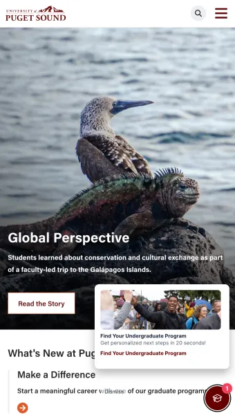
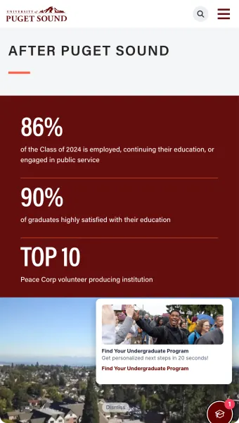
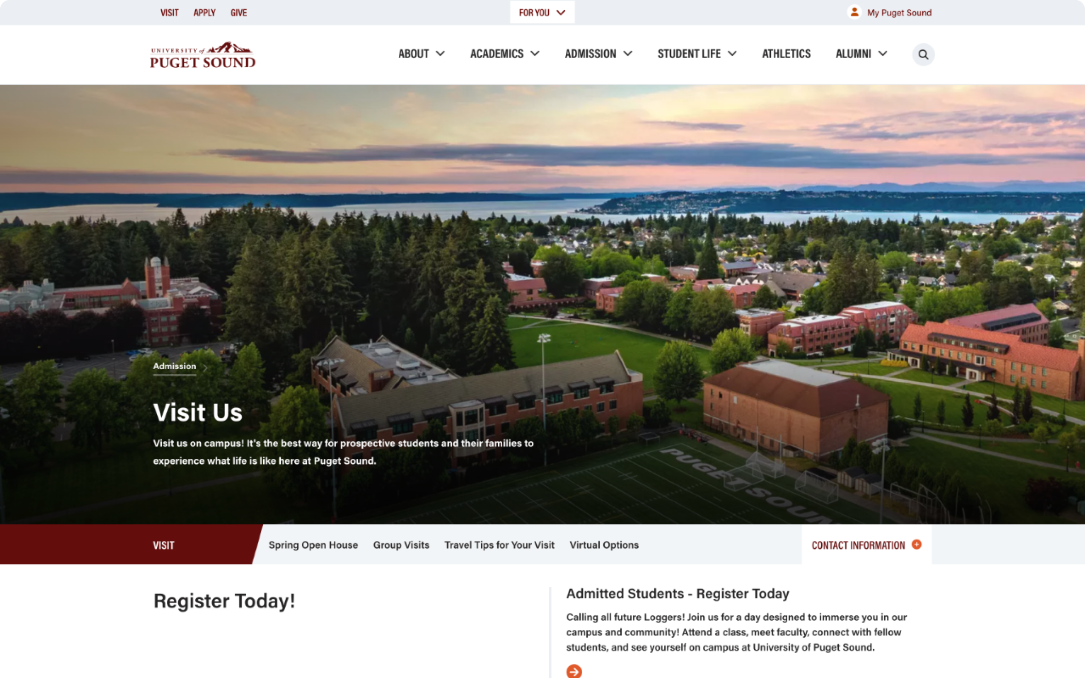
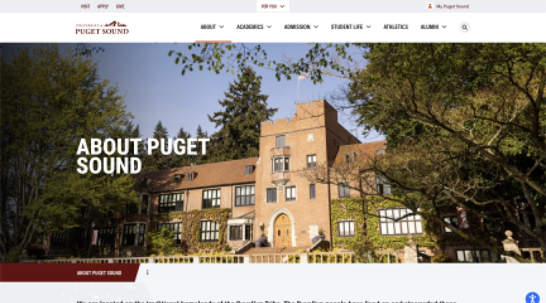
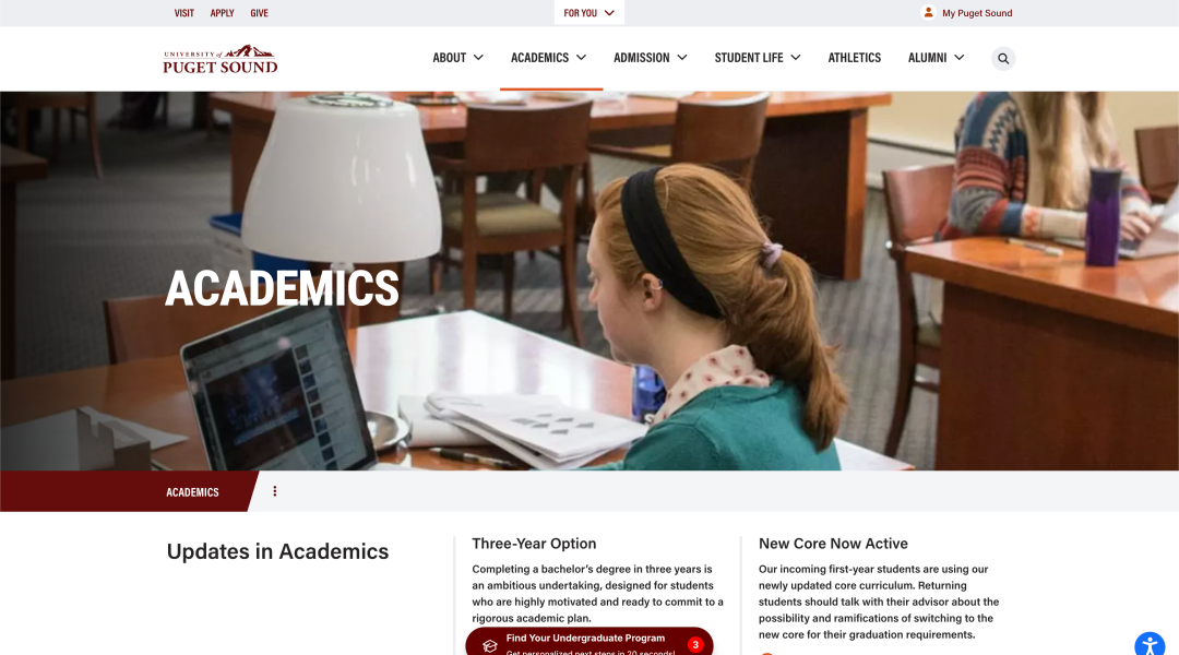
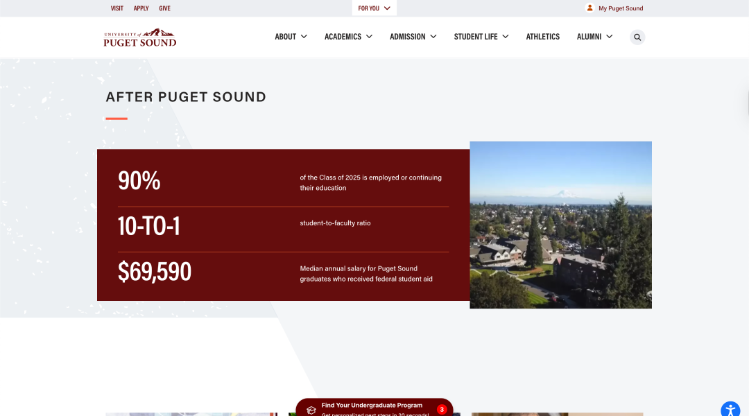
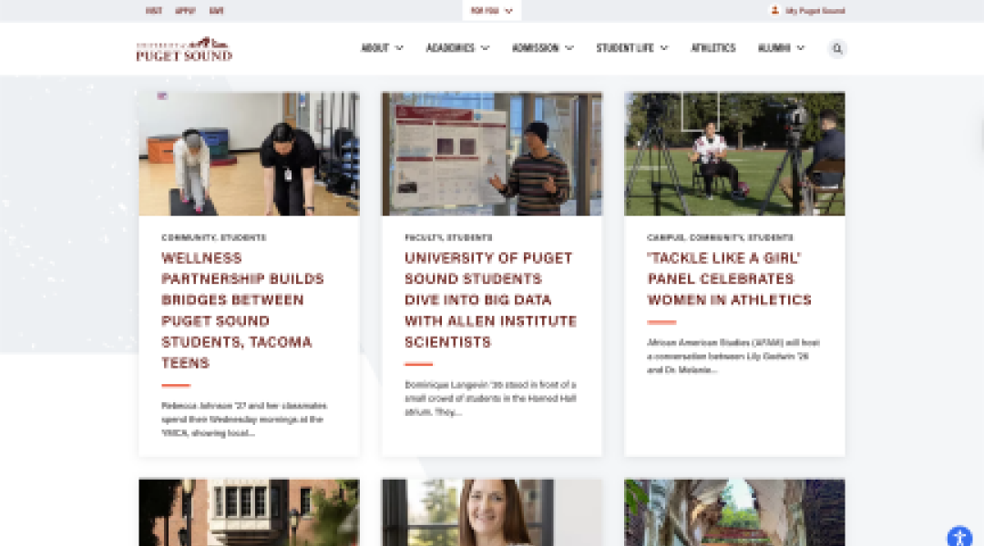
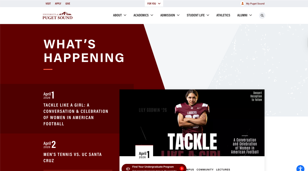
We lightened up the site’s color palette and updated the design elements to create a more welcoming and engaging visual experience.
Improving Navigation and Responsive Design:
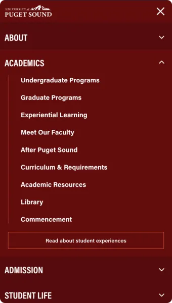
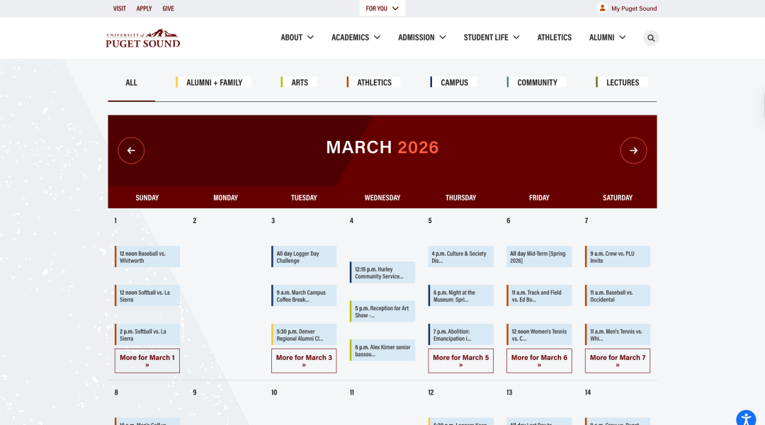
By restructuring the information architecture, we streamlined the navigation, eliminated orphan pages, and ensured that every piece of content was easily accessible. This not only improved the user experience but also boosted SEO performance.
Enhancing SEO and Content Accessibility:
We focused on making the site accessible, implementing keyboard navigability, improved contrast for readability, and better screen reader support.
Technical and Performance Enhancements
On the technical side, our software architects and developers worked diligently to ensure that the revamped website was fast, secure, and robust:
Code Refractoring and Page Speed Boost:
We optimized page load times by compressing images and streamlining code. Regular audits helped identify areas for performance improvements, leading to a significant boost in speed and responsiveness.
Seamless Integration:
We ensured that the website accurately tracked user behavior and conversions. Our enhancements not only improved the overall experience but also provided the client with reliable metrics for ongoing optimization.
Collaborative Execution:
Our project management team coordinated closely with the client, navigating challenges such as limited access to hosting environments and integrating with the client’s existing systems. Despite tight timelines and occasional client-side delays, we met every deliverable with precision.
Ongoing Support and Future-Proofing
Even after the launch, our commitment didn’t stop there. We provided ongoing support to ensure that the website continued to perform optimally. Our team’s expertise in Drupal allowed us to deliver a platform that was not only visually appealing and highly functional but also scalable to accommodate future growth and evolving digital trends.
The Results.
The University of Puget Sound’s website revamp is a testament to the power of strategic, user-focused design. By aligning the organization around a clear, measurable North Star goal and overhauling both the visual and technical aspects of their site, we were able to drive higher engagement, improve SEO, and create a digital home that truly reflects their mission and end users.
