How Is Your Website’s Mobile Performance

Google is steadily working towards mobile-first indexing, and while there’s still some work to be done, eventually it will become the new normal. Google webmaster trends analyst, Gary Illyes said that the mobile-first index is still “probably many quarters away” and likely to launch in 2018, but “don’t freak out”. Mobile-first means that when Google looks for content, they will look for and display mobile content first. If you have a responsive website you will be fine. There’ll likely be slight differences in how you present the data, but the content on your desktop site will be pretty much the same on your responsive site. Most marketers are well aware that mobile usage is rising. People are spending almost as much time looking at their mobile screen as they do their television. 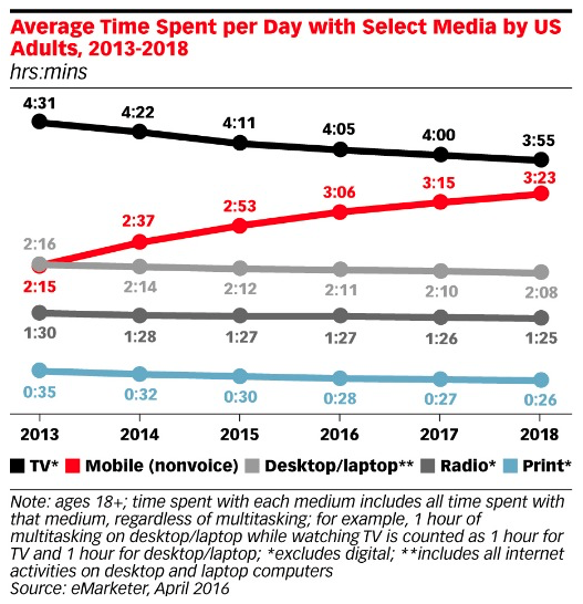 For a lot of organizations more and more of their business and marketing is being impacted by the changes in mobile technology. Users expect that a website will work consistently, and deliver the same experience no matter what device they use. The shift in mobile traffic means that many marketers will be prioritizing mobile as the “first screen”. In this article we’re going to look at how Google analytics can help you analyze your website’s mobile traffic.
Mobile Traffic Reporting
Only a few years ago the total number of mobile users eclipse the total number of desktop user, and not long after that Google’s Amit Singhal said that more Google searches were started on mobile devices than desktop computers. For webmasters, knowing how their sites perform on smaller screens is vital to staying alive in the search results. The Mobile report shows you how well your website (not app) is optimized for mobile, so you can identify where improvements are needed. Getting started with the report in Google Analytics is easy: Go to Audience -> Mobile -> Overview. You want to pay close attention to how users engage with your website when they are on a mobile device. This view will show you how your site does on different platforms: 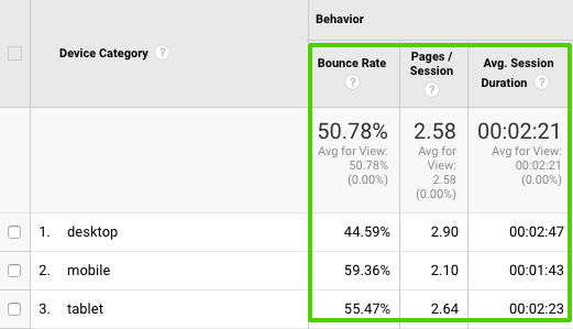 This report is broken down by Device Category: desktop, mobile and tablet.
- Desktop also contains laptops, netbooks and games consoles such as Playstation 3 and the Nintendo Wii / Wii U.
- Mobile Phones covers smart phones and handheld game consoles such as the Nintendo 3DS and Playstation Vita.
- Tablets includes standard iPads, Google Nexus, Galaxy Tabs, and also e-readers such as the Kindle Fire.
The data to compare here is seen in the standard reports, starting with the Summary ABC report then breaking this down for Site Usage, Goals, and Ecommerce. It can beneficial to apply the pie chart option here to visualize just how important it is to use a responsive website. To do this, click the pie chart image in the top right hand corner of the data table. A top-level comparison of conversion rates is also important to consider. Have you checked that your conversions can be completed on as many different devices as possible? Take careful note of bounce rate, page views, and time on site to see how the user experience on mobile compares to desktop. You might have a responsive website but is the experience the right one for your mobile users? Here you can see that generally mobile users are not as engaged as those on desktop.
Digging Deeper on Mobile Reporting
Devices Reports The next bit of really useful information is under the Device report. This view shows the name of the device, including the branding and the model. A useful way to look at this report is to use the “comparison with average” view and look at conversions rates. You can then review this information and identify where there might be opportunity to test and optimize on the most popular devices. 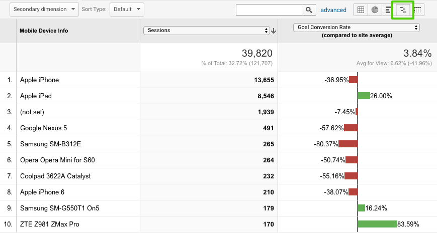 While many manufacturer devices share full information to Google Analytics, some do not. For example, Samsung SM-B312E does a good job of sharing device information, but Apple doesn’t. Google Analytics groups all iPhones together, and likewise iPads and iPods are not broken down by device details. In order to see Apple devices by generation you will need to use screen resolution alongside the device info, either in a secondary dimension or advanced segment. NOTE: this report, unfortunately, doesn’t include desktop device information, meaning you can’t directly compare different types of computer and games console against each other to see where performance needs to be improved. Along with the Mobile Device Info you can dig deeper into information such as Mobile Device Branding, Service Provider, and Mobile Input Selector.
 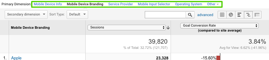 Mobile Device Branding The report also helps to identify any patterns based on the brand of mobile device. For example, are there any problems with a specific brand of device or do certain brands have a higher than average order value, etc? Service Provider This report is like the Service Provider report under Technology, but it just shows the data for mobile visits. This information, when viewed for mobile devices alone, helps you understand how mobile users are connected to the Internet. Mobile Input Selector Here you can see how mobile users navigate your website: touchscreen device, click wheel, stylus or joystick. For the most part, touchscreen, is going to be the predominant method of navigation, but you might discover whether or not there’s opportunities to optimize for other methods. Operating System This is the same report as Operating System found under Technology, but just segmented for mobile devices. It is good to check that your website works across a range of operating systems, and especially in context of conversion rate - which should be consistent across operating systems. Screen Resolution This can be a very useful report and you can find it by clicking ‘Other’ and selecting Screen Resolution. This is the kind of data you share with the design team.
Some More Useful Google Analytics Reporting
Browser Report One of the most common areas that websites experience deficiency and missed opportunity is with incompatibility with certain browsers. Create a custom report that shows conversions per browser, and segmented by device (mobile, desktop, tablet) so as not to skew your numbers. Get the report here >> Visitor Acquisition Efficiency Analysis Report We’re big fans of the reports that Avinash Kaushik creates, and this one helps to organize key metrics that reveal the efficiency and performance of each source of traffic to a website. What you see: total sessions, unique users, new users, goal conversion rate and goal value per session, organized by source and medium. Get the report here >> Customer Behavior Report This report reveals how behavior varies between new and returning users in terms of overall traffic, conversion patterns and event completion. Get the report here >> Site Diagnostics: Page Timing Report This report will instantly reveals problematic pages that need your attention. Discover the pages that are taking extra long to load as well as which have an uncomfortably-high bounce rate. Rachelle recommends that you switch from the “data” table view to the “comparison” table view in order to compare load time to bounce rate; this allows you to view the bounce rate for each page against the site average. Get the report here >>
Conclusion
The growth of mobile traffic and usage isn’t going to slow down anytime soon. If you’re not thinking about the user experience for mobile visitors it’s time to start and a great way is to do a thorough review of the information and data available in Google Analytics. Main photo credit: Daria Nepriakhina on Unsplash