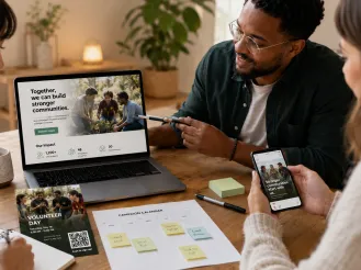
The Web Mindset
Eric Schmidt, Executive Chairman of Alphabet Inc., famously said “The Internet is the first thing that humanity has built that humanity doesn't understand.” In trying to grasp what the web is, we often look to existing technologies. But the web is a different animal, and if you spend a little time putting yourself in the web mindset, you’ll end up with a much better digital product. First, a quick history lesson. Back when the web was new and growing in the mid-90s, our ability to create websites was very limited. But more than the technology, it was the understanding of the web and its potential that was underdeveloped. For years, even the best web developers were taking static pages of information and transferring them to a screen. We were limited by the thought process of taking anything on an 8.5 by 11 piece of paper and transcribing it into a digital format, with a few hyperlinks thrown in. If you remember the Netscape/Angelfire/MySpace days, you’ll know that we became more advanced by adding midi files, site counters and customized cursors to our flashy internet homes. But, largely, the concept of a website remained the same: page by page of a static, book-like structure that just happened to be on a computer screen. As the web evolved, we finally started to dig into its true power: the ability to display information not just as a digital copy, but as dynamic, contextual and immersive experiences - something that cannot be delivered by a piece of paper.
The Web as a Piece of Paper
I was first introduced to thinking about the web in this context by Karen McGrane in 2014, and there’s a lot we can learn from it. For example, how often do you find yourself explaining to colleagues or clients that what they’ve draw out on a napkin can’t be exactly recreated for the website? Usually this isn’t because of a technical limitation or a lack of skill on your part, but because what they are envisioning does not the respect the web as an independent medium. It can be an education process to bring everyone around to the idea of translation rather than facsimile, but the alternative could see you making pixel by pixel adjustments with no other goal than to match the wireframes exactly. The design process is a collaborative one, and that means combining different understandings and concepts into a single product. Get your designs, napkin-based and otherwise, into working wireframes as soon as you can. It doesn’t have to be final code or design, but putting initial ideas into a working environment will help you be realistic about the end product and will help you make more informed decisions early on, rather than signing off on flat content and having to adjust later.
Responsive as a Catalyst
When you’re explaining this concept, demonstrating responsive websites can be the perfect jumping off point. It’s both impossible and inadvisable to serve the exact same web page at an iPhone viewport size and a 27 inch 5K viewport size. In fact, it is downright irresponsible as a designer. Good responsive design requires us to conceptualize the web differently that we have in the past. Instead of fussing over how many pages we’re going to build or how deep the navigation tree will go, we must start seeing the content we’re presenting as malleable, adaptive and capable of existing in multiple views without compromising the integrity of the message or task. Examples of great responsive design should clearly demonstrate that these views should be siblings, not twins.
The “Just In Case” Problem
Unless your site is specifically designed to be an archive, don’t treat it as a document repository. While I often hear the argument of putting something on the website "just in case" someone, someday, wants it, it is a lazy way to manage content. Your site’s real estate should be valuable to you - every piece of unfocused, ambivalent content takes up space that could be occupied by something strategic, and ultimately, helpful. If your site is not helpful, why on earth should a user stay there? Be respectful and considerate of their time online the same way you would be if you were meeting that same customer in person. Don’t make them wade through endless words or confusing information architecture to get their answers - it won’t win you any points.
Before You Start
Setting a clear intention for any design or redesign work before you start will get your team on the same page. Agree to some core values about the purpose of your site and who it should serve, and don’t be afraid to hold each other accountable. Now that Google is testing their mobile-first index, a redesign for mobile-optimization should be on your mind. Contact us to get started.