
How to Easily Transform your Data into Colourful and Informative Charts in Drupal
Today, organizations operate with endless amounts of data. How to get the most out of it? Data visualization! It can transform complicated data sets into rich, accurate, and attractive charts, graphs, dashboards, infographics, diagrams, or maps. The graphical representation of data can provide valuable insights, motivate teams to boost their performance, help businesses set and fulfill their goals, respond to trends, and so much more.
Previously, we shared an exciting article on how data visualization can transform public health communications. However, public health is just an example of how charts and graphs can be useful in any industry. They are easy to create thanks to tools available for various website platforms. In today’s article, we will walk you through the steps of creating a chart on a Drupal website in a very simple way. But before we move on to the Drupal part, let’s review some practical advantages of creating the graphical representation of data on your website.
The benefits of creating charts and graphs
- Easy and fast to understand
Thanks to charts, graphs, or other media for graphical data visualization, even vast amounts of complex data can be represented in a clear and cohesive way, with the most important aspects highlighted and the noise eliminated. In addition, the human brain is wired to understand images faster and better than facts in text. This helps businesses communicate ideas and insights to both internal and external audiences more easily.
- Attractive and engaging
We all know that too much data can be dull, especially given the fact that people are overwhelmed with it today. But an eye-catching graphical representation, especially when made in accordance with the best design practices, can add visual appeal to data and spark interest in the eyes of your audience.
- Detecting the patterns
Charts and graphs help people see the patterns, trends, and relations between data that had not been unrecognized before visualization. Detecting patterns is an essential part of how humans learn and make decisions. Researchers used an MRI machine to find that the human brain processed pattern-based learning differently than other ways of learning.
- Actionable items and data-driven decisions
Charts and other types of visualized data are great at identifying and demonstrating the areas of success and those that require attention. They are able to give a very accurate and clear answer to the question “What steps are needed for improvement?”. This helps teams better understand how to boost their results and empowers managers to make faster and better-informed decisions.
Creating charts in Drupal
To create a chart or a graph on a Drupal website, you might want to use the Charts module, which is the most popular Drupal chart builder. Let’s take a closer look.
Introduction to the Charts module in Drupal
“Charts is designed so that anyone who wants a chart on their site can have a
chart — and be happy with it.”
The above phrase was written by the creators of the Charts module, and it characterizes the module very well. This feature-rich module enables you to create dynamic charts on your Drupal website without having to write a line of code.
With the Charts module, you can create any type of chart — pie, line, bar, column, donut, gauge, spline, and more. The module integrates with Drupal Views and has an API for creating charts with a Drupal-friendly syntax.
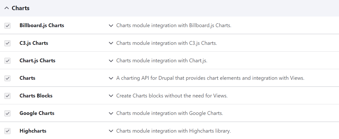
The secret of cool chart creation is that the module connects your Drupal website to popular charting libraries (also known as charting providers):
- Google Charts
- Chart.js
- Highcharts
- Billboard.js
- C3.js
Each of these JavaScript libraries has its own pros and cons, so choosing one is a matter of preference. But there is one thing in common for them all — the Charts module greatly simplifies their usage on Drupal websites. It frees you from the need to be familiar with these libraries’ APIs, add their JavaScript code to your Drupal pages, and write code for every chart.
The Charts module: getting better every day!
The Charts module is actively updating its features in accordance with the latest trends. In its 8.x-3.x and 5.x releases, this Drupal module improved its accessibility, became more easily extensible, and got enriched with new chart types. The process of installing JavaScript libraries became easier, which we will discuss in the installation part.
It also got the new Charts Blocks feature that enables you to create charts without Drupal Views — by directly putting your data into a block. Another new feature, Charts Fields, enables you to add charts to your Drupal content entities. As of the 5.x version of the module, it’s possible to populate the data using a CSV file or through manual entry in a table.
The Charts module installation notes
In our step-by-step guide, we will be using version 5.0.3 of the module. The Charts module comes packed with submodules for the respective charting providers. So, in addition to enabling the main Charts module, you will need to enable the submodules for the libraries you want to use. The submodules make the libraries available and add their JavaScript files to your Drupal website. The list of submodules also includes the Charts Blocks submodule that you might want to enable as well (and we are going to use it in our simple chart creation example).
Earlier versions of this Drupal module also require installing the actual libraries, preferably via the Composer package manager. As of version 5.0.1, the module defaults to using a content delivery network (CDN) to attach the necessary JavaScript files unless a local copy is present.
Default chart configuration
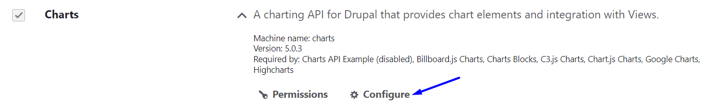
Once the Charts module is enabled, you can click “Configure” and go to its settings page on your Drupal admin dashboard.
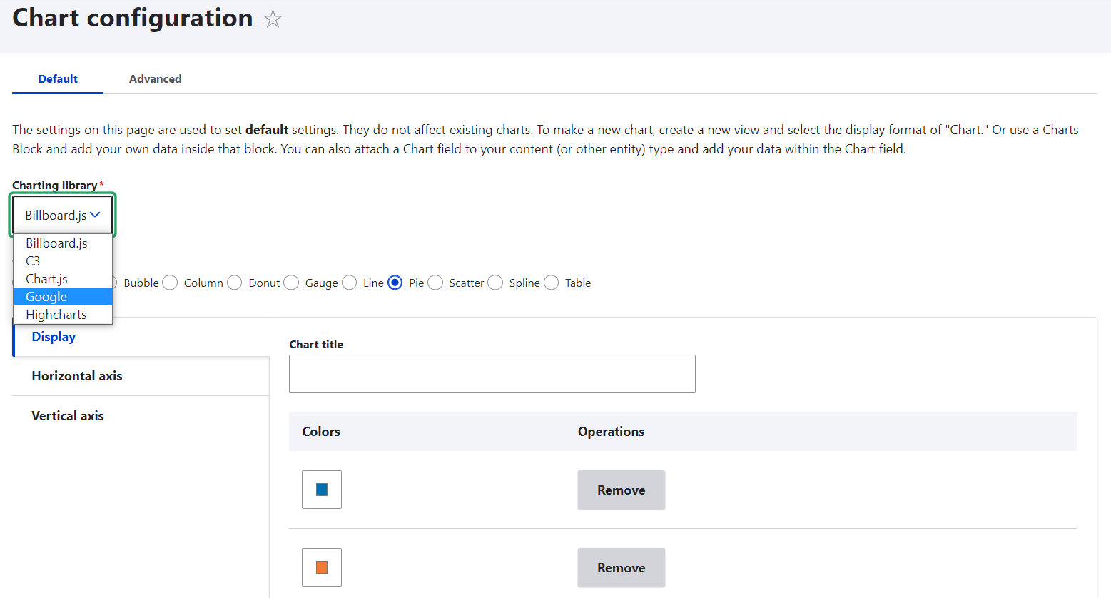
An alternative way to reach the chart settings page is by going to Configuration > Content authoring > Chart configuration.
On this page, you can set the defaults for your charts. For example, it’s possible to select the default charting library and the default chart type. There is also an option to customize the colours using the RGB values, which could be especially useful if you want to use your brand colours.
The easiest way to create a chart with the Charts module
There are several ways to create a chart with the Charts module in Drupal:
- in combination with Drupal Views
- using the Charts Block
- using the Charts Field
- using the Charts API
Let’s review a super easy way to create a simple chart that doesn’t need to dynamically pull any new data — via the Charts Block.
Part 1: Creating a block
You will first need to create a block using Drupal’s Layout Builder or via the traditional Block Layout system in Drupal.
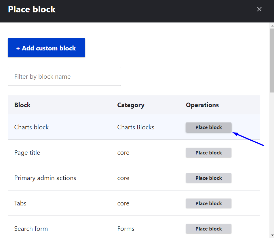
For the traditional way, go to Structure > Block Layout and select the theme’s region where you would like to position the block. If needed, click “Demonstrate block regions” to see how the regions are laid out within the theme you are using.
Click “Place block” next to the selected region. Find the Charts block using the search box or just by going through the list of all Drupal blocks, then click “Place block” next to it.
A configuration window will appear. You can just scroll down the settings (we will come back to them right away) and click “Save block,” then click “Save” again at the bottom of the Block Layout page. To start building your chart, click “Configure” next to the Charts block.
Alternatively, you can create a block using Drupal’s Layout Builder. Open your page in Layout Builder, click “Add block” in the needed section, find the Charts block on the list of Drupal blocks, select it, and proceed to configuration.
Part 2: Creating a chart
Once on the charts block configuration page, start by giving your chart block a title so it can be easily distinguished from other blocks that you might create on your Drupal website. You might want to keep the title for administration only and not display a block title but rather show only the chart title. To do this, uncheck the “Display title” box and find the “Chart title” field further on the settings page.
Then select the JavaScript library and the chart type. These can be changed at any time later — the Update Preview feature enables you to play around with viewing the same data in different chart types and libraries.
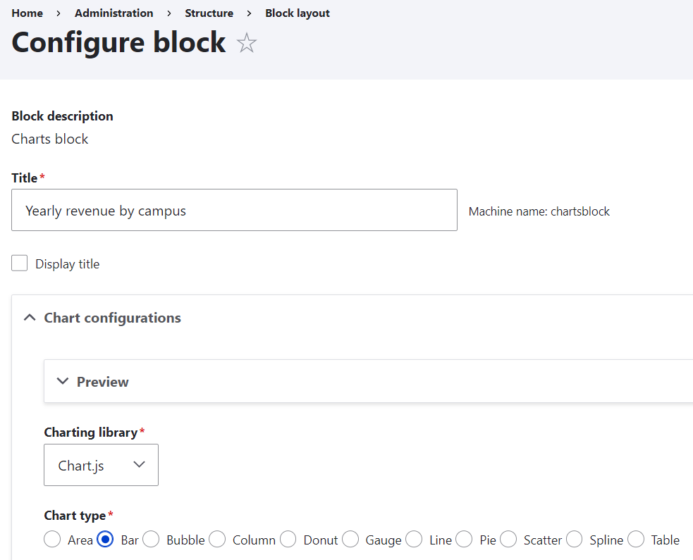
Let’s create some of the most popular chart types to compare several categories of data — a bar chart and a column chart. To enter your data, use the table with rows and columns. Alternatively, there is an option to import data from a CSV file.
The first row and the first column in the table are label fields that will describe what your chart is showing. The other cells hold the actual values. For example, let’s visualize the revenues in millions for each university campus (Central, Eastern, and Northern) for 3 years (2019, 2020, and 2021). You can put the campus names in the first row and the years in the first column, and populate the other cells with the actual revenue numbers.
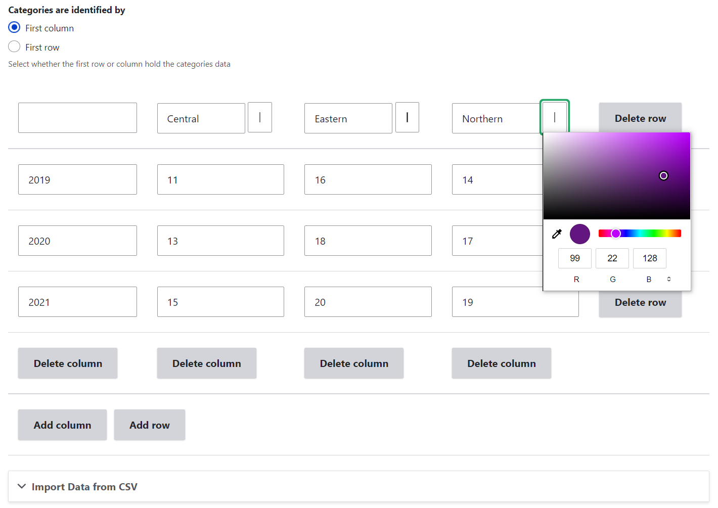
Right above the table, you can select whether the categories should be identified by the first row or the first column. For example, if you select the first column, the years will be the main categories in the chart and the campus names will be distinguished by colours which are fully customizable.
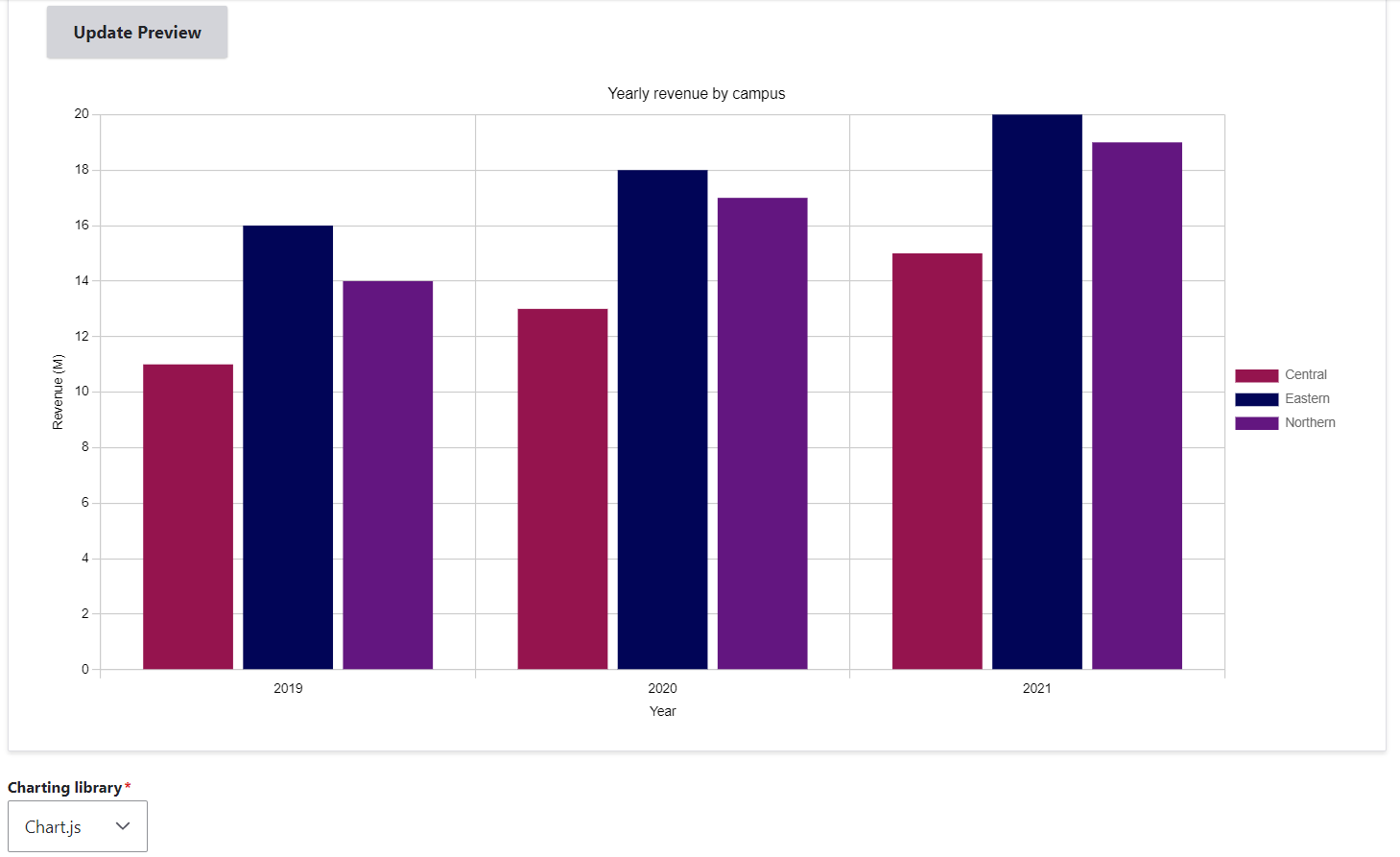
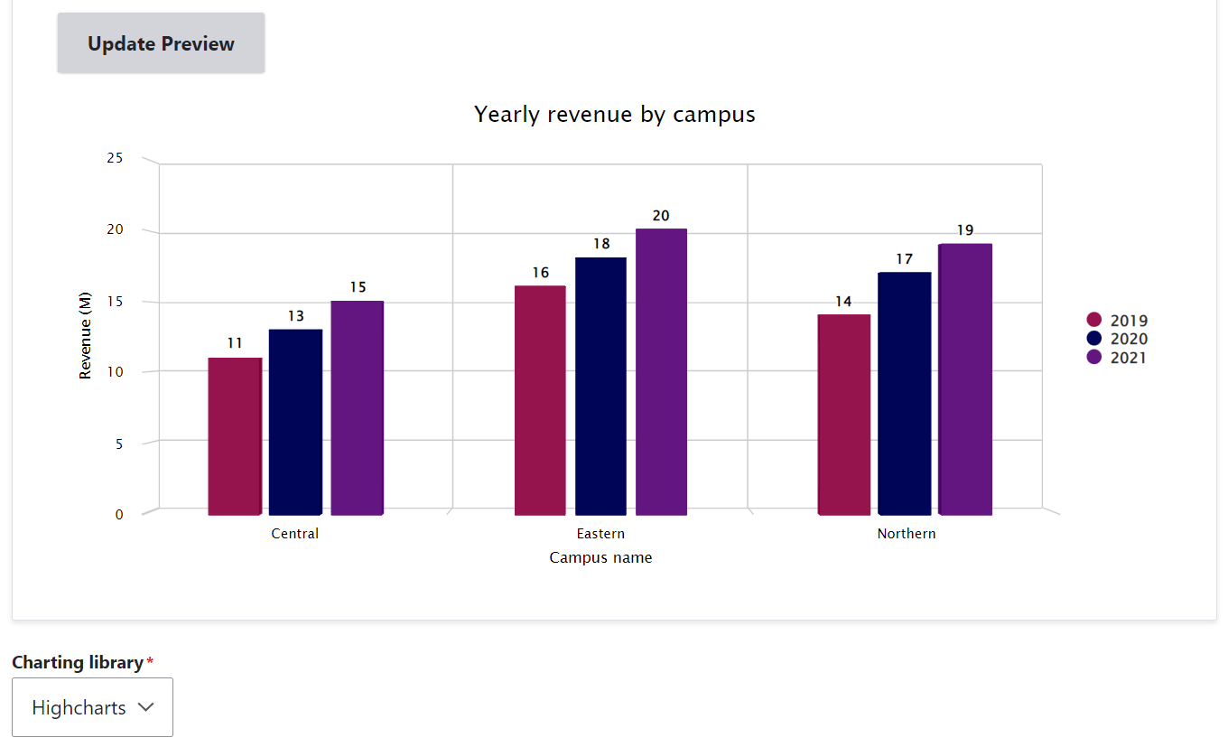
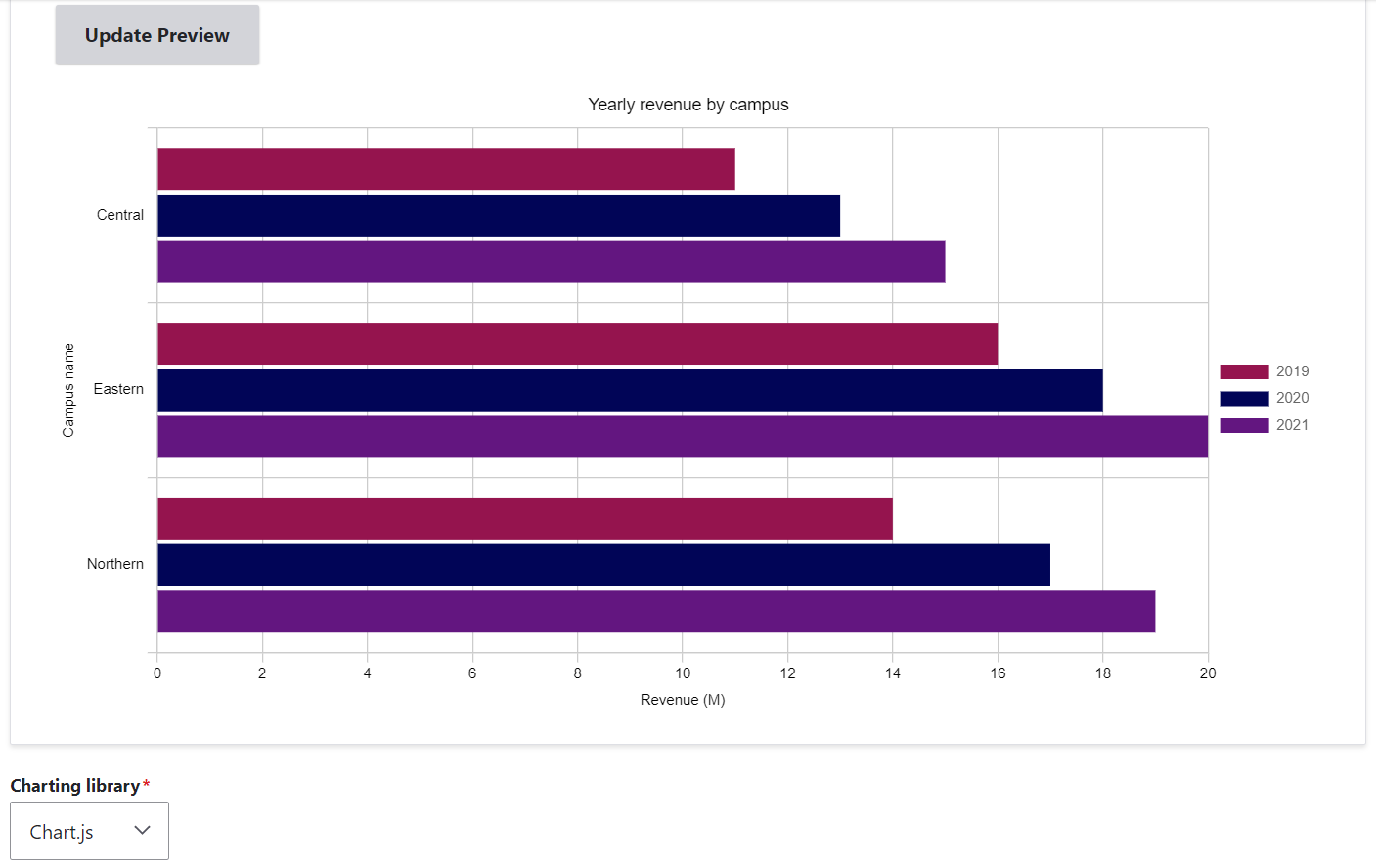
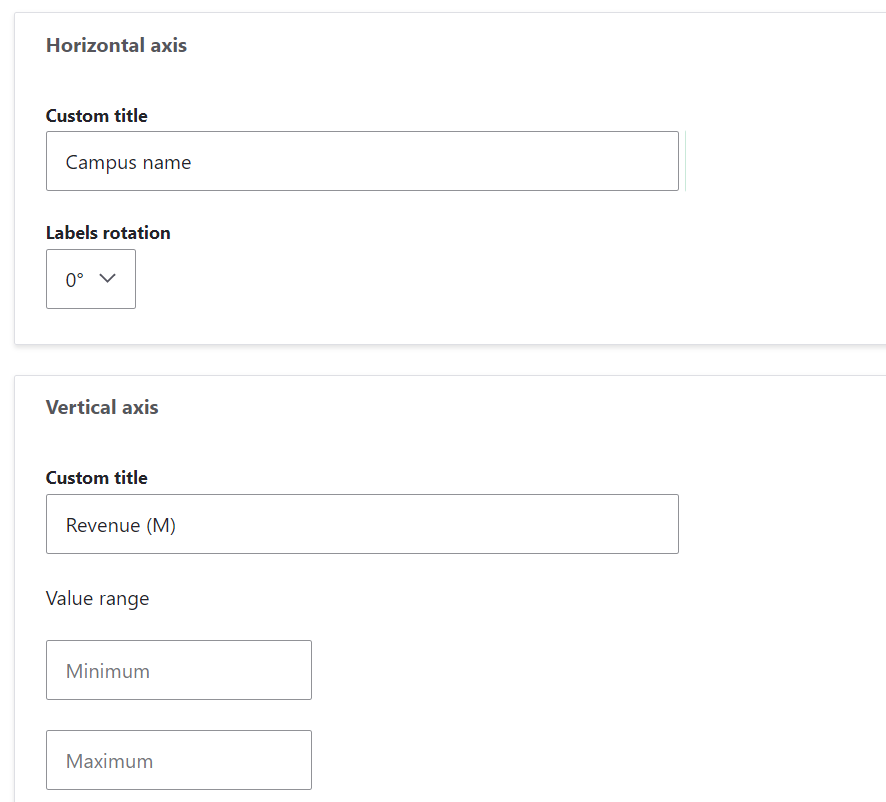
In our examples, you can see some titles along the horizontal and vertical axes of the chart (“Campus name” or “Year” and “Revenue (M)”). These titles can be created and customized further down the settings page. One axis presents the categories being compared (e.g. “Campus name” or “Year”) and the other axis is meant for the measured values (e.g. “Revenue (M)”). You need to double-check whether you are setting the right title for each axis, for every chart type and library.
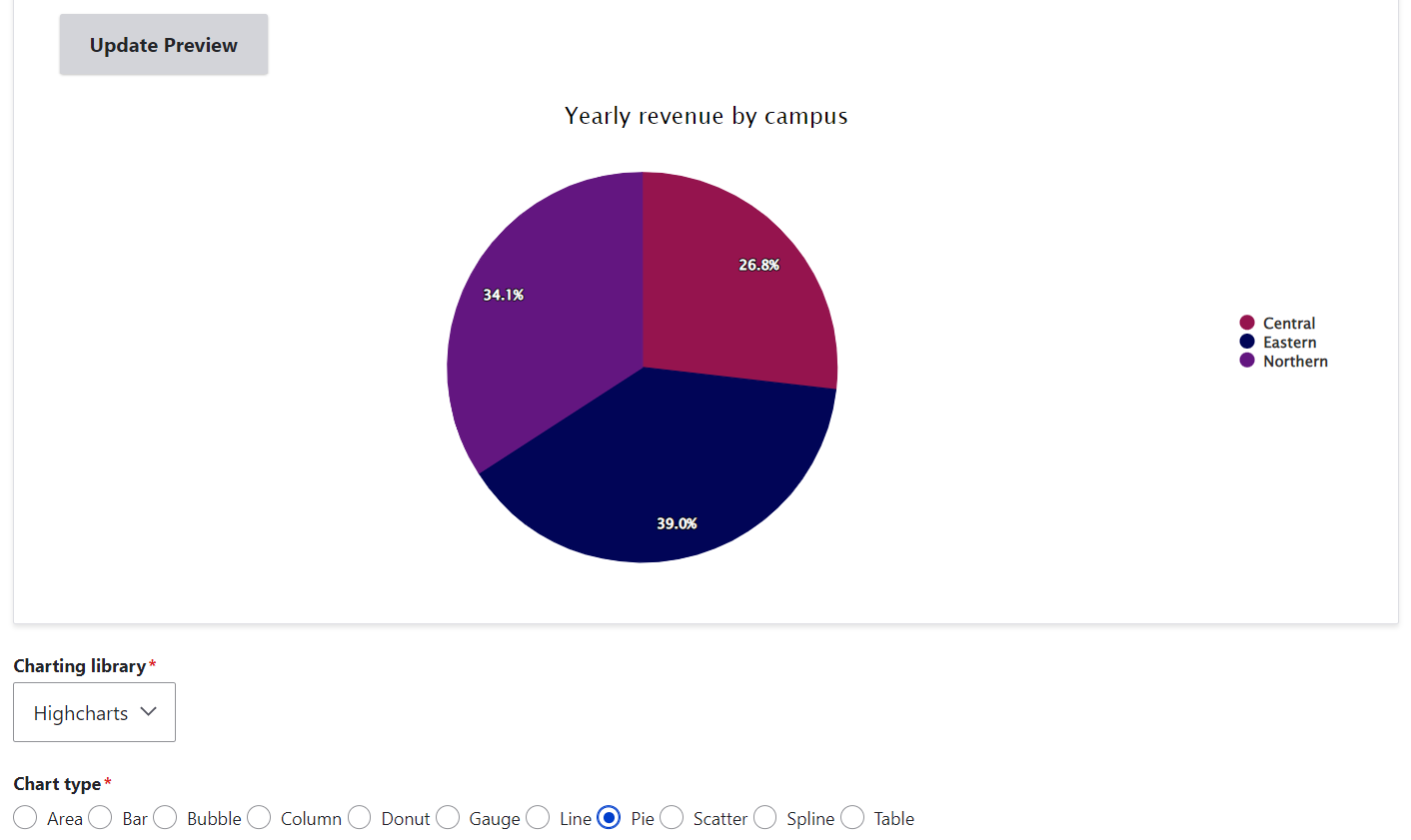
What if you would like to choose a pie chart — a popular chart type to illustrate proportions?
Additionally, you can configure other chart settings such as title position, enabling tooltips to show the data on mouse hover, making the chart three-dimensional (3D), adding the value prefix and suffix, etc.
Final thoughts
We have taken a quick look at chart creation with the Charts module in Drupal. In comparison with its other capabilities, this powerful Drupal module was just “warming up its engine” in our very simple example. The options for creating charts on your Drupal website are unlimited. If you are interested in the help of our professional Drupal development team, let’s start chatting — and charting!