What is a User-Centric Design Strategy? (And Why Guessing Costs You Money)

- What Is User-Centric Web Design? (It’s Not Just Aesthetics)
- The Business Case: User-Centered Design Benefits Your Bottom Line
- Website UX Best Practices for Enterprise Organizations
- 3 Ways Leaders Can Audit Their Own Strategy
- Build a Strategy That Scales With Your Users
You’ve likely sat in a website meeting where opinions suddenly overrule the data. The VP wants a scrolling carousel because they like movement. A department head asks to rename a core navigation link because it doesn't match their internal org chart. When a project shifts to decision-by-opinion, it feels like a normal part of the creative process. But it’s exactly where the budget starts to leak.
The disconnect happens when teams prioritize internal feedback over user intent. It’s easy to fall into this trap because the opinions in the room are loud and immediate, while the data on what your users need is silent.
A user-centric design (UCD) strategy changes who holds the authority. It moves the conversation from subjective preferences to objectively trying to solve what matters to your users: their problems.
If your design gets in the way of that, they’ll leave.
What Is User-Centric Web Design? (It’s Not Just Aesthetics)
User-centric web design places the user’s needs at the center of every decision. This shapes your information architecture, content strategy, and technical infrastructure.
In this model, design acts as the foundational blueprint for the house instead of decoration.
For example, when you separate design and Search Engine Optimization (SEO) into silos, you create unnecessary conflict. Designers often want clean interfaces while SEO specialists push for content relevance. That friction leads to compromises that can fail at achieving both goals.
A smart strategy recognizes that Google is just a robot trying to mimic a human user. Designing for user intent means you are automatically designing for search engines because their goals are identical:
- Speed: Google prioritizes fast load times because users hate waiting.
- Structure: Google rewards a clear hierarchy because users need to scan content.
- Responsiveness: Google indexes mobile-friendly sites because that is where your users are.
The disciplines are the same. A button that is too small to tap creates a bad user experience and sends a negative signal to search engines. A page that shifts while loading frustrates the visitor and hurts your Core Web Vitals score.
Strategic design serves the user, and that behavior signals quality to search engines.
The Business Case: User-Centered Design Benefits Your Bottom Line
Marketing leaders often struggle to secure budgets for discovery or user research. Finance teams frequently view these line items as optional delays because they want to get straight to the build.
It’s crucial to frame this investment as risk mitigation since your website is likely critical to your day-to-day operations. If users can't find what they need, they drop off, and the cost of that exit is measurable. Implementing a solid information architecture strategy acts as a financial lever that prevents this revenue leak.
Mitigation: Fix Problems Before You Build
The cost of fixing a mistake depends entirely on when you find it.
Imagine you’re building a house. If you spot a kitchen layout issue on the blueprints, you just erase a line. It costs pennies. But if you catch it after the foundation is poured, you need jackhammers. The cost jumps to thousands.
Software development follows the same logic. Design is your blueprint; code is your concrete.
Retrofitting usability into a finished product gets expensive fast. If you guess at the navigation and confuse users, fixing it means rewriting code and migrating content.
The industry has a heuristic for this risk. Following the widely accepted 1-10-100 rule of software quality, preventing a defect costs $1, fixing it in development costs $10, and fixing it after failure costs $100.
User-centric design is your $1 investment. By testing a prototype and realizing users can't find the "Donate" button, you’ve just saved the project from a much more expensive error later on.
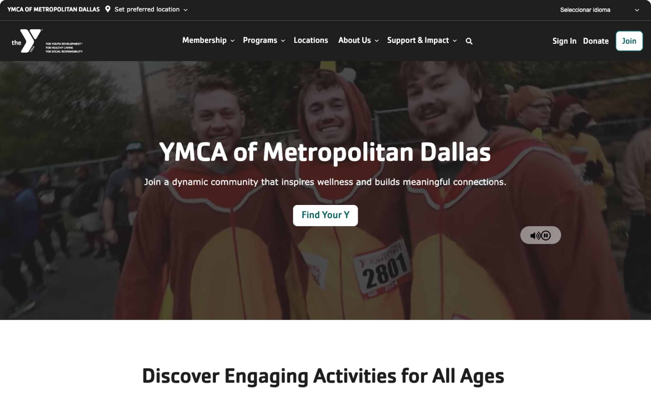
Conversion Optimization: The YMCA Dallas Example
The strongest argument for user-centricity is revenue.
Let’s look at the example of YMCA Dallas. They operate 16 locations and offer hundreds of programs, but they faced a critical visibility gap. Users searching specifically for "YMCA" found them easily. However, parents searching for "fitness classes" or "youth programs near me" saw competitors instead.
The issue was that the digital structure was organization-centric. It prioritized the brand name over the services people wanted.
We pivoted to a user-centric strategy by restructuring the information architecture. We built specific content pathways for "swim lessons" and "gyms" because the data showed that’s how users categorize their own needs. This ensured the site answered the questions users were asking Google.
The financial impact of this shift was immediate:
- The strategy drove a 21% increase in revenue for the organization.
- Organic transactions climbed by 36%.
- Non-branded keyword impressions jumped from 9,000 to 85,000.
Broader industry data indicates that design-driven efficiency yields a return of $100 for every dollar invested. That ROI makes design one of the smartest places to allocate marketing funds.
Read the YMCA of Metropolitan Dallas Case Study here
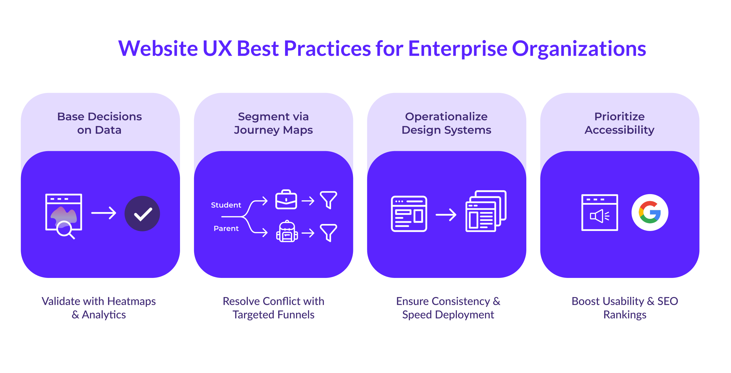
Website UX Best Practices for Enterprise Organizations
When you manage a complex university website, a hospital system, or a multinational corporate site, you can’t rely on intuition; there are just too many stakeholders and too many different types of users involved.
Success at this scale requires strict adherence to architectural best practices.
Base Decisions on User Data
The first step in an enterprise strategy is to prioritize evidence over hierarchy.
You likely battle conflicting opinions daily. The VP of Sales wants a pop-up. The Director of Communications wants a scrolling news ticker. These requests usually come from personal preference rather than user need.
You need to override these opinions with metrics.
Start by auditing your current reality during the initial discovery and preparation phase. Look at the analytics to see where people leave the site. Use tools like heatmaps to spot instances where users click repeatedly on an element they think is a link but isn't.
If 1,000 people a month use your internal site search to look for "tuition rates," and you have that link buried three levels deep in the footer, there’s likely a usability problem. This data allows you to tell stakeholders that you aren't rejecting their news ticker because you dislike it, but because users want the tuition link.
Customer Journey Mapping for Dual Audiences
One of the biggest challenges for enterprise sites is that they often serve multiple, conflicting audiences.
Higher education is a perfect example. A university website must recruit 17-year-old high school students while simultaneously reassuring the 50-year-old parents who pay the tuition.
These two groups behave differently:
- The Student: Browses on a phone between classes, looking for campus life photos, video content, and "vibes."
- The Parent: Researches on a desktop in the evening, looking for safety statistics, career outcomes, and financial aid data.
Trying to average these two out results in a "mushy" middle ground that appeals to neither.
Journey mapping can relieve this tension. Treat the homepage as a traffic cop that quickly directs the student to a "Student Life" funnel and the parent to an "Admissions & Aid" funnel. Once they enter their respective sections, the design shifts accordingly.
The student section becomes visual, fast, and mobile-first. The parent section becomes detailed, structured, and data-heavy. You don't force one page to do two jobs.
Reduce Friction with Visual Consistency
On a five-page site, keeping the user experience consistent is fairly simple. But on a 1,000-page enterprise site with 50 different editors, consistency often falls apart.
When users move from a main landing page to a departmental sub-site and the navigation shifts or the buttons change color, they experience cognitive friction. They have to re-learn how to use the interface, or worse, they wonder if they have left the official site entirely.
A design system solves this by enforcing a shared language. It acts as a living library of pre-tested components that ensures a "Apply Now" button looks and behaves exactly the same way in the School of Business as it does in the School of Arts.
This technical framework protects the user from your organizational complexity. It also happens to drive efficiency—implementing a shared library can deliver up to 135% ROI by reducing development time—but the primary value is a seamless, trustworthy journey for the visitor.
Treat Accessibility as a Growth Engine
Organizations often view accessibility as a compliance box to check so they can avoid lawsuits.
That view misses the bigger picture because accessibility is effectively just extreme usability. Making a site navigable for a screen reader forces the navigation to be logical and clear for everyone.
Accessible sites rank for 27% more keywords because Google’s crawler behaves like an assistive device. It reads the code rather than the visual pixels. If the structure is clear enough for a screen reader, it’s clear enough for search engines.
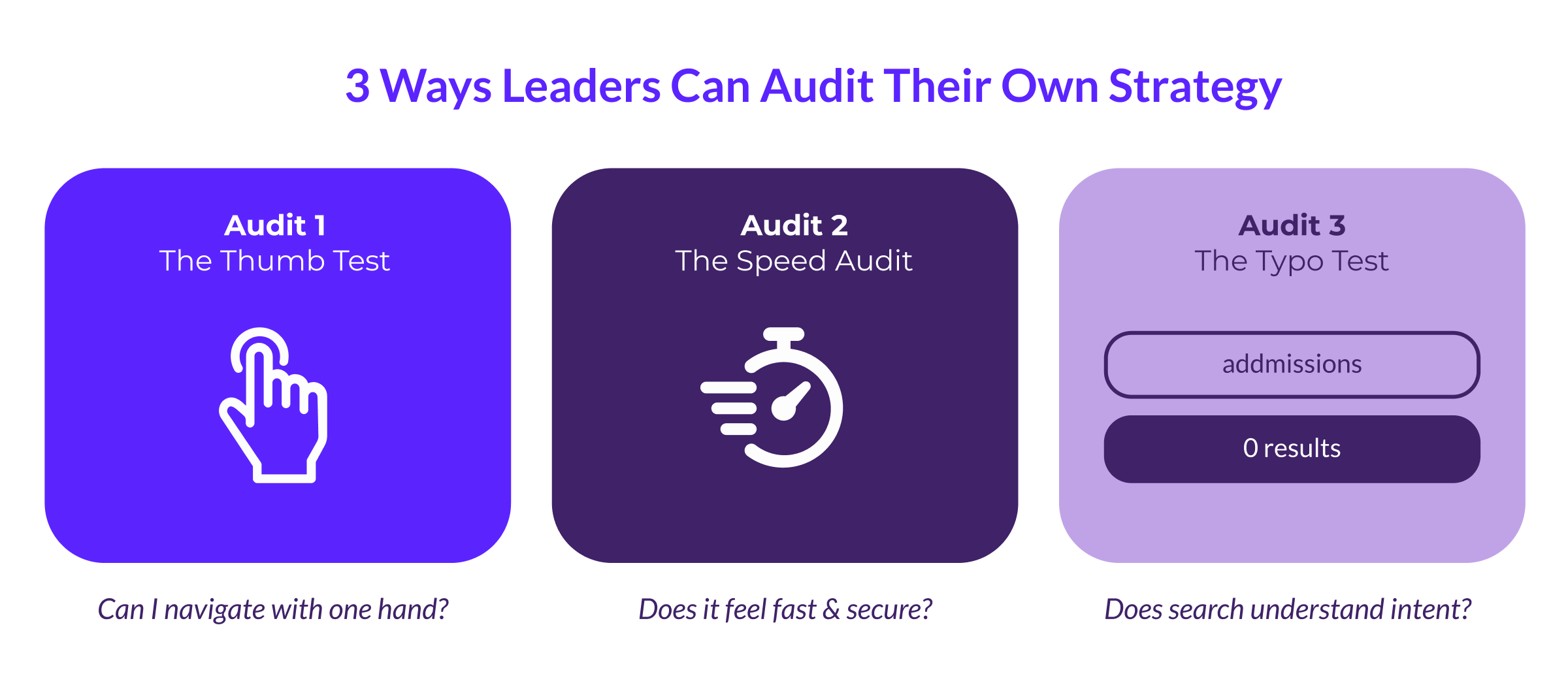
3 Ways Leaders Can Audit Their Own Strategy
You don't need to be a UX designer to check the health of your strategy. Three simple tests can reveal if a site is user-centric.
The Speed Audit
Users associate speed with credibility. A slow site feels broken and insecure.
Ask the team about the project's "Performance Budget." If they don't have an answer, it could be a red flag. Scalable website design is a performance feature, which means setting strict limits on how heavy a page can be.
When a stakeholder wants a high-resolution video background, the question shouldn't only be "Does it look good?" but rather "How many seconds of load time will this add?"
Respect Mobile Context
With mobile devices now driving 64% of global traffic, the desktop version of a site is secondary.
Pull up your website on a phone and try to navigate with one hand.
- Are the buttons large enough to tap with a thumb without zooming in?
- Does the menu require "hovering" to see options? (Hovering is impossible on touchscreens).
- Does the main call-to-action stick to the bottom of the screen?
If using the site while walking down a hall feels difficult, the user is likely struggling too.
Does Internal Search Work?
On large enterprise sites, the search bar is the primary navigation because users instinctively head there when they can't find a link.
Go to the search bar and type a common term with a typo. If it’s a university site, type "admissions" (two d's). If it’s a hospital, type "pay bill" instead of the formal "financial services."
If the result is "0 Results Found," the internal search needs to be fixed.
A user-centric search engine handles synonyms and typos because it knows what the user meant to say. Requiring the user to know the exact internal name of a department forces them to learn the org chart just to use the website.
Build a Strategy That Scales With Your Users
At ImageX, we treat your digital presence as an evolving platform rather than a static project. Our teams combine technical Drupal expertise with deep user research to ensure every feature drives a measurable business outcome. We test assumptions before designing, validate prototypes before coding, and continue optimizing long after launch.
Your users are already telling you exactly what they want. Contact our team today to start building a strategy that listens to them.