3 UX Design Tips to Turn Your Website Into a Conversion Engine
- Map How Your Users Make Decisions
- Remove the Friction That Keeps Visitors From Converting
- Design the Moments That Drive Action
- Your Website Conversion Checklist
- Turn Your Website Into a Conversion Tool
Your website exists to move people toward action. It doesn't matter how polished the design looks or how sharp the content reads. If visitors aren't taking the steps you need them to take, the site isn't doing its job.
The good news is you don't need to start from scratch. Most conversion problems come down to three things: not understanding how your users make decisions, leaving friction in their path, and missing opportunities in the design details that drive action. The best website design tips to increase conversions focus on fixing what's broken in the user experience, with intention and clarity.
Here are three steps to a better user experience on your site, grounded in what works for higher ed, nonprofit, and enterprise organizations.
1. Map How Your Users Make Decisions
You can't design a path to conversion if you don't understand the journey your users are already on. The user journey (sometimes called the buyer's journey or decision funnel) is the series of steps your prospects take before they commit to an action. It's the process they go through, consciously or not, before deciding to take you up on whatever you're offering.
That journey looks different depending on your audience and your industry.
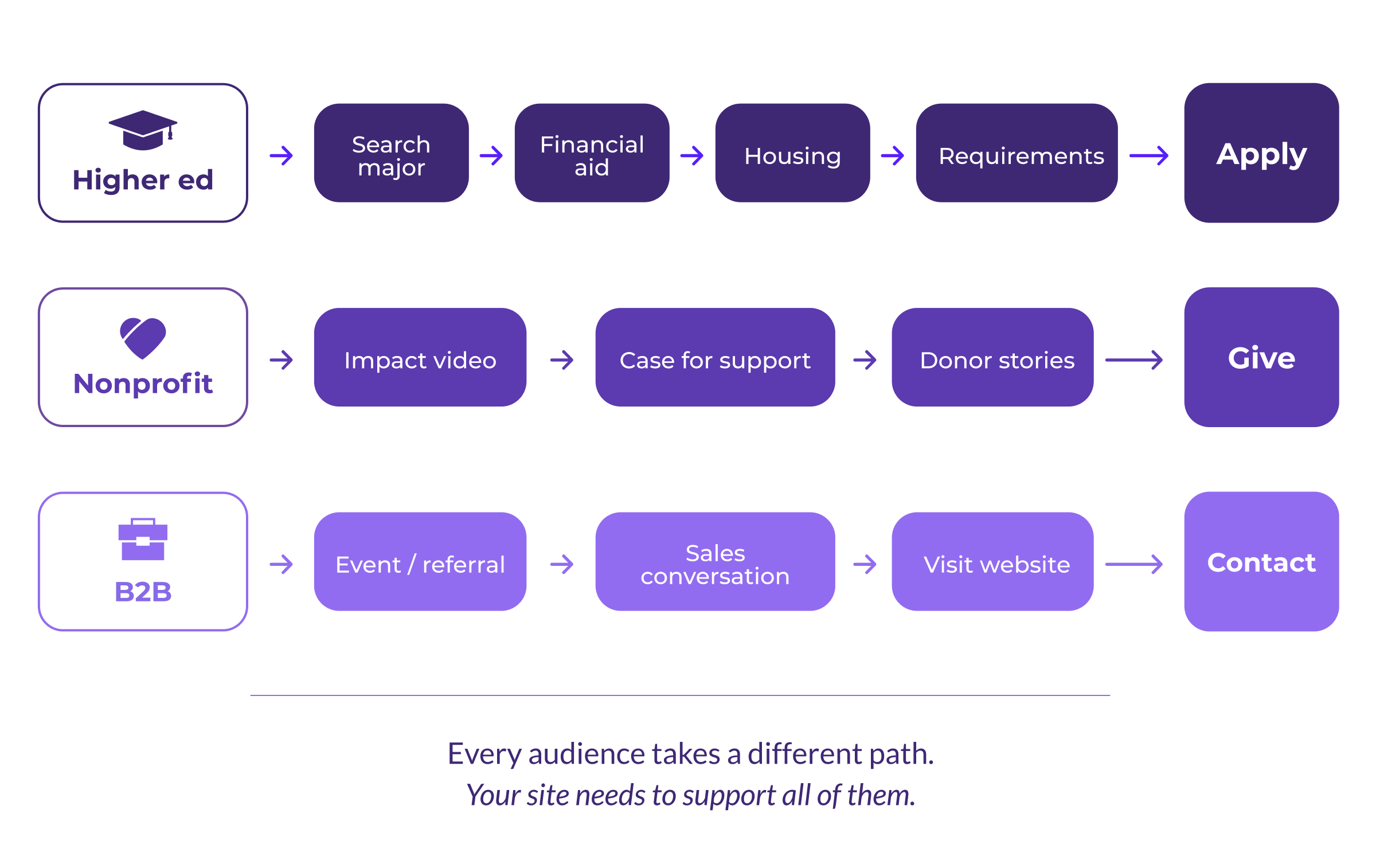
What User Journeys Look Like in Practice
In higher education, a prospective student's decision-making journey might start with searching for a particular major. From there, they review financial aid information, check out housing options, and research application requirements. Each part of the journey should lead the student closer to clicking "Apply Now."
For a nonprofit running a capital campaign, a donor's journey could start with watching a video about the campaign's impact, then downloading the case for support and reading compelling stories of people whose lives will be changed by their generosity. The content strategy should move the donor toward making an online gift or reaching out to the development office.
In a B2B context, the journey might start offline entirely. A prospect meets your team at an event, has a few conversations with your salespeople, and then visits your website to verify specific information before completing a contact form or picking up the phone. The website here acts as a confirmation tool, and it needs to deliver the right details quickly and clearly.
The takeaway: there's no universal template for user journeys. What matters is understanding the specific paths your users take, and building your site around those paths rather than around assumptions.
Persona Research and Journey Mapping That Lead Somewhere
If you've never spent time identifying who your personas are, this is where to begin. Audience research is the foundation of any conversion strategy worth building.
A mix of qualitative and quantitative research methods will help you answer the questions that matter most:
- What's motivating visitors to explore your site?
- Where are they coming from, and what led them to you?
- What stage of the journey are they in when they arrive?
- What information do they need before they feel comfortable taking the next step?
It's also worth considering urgency. Some visitors want to talk to a real person right away, and for them, a chatbot or prominent contact option can meet that need. Others want to browse at their own pace. Your site should accommodate both without forcing either experience.
2. Remove the Friction That Keeps Visitors From Converting
Once you understand who your users are and what they're looking for, the next step is clearing anything that gets in the way. Even well-designed sites can lose visitors when the experience breaks down at critical moments.
Find the UX Problems Your Analytics Are Already Showing You
Tools like Google Analytics and heatmaps (Hotjar is a popular option) give you a clear picture of how people interact with your site. If users aren't reaching key pages in the conversion journey, or if they're leaving the site faster than expected, that's a signal pointing toward a problem you can fix.
Three UX issues come up over and over again:
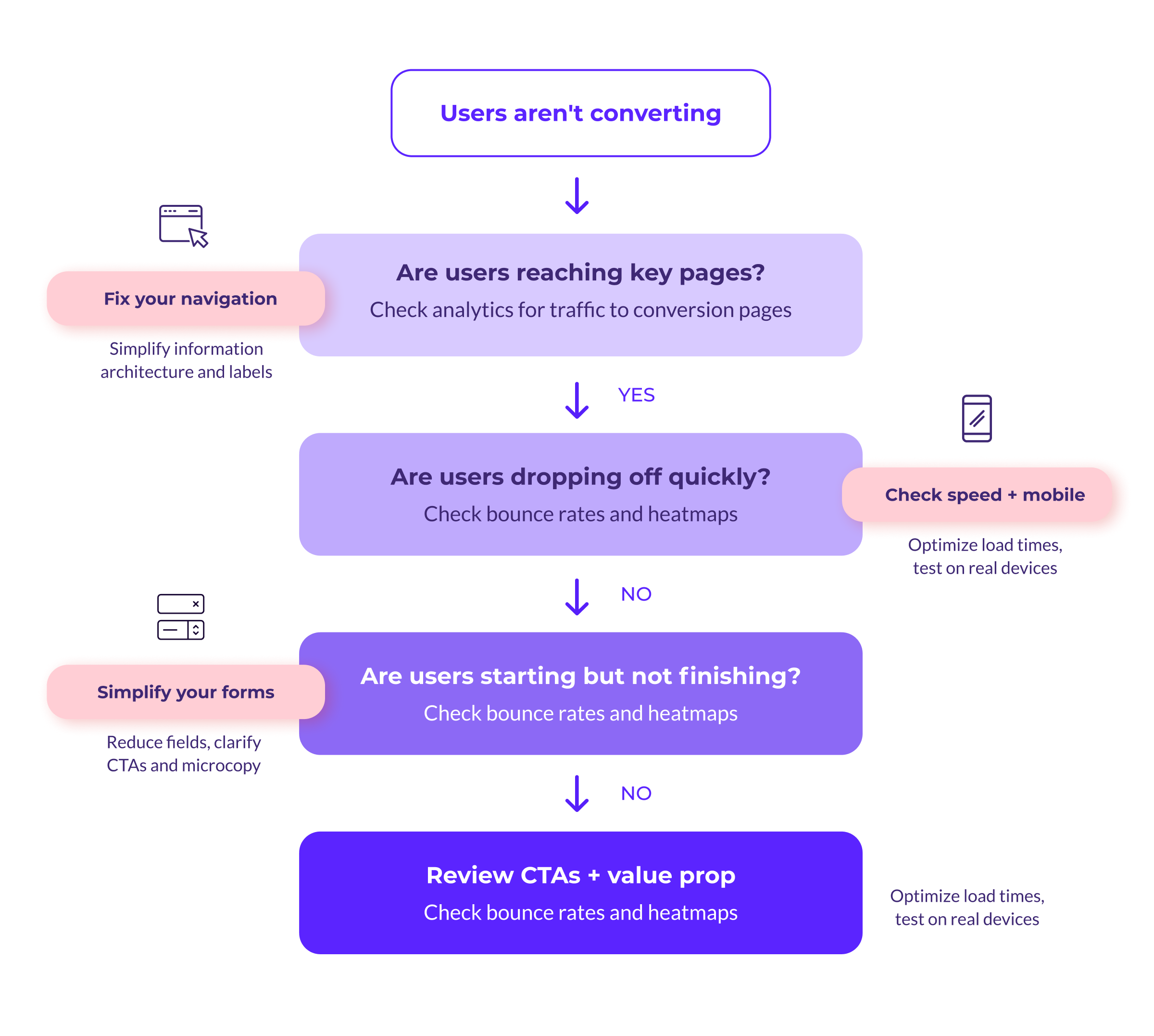
Confusing information architecture
When visitors can't find what they're looking for, they leave. Intuitive information architecture is the primary reason people abandon websites early, and it remains the most persistent usability problem on the web. Navigation that makes sense internally to your organization may not match how your users think about your content. If people have to guess where to click, you've already lost ground.
Poor mobile performance
If your data shows a significant share of visitors accessing your site on a phone or tablet, every part of the experience needs to work on a small screen. Content should be easy to read, buttons should be easy to tap, and conversion forms should be easy to fill out without zooming or scrolling sideways.
Accessibility roadblocks
Forms are a common pain point for users who navigate with a keyboard or rely on screen readers. Designing a positive user experience means thinking about the accessibility needs of everyone in your audience, not only the majority.
The Cross-Platform Experience Matters More Than You Think
Mobile devices now generate over 60% of global web traffic, and for many organizations that share is even higher. That means every form, every CTA, and every key conversion path on your site needs to work well across devices. A site that technically loads on mobile but feels clunky to use will still lose visitors. The experience should be just as clear and functional on a phone as it is on a desktop.
Page speed plays a major role here. Mobile connections are often slower than desktop, and users are less patient when they're browsing on a phone. If your site takes more than a few seconds to load, many visitors will leave before they see a single headline. Compressing images, reducing the number of scripts, and prioritizing what loads first can all make a meaningful difference.
For organizations in higher education, government, and the nonprofit sector, accessibility is often a legal and ethical requirement. Build accessibility into your design from the start, not as a retrofit, and you'll improve the experience for every user in the process.
3. Design the Moments That Drive Action
You don't necessarily need a full site redesign to see better conversion numbers. Often, the biggest gains come from targeted improvements to the specific elements that influence whether someone takes action or moves on.
Headlines, CTAs, and Microcopy That Do Real Work
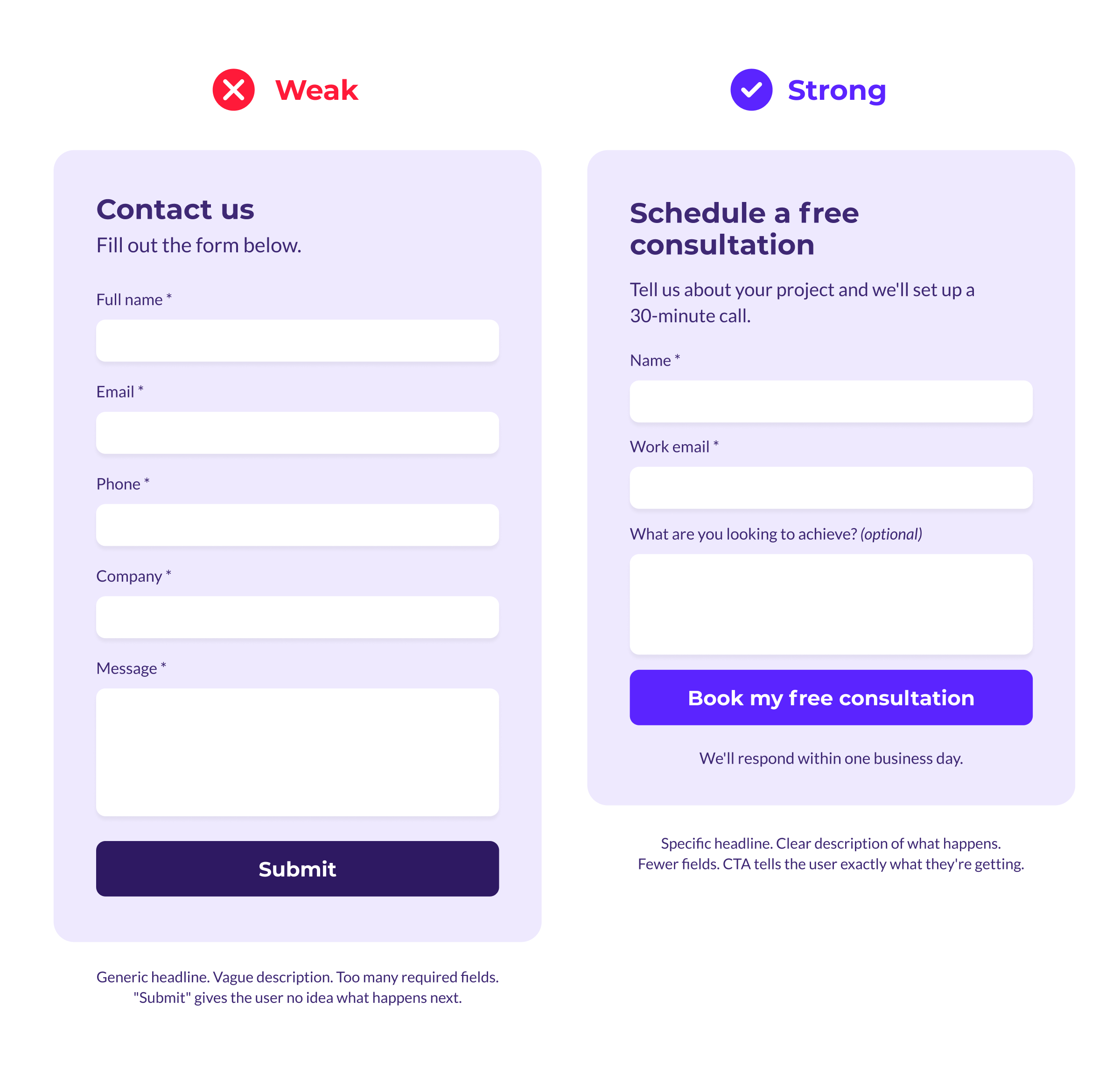
Your headlines should tell visitors exactly what your content and forms offer them. Generic labels like "Contact Us" and CTA phrases like "Submit" don't do much to motivate action. They're placeholders, and they read like it.
Instead, aim for language that's specific and descriptive. A CTA that says "Schedule a free consultation" tells the user what they're getting and what to expect. One that says "Submit" tells them nothing.
This applies to every level of your copy. Subheads, form labels, button text, and the short descriptive phrases that guide users through a page all contribute to how confident someone feels about taking the next step. When the microcopy is clear and specific, users move forward. When it's vague, they hesitate.
Aesthetics play a role here too. Pages that feel clean and organized are more likely to inspire action. Plenty of white space, readable fonts, and a clear visual hierarchy help visitors focus on what matters instead of getting overwhelmed.
Forms That Convert Instead of Frustrate
When it comes to conversion forms, less is almost always more. The average online checkout contains nearly twice as many form fields as it needs, when most sites could get the job done with six to eight. That same principle applies beyond e-commerce. Every extra field you add to a form increases the chance someone abandons it before finishing.
Keep mandatory fields to a minimum. Make sure fonts are clear and readable. And give users enough white space that the form doesn't feel like a chore.
One thing that often gets overlooked: people want to know what they're signing up for before they commit. Whether they're scheduling a demo, starting an application, making a gift, or reaching out to your sales team, the outcome of clicking that button should be obvious. It shouldn't feel like a mystery or a leap of faith.
Test, Measure, and Iterate
Strong design decisions aren't made in a vacuum. They're informed by real data about how your users respond.
A/B testing (also called split testing) and multivariate testing let you compare different versions of a headline, a CTA, a form layout, or any other element to see which one your audience responds to best. Even small changes, like swapping a single word in a CTA or adjusting the color of a button, can produce meaningful differences in conversion rates.
Start with your highest-traffic landing pages, your primary contact forms, and the pages where analytics show the steepest drop-offs are all good candidates for your first round of tests. Focus on one variable at a time so you can clearly attribute any changes in performance to the specific thing you adjusted.
The key is to make testing an ongoing practice. Set up tests, review the results, make adjustments, and then test again. Over time, this cycle of experimentation builds a site that's genuinely optimized for your audience rather than built on guesses about what might work.
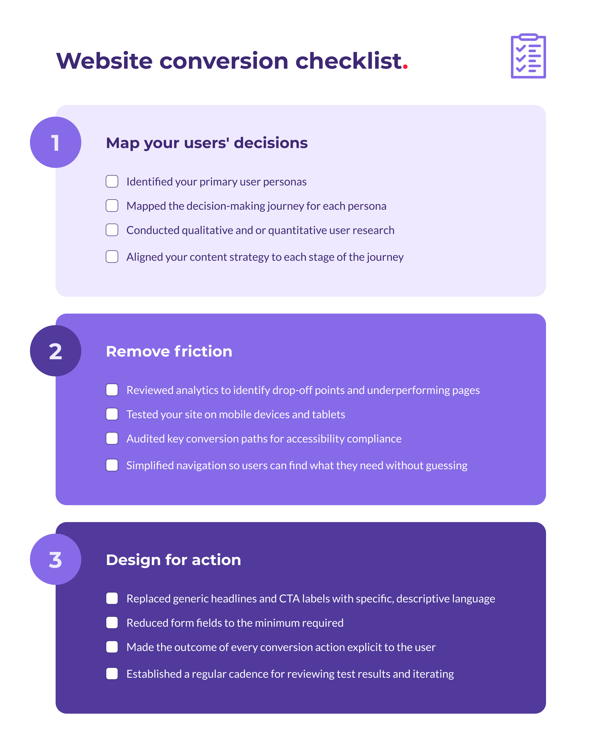
Your Website Conversion Checklist
Here's a quick reference that ties everything together. Use it to audit your current site or guide your next round of improvements.
Turn Your Website Into a Conversion Tool
When your website is built around a clear understanding of your users, free of unnecessary friction, and designed with intentional attention to the moments that drive action, it becomes one of the most powerful tools in your marketing strategy.
Take time to understand how your audience makes decisions. Clear the obstacles that stand between them and the actions you need them to take, and pay close attention to the design details, from headlines to forms to CTAs, that have the biggest impact on whether someone converts or walks away.
Need a web design agency that understands this work? We're here to help. Get in touch.