
Helping Users Find What Matters: How to Build A Guide to Creating Drupal Filters for Better Content Discovery

At the heart of great UX design is a simple truth: it’s essential to help users find exactly what they need in seconds. One of the greatest features in this area is smart, well-structured filters for content collections. They make staff directories, resource libraries, event calendars, and other listings much more intuitive and easier to browse. This eliminates any guesswork, allowing users to rely on clear filter criteria.
A powerful filtering foundation is already baked right into Drupal, enabling you to create smooth filtering experiences. In this guide, we will walk you through exactly how Drupal filters work and how to build them step-by-step.
This article is the second installment in our series on Drupal website search capabilities. Previously, we featured Search API — a powerhouse for content-rich websites. However, unless your site has thousands of pages, you don’t always need a dedicated search server right away. In any case, clean filters serve as the perfect foundation. You can seamlessly plug them into Search API at any time, or even pair them with the AI-based semantic search that our team showcased at the Drupal AI Summit in New York.
A glimpse of filtering experiences in Drupal
The powerhouse behind the scenes: Drupal Views
The absolute backbone of content organization in Drupal is Views — a core tool and one of the platform’s most robust engines. Views enables you to pull and display exactly the content types you want, like staff profiles, resources, or events.
The best part is that you can query your database without writing a single line of SQL code. Everything is managed visually through an intuitive administrative interface, giving you total control over how your content is structured, which elements are displayed, and in what order.
While Views is packed with advanced features, its filtering and sorting capabilities are the primary tools you use to curate and organize these collections:
- Filters. They display only the items that match specific criteria (such as showing staff members from a specific department).
- Sorts. They arrange your displayed items in a specific order (such as organizing an upcoming events list chronologically by date).
Exposing filters: handing the controls to your users
You can transform filters into a powerful frontend search feature by exposing them to your visitors. When you expose a filter, you hand the control over to the user, allowing them to decide which criteria matter to them at that exact moment: browsing a publication library by topic, filtering a directory by a professor’s department, or sorting an event calendar by location. You can present multiple filters simultaneously to let users narrow down a single collection from several different angles.
By using contributed modules like Better Exposed Filters, you can add user-friendly radio buttons or interactive links to the choice of filter options, use the “auto-submit” feature, and more. We’ll explore this in more detail soon.
Because Views handles filtering independently of your layout, this setup plugs perfectly into whatever theme or display system your site is running (Layout Builder, Display Suite, or other tools). You get a highly responsive, modern browsing experience built entirely from the Drupal administrative interface.
How to create filters in Drupal’s content listings
Let’s check out a couple of examples with a step-by-step explanation. First of all, you’ll need a collection of content built with Drupal Views. If you don’t have one yet, you could follow our step-by-step guide on how to build a Drupal staff directory. Then come right back here to supercharge it with filters.
Example 1. Create filters by resource type, topic, and reading time
For this setup, we’ll be using a view that shows a library of digital resources. The view displays all items of the “Resource” content type, styled using the “Grid” format displaying fields.
For every resource, we display the title and the image field. Next, there are three fields implemented through taxonomy vocabularies, and they will serve as the main filtering criteria:
- Resource Type: Case Study, E-book, or White Paper
- Resource Topic: Education, Healthcare, or Public Policy
- Reading Time: Quick Read (< 5 mins), Medium Read (5-15 mins), or Deep Dive (15+ mins)
Step 1. Add filters in Drupal Views
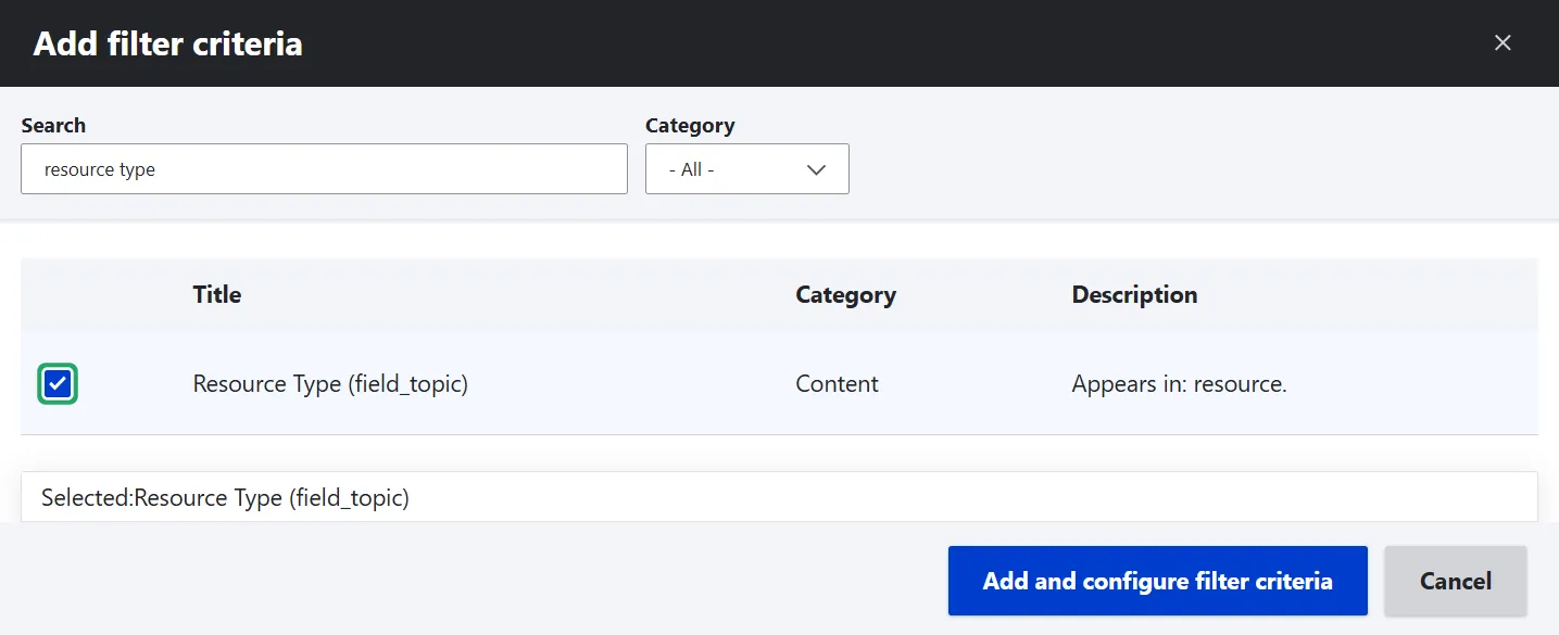
In this example, we’ll add exposed filters for all three of the above-mentioned criteria. To add an exposed filter, open the view’s settings, locate the “Filter criteria” section in the left column and then “Add.” Search for and select your first taxonomy field (like “Resource Type”). Click “Add and configure filter criteria.”
Repeat this process one by one for the remaining fields to establish the foundations of your three filters.
Step 2. Configure the filter settings
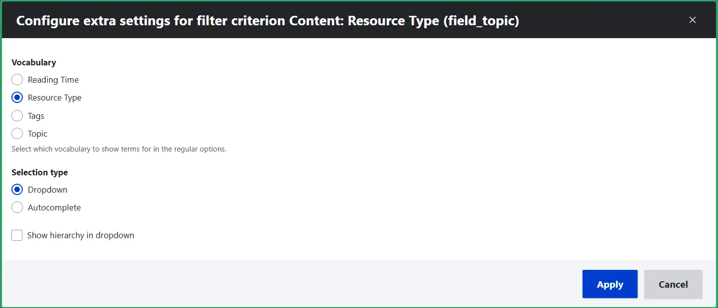
For each of the three filters, ensure you select the matching taxonomy vocabulary in the configuration settings.
Next, decide how you want users to interact with the filter by choosing a widget type:
- Dropdown. Best for presenting a finite, manageable list of options (like our resource types or reading times).
- Autocomplete. Ideal for massive vocabularies where a dropdown would become too long or overwhelming to scroll through.
For this setup, since our vocabularies are small and distinct, dropdown is the perfect choice.
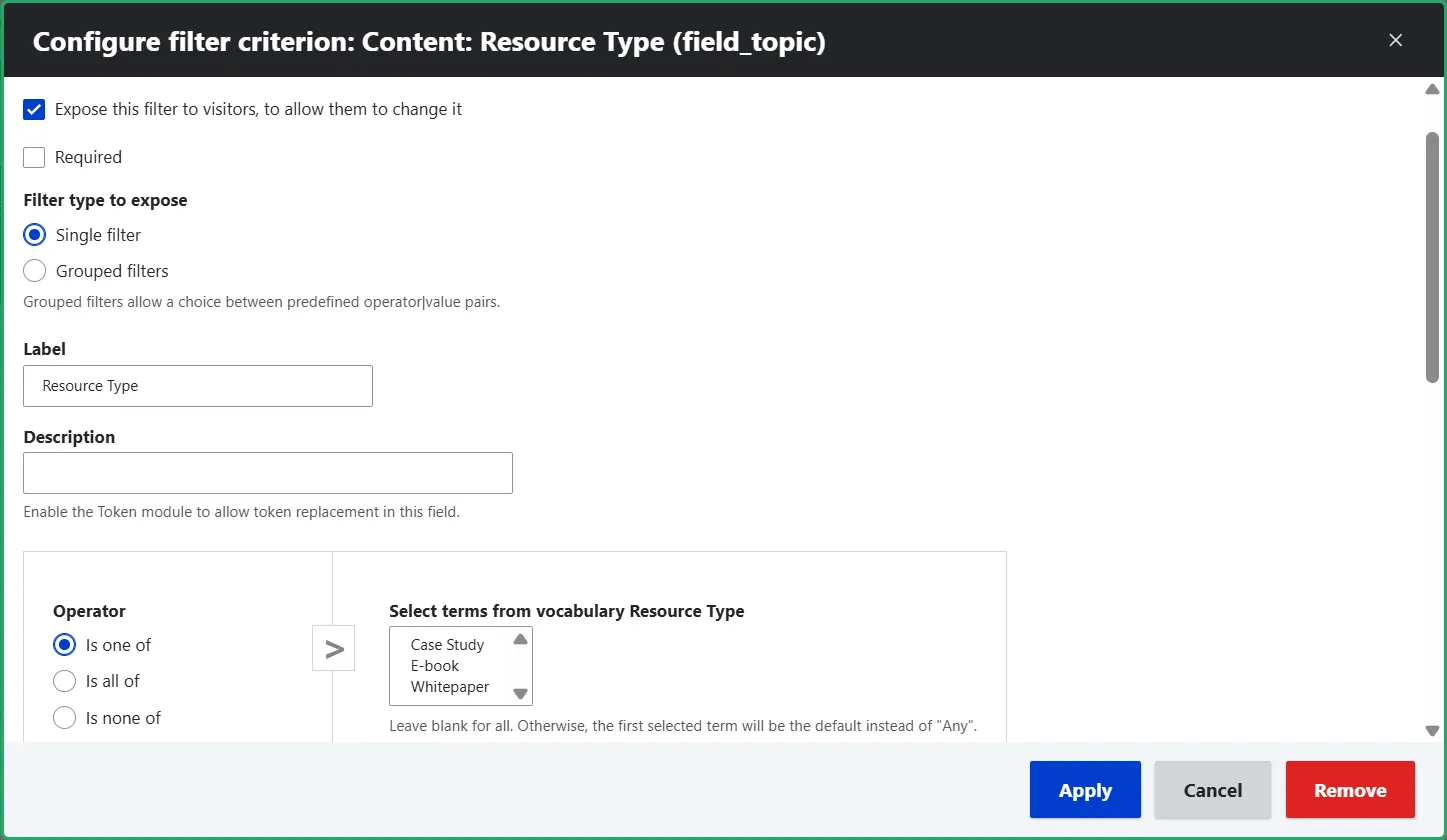
Check the “Expose this filter to visitors” box. Under the “Operator” dropdown, choose “Is one of.”
Step 3. Customize the main buttons
Locate the “Exposed form” section in the right column of the view settings. Here are two quick, high-impact adjustments you can make in seconds without coding:
- Customize the “Submit” button text. By default, Drupal displays a generic “Apply” button. Let’s make it much more engaging. Change the text to something action-oriented, like “Find What You're Looking For!”
- Enable a “Reset” button. Check the box to include a “Reset” button, which is a crucial UX detail, giving users a single-click way to clear all their active filter selections and start their search fresh.
Step 4. Check the result
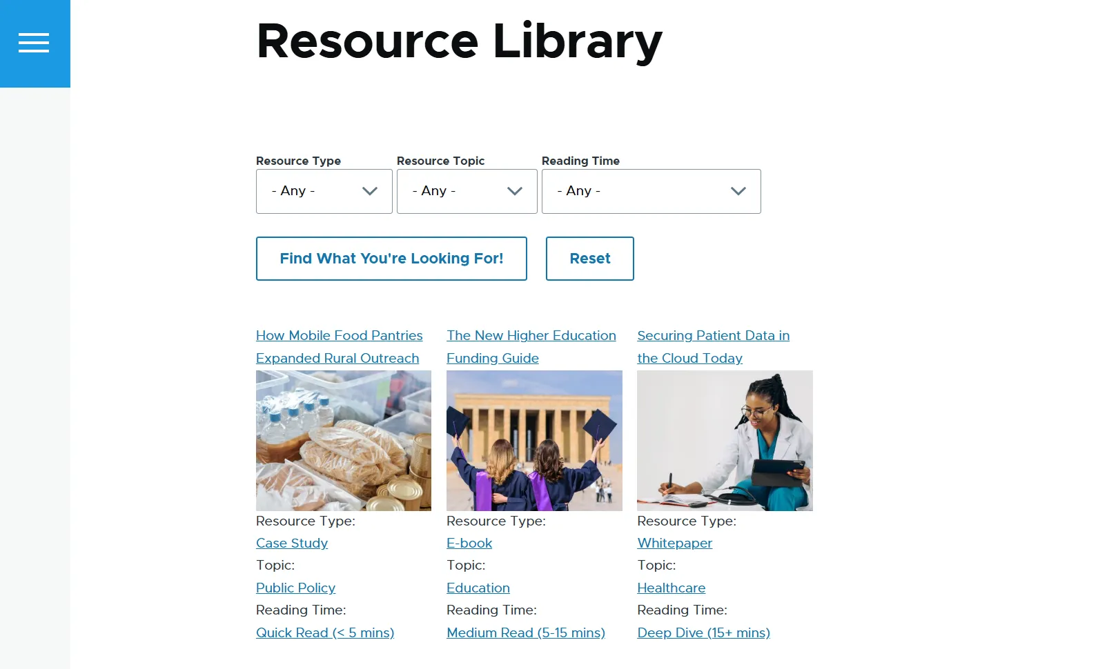
Navigate to the URL path you configured for your view page. You will now see your collection of resources complete with three interactive filters: Type, Topic, and Reading Time, along with a customized “Submit” button and a “Reset” button.
Example 2. Enrich the filtering options using the Better Exposed Filters module
With the Better Exposed Filters module installed, go to the “Exposed form” section and change “Exposed form” from “Basic” to “Better Exposed Filters.” Once you apply the change, a detailed settings window will automatically open (you can also access it at any time later).
You will see each of your three exposed filters listed. You can now choose exactly how each one should be rendered on the frontend.
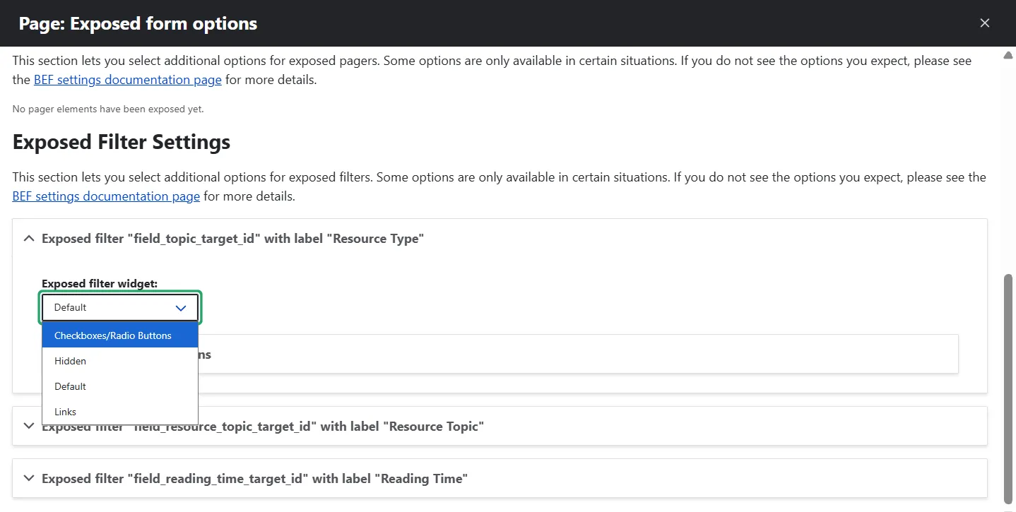
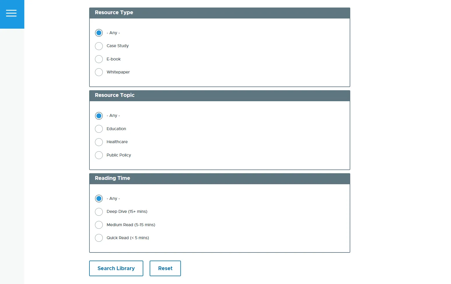
One option is to display the filter choices as checkboxes or radio buttons.
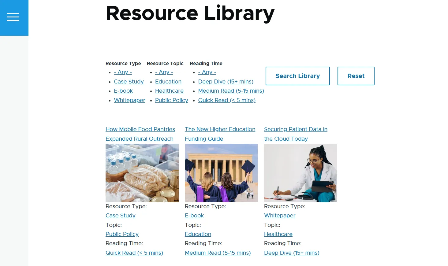
Another option is to display the options as links, which can be more concise.
More BEF customizations:
- Enabling auto-submit. You can turn on “Auto-submit” in the settings, which will instantly update the content grid the moment a user clicks on a filter option..
- Moving filters to a sidebar. By default, filters stack directly above your content. To place them in a sidebar instead, set “Exposed form in block” to “Yes.” This detaches the filter panel, allowing you to position it anywhere using Drupal’s block layout system.
A quick note on styling: the exact look of your checkboxes, links, or radio buttons depends on your active Drupal theme. However, because BEF outputs clean HTML, you can easily polish the design further with custom CSS to match your brand.
Example 3. Build a “Choose events by time” filter
In the next example, we’ll enable users to filter upcoming events by natural, human-friendly timeframes: “This Week” and “This Month.” We’ll use a view that shows a grid of events. The most important field in this case is the “Event Date” field.
Step 1. Sort the view by event date
First, to make sure your audience always sees your events in chronological order, you’d need to sort them.
Look for “Sort criteria” (right below your filter criteria). By default, Drupal usually sorts content by “Authored on” (the date the page was created). For this example, we care about when the event happens, not when it was published, so the default sort will need to be removed.
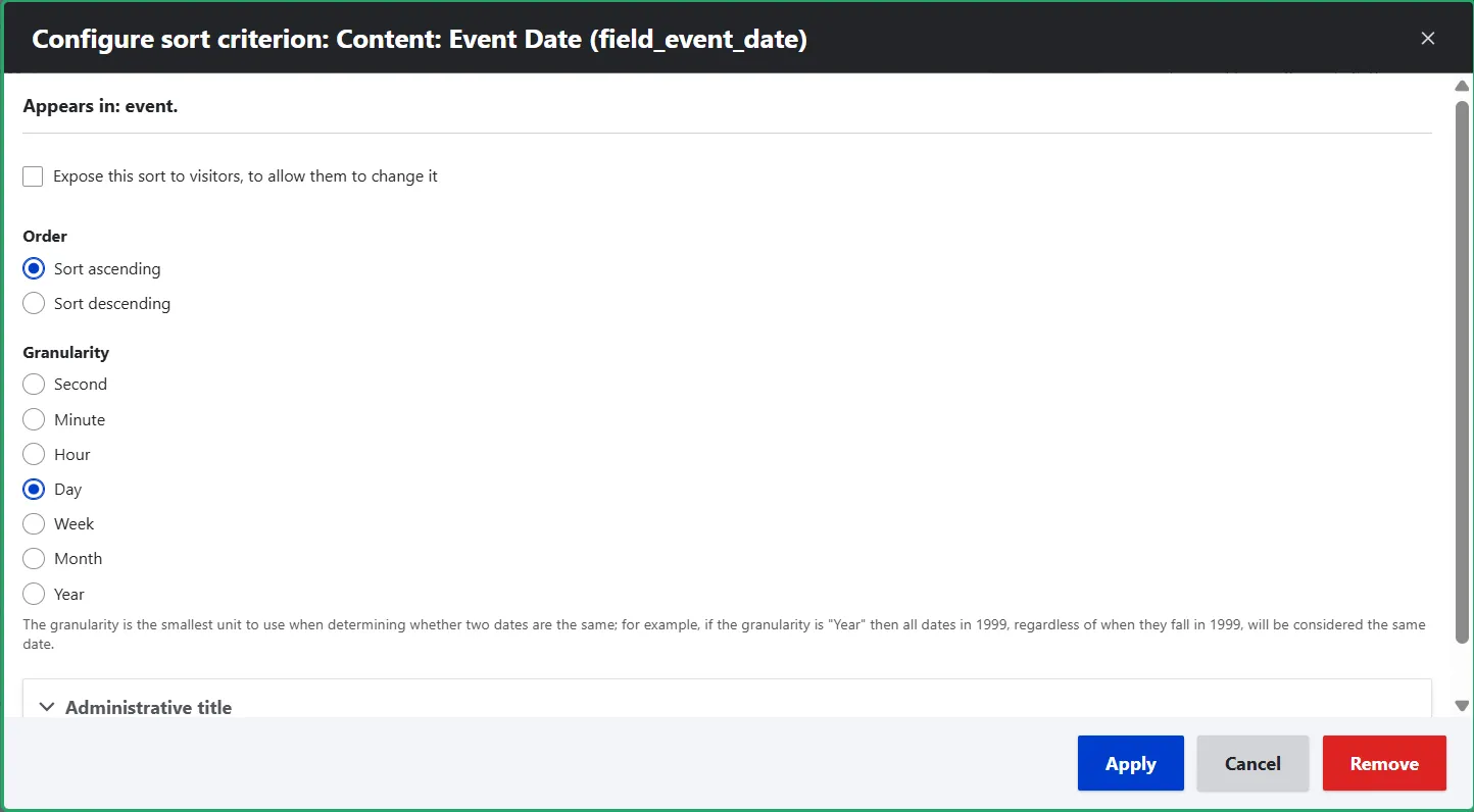
Now, create a new sort by clicking “Add” and searching for the “Event Date” field. You could expose this sorting option to your visitors, but there is really no need to. By keeping it unexposed (hidden in the background), you make sure Drupal automatically arranges the events without cluttering the screen with unnecessary sorting buttons.
In the configuration settings:
- Order. Select “Sort ascending.” This ensures that events happening today or tomorrow bubble up to the top, while events later in the month slide further down the grid.
- Granularity. Choose the level of detail that matches your event times, depending on whether you need to sort down to the exact hour and minute, or simply sorting by day is enough.
Step 2. Add a filter by timeframe
Now let’s move to our main filter. By clicking “Filter criteria” and “Add,” add a filter based on the “Event Date” field.
Step 3. Configure the filter
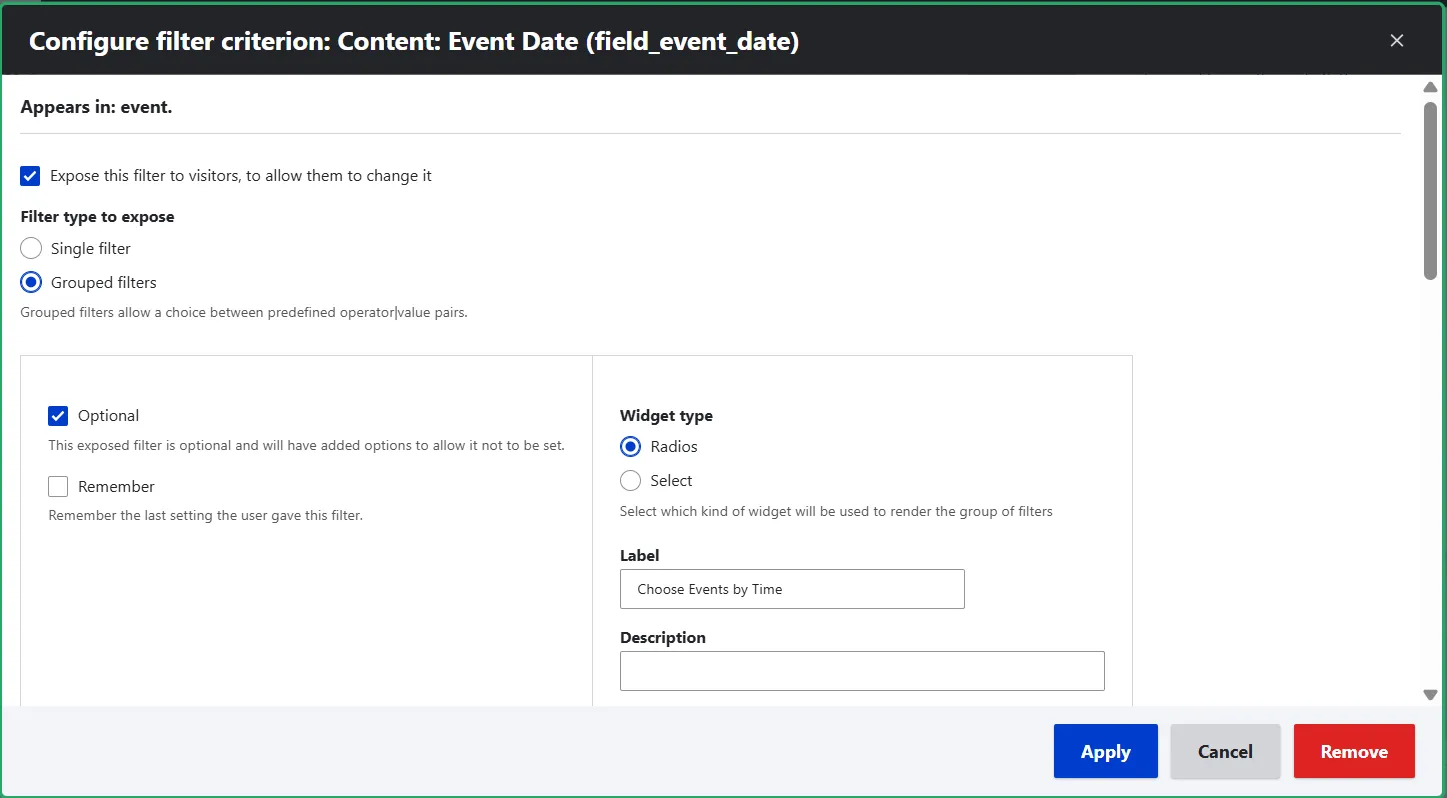
Check the box to “Expose this filter to visitors.”
Under “Filter type to expose,” select “Grouped filters.” Set the “Widget type” to “Radios.” We mentioned earlier that the Better Exposed Filters module is needed for radio buttons, but in the case of grouped filters, Views supports this widget type out of the box.
Next, customize the “Label” (in this example, it is “Choose Events by Time”).
Step 4. Define the timeframes
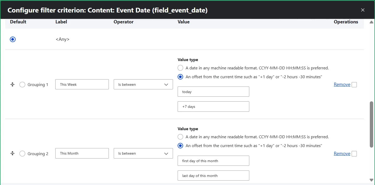
Let’s now create the “This Week” and “This Month” filtering options. Under “Grouping one,” add a “This Week” label, set the operator to “In Between,” and set the “Value type” to “An offset from the current time.” Provide the minimum and maximum values:
- Min: “today”
- Max: “+7 days”
Under “Grouping two,” add a “This Month” label and repeat the same steps as for the previous grouping, with the difference of the minimum and maximum values:
- Min: “first day of this month”
- Max: “last day of this month”
Those are dynamic, programmatic expressions. Because they are relative rather than hardcoded dates, Drupal evaluates them automatically on the fly. No matter when a user visits your site, “today” will always mean the current day.
Step 5. Check the result
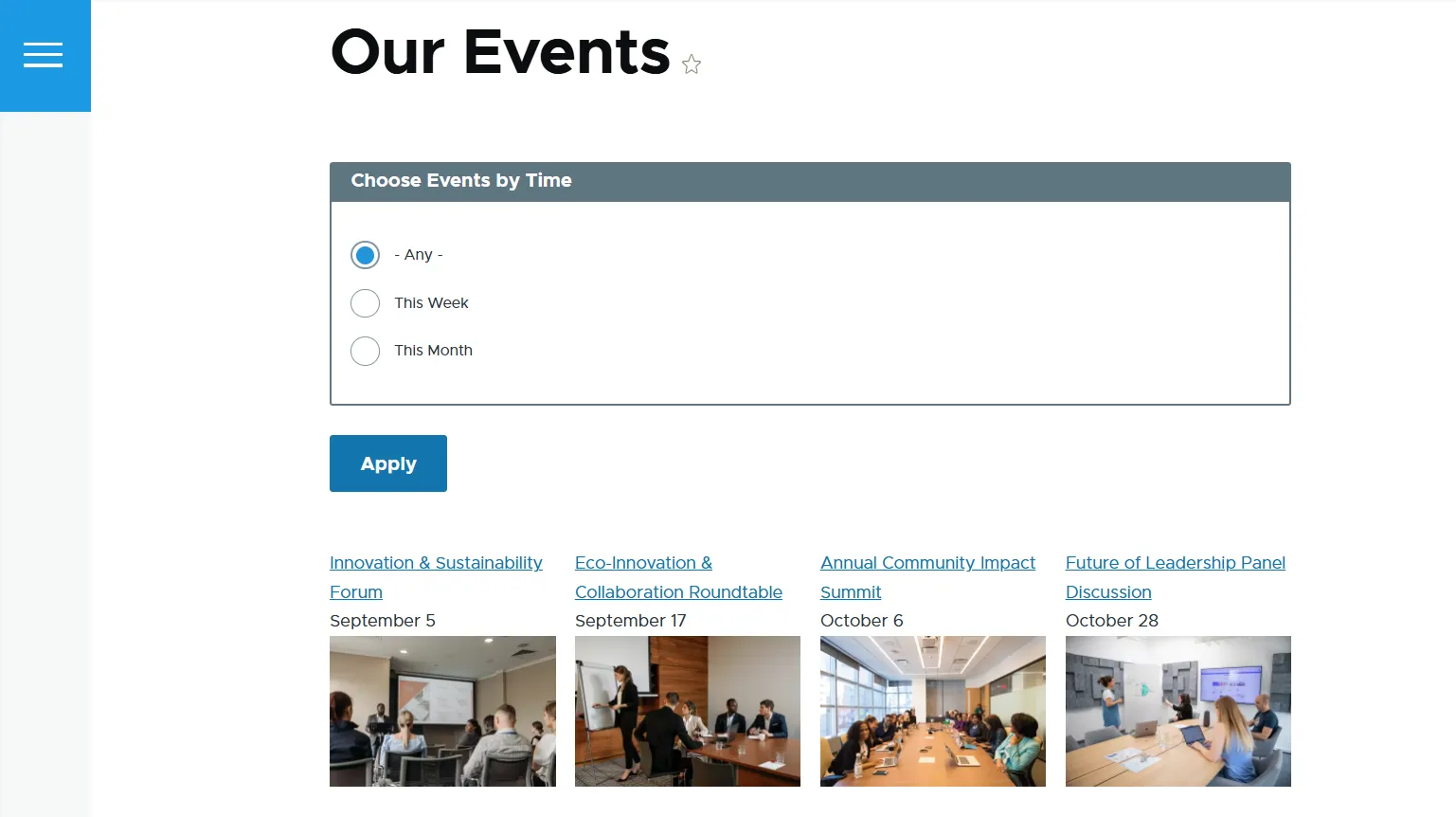
Visit your view page and discover the collection of events. Your visitors can now easily toggle between “This Week” and “This Month” using clean, intuitive radio buttons. All the events are automatically sorted in chronological order.
Final thoughts
What we’ve built here is just the scaffolding or the foundational mechanics of how filters work on a Drupal site. The styling in these examples is simply what Drupal Core delivers right out of the box, which is perfect for showing exactly how the gears turn under the hood.
In reality, the magic happens when these filters are styled to match a brand’s unique identity and polish the design. A truly customized front-end turns these basic functional elements into a seamless, satisfying filtering experience for users.