How to Improve Web Design ROI with Data and Testing
Ask any stakeholder about their organization's website, and you'll likely hear plenty of positive and negative opinions about the overall design. If you’ve ever worked on a website redesign project, then you know how lively and opinionated the conversation can be when departments come together to discuss design preferences. The subjective nature of design is one of the stickiest challenges of a successful website redesign project.
How Do You Overcome Subjective Design Challenges?
Business leader and conversion optimization expert Flint McGlaughlin has said that "there are no expert marketers; there are only experienced marketers, and expert testers." McGlaughlin is referring to the idea that the end users of any site are the ones who know best what they want. As a Drupal web design and development agency, our job is to understand who the audience is, what their needs for a successful digital experience are, and then, to deliver relevant information in a virtual environment that will support long-term growth for both the target audience and the business. Our objective is to calibrate the project to overcome subjective challenges while achieving high performance on business and user goals.
Identifying Design Challenges
Some of the more common design challenges in nearly any digital project are:
Cutting Through the Noise: Everyone has a design preference and most people feel confident in sharing their preferences and ideas. The challenge is balancing preference and data to start uncovering the right solution for the target audience and the business.
Alignment: Design preferences may not always align with the best interest of the project.
The HIPPO Effect: The HIPPO, or "Highest Income Person’s Personal Opinion," can significantly impact the overall direction of the design. This can be great when preferences are aligned with user user goals, a challenge when not.
Overcoming Challenges to Increase ROI
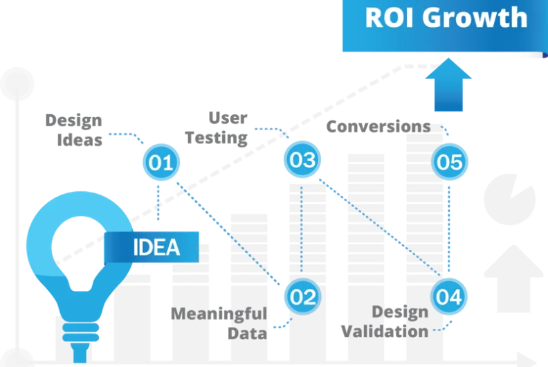
To address these common challenges and to achieve a higher return on on investment (ROI), we'll focus on five key elements, which we’ll explore a little deeper later in this article.
Data and facts - not opinions - should guide design process. Input about design preference is great; however, research and data should be at the forefront guiding digital solutions.
Incorporate user feedback early and often.
Focus on targeted goals such as achieving higher conversion rates, rather than subjective design preferences.
Include optimization initiatives such as usability testing, search engine optimization (SEO), and conversion rate optimization (CRO).
Establish meaningful and specific key performance indicators (KPIs) to measure and evaluate goal conversions.
Let Data and Facts - Not Opinions - Guide Design Process
To bring some context on this critical element, let’s use an example of an industry we work with regularly, higher education. Increasing enrollments is a goal that for most universities, especially from their website. Key business goals and KPIs such increasing enrollment are needed in order to measure the effectiveness of any web design. There are many possible goals and KPIs and time should be invested in developing targeted goals that are unique to the business. This will help the project team rally around an agreed-upon goal and deliver solutions with ROI in mind.
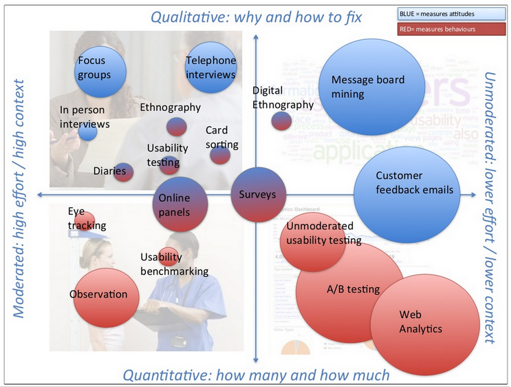
The above quadrant (courtesy of consultancy group UX Guys) illustrates the spectrum of available research inputs needed in order to create and validate a design hypothesis. The strongest validation will typically come from including data from multiple (and ideally opposite) quadrants. For example, combining qualitative and quantitative data typically provides more powerful, persuasive insights than relying on qualitiative or quantitative data alone. Using data from multiple sources, both qualitative and quantitative (i.e.. heat map visualizations), allows us to better identify distinct user behaviors and patterns. Having this data will help to improve the quality of the analysis and oftentimes lowers resistance from stakeholders.
We could easily write a blog post on the how to select research sources (and perhaps we will in the future), but for the purpose of this piece, we’re simply highlighting the broad power of using meaningful, triangulated data to help guide the design process.
Incorporate User Feedback - Early and Often
Your website will be user tested. The question is, do you conduct user tests before or after you website launches? Real success on the web occurs when user objectives and business goals are clearly defined and integrated. You can spend a lot of time and effort trying to project what users need, but a more efficient and reliable approach is to "get out of the room" and talk to your targeted users about their needs.

The above photo are stakeholder/user sessions from recent workshops hosted by ImageX
We find value, when possible, in having both end users and project stakeholders in the same room during this process. This increases stakeholder confidence in findings and allows stakeholders to better understand the user needs (and you know this valuable information is coming directly from a transparent source). It is difficult for stakeholders to rely on opinion about what users would do when their users are directly telling or showing them how they use the site.
One of the tools we like to use when gathering user feedback is product reaction cards. The idea behind product reaction cards is fairly simple: the more words that are highlighted in the "I Like It" side, the better. The "I Don't Like It" side reveals potential design issues. Success is ultimately achieved when the reaction of the user is predominantly positive with most of the highlighted adjectives aligning with business goals. This tool and several similar tools can help design teams escape the slippery slope of design preference discussions, such as the oft-heard, “It should look like Apple's website.” Using tools to validate design objectives and gauge users' emotional response to your design will help lead to long-term success and positive ROI.

Mojoleaf is a free online tool that uses Microsoft Product Reaction Cards to test design concepts.
While there are online tools like Mojoleaf to simplify data collection, it’s worth exploring in-person usability tests with Product Reaction Cards too. This allows the test moderator to ask participants why they chose a given word in real-time. Again, whenever possible, it’s worth combining qualitative and quantitative feedback to understand the whats and the whys.
Balance Usability & Conversion
By now, you may have started noticing some important patterns in this blog piece:
Minimizing subjectivity and leveraging meaningful data
Establishing user objectives and business goals to overcome any internal objections
Leveraging goals and KPIs and testing them to achieve ROI
As stated earlier, real success is achieved when both the user and the business goals are carved out and in alignment. "Wayfinding" is the pathway a user takes on their journey towards accomplishing their intent on any website. "Conversion," of course, is the accomplishment of the business goal at the end of a successful user journey. Unmoderated user testing can be an efficient method for measuring the effectiveness of the user’s pathway.
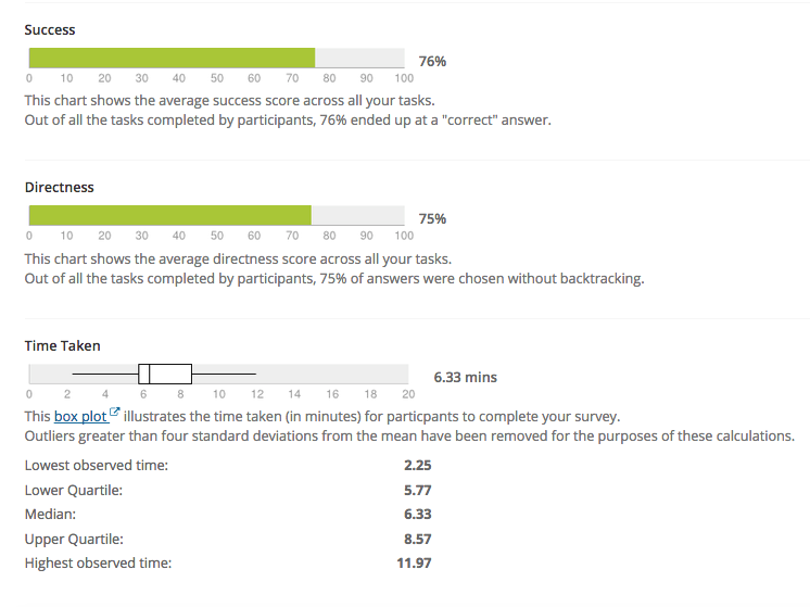
The image above illustrates an example of an unmoderated user test using TreeJack.
"Success" indicates the percentage of users able to complete the task, while "Directness" is defined by how many users were able to complete tasks without having to go backwards in their navigation. Larger “directness” percentages can reveal issues with the ease of navigation during a user’s journey. Lastly, we can measure how long (on average), it takes users to complete tasks. A successful outcome will have a high “success” and “directness” rating combined with a low, average time to complete tasks.
Let’s move on to conversion optimization by defining what conversion mean in a design process. Conversions are the culmination of a successful user journey and the accomplishment of business goals. Using our our higher education industry example from earlier, a conversion goal could be increasing the number of users submitting requests for information about an academic program, or increasing the overall number of admissions application for the university.
There are well-known design principles for increasing conversion such as encapsulation, color contrast, and directional cues around the calls to action (seen below), to name just a few. Unbounce has published and shared this excellent guide to conversion centered design (email signup is required).
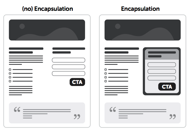
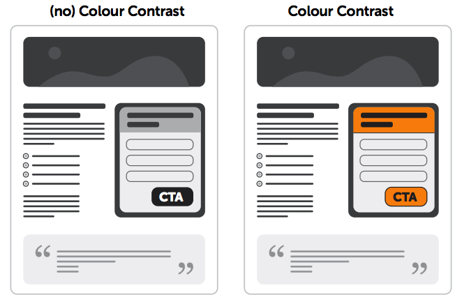
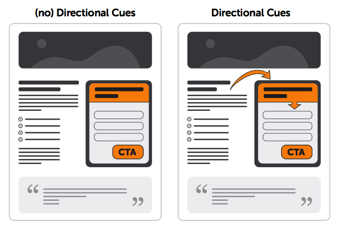
Layering conversion principles into a design. Images courtesy of Unbounce’s Conversion Centered Design Guide.
Define Meaningful KPI's
Perhaps one of the most important aspects in achieving organizational alignment around design is measurement. Again, the idea is to focus on the desired result as opposed to individual preferences on how to achieve it. Simply put: let the best design wins! We have found the following attributes are key to well-defined KPIs:
They resonate with stakeholders (visuals help)
They are clearly aligned with project goals
There’s a small, manageable number of KPIs
KPIs are easy to understand and measure
Remember, KPIs should be unique to each business and their goals - despite any obvious product and/or service similarities. The goal is for the stakeholders and organizations to rally around a defined set of KPIs to better focus on the end result.
In Conclusion
We've covered a lot of ground at a high level in this post. The knowledge and advice shared has been accumulated over years of delivering more than 200 successful digital projects, and it certainly does not cover everything that should be considered when attempting a website design project.
Have questions about this article or web design in general? If so, or if you're interested in a free Usability Analysis (time and resources permitting) of your website, follow up with us here.
