Insights from a Web Redesign that Transformed Verimatrix's Online Presence
One of the greatest benefits of working in our field is the opportunity to connect with industry leaders who we might not have crossed paths with otherwise. Our clients span the gamut -- from higher education, to technology and beyond -- and Noe Marti from Verimatrix is one of those leaders. Noe was kind enough to contribute to our blog, sharing some of the insights that Verimatrix learned from a recent website redesign that they partnered with ImageX on -- and that ultimately transformed their online presence entirely. Verimatrix is at the forefront of the global revenue security market for next-generation video services. As people continually change how they consume content, our security software protects content and its revenue streams for pay TV operators globally across any network, any device, and any platform. 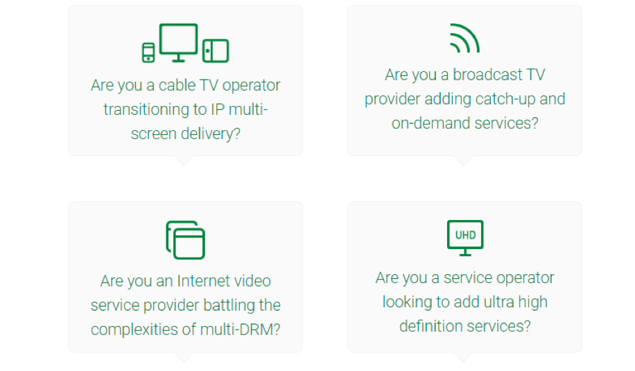 Also, since our website’s visitors are mainly divided into prospects, customers, or partners, we made sure that we structured our menus to make it easy for each of these personas to find what they need.
 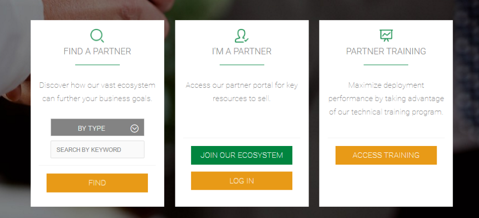 For example, from our partners’ menu, visitors can find all the companies that are part of our vast partner ecosystem, access or sign up to our partner portal, and access specific partner training courses.

Website Redesign Project
In June 2015 we partnered with ImageX Media to redesign our website in order to elevate the online representation of our brand and take our web presence to the next level. As the main touch point of our online marketing ecosystem, our main goals for the new site were:- Educate our prospects on who we are and what we offer in an easy way;
- Position us as security leaders in the Pay TV industry offering a wide variety of thought leadership content; and,
- Convert unknown visitors into actionable leads.
Taking a User-Centric Approach
We differentiated ourselves from our competitors by focusing on delivering the best user experience possible, making it easy for visitors to find the information they need with the least amount of clicks. We structured the site taking into consideration the different personas that would be using it. For example, instead of displaying our offerings by their commercial name, we show visitors different use cases, so they can easily identify our different solutions based on their specific needs. Also, since our website’s visitors are mainly divided into prospects, customers, or partners, we made sure that we structured our menus to make it easy for each of these personas to find what they need.
  For example, from our partners’ menu, visitors can find all the companies that are part of our vast partner ecosystem, access or sign up to our partner portal, and access specific partner training courses.
 Making Content that’s Easy to Share
We wanted the website to be the central repository for our thought leadership content including white papers, solution briefs, blog posts, press releases, case studies, videos, etc., so ImageX designed, developed, and implemented a comprehensive resource library for us. In order to expand the reach of our content, it was very important for us to make it easy for visitors to share it. ImageX implemented a design based on individual content tiles, where visitors can quickly share content by hovering over the tile and selecting their preferred social media channel.
The Importance of Going Mobile
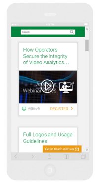
In today’s world, people no longer navigate the web only using a computer, so we wanted to make sure our site looked great on both tablets and smartphones. Mobile responsiveness became a key factor as mobile currently accounts for approximately 40-50% of recipient opens from our marketing emails linking directly to our site. In order to maximize conversions, we focused on making sure that our emails display great on any device. This ensures a seamless experience for users who start their journey from an email and continue to the website after clicking on it, so they can easily access the content they are looking for.
Redesign Success
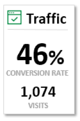
As a direct result of the redesign, our conversion rates have increased to be consistently 40-50% for all of our lead generation campaigns. That means that out of all the users who visit a landing page for any given piece of content – like a white paper, for example -- half of them complete the web form to download the content.