How to Know if Your Website Is Putting Off Potential Clients (And How to Fix It)

Ever clicked away from a website because the text was microscopic, a popup wouldn't go away, or filling out a simple form felt like solving a riddle blindfolded? We've all been there. Here’s the kicker: your website might be causing the same headaches for potential clients.
It’s not you, it's your website. Or more specifically—your website's accessibility.
An inaccessible website doesn't just inconvenience users with disabilities—it pushes everyone away. Let's talk about accessibility and inclusive design and why getting them right is crucial to your business.
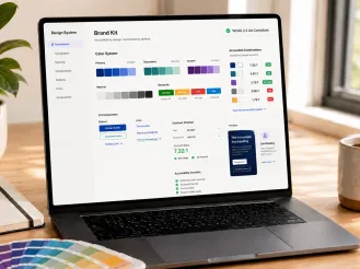
Accessibility Matters More Than You Think
Quick reality check: roughly 1 billion people worldwide live with some form of disability. That's roughly 15% of your potential customer base. And accessibility isn’t just about traditionally defined disabilities. In fact, many accessibility improvements enhance usability for everyone, whether they're squinting at their phone in bright sunlight or dealing with aging eyesight (yes, even the boss who still refuses bifocals).
Moreover, accessibility isn’t just ethical—it’s practical. Improved accessibility means better SEO, stronger conversions, and higher customer satisfaction. Enhancing accessibility directly ties back to tangible business outcomes like increased search rankings and reduced bounce rates.
What Is Website Accessibility Really?
Accessibility isn’t just for people with recognized disabilities. It's about creating a better, more comfortable experience for all users, including those who simply prefer larger fonts or clearer layouts.
Common Accessibility Pitfalls That Turn Clients Away
Poor Color Contrast (Or Why That Trendy Grey-on-White Might Be Hurting Readability)
Weak color contrast is frustrating even for eagle-eyed visitors—let alone those with vision impairments. If people have to squint to read your content, they’ll probably just leave.
Quick tip: Use free tools like WAVE to check your site’s color contrast. A simple contrast adjustment is a quick win that can massively boost readability and engagement.
Forms That Fight Back
Ever rage-quit a form because tabbing through the fields sent you into a confusing digital labyrinth? Poor keyboard navigation and unclear labels frustrate users and can block conversions.
Quick tip: Navigate your site forms using only your keyboard. Can you easily fill them out and submit them? No? Neither can your potential clients.
Screen Reader Roadblocks
Screen readers help visually impaired users "hear" your website. But if images aren’t properly tagged, links lack clarity, or headings are disorganized, those users may struggle to navigate—and could leave frustrated.
Quick tip: Test your site with popular screen readers like JAWS, NVDA or VoiceOver (for Mac and iOS). Or simply ensure all informative images have accurate alt-text and use clear, descriptive link texts (no more vague "Read More" buttons, please).
Inaccessible Multimedia (Videos that Play Silent Films)
Videos without captions or transcripts exclude users with hearing impairments and those who browse with sound off—hint: that's practically everyone in public spaces or quiet offices. In fact, studies show that a large percentage of users who don’t rely on captions still watch videos with them enabled, even when sound is available.
Quick tip: Always provide accurate captions and transcripts for multimedia content. This isn't just accessibility; it boosts your SEO rankings too.
Non-Accessible Navigation (Maze Runner: Website Edition)
If users can't smoothly navigate your site using keyboard controls alone—no mouse, no tapping—they’ll bounce fast. And for those who rely on keyboard navigation, that's not just bad UX—it’s a barrier.
Quick tip: Test keyboard-only navigation thoroughly. If you can't easily reach every part of your site, neither can your customers.
Mobile Mayhem (Popups That Won't Pop Down)
Mobile UX disasters are alarmingly common—especially popups or modals that can’t be closed on smaller screens. And on mobile, frustration turns into lost business fast.
Quick tip: Regularly test your mobile experience. If you get stuck in your own modals—fix them right away.
Heading Hierarchy Headaches
Missing or misordered headings confuse users and technology alike—making your content feel like a jumbled stream of consciousness instead of a structured experience.
Quick tip: Use tools like HeadingsMap or WAVE to visualize your page’s heading structure. Aim for a clean, hierarchical flow: one H1 per page, followed by logically nested H2s, H3s, and so on.
Tabbing Troubles and Focus Faux Pas
One of the simplest accessibility tests? Press the "Tab" key. If you can't move smoothly through interactive elements, or worse—if there's no visible focus indicator (that glowing outline or highlight)—your site is failing users who rely on keyboard navigation.
Quick tip: Check that focus indicators are clearly visible and follow an intuitive tab order down the page.
Quick Self-Audit: Is Your Website Accessible?
Here's your rapid-fire accessibility checklist:
- Keyboard navigation: Can you fully navigate your website without a mouse?
- Screen reader compatibility: Does content still make sense read aloud?
- Color clarity: Is your text readable without eye strain?
- Videos: Are captions/transcripts accurate and clear?
- Forms: Can forms be submitted effortlessly using keyboard navigation only?
- Image Alt Text: Does every image have meaningful alternative text?
If you hesitated on any of these, your site probably needs accessibility improvements.
Real-Life Example: Website Accessibility Done Right
Consider the University of Puget Sound. Their original site was visually dense and challenging to navigate, which made it harder for prospective students to engage. After ImageX’s redesign, the new site focused on accessibility and usability, with features like clear keyboard navigation, proper alt-text, improved contrast, responsive design, and streamlined content.
The result? Increased search visibility, faster page loads, improved conversions, and much happier prospective students—exactly what accessibility done right looks like.
Similarly, YMCA of the USA revamped their digital transformation platform built for YMCAs—the Website Services platform—resolving keyboard navigation problems, and ensuring comprehensive screen reader compatibility, which resulted in noticeably improved engagement.
Both are excellent examples of Drupal accessibility success.
How to Increase Website Accessibility to Grow Your Business
Accessibility upgrades aren't just "nice-to-have"—they’re critical drivers for your business growth:
- Expanded Audience: Accessibility opens doors to wider demographics.
- Improved Customer Trust: Inclusive websites earn trust, fostering loyalty.
- SEO Benefits: Accessible content boosts your organic search rankings.
- Higher Conversions: Frustration-free experiences mean more leads, sign-ups, and purchases.
- Lower Bounce Rates: Visitors stay longer, engaging more deeply with your content.
- Compliance and Regulation: Certain industries require accessible sites, reducing business risks.
Accessibility isn’t purely about compliance. It’s directly linked to critical business metrics, including SEO performance and user engagement. Embrace accessibility—your bottom line will thank you.
Quick Accessibility Wins (That Businesses Usually Miss)
Here are a few quick wins:
- Text to Images: Add descriptive alt-text to informative images—simple but impactful.
- Video Captions: Transcripts and captions can be quickly implemented.
- Descriptive Links: Replace vague links (“Click Here”) with clearer, action-oriented alternatives.
- Semantic Structure: Proper heading hierarchy (H1, H2, H3) helps readability, SEO, and accessibility.
- Inclusive Call-to-Actions: Use universal verbs (“Explore,” “Discover”) rather than sensory-specific ones like “Watch” or “See.”
These fixes are quick, affordable, and immediately enhance user experience.
Inclusive Design Trends Worth Adopting Now (and Beyond)
- WCAG 2.2 Standards: Aligning with the latest accessibility guidelines isn’t just about ticking boxes—it’s about staying relevant and responsible in an increasingly inclusive digital world.
- Diverse User Testing: Your testing pool should reflect your real-world audience. Think beyond just personas—include users with different levels of vision, mobility, neurodiversity, and language preferences to get feedback that actually matters.
- Regular Accessibility Monitoring: Tools like WAVE, SiteImprove, and Lighthouse help track accessibility health over time. They surface errors and opportunities so you can fix issues before users ever feel the friction.
- Accessibility UX (not just accessibility compliance): Here’s the kicker—just because a site technically complies with accessibility standards doesn’t mean it delivers a good user experience for someone using assistive tech. For example, screen reader users may technically access your site, but if the experience is clunky, disorienting, or filled with repetitive elements, they’ll bounce.
Accessibility isn’t just a checklist—it’s an ongoing design commitment.
Embedding Accessibility Long-Term
Our experts' best advice:
- Automate Testing: Regular, automated accessibility checks (SiteImprove, Deque axe, Acquia Optimize) make accessibility habitual.
- Set Governance Structures: Include accessibility as a core governance principle, possibly involving diversity committees or advisors.
- Tie Accessibility to Business Goals: Reinforce accessibility improvements by demonstrating direct connections to SEO and ROI. Your CFO will love you.
And if this sounds overwhelming, consider an accessibility audit service to quickly identify your site's specific issues.
What’s Your Next Move?
The bottom line: Accessibility isn’t optional—it’s smart business. Your website should invite visitors in, not push them away, regardless of how they browse or interact.
Ready to create a more inclusive experience for potential clients? Our team at ImageX is here to help make your website accessible and user-friendly, so you can better serve everyone. Make your website accessible today.