Seven Things You Can Do To Improve Your Website Right Now
We’re big fans of long-term planning and strategies for your website rather than short-term fixes. Content marketing, for example, yields its best results over time; building an audience and establishing yourself as a thought leader in your field is a continuous effort. That said, however, there are still some relatively small and quick changes that you can make to your website that can make an immediate difference. Improving your website, increasing conversions, and incentivising your audience to return to your website are strongly influenced by first impressions. Your first impressions can be greatly improved by following some of these easy tips.
WHAT's Your Value Proposition?
Your unique value proposition is what sets you apart from your competitors. It tells your audience who you are, what you do, why you do it, and, most importantly, why that adds value. Because of this, your value proposition should be prominently displayed and/or easily accessible -- build it into a headline on your homepage, add it to your about page, and reinforce it throughout any pages that are involved in the buying cycle. The Content Marketing Institute provides this easy formula for defining your value proposition:
[our company] is where [our audience] gets [what information] that offers [what benefit].
Call to Action
Once your audience has found and visited your website, what is it that you would like them to do? If your website is a funnel then your call to action is inviting your audience to engage with it in the way that you would like them to. For example, “Get a Quote”, “Download My eBook”, or “Open Your Account” are all actionable requests that can convert a prospect into a lead. Do you have a call to action clearly and prominently displayed? If so, what does it say? And does it pass the interrogative test (“Would you like to _____?” or “I would like to _____?”)? Remember that your call to action isn’t just text. It’s graphical too. Is it obvious that it’s a button or link? And do you use complimentary colours to offset it against the page? Placement matters, too. Did you know that your audience usually follows an F-shape pattern when viewing your content? The Neilsen Norman Group published a study where they tracked eye movements on websites:  Knowing this about your audience, here are some specific design tips to consider:
- Logos should be placed in the top-left of your page and have enough white space around them to free them from neighbouring distractions;
- Your most important content should be on the left side of your page;
- Your navigation bar should be at the top of your page;
- Front-load your content and divide it into easily scannable chunks; and,
- When you're laying out your text and images, remember the F-pattern.
Thank You pages
Once the user has taken action, you have the opportunity to deliver a follow-up message through a simple thank you page. If they've just purchased a product, then ask them to sign up for your newsletter; if they just signed up for your newsletter, present some of your products that you think they might be interested in; or you can offer them a discount coupon, to download a copy of your e-book, add a follow-up video, or invite them to follow you on social media. Whatever you choose, be sure to take advantage of the opportunity to continue the engagement with them through another product, service, or piece of content that can add value for them. Here's how HubSpot maximizes the usefulness of their thank you pages: 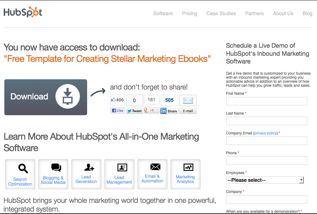
Add some social proof
Social proof is "a psychological phenomenon where people conform to the actions of others under the assumption that those actions are reflective of the correct behaviour." For marketers, it's an effective tactic to personalize your product or service, ease potential concerns, and lead to more conversions. And with nearly 70 percent of online shoppers looking at product reviews before purchase and product reviews being 12 times more trusted than product descriptions, your audience wants proof from their peers. 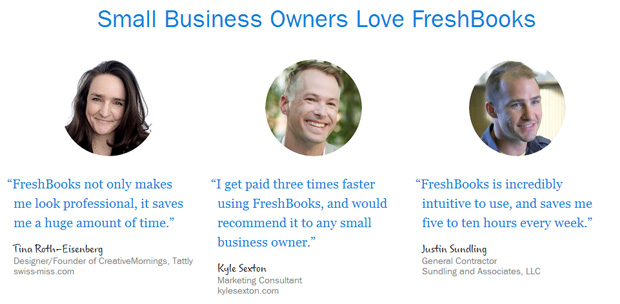 Customer testimonials, case studies, media mentions, client logos, and social media integrations are all simple and effective ways to build your audience's trust.
Tighten Up Your Navigation
Your website’s navigation serves two primary purposes:
- It helps users navigate around your website and find the information they’re looking for; and,
- It helps search engines crawl and rank your website, improving your search engine results page rankings.
These purposes are prioritized as they are for a reason: you should always build your website for your audience first and search engines second. Think like your audience will -- what might they be looking for, how would that information be logically organized, and does your website’s navigation follow that logic? If not, then reorganize it so that your audience is more likely to find what they need and, therefore, to return to your website in the future.
Is Your Website Mobile-Friendly?
No longer just a nice to have, a fully responsive website that delivers a consistent user experience across any device is a must have -- so much so that Google even updated their algorithms to rank mobile websites higher on mobile searches. A responsive website's layout will adjust based on the size of the device that’s being used to access it. For example, when viewing a responsive website on a desktop, a user might see three or four columns of content. However, if the user looked at the same website on a tablet or a smartphone, it will display the content in two columns or a single column, respectively. Here's how ImageX designed the website for International Partnership for Microbicides to deliver a consistent experience regardless of if the user is viewing it on a desktop or on their smartphone: 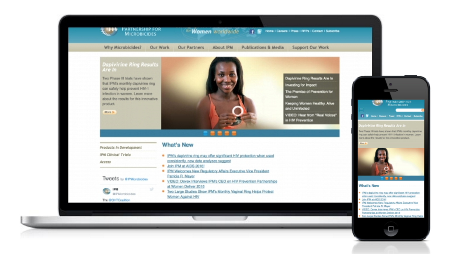 Designing your website for multiple breakpoints to accommodate different sizes of devices will ensure that you can control the consistency of your user’s experience.
Change Up your content
Regardless of how much research and effort has gone into producing your content, sometimes, for some reason, it just doesn't resonate with your audience. If it's not being read or it's not resulting in your desired action, then it's not providing value. Thankfully, however, you have the opportunity to establish benchmarks for how your content should perform, to monitor all of your content against those benchmarks, and to use this data to inform iterative updates to your content. Updating your content might also have SEO benefits. The marketing software company, Moz, recently reported that "Google measures all of your documents for freshness, then scores each page according to the type of search query." This might only apply to the types of content that require fresh updates, such as:
- Recent events or hot topics: “presidential election” “charter school debate”
- Regularly recurring events: “NCAA scores” “dancing with the stars” “sevone earnings”
- Frequent updates: “best slr cameras” “subaru impreza reviews”
But if your content is more topical in nature -- reporting on industry trends or new products and services, for example -- then it would behoove you to keep it updated.
Wrapping Up
According to research by the Neilson Norman Group, the average visitor to your website will only read about 20% of the words on a page at most. Knowing this, it becomes all the more important to both deliver a strong first impression and to provide clear direction towards the actions you would like them to take. Ensuring the clarity of your company's message, buoying it with social proof, organizing your content simply and logically, having a strong and clear call to action, updating your content, and delivering a consistent experience across any device are all things you can do to make an immediate improvement on your website...today.
