Understanding Responsive-First Design
If you think of the device you use to connect to the internet as a container for content, then a responsive website delivers identical content across all devices while conforming to the limitations of that container. From the user’s perspective, the design should be responsive in the way that images, text, and menus work together to fit the device that they’re being viewed on. And since mobile traffic surpassed the 50% mark of all internet traffic as of January 2015, and a website’s mobile friendliness impacts its Google ranking, either your website is responsive or it’s obsolete. But designing a website with a responsive-first approach doesn’t just mean designing it for mobile. A mobile-first design “might be developed specifically to support an app or mobile game, where marketing efforts are focused on mobile device conversions”, whereas a responsive-first design takes the desktop experience and then strips away anything that may not work on a mobile device. 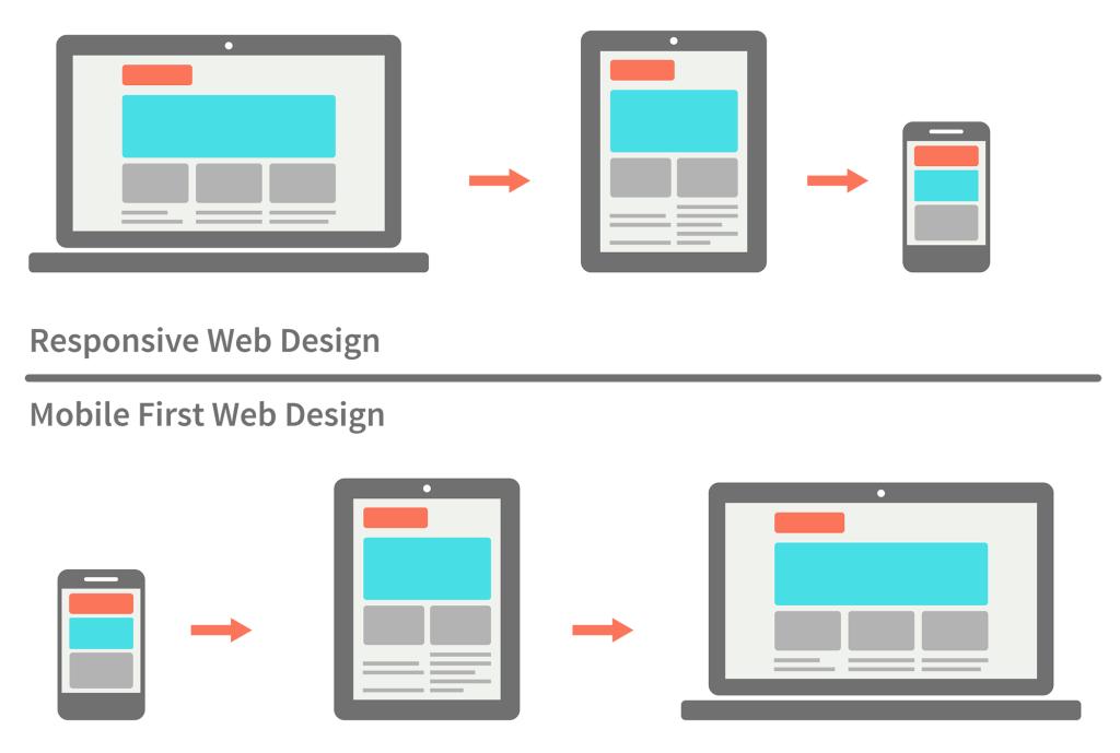 The debate between the two ultimately comes down to the needs of your users and your future marketing efforts, but for the purposes of this post, we will be focusing on responsive-first design and how Drupal 8 can help.
 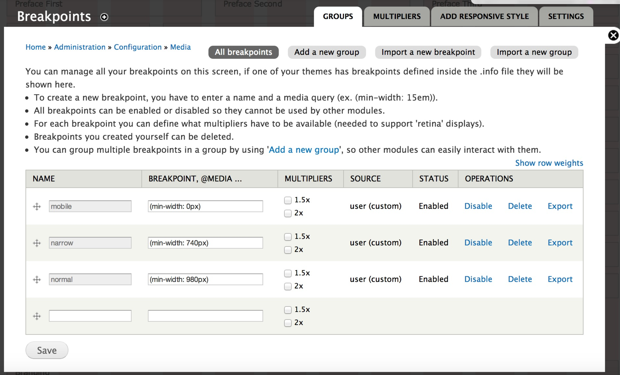 Now that you have an easy way to define our breakpoints, you can use them to manage your images. To help with this, the Responsive Image module is also included in Drupal Core. It requires the Breakpoints module to function, as it uses the breakpoints that are coded into the theme along with image styles to resize the images as needed. And much like Breakpoints, there is still some configuration that must be set up; however, unlike Breakpoints, there is a user interface to manage your configuration.
The design is influenced top-down from the desktop, not bottom-up from mobile. There’s a difference between thinking about how a site will look or perform on a phone, and designing phone wireframes first. I’ve seen plenty of instances where mobile practices are applied to desktop sites to the detriment of the design and user experience. Going at it that way makes for lazy designers and ultimately websites that miss the mark.
The debate between the two ultimately comes down to the needs of your users and your future marketing efforts, but for the purposes of this post, we will be focusing on responsive-first design and how Drupal 8 can help. So What is Responsive-First Design?
In the strictest technical sense, responsive design generally means “three specific techniques for making sites that adapt well across many browser environments: fluid layouts, flexible images (and media objects), and media queries.” But this definition is greatly informed by the “conceptual notion of designing and building usable, broadly supported sites and apps now and in the future, now that we have all of those pesky devices to deal with.” That is to say that there’s no single universal definition of what makes a website responsive -- its definition evolves as the technologies it exists to support do. Beyond the three specific techniques mentioned above, there are three other primary considerations to make when designing responsively.Be Selective In Your Content
If you’re flying across the country but only taking a carry-on suitcase, suddenly everything you take must be essential. For your website, copy must be tight and clear, navigation must prioritize your top tasks, and any “flash” without function should be eliminated.Prioritize Your User’s Needs
We also call this the vanity check; while the most important thing to you (or your CEO) might be to tell everyone about the latest award your company won in 1,200 words, what is your user trying to accomplish when they visit your site?Be Mindful of Load Size
One of the biggest reasons mobile websites used to be “lite” versions of their corresponding desktop website was how slow and expensive it was to load a website on a mobile device. In 2010, the average webpage was 716kb according to HTTP Archive; in 2015 that number jumped to over 2MB. Having a web performance budget can make a world of difference in user and customer retention down the line.And How Can Drupal 8 Help?
Providing targeted mobile experiences in the right context at the right time is critical, especially when cultivating customer loyalty. Drupal 8 is built with responsive-first initiatives in mind, enabling responsive experiences across devices and supporting mobile apps. Drupal 8 is built to be fully responsive out-of-the-box. You can use the platform to deliver enhanced experiences on any device, or anywhere else that your business’ content and data need to flow -- today and in the future. So how can Drupal 8 help? Drupal Core includes two modules, Breakpoints and Responsive Image, that greatly assist in enabling responsive-first design. In fact, Drupal 8 uses Breakpoints natively to make its updated admin toolbar responsive. Breakpoints also makes it possible for you to make change your website at different defined sizes, or breakpoints. This doesn't make your website responsive on its own, but it gives you a way to easily define and use your breakpoints. The heavy lifting is done in the theme itself. Now that you have an easy way to define our breakpoints, you can use them to manage your images. To help with this, the Responsive Image module is also included in Drupal Core. It requires the Breakpoints module to function, as it uses the breakpoints that are coded into the theme along with image styles to resize the images as needed. And much like Breakpoints, there is still some configuration that must be set up; however, unlike Breakpoints, there is a user interface to manage your configuration.