How 3 Emerging UX/UI Design Trends Can Make Your Website More Inclusive
Web design is a lot like fashion. Trends come and go. Each one initially promises new ways of reaching your audience and outperforming your competitors — but most fall by the wayside quickly, only to be replaced by the next big thing. Chasing the latest trends can be a time-consuming, expensive, and ultimately futile endeavour.
But just like in fashion, some designs never go out of style. And trends can move beyond mere fads when they’re thoughtfully layered on top of design choices that stand the test of time.
We believe that designing for accessibility and inclusion is one of those classic design elements fundamental to any good website. As such, you should filter any trend you’re tempted to adopt through the lens of how well it helps you offer an accessible and inclusive experience for every user who needs to navigate your site.
To that end, we've highlighted 3 emerging UX/UI trends worth consideration. Each one has the potential to enhance your ability to offer an accessible and inclusive experience for all your users. But before you start thinking about those trends, ask yourself this important question: Does your website truly offer a consistently accessible and inclusive experience for all your users right now? If not, addressing this deficiency is where you need to start.
First Things First: Make Accessibility and Inclusion a Priority for Your Website
A fully accessible website accommodates a variety of cognitive and physical needs. Beyond the minimum standards of accessibility, there are a number of additional steps you can take to ensure people who are differently-abled can access your site. These include:
- Populating your site with clear, easy to understand, scannable content
- Converting PDFs and other hard to access files into HTML to make it easier for assistive technologies to navigate all your content
- Removing navigation traps such as pop-up windows to accommodate users who can’t see what’s happening on the screen
Designing an accessible website is critical to offering an inclusive experience for your audience. But there is more to inclusivity than accessibility alone.
Creating a fully inclusive website starts by completing extensive user and persona research to understand who your audience is and what is important to them. Only then can you make sure your design choices serve your users’ needs.
For example, designing with inclusivity in mind means:
- Selecting photos and images that represent the full spectrum of the human experience
- Speaking to your audience in ways that don't leave people out (e.g., avoiding gendered phrases like “you guys” and choosing gender-neutral options like “you/yours,” “friends,” and “users” instead)
- Considering the needs of users for whom English is not their first language
- Crafting a user experience that’s welcoming for elderly people, children, and all ages in between (if your audience spans generations)
- Thinking through how you present information for people with varied learning preferences
- Making design choices and color selections based on how they are known to impact moods and emotions
When your website is both accessible and inclusive in every area possible, you will be better positioned to reach your audience and advance your business objectives.
Now — let's explore 3 emerging trends that can bolster your efforts to make your website more inclusive.
Trend #1: 3D in the User Interface
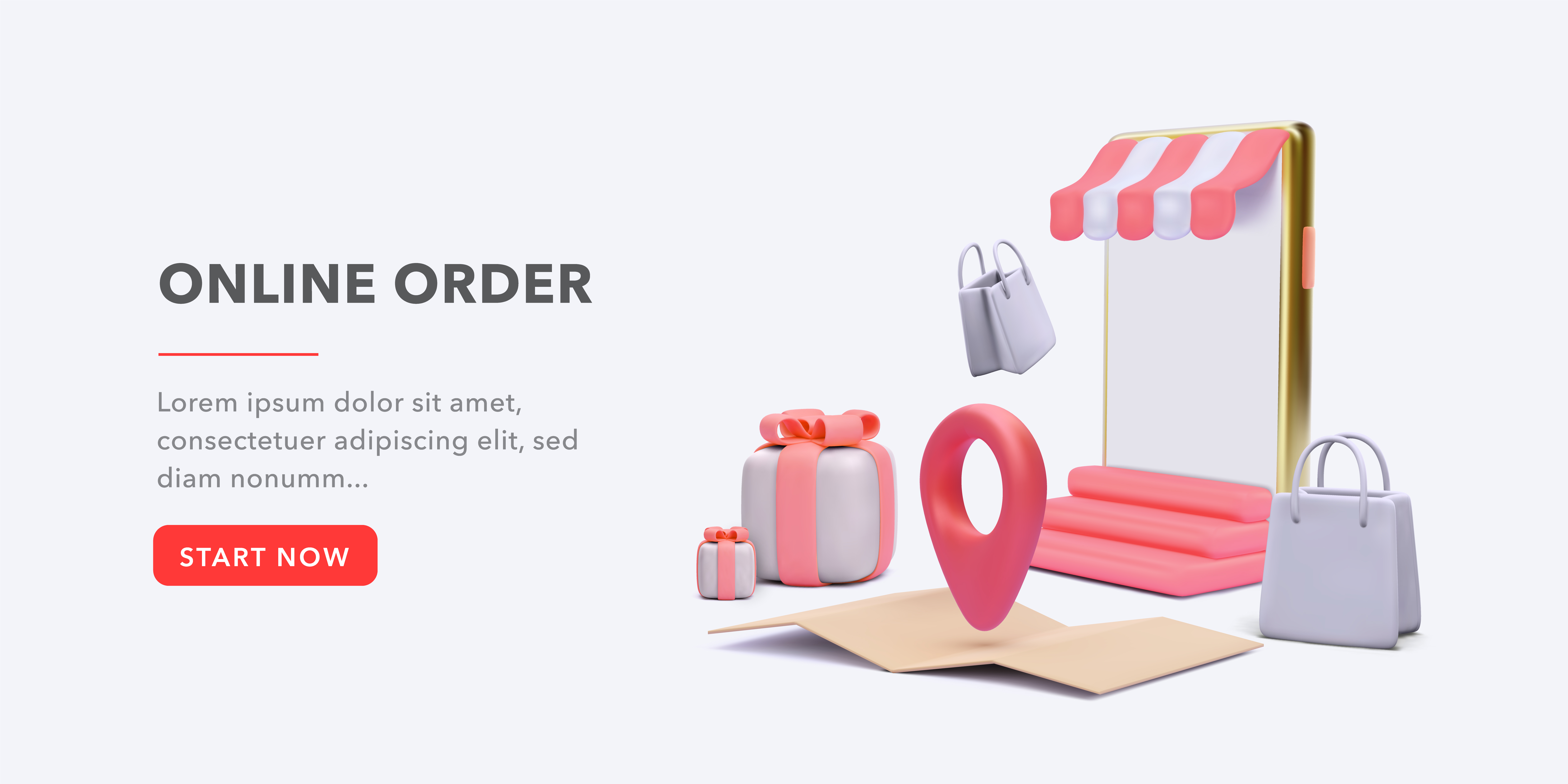
Incorporating 3D design elements into the user interface is nothing new — developers have been doing this for years. But those design choices historically led to slow load times and ate up large amounts of bandwidth, leading to a poorer user experience overall.
Recent advances in technology have changed all that. For example, Figma, Sketch, and Adobe XD make it easy to design 3D features without bogging down a site’s bandwidth. As a result, we anticipate that 3D in the user interface will soon become the norm rather than the exception.
Incorporating 3D elements will add some pizzazz to even the most classic website design and is an easy way to modernize your site. But beyond the surface benefits, making use of 3D elements will also enable you to reach your users in new ways.
For example, consider:
- Designing buttons and icons that appear multi-dimensional rather than flat. This makes it easier for users to navigate the site whether they’re using a mouse or assistive technologies like keyboards and switches.
- Creating product renderings that show the many facets and views of a product. This appeals to visual learners who want to see every possible detail of a product before making a buying decision.
- Creating pleasing, 3D labels and descriptions for users who prefer to read detailed information about a product or who can’t see the images. These labels and descriptions can also be read by assistive technology devices to ensure users with visual impairments don’t miss important details.
Trend #2: Neumorphism
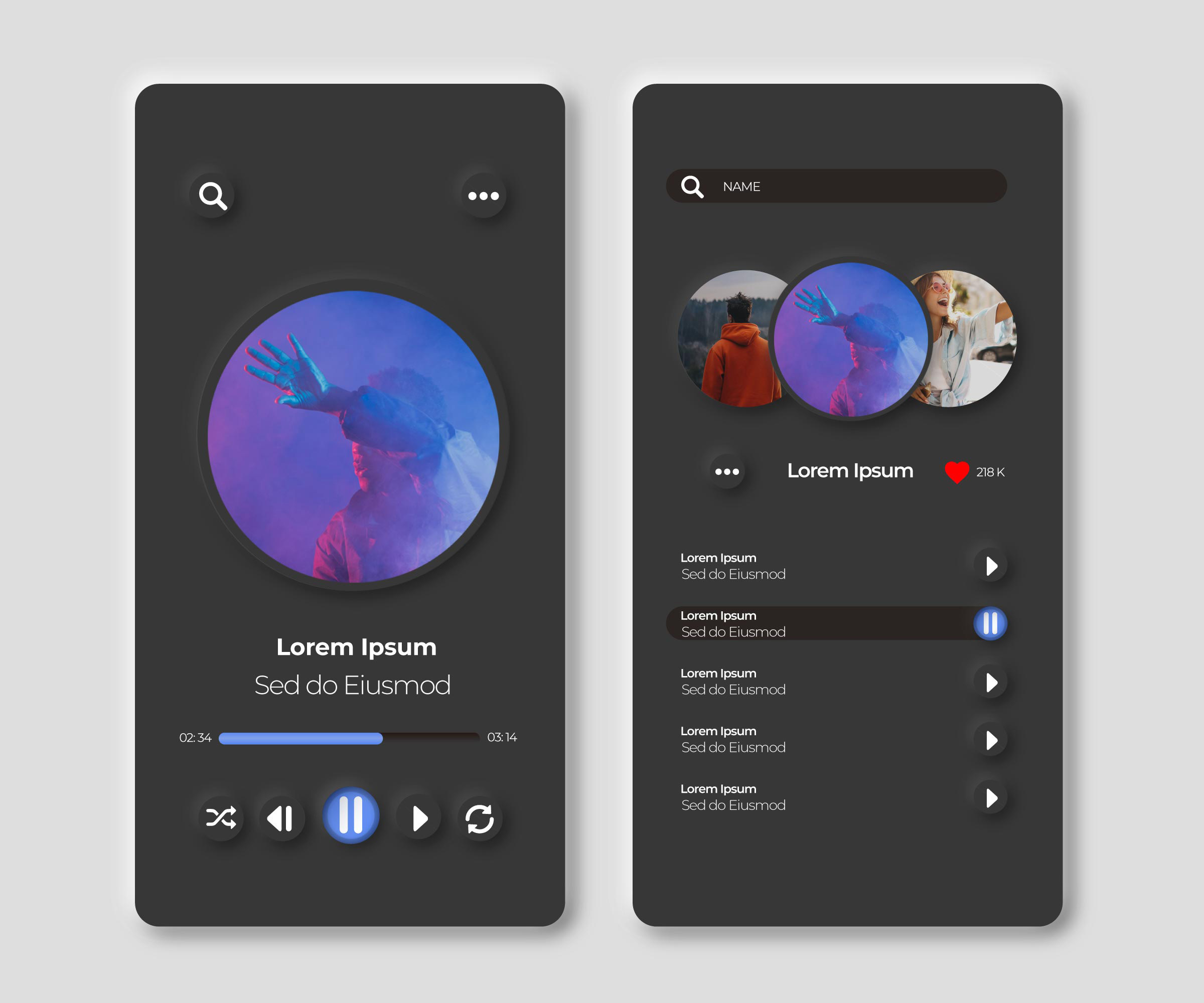
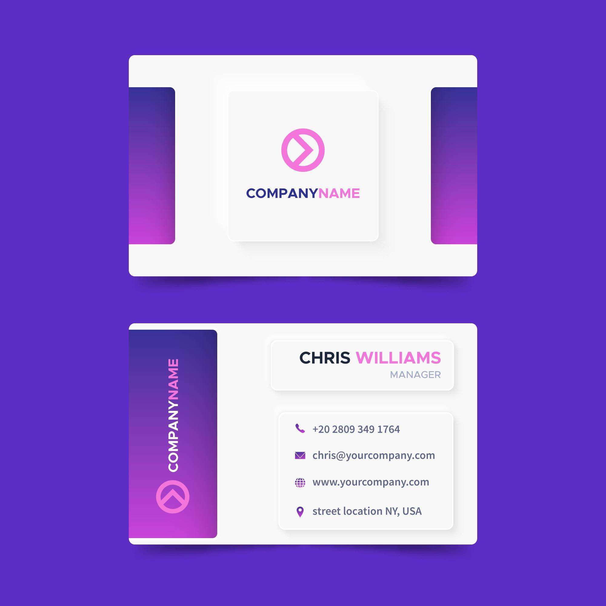
As people spend more time online, they tend to crave more real-world experiences to counter their screen time. Neumorphism is about creating a subtle yet pleasing visual experience that makes the digital world look more tactile and real.
Whereas skeuomorphism attempts to mimic the real-world appearance of objects and flat design favors a starkly minimalist approach, neumorphism offers a middle ground. Through color choices, light, and shadowing, neumorphism makes elements appear to emerge from the user’s screen.
Employing a neumorphistic design can make mobile users feel they’re interacting with a real surface rather than a screen. This can draw users in and keep them engaged as they explore your site and complete their user journey.
To make a neuromorphic design more accessible for users who can’t see its visual elements, consider adding haptic features such as buzzes and vibrations. This will bring the experience to life for more of your users.
Trend #3: Voice User Interface (VUI)
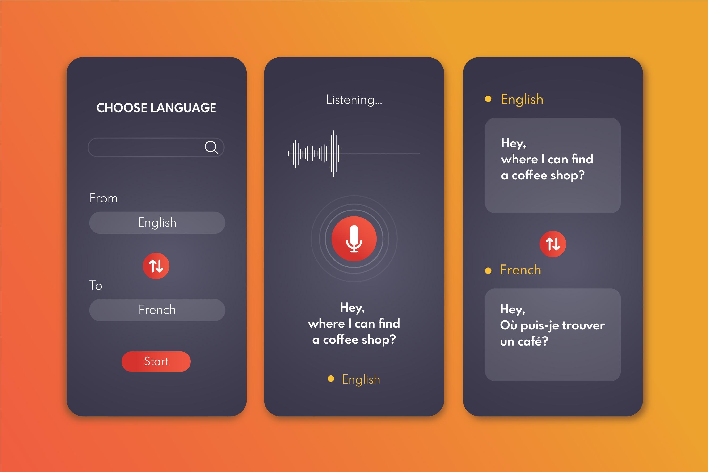
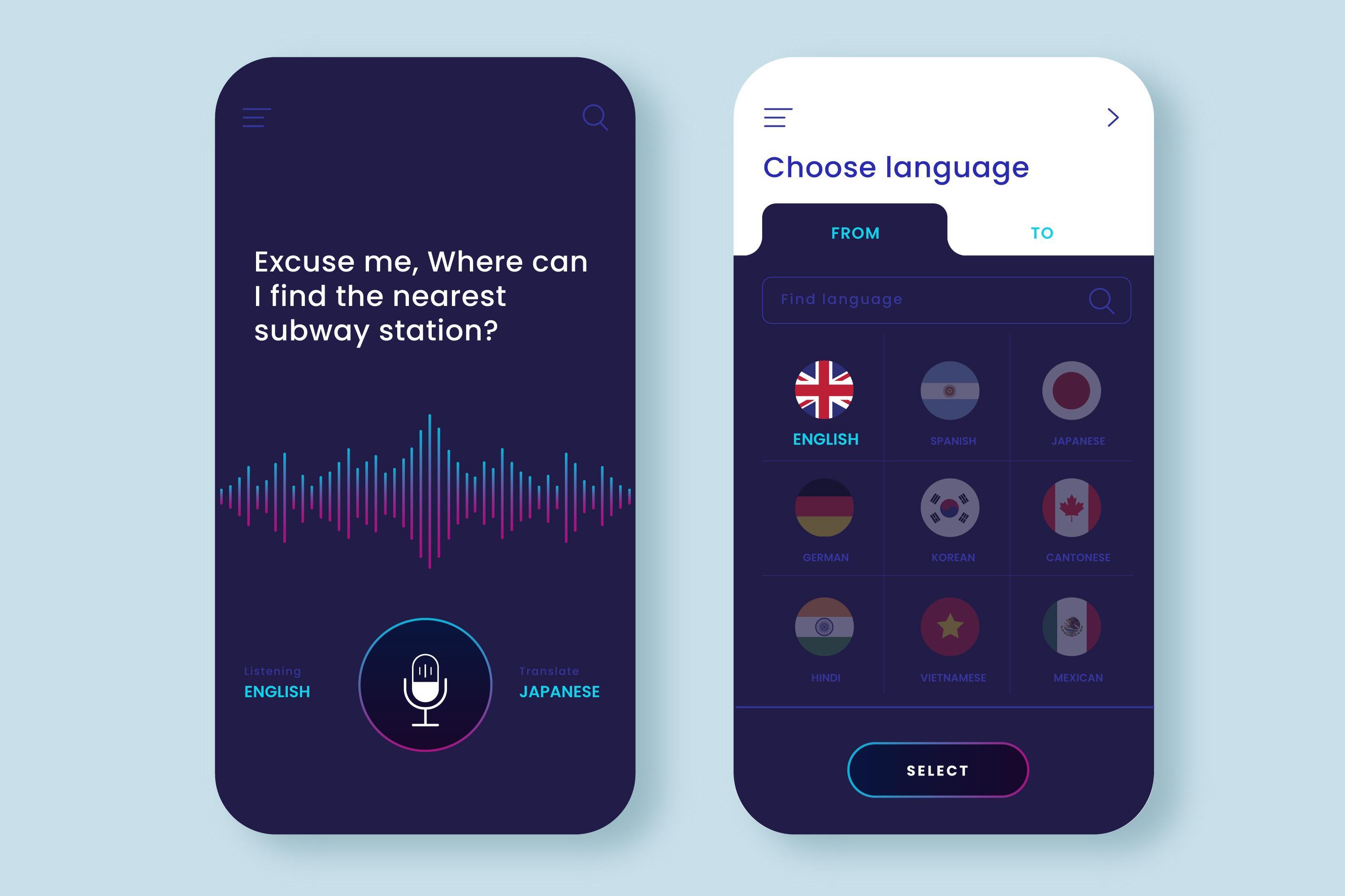
Developing a voice user interface (VUI) for your website is a great way to make your site more accessible and inclusive. This feature allows users to replicate the “Hey Google” and “Hey Siri” commands they’re accustomed to using on their phones.
This can boost productivity for people who need a hands-free experience while multitasking. But it’s even more of a boon for users who have physical impairments and therefore use keyboards or switches in place of a mouse. Using voice commands like “scroll down,” “return to main menu,” or “enter” allows differently-abled users to search and navigate websites faster and removes the friction they experience all too often.
As artificial intelligence capabilities improve, users will be able to dictate longer amounts of text using voice user interfaces. But for now, commands should be simple and to the point.
Adopt UX/UI Design Trends to Advance Your Marketing Objectives
In a rapidly changing marketing landscape, you can’t afford to allow your website to become stagnant. If your current design is hopelessly old-fashioned and out of style, it makes sense to explore whether the latest UX/UI design trends offer solutions to your marketing challenges.
But the latest trends will only take you so far. A well-designed, user-focused website is the core elements you need to reach your goals. And since reaching your audience more effectively is at the heart of every single one of your marketing objectives, make it a priority to keep accessibility and inclusion at the forefront of any changes you make.
Need a web design agency to partner with? Reach out today!
