University Edition: Best Practices to Help Your Higher Ed Website Shine
Authored by: Nadiia Nykolaichuk
In the digital age, having a good website is crucial for higher education institutions. A higher ed web design that is user-friendly serves as the virtual front door to the institution, providing prospective students, parents, and other stakeholders with essential information. A strong online presence showcases the institution's values, academic programs, faculty expertise, campus facilities, and student life, thereby helping prospective students make informed decisions about their educational journey.
In this article, we’ll provide you with our best practices on how to elevate your higher education website so that it effectively communicates your mission, engages with your community, and ultimately drives enrollment and success.
Top tips and best practices for higher ed websites
Make your higher ed website accessible and inclusive
Let us start with accessibility and inclusion — terms that are familiar to most people today, but especially to higher education marketers. Indeed, following accessibility standards and practices is crucial for every university. Failing to do so can unwittingly alienate quite a large percentage of prospective students.
That said, we have no doubt your institution has already put a lot of effort into improving accessibility. First, you would declare your genuine commitment to inclusion as part of your institution’s core values. Next, you would invest in making your physical campus as accessible as possible.
Finally, living in the digital-first world, you are very likely to have already taken steps to bring your website into conformance with accessibility guidelines (or are just about to do it). In any case, we want to make sure you don’t miss these 3 additional actions for making your higher ed website accessible.
Optimize your higher ed search experience
For your prospective students, the selection process starts with exploring your website. Faculties, departments, study programs — the list goes on for the types of content they might want to research.
A good internal search feature for finding specific information in a convenient way is really important for this audience. It could even give you a greater competitive edge than a beautifully designed homepage.
Chances are high that you already have the internal search functionality on your higher ed website. But are you 100% sure it is effective at helping your audience find what they are looking for? Check out 3 important steps for optimizing your higher ed website’s search experience. They are sure to help you improve your higher education website’s findability and searchability.
Create vibrant and user-focused content
University pages need to include a lot of useful information, and sometimes that runs the risk of having long walls of text that are hard to engage with. Even when the content is well written, it can be a lot to take in at once.
Of course, students research important factors such as costs, locations, and programs, but still, they make decisions largely based on emotions. While reading about a university, they need to feel that they really belong to it and imagine their bright and exciting future there.
To achieve this, you will need compelling, engaging, fresh, and student-centered content that could turn your higher ed website into a vibrant content hub. See useful practical tips for implementing this in the blog post by our leading content and UX strategists.
Add structured data
In addition to writing great content that gives users answers to their questions, a best practice is to also use structured data to boost SEO and user engagement. This is data in a standardized format about your higher education website’s pages.
Google loves structured data because it helps it better understand and classify your pages, as well as present them in search results as featured snippets that users love as well.
Featured snippets are excerpts of your website’s content that summarize a response to a user's search query. They are displayed above the other search results and can consist of paragraphs, lists, tables, videos, or a combination of these elements. Other great ways for your content to be displayed are the “People Also Ask” section or as Knowledge panels — information boxes to the right of the search results.
Structured data is a missed opportunity for many universities that are not using it. If you would like to gain a competitive edge, head over to our structured data article for more details.
Combine quantitative and qualitative insights
When you want to find guidance for improving the decision funnel on your higher ed website, the first idea that comes to mind is to use stats like Google Analytics. Indeed, numbers are unbiased and strict, and they can give you valuable insights.
But have you ever looked at endless quantitative data and felt more confusion than clarity? Does it look like something is missing in the puzzle of understanding your audience's real needs as you only see numbers?
A good practice is to complete the picture with qualitative insights. They help you make sense of the numbers so you can improve your website’s UX and make it more user-centered. Discover ways to get qualitative insights for higher ed, as well as an exciting example of one of our own case studies and how we helped a client improve their Admissions page.
Are you in need of a new website for your higher ed institution? Next up are our CMO’s guides to make sure your future website fully meets all your needs.
Prepare carefully
One of the key secrets to successfully developing a new higher ed website is thorough preparation. That’s why the Preparation and Discovery Phase of a web development project is something you absolutely need to invest your energy into. This will directly influence how well your future website will serve your organization and your audience.
Discovery involves in-depth exploration and analysis of the project that gives you a chance to define your audience and consider how the site should work. It helps our team gain a deep understanding of the goals, requirements, and success drivers for your project.
What are the best practices for the discovery phase and how exactly can you make your input? See the definitive CMO’s Guide to the Preparation and Discovery Phase of a Website Development Project featuring invaluable knowledge from our design and digital experience directors.
Refine your design goals
The information gathered in the discovery phase is used as a basis for the design phase. Your higher ed website’s design shapes its look and feel, and ensures that all visual elements — colors, buttons, fonts, etc. — work in harmony according to the best practices of UX and UI.
However, website design is something even larger than that. The significant work of designers resembles that of architects. Designers create the blueprint (i.e., wireframe) for developers to use in creating the website’s UX/UI. Designers put a lot of effort into carefully layering the visual experience on top of the information architecture.
There are some best practices to ensure your higher ed website design is created with your business goals and audience needs in mind and stays within your budget and scope. Find them in another CMO’s Guide — to the Design Phase of your project.
Provide regular feedback
With both the discovery and design phases complete, there begins the magic of bringing all the functionalities to life. While it’s the developers’ mission to create the necessary capabilities for your higher education website, what can you do as a CMO?
Your input might be needed in the pre-development stage for things like refining the project’s scope and budget, finalizing an actionable development plan, and more. In the actual development phase, we typically need regularly scheduled check-ins based on Agile best practices. This enables us to update you on the progress and get your feedback to be sure we are on the right track.
The CMO’s guide to the Development Phase of a Website Project contains much more details and tips for you to read and use in practice during your website’s development stage.
Get inspired by exciting examples
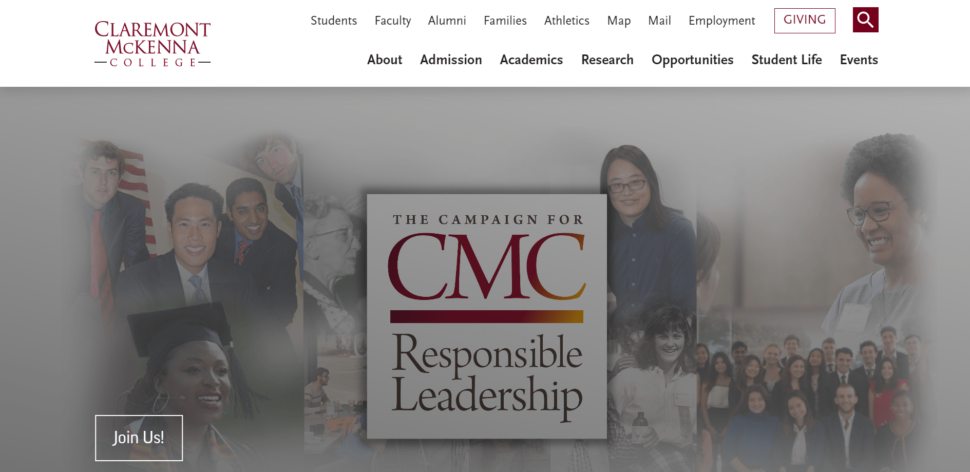
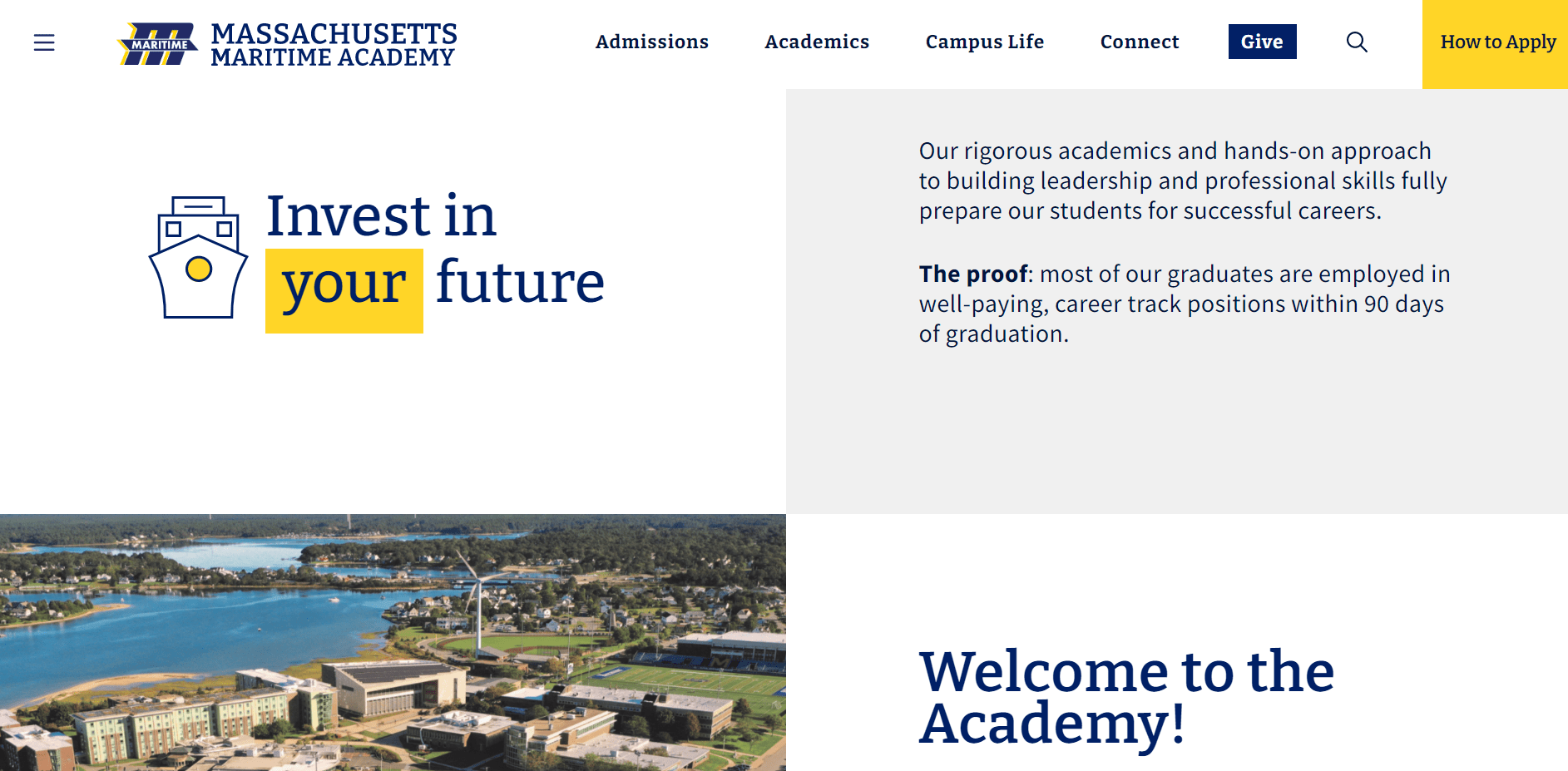
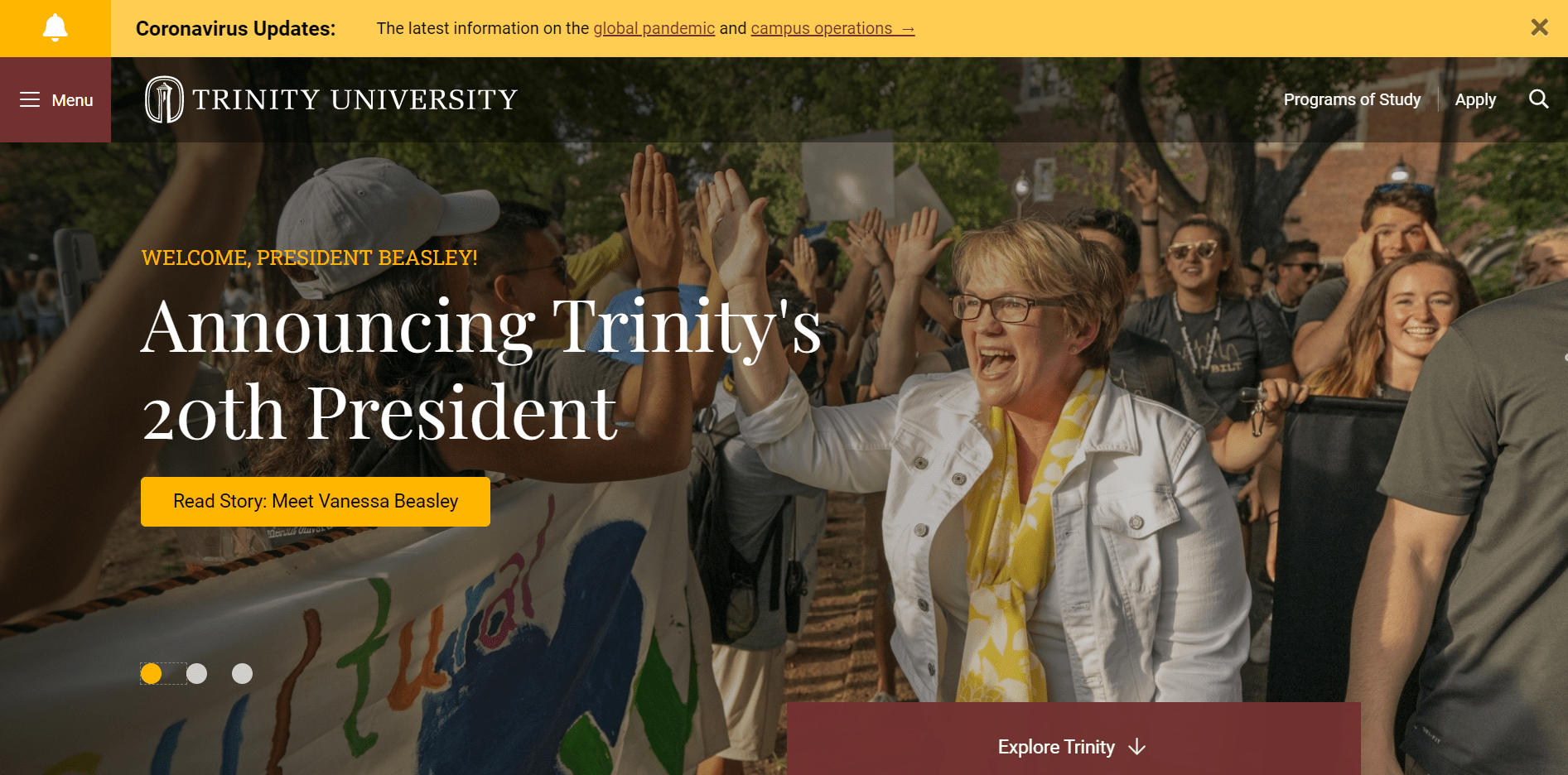
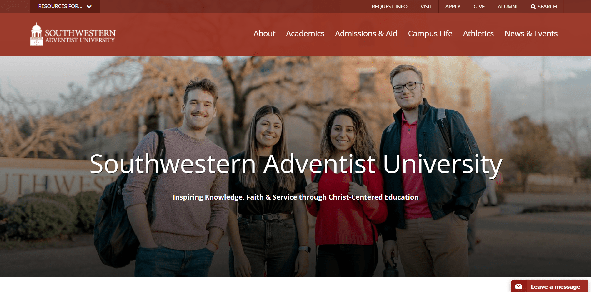
No matter if you already have a website or are just thinking of having one built for you, you can take a look at some great examples of higher ed websites that speak louder than words. We’re proud to show you several below from our own portfolio.


Final thoughts
Of course, one article is not enough to include all the knowledge and experience that we have accumulated while developing websites for higher ed. In addition, every university website project is unique, and you might have specific questions or ideas about it. We’d love to have a chat where we could exchange our visions of how to optimize your existing higher ed website or build you one from scratch using the best practices.


