
Get More Out of Gin: Extra Modules for Drupal’s Latest Admin Theme

The Gin theme brought a fresh approach to Drupal admin experiences. With its clean interface, rich customization options, and a focus on daily usability, it quickly became a go-to favorite for site builders, content teams, and administrators alike. Handy features like sticky action buttons, autosave, a redesigned layout menu, and built-in dark mode are a huge reason why it’s running on so many live Drupal sites today.
We explored the Gin theme as it was rapidly gaining popularity in the Drupal community. Fast forward to today, and it has reached an important milestone. Gin has been merged into Drupal core, becoming the foundation for the brand-new admin experiences under the name “Default Admin” (or, in the most recent version, “Admin”) theme. This means that on fresh Drupal installations starting with 11.3, right out of the box, users will see the best of Gin’s features they love. At the same time, Gin continues to exist as a contributed project.
While the interface already offers a polished and user-friendly experience, you don’t have to stop there. Let’s take a closer look at some of the best companion modules that enhance the Gin theme with even more features.
1. Creating a beautiful, customized Drupal user login screen
By default, Drupal’s standard login screen is famously bare-bones. Clients or editorial teams land on a generic login page right before they enter a beautifully crafted Gin dashboard. This feels like a missed opportunity.
The Gin Login module solves this by transforming your site’s entryway into a modern, polished login card. It mirrors a premium Software-as-a-Service (SaaS) application.
The benefits of the Gin Login module
- Complete gateway coverage. It automatically restyles the login, registration, and password recovery pages.
- Instant branding inheritance. It pulls your existing Gin configuration, accent colors, and custom logos, without requiring any manual setup.
Decoupled-friendly logic. It is perfect for “headless” setups where a separate framework handles the public website. It routes anonymous traffic straight to the login page and sends logged-in users straight to the content dashboard.
How to use the Gin Login module
Installation
Install the Gin Login module on your Drupal website. The preferred way is by using the Composer command:
composer require drupal/gin_login
Then enable the module on the “Extend” tab of your Drupal admin dashboard.
Customization
To create a cohesive, premium entryway for your users, you can manage settings across two screens: the theme’s settings and the Gin Login module.
a) Wallpaper
To customize the wallpaper image that will be displayed in the login screen, navigate to the Gin Login module’s settings (Configuration > System > Gin Login). There is a “Use random image” toggle for “Wallpaper.”
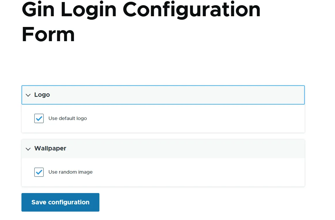
To add the desired wallpaper, uncheck the toggle, and you’ll see the “Choose file” screen for uploading your wallpaper image.
b) Logo
The website’s logo that will be displayed in the login screen can be controlled in two ways:
- you can upload it directly to the Gin Login module’s settings page, similarly to the wallpaper
- or you can add it to the theme’s settings page
Doing it via the module’s settings is very similar to changing a wallpaper. In the theme’s settings, the principle is absolutely similar, too. Let’s now check where to find this in the theme’s settings.
The module will work both if your website’s admin theme is:
- the contributed Gin theme
- or its newly-merged Drupal core implementation (the “Default Admin” or “Admin” theme)
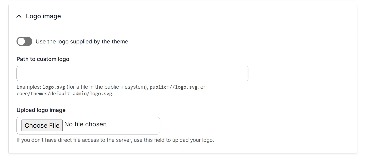
Go to Appearance > Settings > [the theme’s name]. Uncheck the “Use the logo supplied by the theme” toggle. Leaving it checked means the site will display the logo packaged inside that specific theme’s codebase. As you uncheck this toggle, you’ll see the file upload field.
c) Interface colors
It’s possible to customize the interface colors:
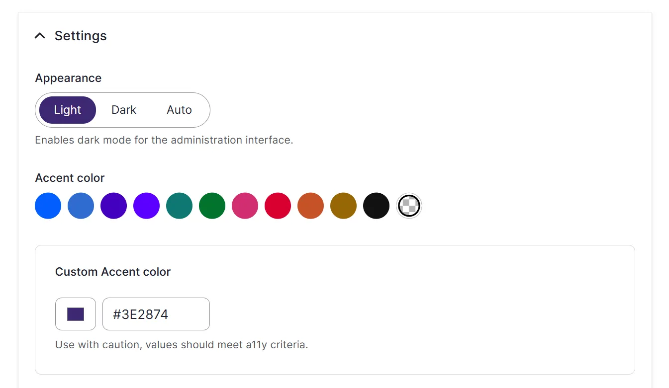
- Accent color. It is the primary brand color used to highlight key functional elements (primary buttons, active menu states, toggles, links, and progress bars).
- Focus color. It defines the color of the outline ring that appears around an element (like a text field, dropdown, or button) when a user clicks into it or navigates to it using a keyboard.
To customize them, go to Appearance > Settings > [the theme’s name]. Scroll to the “Accent Color” section and select your brand’s primary color (or enter a custom Hex code). You can also set your Focus Color to “Same as Accent Color” to ensure sleek, matching accessibility borders when users click into the text fields.
You might need to clear the system’s memory before testing your work by going to Configuration > Development > Performance > Clear cache.
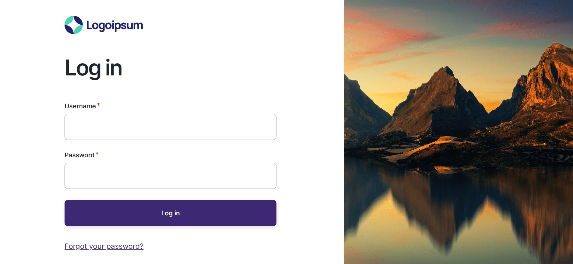
Open a fresh incognito window and visit your site’s login page (/user/login). You will see a beautiful, customized gateway. The background wallpaper is controlled by the Gin Login module’s settings, while the logo and the interface colors are dynamically inherited from the theme.
2. Bringing the Gin toolbar to Drupal websites’ frontend
In Drupal, administrators and content editors spend a massive amount of time browsing the actual, live public frontend of the website. They need the administrative toolbar on the frontend for many things, like:
- Contextual “on-the-fly” editing. Instead of hunting through backend menus to fix a typo, logged-in editors can simply click an “Edit” tab directly on the live page to update content instantly.
- The universal jump-menu. It provides one-click shortcuts to critical layout and structural tools without leaving the frontend page. Editors can instantly place a new block into a sidebar, adjust the page visibility settings, or jump straight to the specific menu configuration for the navigation links they are currently looking at.
- Quickly adding new content. Editors can jump straight into creating a new article or press release via a quick dropdown shortcut, eliminating the need to navigate backward through the administrative dashboard.
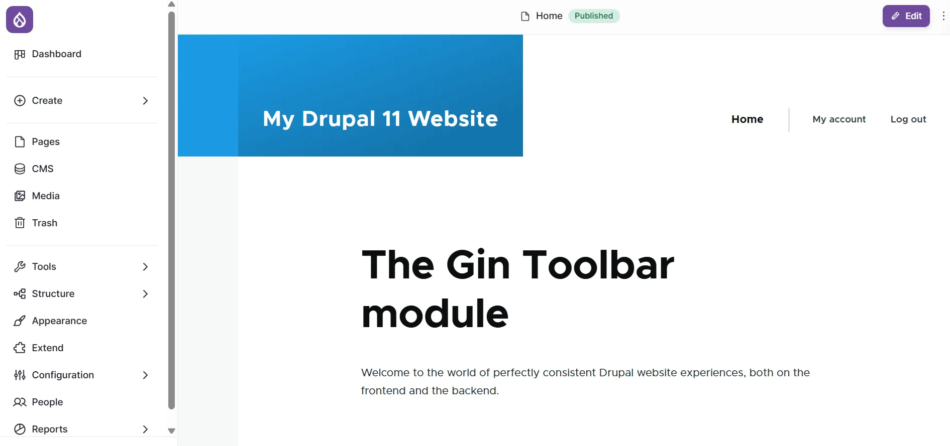
The Gin Toolbar module manages the seamless transition between the frontend and backend. It injects Gin’s refined navigation templates, typography, dark mode capabilities, and custom brand accent colors directly into the frontend interface. This keeps the global administration overlay perfectly styled, no matter which theme the public is viewing.
The benefits of the Gin Toolbar module
- Visual continuity. It wraps the frontend administrative bar in Gin’s clean design tokens, eliminating the jarring transition between backend work and frontend viewing.
- Persistent brand identity. It forces custom theme settings (like the custom purple accent color in our example) to broadcast onto public pages.
Mobile and accessibility parity. It inherits all of Gin’s core accessibility improvements, clean hover states, focus indicators, and responsive layouts right on the live site.
How to use the Gin Toolbar module
Installation
Install the Gin Toolbar module on your Drupal website. The preferred way is by using the Composer command:
drupal/gin_toolbar
Then enable the module on the “Extend” tab of your Drupal admin dashboard.
Checking the results
The beauty of the Gin Toolbar module is its zero-configuration design. Because the module acts as a bridge, it automatically scrapes your configuration preferences right from the theme’s settings page.
Let’s change something in the theme’s settings: for example, make the accent color purple, similarly to how we did it using the previous module.
The final step is to navigate to the public homepage while logged in as an administrator. You can see the administration bar stretching across the top of the public theme (in this example, Olivero). The main menu logo and the contextual “Edit” button perfectly match the newly configured purple brand color.
2. Bringing the Gin admin theme to Drupal’s Layout Builder
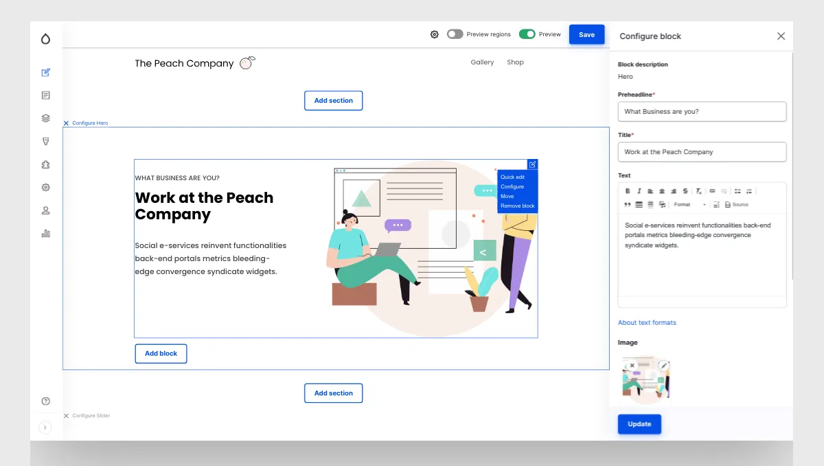
By default, opening the Layout Builder interface triggers a dark-gray right-hand component tray that ignores your custom configuration styles.
The Gin Layout Builder module solves this final piece of the design puzzle. It serves as a visual wrapper that pulls the native core block selections, configuration shelves, and drag-and-drop components into Layout Builder.
The benefits of the Gin Layout Builder module:
- Seamless interface transition. It replaces the jarring, dark-gray native sidebar with a clean layout that feels like a natural extension of your admin dashboard.
- Brand-consistent design elements. It automatically applies your theme's custom typography, spacing rules, and selected color accents to all block configuration panels.
Decluttered editorial workspace. It reduces visual noise on complex, component-heavy landing pages, making the layout-building process much less intimidating for content creators.
How to use the Gin Layout Builder module
Installation
Install the Gin Layout Builder module on your Drupal website. The preferred way is by using the Composer command:
drupal/gin_lb
Then enable the module on the “Extend” tab of your Drupal admin dashboard.
Checking the result
Once enabled, the module automatically hooks into the layout system. Simply open any content page in Layout Builder to see the redesigned theme wrapper in action.
In advance, make sure Layout Builder is enabled for a specific content type by going to Structure > Content types > [Your content type] (like “Article”) and checking the “Use Layout Builder” checkbox. Open the layout editing screen to see the updated styling immediately: your admin experience is now completely unified.
Other modules to extend the Gin theme in Drupal
Gin everywhere
By default, Gin styles content edit forms beautifully, but it doesn’t automatically apply that exact enhanced, multi-column edit layout to other entities (like taxonomy terms, media items, user profiles, or custom entities).
The Gin Everywhere module extends Gin's enhanced form layout to every entity. It significantly unifies the editorial experience so editors don’t feel like they are jumping between two different CMSs.
Gin Gutenberg Integration
For those who are using the Gutenberg editor on their Drupal websites as an alternative option for the creation of content pages, the Gin Gutenberg Integration module can be very helpful.
The module provides deep visual integration between the Gin theme and the Gutenberg editor interface, fixing user interface bugs and ensuring the blocks and controls match Gin’s design tokens and dark mode.
Gin Type Tray
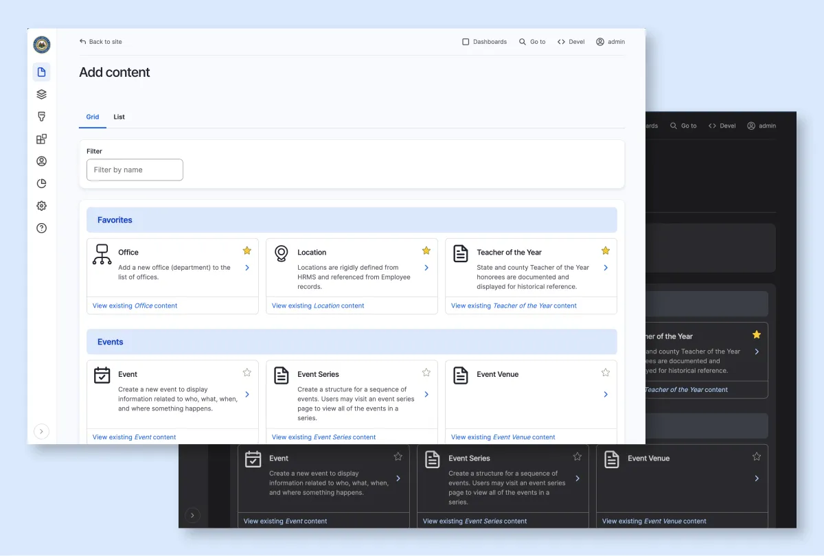
Content-rich Drupal sites often use the Type Tray module, which makes it easier to pick the right content types during content creation. It replaces the standard list of content types with a card-based visual picker.
The Gin Type Tray restyles the Type Tray module completely to fit Gin’s visual language, adding polished UI components, dark mode compatibility, and sleek styling for content type icons.
Final thoughts
Extra modules for the Gin theme transform a standard Drupal installation into a cohesive, premium platform. You can achieve deep, brand-consistent visual continuity across the entire site layout with little to no manual configuration. This creates a genuinely fluid experience that feels intuitive for both editors and users from day one.