Website Accessibility for Nonprofits: 4 Areas to Assess and Improve
As a nonprofit marketing leader, you know you need to make accessibility a priority when developing and maintaining your organization’s website. After all, reaching your audience and serving them well is fundamental to your mission. The last thing you want to do is hinder anyone on their user journey, especially if they’re searching for much-needed help only your nonprofit can provide.
But there are also legal and reputational factors to bear in mind. For instance, if you operate in the United States and receive government funding or provide a public service, you may be required to comply with ADA and Section 508 guidelines. Failing to do so could result in a lawsuit and/or significant reputational harm, which could have a negative ripple effect on your community engagement and fundraising efforts.
So where should you start? And how can you make meaningful improvements quickly, especially if you’re low on time and resources?
Foundationally, creating an accessible and inclusive website experience is about having empathy for your audience and considering their unique needs every time you create new content or adjust your site’s information architecture.
Here are four areas to pay particular attention to — and some low-cost, high-value tips to make your site more accessible now and in the future.
1. Content Strategy and Creation
People typically visit your website for one of two reasons: To explore what they can do for your nonprofit or to find out what your nonprofit can do for them. Your content holds the answers to the questions they’re asking — but only if they can access it.
The best time to make your content accessible is when you’re first creating it. That way you can maximize your reach from the get-go and avoid costly re-work down the road. But if it’s not possible to start from the ground up, embrace a “progress over perfection” mindset about your content. You can still take steps in the right direction by looking at the following areas and making smart adjustments.
Text/Language
One important facet of making the written word accessible is ensuring e-readers can navigate it effectively. But it’s just as important to make sure human readers can absorb the information you’re trying to relay.
Long walls of text, large words, jargon, and convoluted sentence structures are enemies of readability. People with physical and cognitive impairments, learning disabilities, and short attention spans all benefit when you:
- Use the active voice rather than the passive voice
- Break long paragraphs and sentences into shorter ones
- Make content skimmable and scannable by using frequent headings, subheadings, and bulleted lists
- Choose plain, straightforward language that’s easy to understand
When writing web copy, it can be helpful to start with a simple outline. First, define the page’s value proposition and ensure it’s clear in the title or in the opening paragraph. Then, turn the additional points from the outline into subheadings and short paragraphs. Don’t overload one page with too much information. Keep it short and sweet, and highlight important takeaways using pull quotes and graphics.
Before you publish anything, use a tool like Hemingway Editor to make sure your readability scores are where you need them to be. The lower the reading level, the more accessible the writing is.
If you can, ask someone with a known impairment to review the content and provide feedback about how well they’re able to comprehend your key points.
Video and Audio
Rounding out written content with video and audio is a great way to improve accessibility and inclusivity for your users, particularly for those with hearing and visual impairments and/or learning disabilities such as dyslexia.
To make media types fully accessible, make sure to:
- Add alt tags (an attribute of the HTML <img> tag) so screen readers can identify what the content is about for the user
- Include closed captions on videos
- Publish transcripts of videos and audio clips
- Remove any auto-play features that take control away from the user
Starting with a video transcript makes it easier to translate content into other languages, which is another great way to be inclusive and welcoming. This also makes it easier for people to find your content through search.
Photography/Images
There are two primary things to remember about photos and images. First, make sure the photography you select represents a wide range of people from diverse and underrepresented backgrounds, including those with physical disabilities.
And second, include captions and alt tags that clearly convey the value the photo adds to the content. Be as descriptive as possible and include any context that would help a visually impaired user understand how the photo is related to the other types of content on the page.
PDFs
Downloadable PDFs are notoriously inaccessible. For one thing, they don’t always scale appropriately on mobile devices, which makes it difficult and frustrating for anyone to read them. But they’re especially problematic for people with visual impairments, including elderly users who need large text options.
Downloading a PDF also adds legwork to the process of accessing valuable information. And for people who rely on assistive technologies and/or navigate the web using keyboards and switches alone, this makes their already-challenging user journey even more challenging.
It’s best to convert your PDFs to HTML whenever possible. Don’t worry if you have hundreds or even thousands of historical files. Start with the ones that people download most frequently and convert those first. Then make it a goal to update the others over time.
2. Website Navigation and Links
One of the best ways to improve your site’s navigation is to make pathways clear and direct. This involves:
- Limiting the number of clicks it takes to get users where they want to go
- Labeling links thoughtfully so users — especially those relying on screen readers — know exactly where that link will take them
Try and avoid vague link language like “Learn More” and “Find Out How” whenever possible. These phrases don’t provide users with any idea of what will happen next once they click. Be open and transparent about where your navigation leads.
3. Forms
Forms are often the worst accessibility offenders. That’s particularly true when they’re designed by the average content creator who doesn’t understand the inherent usability issues that come with them.
Thankfully, there are ways to lessen form-related pain points. Again, it all starts with having empathy for your user and putting yourself in their proverbial shoes.
Here are some best practices to keep in mind:
- Keep forms simple and uncluttered
- Limit the number of required fields to those that are truly necessary (and make sure it’s obvious that they’re required)
- Don’t ask for information you don’t need — the shorter the form, the better
- Label all fields clearly and make sure labels align with each field correctly
- Offer descriptions and sample language to help users understand what you’re asking of them
- Make sure error messages tell the user exactly what they did wrong
Furthermore, your forms should be easily navigable using nothing but a keyboard (aka caret browsing). The sequencing should be intuitive and chronological so the progression from element to element feels natural and orderly.
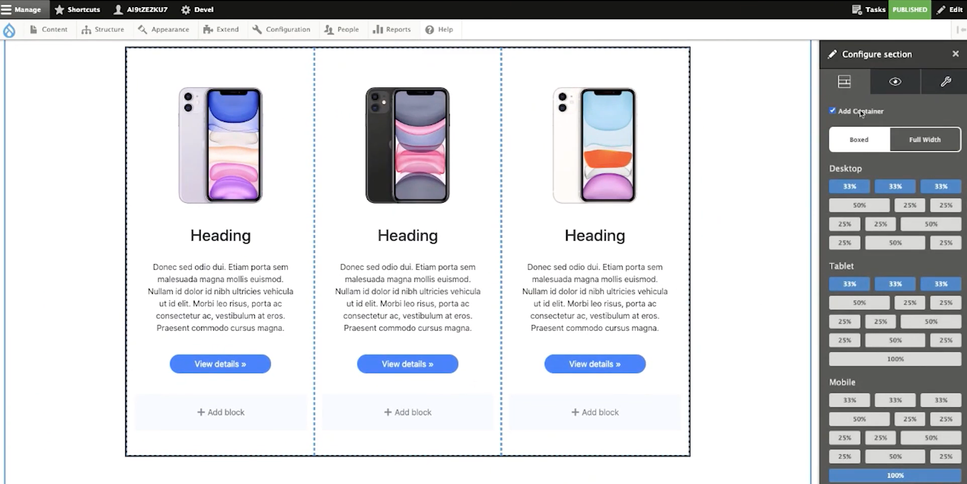
4. Web Page Design and Styling
Universal design principles are automatically accessibility-friendly. So if your website was designed by an experienced vendor, chances are your website is already styled to be accessible and inclusive.
However, your website isn’t stagnant. You and other content editors update it frequently. And unfortunately, it’s very easy to negatively impact your design’s integrity and consistency if you’re not aware of the ramifications of each change you make.
For example, let’s say you use a WYSIWYG (what you see is what you get) content editing tool like CKEditor. If you copy and paste text out of Microsoft Word, you might lose inline styling that breaks up long walls of text. So you’ll need to make thoughtful adjustments before you publish it to the page.
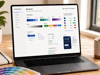
Along the same lines, if you and other content creators use a tool like Layout Builder to create new landing pages, you’ll need to be aware of how font sizes, color combinations (especially foreground and background combinations), and non-text elements like charts and graphs impact accessibility.
A good, relationship-focused web dev partner will create guidelines for you to follow and toolkits to use so you can stay compliant with each design choice. But in general, keep font sizes to 12 points or above, choose high-contrasting colors, and make ample use of white space.
Design an Accessible Website For Your Entire Audience
There are no two ways about it: It can be complicated and confusing to make your website the accessible and inclusive tool you want it to be. Accessibility modules and site checkers can help you diagnose problematic areas and navigate this complex terrain.
But it’s not enough to simply check the right boxes. The most important thing is to consider your audience and understand what they need from you. Then, make thoughtful, informed improvements in each of the areas that are most likely to impact their user experience.
Just remember: You don’t have to figure this out alone. We’d love to help.