The Evolution and Importance of Dark Mode in Digital Design

Dark mode isn't just a trend—it's a game changer. If you're a marketing or digital experience leader, implementing dark mode on your website can significantly enhance user experience, extend device battery life, and cater to a growing demand among consumers. This article shares everything you need to know about dark mode, why it matters, and considerations you need to take to implement it effectively on your website.
The Rise of Dark Mode
Dark mode, sometimes known as night mode or black mode, is the inverse of the traditional light mode. Instead of black text on a white background, dark mode features white or light-colored text on a dark background. This system-wide or program setting has become increasingly popular due to its numerous benefits, particularly for those who spend extended periods on screens.
Dark mode isn’t new, Microsoft's introduction of a dark theme in the Windows 10 Anniversary Update, back in 2016, marked a significant shift in user interface (UI) design. The move was aimed at providing users with an alternative viewing option that could reduce eye strain and improve usability, particularly in low-light environments. Apple's adoption of dark mode in macOS Mojave further cemented its place in mainstream computing, offering users the choice.
By 2019, the inclusion of dark modes in iOS 13 and Android 10 brought this feature to millions of mobile users worldwide. The widespread availability of dark mode across major operating systems underscored its growing importance. With CSS enabling dark mode support in web projects, developers and website managers gained the tools to implement dark mode seamlessly across their digital properties.
Why Dark Mode Matters
There are several reasons to consider implementation of dark mode in your digital platforms, including:
Increased Inclusivity and Enhanced User Comfort
Offering a dark mode option caters to the diverse needs of your audience. Everyone's eyes are different, and providing options enhances the user experience and accessibility. While light mode is more legible for most people, dark mode can be better for those with some visual impairments, including cataracts and photophobia. To ensure accessibility it’s crucial to maintain appropriate contrast and ensure that inverted text is readable.
Dark mode offers considerable benefits in terms of user comfort. By reducing the amount of blue light emitted from screens, it helps alleviate eye strain and supports healthier sleep patterns for users who spend prolonged periods on their devices. This is particularly beneficial for users accessing your site in low-light conditions.
Respectful of the Contextual Experience
When you understand the context in which users interact with your site, you can make an impact on their overall satisfaction with the experience. Are your users browsing in a dark room? Did they come from a site that supports dark mode? Offering dark mode can reduce friction and ease the transition between digital spaces.
This also takes into account a law of UX, Jakob’s Law, that users develop expectations based on their experiences with similar products or services, leading them to anticipate similar features and functionalities on your site. By offering dark mode, you align with the mainstream user’s expectations and enhance their overall experience.
Takes into Account Aesthetic Preferences
Dark mode isn't just functional; it's also aesthetically pleasing. A well-designed dark mode can create a positive response in users' brains, leading them to believe the design works better. This is known as the "Aesthetic-Usability Effect". Of course, addressing basic usability issues should remain the top priority.
A Step Toward Energy Efficiency
It has been reported that using dark mode on devices with OLED screens can save up to 47% battery life. These screens light up individual pixels, meaning that displaying darker colors requires less power which can make a substantial difference for users.
It’s worth noting that devices built with LCD screens work differently, being that they are always backlit, so the energy savings will not be seen if users are working with those devices.
4 Tips for a Smooth Dark Mode Implementation
Implementing dark mode isn't as simple as just reversing colors from light to dark. We’ve collated some tips to ensure that you get it right for your users:
1. Avoid pure black and pure white in your designs
Pure black (#000000) and pure white (#FFFFFF) create extreme contrasts that can be visually jarring and lead to eye strain, especially during prolonged use. Instead, if you are looking to use a monochrome design, consider using softer shades of dark grey and off-white. These hues reduce the stark contrast and provide a more pleasant visual experience while retaining the benefits of dark mode.
2. Testing & Feedback to Ensure an Inclusive Experience
Having chosen to proceed with dark mode, conduct regular testing to ensure your dark mode meets accessibility standards. Utilize accessibility tools such as color contrast checkers and screen readers to verify compliance with WCAG guidelines. Gathering feedback from users with varying visual abilities can also provide valuable insights into potential improvements. Test again before fully rolling out dark mode using a segment of your audience and gather feedback. This practice will help you identify any issues and make necessary adjustments.
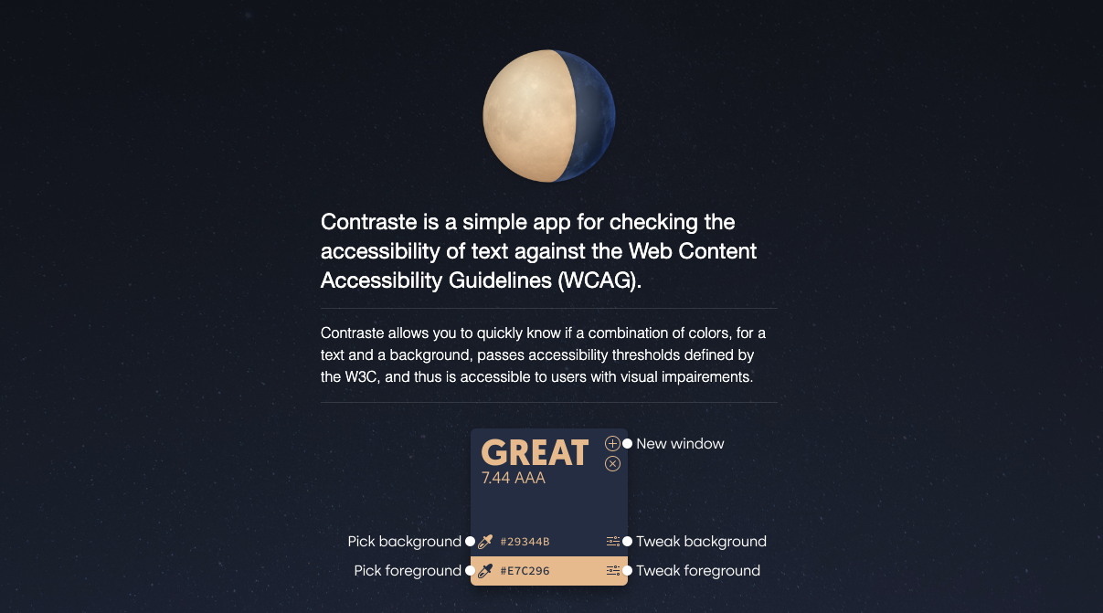
Ensuring that your dark mode design adheres to accessibility guidelines is crucial. By maintaining sufficient contrast and avoiding the use of thin fonts for inverted text, you can create an inclusive and user-friendly experience for all visitors. Use an Accessibility checker such as Contraste when reviewing your mockups to check that the colors are meeting the latest Web Content Accessibility Guidelines (WCAG) requirements.
3. Early Discussions are Key
Discussing your requirements from day one, and choosing to adopt dark mode early in the design process can lead to a more affordable and efficient project. Similar to building out user personas in the discovery phase, understanding the preferences of your users, like mobile vs desktop usage, can provide your team with valuable insights and help in creating a more tailored and satisfying user experience. Another effective strategy is starting your process with discussions around creating a design/UI toolkit, such as Drupal’s Bootstrap UI Kit which, using Bootstrap, supports dark mode out of the box. A toolkit offers an extensive set of pre-designed components, templates, and guidelines that streamline your design process.
4. Continuous Improvement
Dark mode isn't a one-and-done deal. Continuous improvement is key to maintaining an effective experience. To create a truly effective dark mode, it's crucial to adopt an ongoing process of refinement and enhancement. This involves not only the initial design but also a commitment to regularly revisiting and optimizing the feature. User needs and preferences evolve over time, and staying attuned to these changes is key to staying aligned with the needs of your user.
By actively seeking user feedback, monitoring analytics, making iterative updates, and ensuring accessibility, you can refine your dark mode design to meet the evolving needs of your audience.
A Strategic Advantage for Your Web Strategy
Dark mode is more than just a trend—it's a crucial tool for enhancing user experience, improving accessibility, and aligning with user preferences. By integrating dark mode into your digital experience strategy, you show respect for your audience's needs and preferences.
The bottom line would be to implement dark mode and keep the option open for your users. It’s best not to enforce either light or dark display mode and, instead, respect the user's choice.
Ready to elevate your website's user experience? Consider implementing dark mode as an option within your digital platforms to ensure choice for your users. For more insights and personalized guidance, reach out to connect with our experts today.
Contributors