Accessibility Elements, Part 2: Semantic HTML and WAI-ARIA in Drupal
Authored by: Nadiia Nykolaichuk.
Websites are complex systems, and navigating them with assistive tools like screen readers is not an easy task. Luckily, if a website follows the accessibility guidelines, the user journey becomes much more seamless thanks to useful “road signs.” They are contained in the HTML code of accessible web pages and announced to the user by screen readers.
Among the elements that are specifically good for this mission are semantic HTML and WAI-ARIA. So they will be the next “heroes” of our series about essential accessibility elements after the previously featured alt text for images. Of course, the role of a CMS in supporting web accessibility is huge, so after the general overview of semantic HTML and WAI-ARIA, we’ll focus on how they work in Drupal.
Semantic HTML and WAI-ARIA for accessibility
Semantic HTML and WAI-ARIA complement each other in ensuring that web content communicates its meaning, purpose, and structure in a clear and meaningful way. For better clarity, it needs to be noted that “content” in the context of web accessibility is used as a broad term that encompasses everything that a web page conveys. This includes not only the main text or images, traditionally thought of as content, but also various elements and components that shape the user interface. So let’s take a closer look at what semantic HTML and WAI-ARIA do specifically for improving web accessibility.
The key overview of semantic HTML
Semantic HTML is the use of appropriate HTML (Hypertext Markup Language) tags in web pages so they can be properly understood and processed by various technologies — parsed by browsers, crawled by search engines and, of course, understood by screen readers, which is paramount for web accessibility.
It needs to be noted that utilizing semantic HTML to improve the accessibility of web pages is a mission for both developers and content creators. While developers rely on semantic HTML to define the larger structure of the web page including all its UI elements, content creators take care of creating accessible content. WYSIWYG (What You See Is What You Get) editors inside CMSs enable them to do it with no actual knowledge of HTML. They can use its UI to organize content hierarchically with heading tags (<h2>,<h3>. etc.) or create other elements, such as blockquotes, bullet lists, tables, and more.
Even the name of each semantic HTML tag communicates the purpose of the element. For example, here are some tags introduced in the latest version of the Hypertext Markup Language — HTML5 — that provide more meaningful and specific labels for various parts of a web page:
- <header> (for the top section of a web page)
- <nav> (for the navigation section of a web page that contains links to other parts of the site)
- <main> (for the main content of the page)
- <section> (for a specific topic or area of the page)
- <article> (for a self-contained piece of content)
- <footer> (the bottom section of a web page)

The arrival of new semantic elements marks a shift away from the practices of using generic, non-semantic tags like <div> or <span> for any type of information. And while <div> and <span> are still in use on websites, it's recommended to prioritize the use of the specific HTML5 semantic elements for website accessibility and the clarity of code.
The key overview of WAI-ARIA
WAI-ARIA (the acronym for “Web Accessibility Initiative — Accessible Rich Internet Applications”) is a set of guidelines and tools provided by the World Wide Web Consortium (W3C). The latest version of the specification is WAI-ARIA 1.2 published in June 2023.
WAI-ARIA enables developers to add attributes (roles, properties and states) to HTML elements to enhance their semantics. This provides additional information to assistive technologies that is related to dynamic changes, the current states of the elements, user interaction features, etc. This makes ARIA especially useful for websites with dynamic content or advanced user interface controls.
ARIA provides information that is not conveyed by native HTML elements alone. However, when native HTML tags are enough, using WAI-ARIA is not recommended to avoid overlaps.
WAI-ARIA attributes include:
- ARIA roles. They define the type and purpose of various web page elements (a button, a navigation menu, a form input field, a progress bar, etc.). For example, ‘role=“progressbar”’.
- ARIA states. They communicate the information about the current state of an element to assistive technologies. For example, the ‘aria-checked’ state can be used to tell that a checkbox or a radio button is checked (‘aria-checked=“true”’) or unchecked (‘aria-checked=“false”’). Another example is the ‘aria-selected’ state can indicate that an option within a set of options is currently selected.
- ARIA properties. They provide additional information about the characteristics of the element. For example, the ‘aria-hidden’ property followed by the “true” or “false” value indicates whether the element should be ignored by screen readers or not (they can ignore it when it’s decorative, redundant, or not relevant for the current context). Another example is the ‘aria-valuemin’, ‘aria-valuemax’, and ‘aria-valuenow’ properties that define the minimum, maximum, and current value of a widget like a progress bar.

ARIA also categorizes roles into abstract, widget, document structure, and landmark roles. Here are some examples of the key ARIA roles:
- ARIA widgets. They are interactive components of a web page. Examples of widget roles include ‘role=“button”’, ‘role=“slider”’, ‘role=“tablist”’, etc. An example of a widget role together with a state would be ‘role=“switch” aria-pressed=“false”’ (for a toggle switch that is currently not pressed).

- ARIA landmarks. They are a set of roles that define important sections or regions of a web page and help users quickly jump to them. Examples include ‘role=“main”’ (for the main content), ‘role=“navigation”’ (for the main navigation menu), etc. ARIA landmark roles shouldn’t be used over semantic HTML elements (such as <main>, <footer>, etc.) to represent landmarks. They are only needed in cases when semantic HTML couldn’t be implemented or you need to provide more explicit information about the purpose of a particular section.
ARIA live regions
Another super important concept in ARIA are live regions — areas on a web page that may be updated dynamically. A live region can be an error message, a message in the chat window, etc. WAI-ARIA attributes help alert assistive technologies about the changes in live regions. The attribute associated with this is ‘aria-live’, which specifies how urgently the screen reader should announce the changes to the user:
- The ‘aria-live=“polite”’ value means the changes to the live region don’t have to be announced immediately and the user can finish their current task before hearing the alert.
- The ‘aria-live=“assertive”’ value indicates that changes are so important that they should be announced immediately, interrupting the user's current task.
Semantic HTML and WAI-ARIA in Drupal
The Drupal community is deeply committed to enhancing the accessibility of websites. Currently, the CMS is aspiring to attain the AA accessibility level of Web Content Accessibility Guidelines (WCAG) 2.1. Drupal has been making huge strides in the accessibility area during the last decade, but the arrival of Drupal 8.0 in 2015 marked an especially outstanding leap. Among a bunch of other remarkable accessibility improvements, it added extensive support for semantic HTML5 and WAI-ARIA, bringing Drupal code in line with the up-to-date web development practices.
“One of the big enhancements that will be evident is a broad adoption of HTML5 and Web Accessibility Initiative's Accessible Rich Internet Applications Suite (WAI ARIA). Neither standard was mature enough to bring into Drupal 7, but we are happy to see their adoption in Drupal 8.”
Mike Gifford, Drupal core committer, “godfather of Drupal accessibility”
The adoption of HTML5 gave developers a chance to create templates and layouts using semantic HTML elements, which helped make content better-structured and more accessible. In his drupal.org article, Mike Gifford explained that much of Drupal’s HTML was brought up to current HTML5 standards with the adoption of the TWIG template engine in Drupal 8.0. Indeed, Twig is renowned for being modern and flexible, so its arrival made Drupal templates more adjusted to leveraging the best HTML5 features for better semantic markup. Within Drupal templates, regions were defined to organize content into meaningful sections.
Thanks to the HTML5 Initiative for Drupal, the template and theme functions were refactored to use new HTML5 elements such as <article>, <aside>, <embed>, <footer>, <header>, <nav>, and so on. Special attention was given to helping Drupal’s Form API adopt a bunch of new HTML 5 form elements that enhance form accessibility.
When it comes to WAI-ARIA, Drupal became “equipped” with built-in support for its attributes, enabling developers to assign appropriate roles, states, and properties to interactive elements and dynamic content elements like menus, sliders, modals, and so on. The Drupal core and contributed modules were updated to better align with the latest ARIA best practices.
Mike Gifford’s article summed up the key innovations that arrived in Drupal 8.0 to help Drupal developers harness the power of WAI-ARIA:
- ARIA landmarks were added to Drupal’s core themes.
- ARIA roles were introduced to the core blocks and status messages.
- Proactive error notification for users was added through the aria-invalid attribute to alert the users of screen readers whenever there is a problem.
- The ability to provide additional context for tables was added thanks to the aria-sort attribute. The use of the aria-sort attribute was enhanced in Drupal Views to make tables more accessible. It also gave developers the ability to add caption and summary in tables and include the header for better semantics.
- The aria-describedby attribute was added to form elements when they had related descriptions, enhancing the accessibility of form fields.
ARIA live regions. Furthermore, developers became able to implement ARIA live regions to dynamically announce the changes so they can be read by screen readers. This is especially useful for applications with real-time updates or notifications. Mike Gifford called it one of the biggest steps for ARIA that Drupal became equipped with the ARIA Live Announcements API, which consolidated all previous implementations to provide super consistent and seamless aural experience to users.
Drupal’s accessibility advances never stop, so the support for HTML5 and ARIA has been improving and extending all the time. The latest major Drupal core version, Drupal 10, has super accessible default themes — the administration theme Claro and the front-end theme Olivero — that also rely on these elements.
Here is an example of ARIA use in the Claro theme for a live region. There is an announcement that screen readers must read out to the user — “Tray ‘Administration menu’ opened.” A couple of attributes are used to implement this:
- The ‘aria-live=‘polite’ attribute value tells screen readers that the announcement is not critical and can be made in a “polite” manner — without interrupting any current task.
- The ‘aria-busy=‘false’ attribute value indicates that the live region is not currently undergoing changes or updates, so there’s no need for screen readers to wait for any modifications to complete before they can read the announcement.

Another example in the Claro theme is related to pressing the main Drupal administration menu link, so let’s check some of its key ARIA attributes:
- ‘Role=”button”’ assigns the ARIA role of “button” to the admin menu link, indicating that it has a button-like behavior.
- ‘Aria-pressed=”false”’ is a state indicating that this admin menu link is currently not pressed.

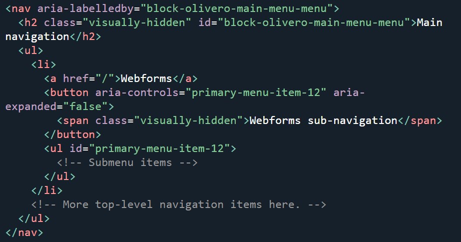
In his article “The Accessibility And Usability Journey Of Drupal’s Primary Navigation,” Mike Gifford demonstrated the use of ARIA in Drupal’s default front-end theme Olivero. There is the ‘aria-labelledby’ attribute that accompanies the standard <nav> element at the beginning of the menu. The attribute points to an h2 element that is visually hidden but accessible to screen readers. Thanks to this, screen reader users can know the navigation menu name and differentiate the different navigation elements. This also helps users find this menu if they navigate by headings.
For the top-level navigation item, Drupal can use a <button> element injected after the hyperlink, explains Mike. The button contains the ‘aria-controls’ attribute (mapped to the ID of the nested <ul>) and the ‘aria-expanded’ attribute. They are initialized with JS, but in case a website is loaded without JS, the button serves for presentational purposes only. The button has visually hidden text with the menu item’s text, followed by “sub-navigation,” explains Mike. This helps people who tab between form controls understand what submenu this button controls.

Some useful contributed Drupal modules for semantic HTML and ARIA
Semantic Views
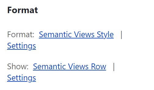
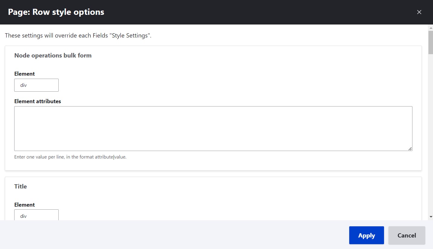
The Semantic Views module enables developers to specify various HTML tags and class attributes inside the Views UI with no need to override the template files. It adds a special Semantic Views Style format, as well as an option to show Semantic Views Row.


Block ARIA Landmark Roles
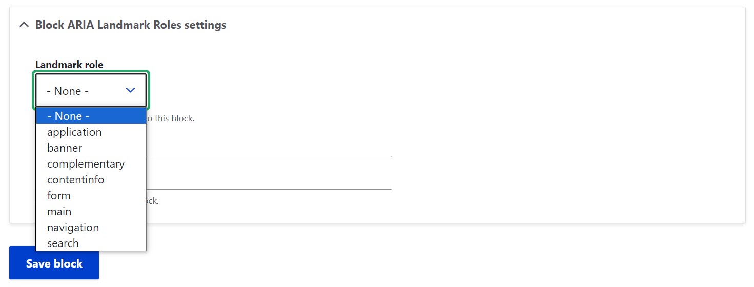
The Block ARIA Landmark Role module adds a new option on the block configuration form that enables users to assign an ARIA landmark role to a block.

Final thoughts
It’s amazing how small tags added to the source code of web pages can make the life of people with disabilities so much easier. With proper use of semantic HTML, WAI-ARIA, and other essential accessibility elements supported by advanced CMSs like Drupal, the World Wide Web can become a genuinely inclusive place. Stay tuned for the next parts of our accessibility series, and remember you can always rely on our Drupal development specialists in taking your website accessibility to the next level.


