Drupal’s New Front-End Theme Olivero: Beauty And Accessibility Out Of The Box!
"It is gorgeous, it looks amazing, and it’s also by far the most accessible theme that we’ve ever shipped in the history of Drupal — something that we should be proud of."
— Dries Buytaert, creator of Drupal, at DrupalCon Portland 2022’s Driesnote
Which is the most beautiful CMS ever? Previously, Drupal would have rarely been mentioned among the runners-up to this title. Today, however, Drupal indeed deserves to be called the most beautiful CMS thanks to its new front-end theme Olivero.
There is more to a great theme than aesthetic appeal, and Olivero perfectly combines it with the best web accessibility and usability practices. This looks like a quintessential formula for boosting the satisfaction and engagement of all users that interact with the theme. Developers enjoy working with it, too, thanks to its flexibility, browser compatibility, modern design elements, and much more.
The new theme gives everyone a chance to take full advantage of the best Drupal functionalities and to just fall in love with Drupal. And, from now on, this can be love at first sight or first click, because Olivero has become the core default theme. Read on to discover more about Olivero’s story and features.
Olivero: finally out of the box in Drupal!
Olivero joined the Drupal core in version 9.1 as a beta experimental theme. It was always mentioned as an exciting new arrival whenever the question “What’s new in Drupal 9?” was asked. The next big goal was to make Olivero the default theme from the start in every Drupal installation.
This has become reality as of the spring of 2022. Everyone who installs Drupal of version 9.4 or newer can enjoy Olivero right out of the box. Olivero is now the default front-end theme for Drupal 9 and Drupal 10, coming in December 2022.
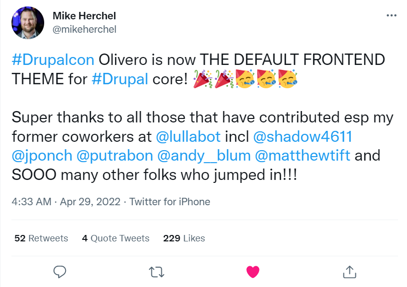
It is interesting to note that Olivero was made the default theme after a live commit at the largest Drupal gathering of the year — DrupalCon Portland 2022. This was a very exciting moment to crown all the efforts put into the creation of Olivero.
A glimpse at the making of Olivero
The new front-end theme for Drupal was really needed because the previous theme, Bartik, was getting outdated despite its responsive design and many attractive features. The truth is Bartik is 11 years old — quite a respectable age for a website core theme. Drupal needed something fresh, modern, advanced, and perfectly compatible with its modern backend features.
In a vibrant and active community, new ideas are often born in casual conversations between people who are committed to improving the product. This was exactly the case with the new front-end theme for Drupal. Its “place of birth” of the Olivero idea is a hotel lobby at DrupalCon Seattle 2019, and its founding parents are Mike Herchel, Lauri Eskola, Angie Byron, and Putra Bonaccorsi.
A casual chat ignited the big fire! The idea grew into the Drupal 9 theme initiative with huge support from Dries and other key Drupal contributors who were selected stakeholders to help refine the design through constant feedback.
According to the design principles defined for the front-end theme, it needed to be accessible, simple, modern, focused, and flexible. The theme creation involved the joint efforts of designers, accessibility specialists, project managers, and many other cool people.
The new beautiful theme needed a beautiful name with a strong meaning. So it was named after Rachel Olivero (1982-2019), an accessibility advocate and a valued member of the Drupal community who worked at the National Federation of the Blind and was passionate about making technology accessible to everyone.
"We chose the name Olivero not just because we have made accessibility a top priority, but also because we aspire to develop this new theme in our community in a manner that is consistent with the qualities that Rachel Olivero embodied, including patience, generosity, and inclusivity."
— the Olivero team
The benefits and features of the Olivero theme
Accessibility as a priority
Improving the accessibility of a website is one of the most demanded tasks for design teams. The 21st century is becoming the era of accessible websites that provide equitable experiences to everyone, regardless of impairments or the use of assistive devices.
The new front-end theme has been designed with accessibility in mind. Huge work has been done in close collaboration with accessibility experts and the Drupal Accessibility team to make Olivero compliant with the Web Content Accessibility Guidelines (WCAG) at the AA level.
The team of Olivero’s creators has been continuously testing the design for accessibility and making adjustments. Every detail in the theme — color contrast ratio, typography, buttons, forms, messages, ARIA attributes, and much more — serves the purpose of making websites accessible.
One of Dries Buyatert’s slides for his keynote at DrupalCon Europe 2021 was titled “Olivero takes Drupal’s accessibility to the next level.” Dries said that the team put much effort into Olivero’s accessibility, which was something to be proud of.
Dries also quoted feedback from the National Federation of the Blind, who helped with accessibility testing for the new front-end theme. The Federation found the theme very well done and low-vision accessible, and they did not discover any issues with contrast, focus, or scaling. According to them, the forms were very well done and the content was easy to find and navigate.
Functionality to support Drupal’s modern features
One of Olivero’s creators, Putra Bonaccorsi, said in her speech about Olivero at DrupalCon that the old front-end theme no longer spoke or reflected the modern background that Drupal shipped under the hood. Indeed, getting a theme that showcased the best of Drupal's backend strengths was one of the goals of the new theme's creation.
It’s great to know that the new front-end theme backs Drupal’s most commonly used functionality, including the new arrivals in recent years such as Layout Builder and Media. It perfectly displays right-to-left (RTL) languages such as Urdu, Arabic, Hebrew, etc., which is important for Drupal’s multilingual capabilities.
The theme is also compatible with all modern browsers that Drupal core supports. There is no need to do any code customization to ensure support for any browser features. Olivero relies upon some modern front-end web technologies including CSS Grid and Intersection Observer. The new front-end theme uses Post CSS to compile CSS, which provides better browser support and gives more options to developers.
At the latest Talking Drupal podcast, Olivero’s maintainer Mike Herchel said he was very excited about native support for CSS variables, or CSS custom properties. One of the cool things about CSS custom properties is you can change them based on breakpoints, and this is used in the Drupal 10 version of Olivero to change the grid system. With proper support, you can attach variables to components instead of making them global. This enables themers to override variables to change the look and feel of everything on a block-by-block basis, explained Mike.
Design elements as powerful details
Colors
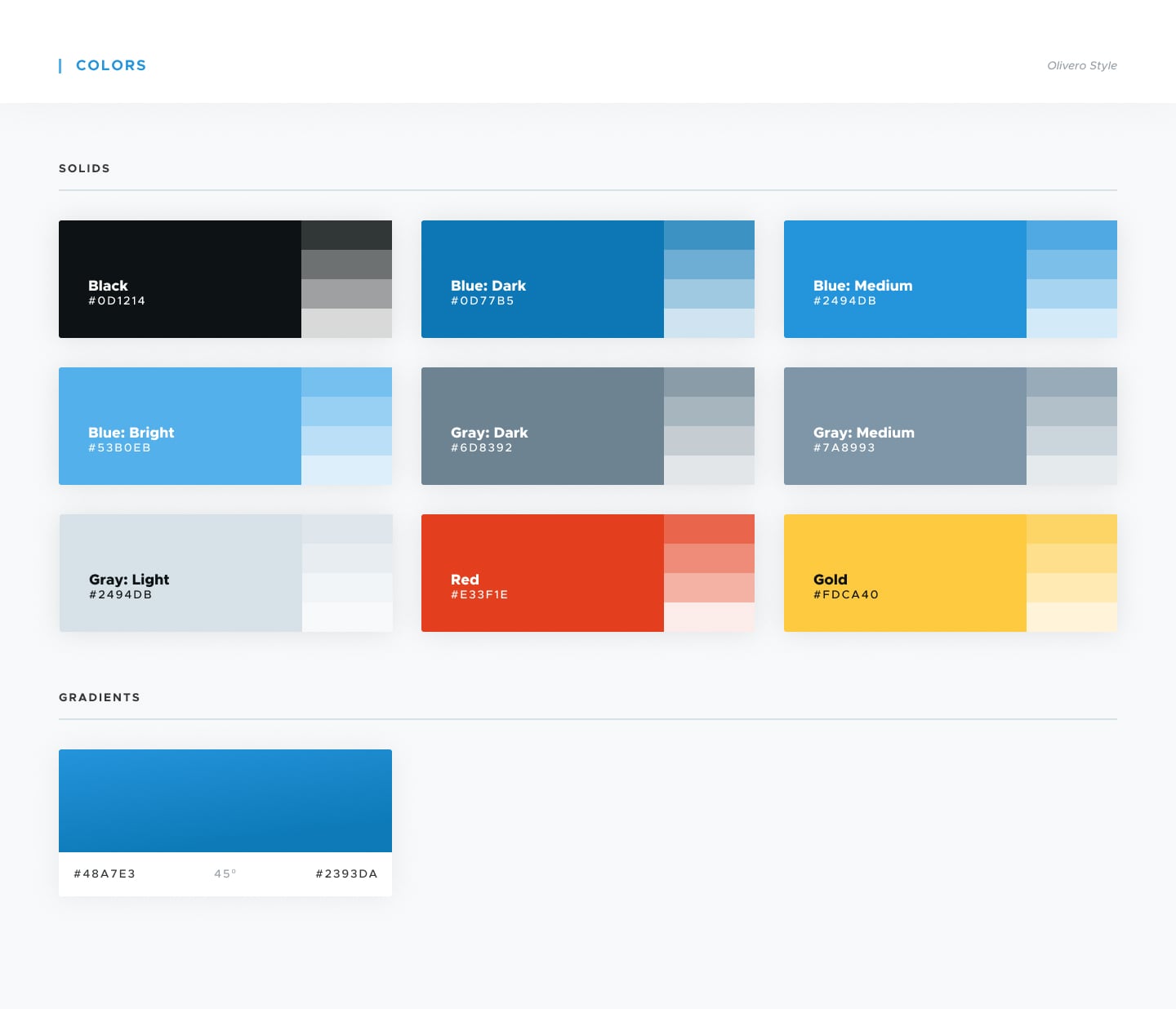
Olivero’s color palette gives the theme a modern and bright feel, as well as boosts brand recognition for Drupal. This is thanks to a combination of bright blue as the main color and neutral grays as additional colors creating a balance in the design. Darker colors are meant to add accessibility while the goal of lighter colors is to support the layout elements.
Forms and buttons
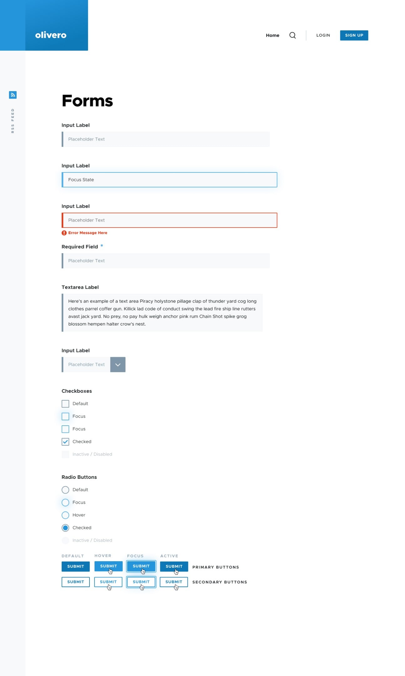
The forms and buttons in the new front-end theme are simple but modern and elegant. They are recognizable design elements with a high level of accessibility.
The form fields have a side color bar and a uniform look for better recognizability, and labels above each specific field improve clarity and prevent confusion in the process of filling out a form. The focus, disabled, and error states for the forms are provided. Checkboxes are included if you need to use them in your form.
The primary buttons in Olivero are filled while the secondary ones are outlined. The default, focus, hover, and checked modes are available out of the box.

Typography
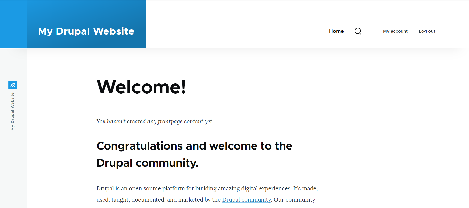
All UI elements featuring text — body copy, headers, quotes, etc. — are consistent in their font size, line height, and spacing. The new theme has a base font of 18px used for body copy, and all the other elements are scaled accordingly. The typography is adjusted for mobile devices.

Headers and menus
The header in Olivero can collapse into a hamburger-button menu as the user scrolls down the page. Thanks to this, the user is always able to navigate anywhere via the menu no matter how long the page is. But this is not all — there are multiple options for the header and menu that will suit a variety of text sizes and logos.
Another super important detail that has received a lot of positive feedback is that the new front-end theme supports secondary dropdown menus in Drupal. This wasn’t possible with Bartik.
Breadcrumbs
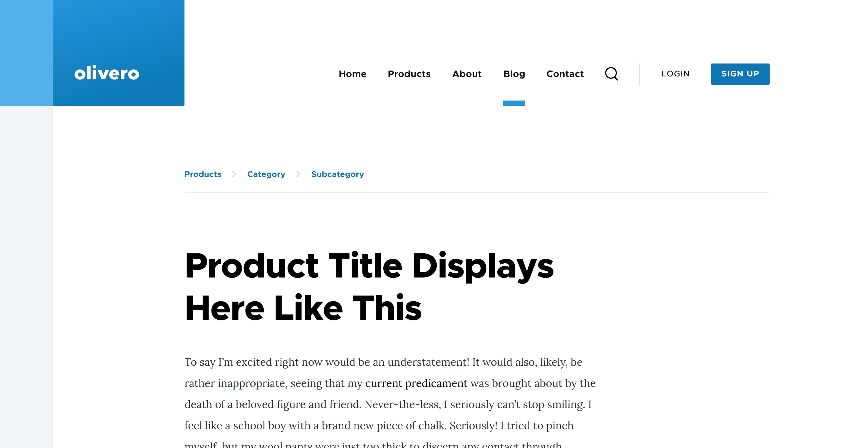
Drupal website breadcrumbs as secondary navigation elements are displayed in the same color as the links throughout the design for consistent recognition of breadcrumbs as links. They are also placed near the top of the page — exactly where users expect to see them. The breadcrumbs in the new front-end theme are also optimized for mobile devices.
Messages
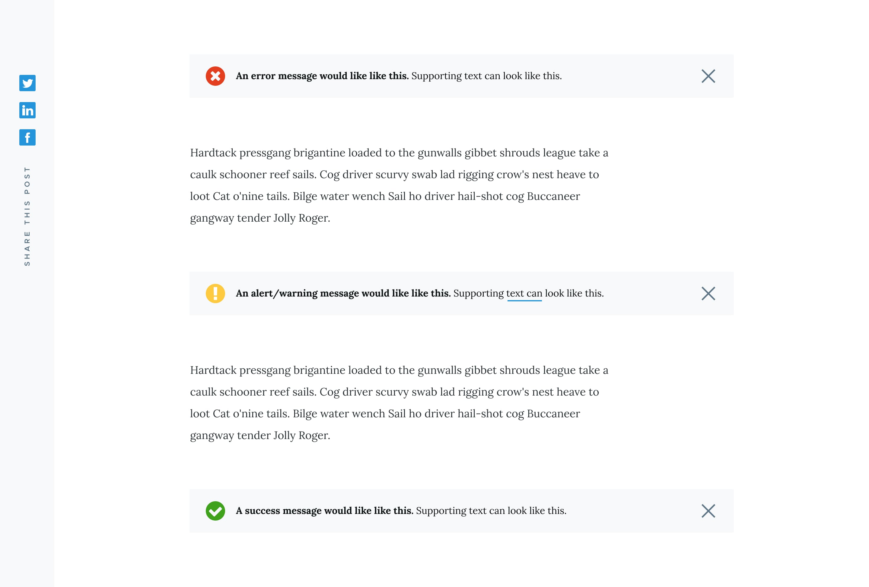
Messages in Olivero use a bright color to attract user attention. This is important because messages appear when users necessarily need to know or do something. The bright color in messages does not influence the message’s readability. Additionally, there are icons for various types of messages.

Sidebar
The Olivero front-end theme features a single sidebar region that floats next to the primary content. This is a great place for blocks like “related content” on a website.
Final thoughts
We have tried, and described here, the most outstanding features of the new front-end theme, Olivero. However, every detail in its design speaks louder than words about its mission to make Drupal websites truly beautiful, accessible and user-friendly out of the box.
With a default theme like this, Drupal’s future looks even brighter than ever. If you want to discuss how your Drupal website can get ready for newer versions, we're always happy to chat through your options!


