
Accessibility Elements, Part 3: Accessible Forms in Drupal
Authored by: Nadiia Nykolaichuk.
Online forms serve a myriad of purposes, including logging into accounts, leaving comments, and registering for events, to name a few. In an inclusive web environment, it is crucial that people with disabilities, who rely on assistive technology, can do these tasks seamlessly. That’s what makes accessible forms indispensable for overall website accessibility.
So, after overviewing alt text and semantic HTML and WAI-ARIA in our previous posts, we are now turning our focus to accessible forms as the next topic in our series on essential accessibility elements. We will go through the nature of accessible forms, as well as some specific ways in which the Drupal CMS supports their accessibility.
Introduction to the world of accessible forms
Accessible forms are easy for users with disabilities to perceive, complete, and submit. The ease of working with forms shouldn’t be hampered by the fact that users rely on assistive tools like screen readers or screen magnifiers, use the keyboard only, or access your website with a touchscreen device, for example.
A journey through a form with a screen reader
A user navigates through an online form, often with the help of keyboard commands or gestures. A screen reader identifies the form elements such as fields, labels, headings, and associated instructions, all of which help it convey its structure. It translates the information into speech for the user or presents it as Braille.
The screen reader indicates which form element is currently focused, helping the user understand where exactly they are in the form. It announces the type of each field (e.g., text input, checkbox, radio button), as well as provides information about the expected input. In case a submission error occurs, the screen reader announces the error message so the user can address the issue.
The key characteristics of an accessible form
- Semantic HTML. An accessible form uses semantic HTML elements such as <form>, <label>, <select>, <option>,<input>, <textarea>, and more to convey its structure. The form elements need to have a clear hierarchy.
- WAI-ARIA. The accessibility of user interactions with the form is enhanced through the use of WAI-ARIA attributes if needed.
- Descriptive labels. Each field has a clear and descriptive label that makes its purpose clear. Labels are explicitly associated with the corresponding form fields.
- Focus and interaction indicators. An accessible form has clear indicators for the form elements that are currently in focus and for its current interaction state (e.g. ‘Checked’). This is crucial for users navigating with a keyboard or other non-mouse input methods. This includes both visually distinguishable styles for sighted users and announcements by screen readers for non-sighted users.
- Clear instructions. There are clear instructions or hints that guide users through filling out the form fields. Required fields are explicitly indicated, users are able to hide or show help text, and so on.
- Proper form validation and error handling. Properly structured, meaningful error messages for specific fields provide context and guidance on fixing the errors. Fields with errors are clearly highlighted.
- Keyboard accessibility. Users can navigate and interact with the entire form relying solely on the keyboard. A logical tab order and a clear indication of the focus state on the form elements greatly helps that.
- Contrast and readability. Sufficient color contrast for text and form controls helps users with low vision or color blindness. An accessible form also uses readable font sizes and styles, and avoids relying solely on color to convey the information.
- Responsive design. Users with special needs have smooth experiences with form handling across various devices and screen sizes, including desktops, tablets, and smartphones.
- Comfortable length. If a form is lengthy, it’s better to split into multiple pages or use headings for its sections.
Accessible forms in Drupal
The Drupal CMS is renowned for prioritizing web accessibility and constantly embracing relevant best practices. It’s built to provide the best mobile experiences, uses HTML5 and WAI-ARIA, requires Alt text, and more. The Drupal community has done — and keeps doing — amazing work on increasing the accessibility of forms. The Drupal core themes, the Form API, the Inline Form Errors module, the Webform module, and other components and tools have introduced useful enhancements in this area. They make sure a wider range of people with disabilities can use accessible forms, and empower developers and site builders to create them.
Form accessibility in Drupal’s new core themes
New Drupal default themes, Claro for the admin experiences and Olivero for the front end, are genuinely focused on accessibility in everything, including online forms.
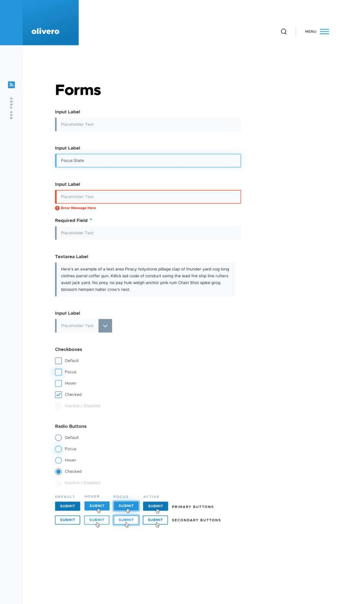
Here are some examples of how form accessibility is handled in the Olivero theme. The elements have a standard look that makes them more recognizable. A color bar on the left side is used to signal the form element. The labels are displayed above each field for perfect clarity in the process of completing a form.
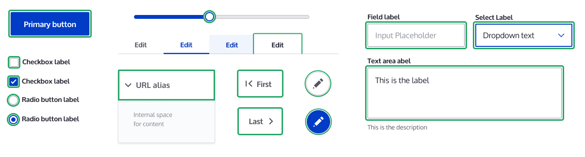
All the input elements, be it text fields, checkboxes, radio buttons, or submit buttons, are created with accessibility in mind and have properly implemented states (Focus, Checked, Disabled, Hover, and more) to let users know what is happening at every moment of their interaction with the form. Each state has a distinctive style (a specific color border around the element).
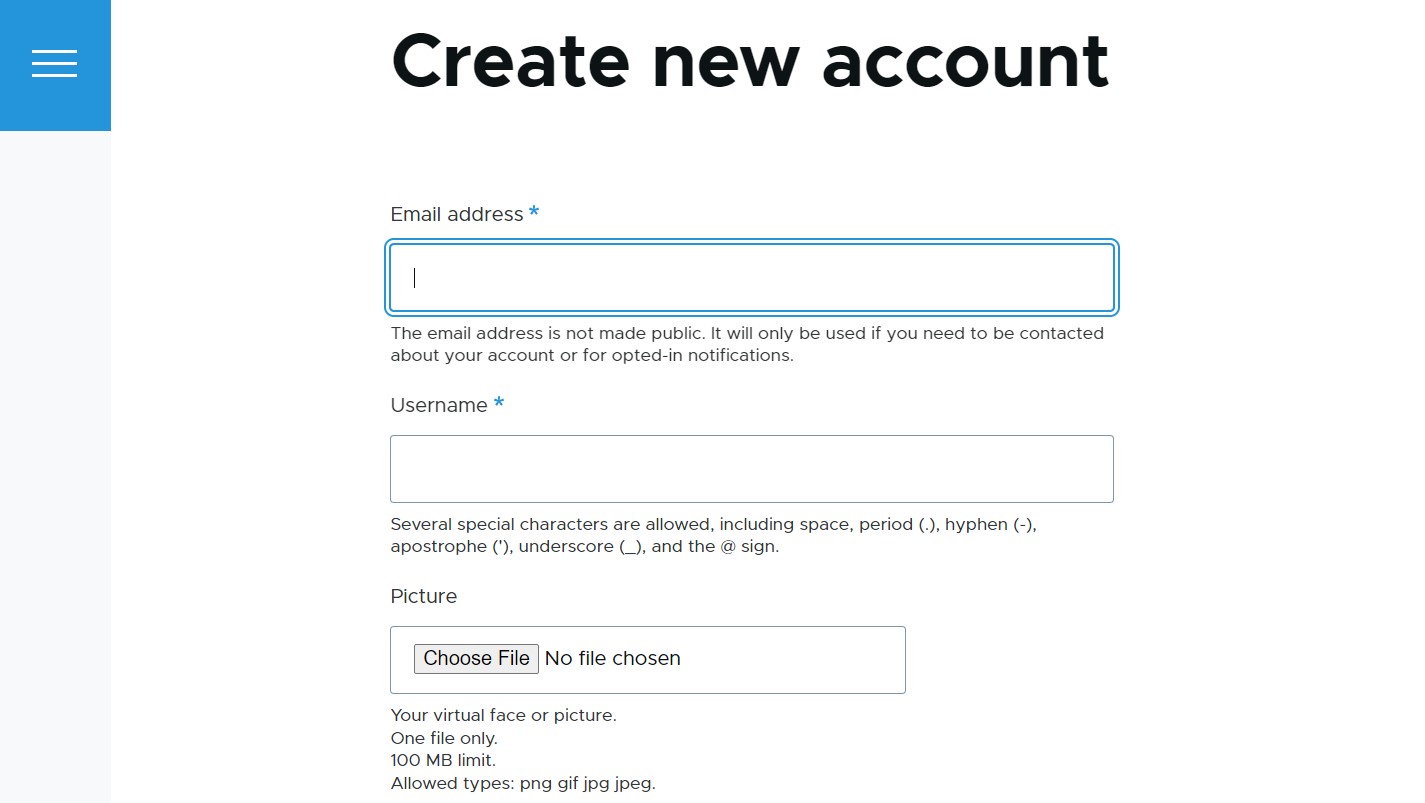
The default admin theme Claro is yet another embodiment of accessibility. Among other features for accessible forms, it can boast form element sizes that meet the Web Content Accessibility Guidelines (WCAG) at the AA level, which makes them much more convenient for the users of touch devices. The focus styles for the text input areas, checkboxes, and other elements are consistent and clear, drawing users attention to where they are in the form.
Form accessibility in the Drupal core Form API
Form API (FAPI) in the Drupal core is a developer-oriented set of tools for form creation and management. It is designed with accessibility in mind, supporting the best accessibility practices and handling a lot of the behind-the-scenes work to ensure compliance with accessibility standards.
Here are at least some examples of important Form API features and related practices that enhance form accessibility:
- HTML5 support for form elements
The Form API extensively supports modern semantic HTML5 elements that make forms more accessible by better conveying their structure to screen readers. For example, when Drupal 8.0 was released in 2015, the support for multiple new HTML5 elements were added to FAPI such as the email, telephone, URL, search, number, color, and placeholder elements, as well as the ‘#pattern’ property to provide easy field validation. That was a great start to the enhancements of the form semantics that are still going on.
- Details VS. Fieldsets
In Drupal 7 and earlier versions, the ‘FIELDSET’ and ‘LEGEND’ HTML elements were used to group related elements together into collapsible sets of fields. With the Drupal 8 release, new HTML5 ‘DETAILS’ and ‘SUMMARY’ elements were introduced for collapsible fieldsets. The new elements provide a clear and meaningful structure to assistive technologies, have native support across modern browsers, are more consistent and straightforward in styling, provide built-in keyboard accessibility, and are well-suited for responsive web design.
- The #title property
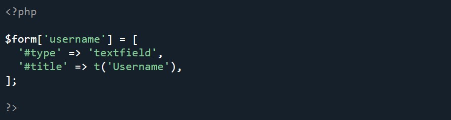
Drupal's Form API encourages the use of the #title property to provide clear and descriptive labels for form elements. This helps diverse audiences, including users relying on screen readers, understand the purpose of each element (e.g. ‘#title’ => t(‘Username’)).
As part of ongoing accessibility enhancements, it’s planned to create a new core test in the upcoming Drupal 11 that will check every module's forms and ensure that the relevant form elements have a #title property. The forms that don’t have it won’t pass the test so they can’t be added to the Drupal core.
- The #type property
The #type property is another property in Drupal’s Form API that’s essential for accessibility. It enables developers to specify the type of form element (e.g. ‘#type’ => ‘textfield’). This helps make forms more accessible by ensuring that screen readers can interpret and interact with specific form elements in a proper way.
- The #description property and the aria-describedby attribute
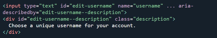
The #description property is used in Drupal's Form API to provide additional information or context for form elements (e.g. ‘#description’ => t(‘Choose a unique username for your account.’). This text is often displayed below the element.
However, for users who rely on assistive technologies like screen readers, the visual presentation may not be sufficient. This is where the ‘aria-describedby’ attribute comes into play. It is an Accessible Rich Internet Applications (ARIA) attribute that associates an HTML element with additional descriptive text. It makes sure that the screen reader reads out the additional description when the user interacts with the specific form element. The support for the attribute in the Form API was introduced in Drupal 8.0, and it’s a great example of WAI-ARIA attributes used in the Form API.
- Error handling
Form API provides mechanisms for validating form submissions and handling errors. It supports the display of form validation errors with clear error messages, helping users who rely on screen readers understand and address the errors. In Drupal 8 and later versions, the validateForm method is used for form validation.
- Ongoing FAPI improvements
In addition to the above-mentioned and many other accessibility features and enhancements in FAPI, the work never stops in this area. A lot more is planned to do in the near future, mostly related to cementing in the semantic relationships in FAPI, checking for form field titles, ensuring the proper management of form labels, allowing customized validation messages, using ARIA to link descriptive text, and more.
Form accessibility in the Inline Form Errors core module
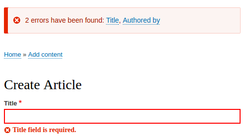
When it comes to the accessibility of form error messages, the Drupal core also includes a module called Inline Form Errors (also known as IFE). The module’s mission is to make sure form validation errors are displayed inline with the specific fields that need attention. A semantic alert at the top of the page lists all the fields that have an error, providing links to specific fields that require correction.
This provides more context and clarity for error handling. Users who rely on screen readers, screen magnifiers, and keyboard only are able to find the error for the relevant field with less effort.
The Inline Form Errors module is not enabled by default in Drupal core. This is meant to keep the core installation minimal and allow site builders to make decisions based on their specific needs. The Drupal core itself provides methods for handling form errors, and developers have the flexibility to use modules like Inline Form Errors or implement custom solutions to create a more user-friendly error presentation.
Form accessibility in the Webform contributed module
Webform, one of the most popular contributed modules of all times, provides an excellent UI with an outstanding choice of options for creating and handling online forms. The module’s creator, Jacob Rockowitz, wrote an article called “Webform for Drupal 8: DIY Accessibility” where he shared how he performed a DIY accessibility audit to properly self-assess the Webform module's accessibility as he was working on the stable module’s 8.x release.
Among other things, Jacob Rockowitz mentioned that the combination of reviewing the WCAG guidelines and comparing the feedback from two automated tools, WAVE and Pa11y, helped him see some immediate issues. He found and fixed a few problems related to the proper labeling of form inputs with appropriate contextual information for screen readers.
He also decided to publicly define the Webform module’s accessibility benchmark by adding the link to the audit results and the statement of commitment to accessibility to the project page. He encouraged the community to get involved with improving the accessibility of the Webform module and Drupal overall. He also created the Webform Accessibility documentation page on drupal.org.
Final thoughts
There’s no doubt that Drupal will remain steadfast in its unwavering dedication to accessibility. The best practices and features adopted within the CMS for all website components, including online forms, create a super favorable environment for websites to be accessible to diverse audiences. It’s more than just about meeting the accessibility standards — it’s about a commitment to inclusivity and aligning with the progressive values of the modern world. With the help of a trustworthy Drupal partner, this mission is easy to fulfill.