Extending CKEditor 5 in Drupal 10: a Couple of Great Contributed Modules
One of the most talked about features of Drupal 10 is the revamped text editor. CKEditor 5 offers a modern, light, and fresh user interface with improved icons, colors, and toolbar mechanics, making editorial experiences in Drupal more efficient and enjoyable for the user.
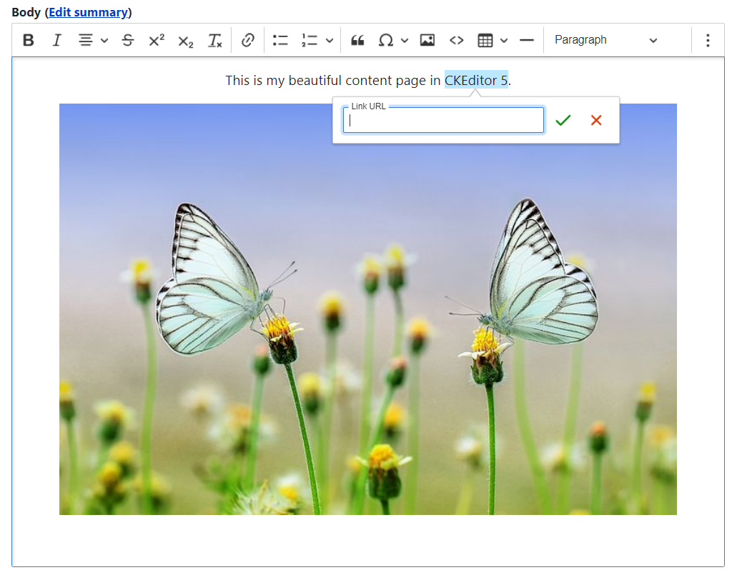
New balloon panels speed up link management and ALT text creation. Embedded media now has a dedicated panel for faster formatting. In addition, there is a toolbar to create tables on the fly, a reworked collection of special characters, an option to add images in bulk, and more.
In this post, we walk you through using a couple of useful contributed modules, created by the ImageX team, that build on the out-of-the-box capabilities and extend CKEditor 5’s potential in Drupal 10. The information about these modules is also useful if your website is based on Drupal 8 or Drupal 9.
A glimpse at shaping your CKEditor 5 toolbar in Drupal
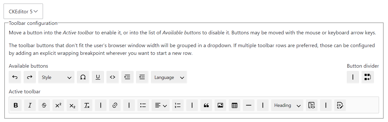
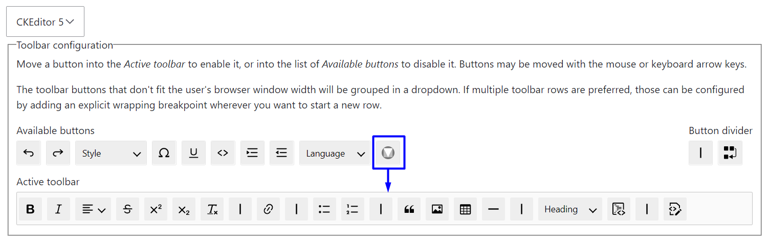
To begin, it's worth mentioning that CKEditor 5 in Drupal 10 hides more options in its settings than you see on the toolbar by default. You can activate additional buttons with no need to download anything. The CKEditor toolbar is designed for ultimate flexibility, allowing you to tailor it to include only the buttons you need. Furthermore, different text formats can have their toolbars customized for user roles with higher or lower permission levels.
To configure the CKEditor 5 toolbar in Drupal 10, go to Configuration > Content authoring > Text formats and editors, click “Configure” next to the format you want to change (Full HTML, Restricted HTML, or Basic HTML), and drag the needed buttons from the “Available buttons” to the “Active toolbar.” On the contrary, you can disable the unnecessary buttons by dragging them in the opposite direction. When you are done, scroll down the page to click “Save configuration.”
Extending Drupal 10’s CKEditor 5 with contributed modules
While the CKEditor 5 functionality in the Drupal 10 core is impressive, the tool is capable of much more. CKEditor 5 has a wide range of features, both free and premium, that are not part of the Drupal 10 core — at least, for today. Some interesting feature examples include autoformatting, word count, export to PDF and Word, spelling and grammar check, mentions, comments, tracking changes, revision history, and more.
There is always a way to connect a CKEditor 5 plugin to a Drupal 10 website for integrating a specific feature. Smooth integration can be provided by a Drupal module that registers a CKEditor plugin. Both custom and contributed Drupal modules are eligible for this job.
With the thriving Drupal community, chances are high that a contributed module for anything you might need already exists, so no wonder there is a great ecosystem of Drupal modules to extend CKEditor. However, we need some time until all contributed modules become fully ready for the 5th version of CKEditor, considering its brand new architecture.
Let’s see how to extend CKEditor 5 with the help of the following modules contributed by Bryan Sharpe and Aaron Christian of ImageX. These modules are in different stages of readiness for CKEditor 5 in Drupal 10 — from full support to being in active development.
The Material Icons contributed module
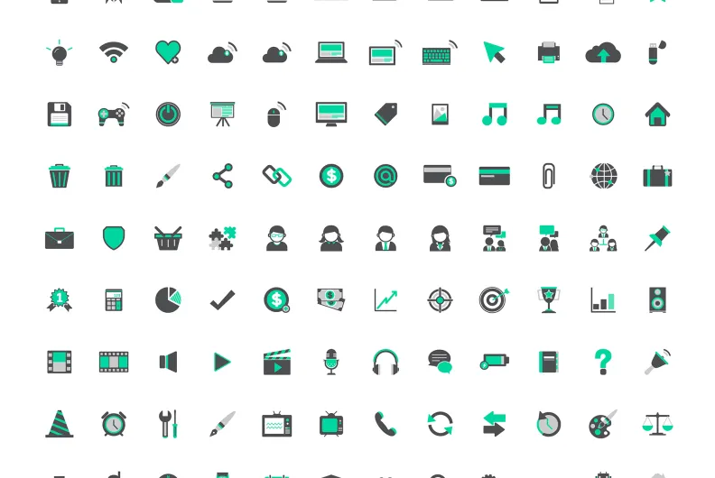
Icons can do a great job at drawing your audience’s attention to content, highlighting some important aspects, and helping users process the information. Material Icons by Google are described as simple, modern, and friendly. They are designed with readability and clarity in mind and optimized for great display across all platforms or device resolutions.
The huge collection includes around 1500 icons grouped into categories such as Action, Alert, Audio & Video, Communication, Social, and so on. There are icons for every concept you may need to depict on your content pages.
And the entire collection is at your fingertips for easy use in Drupal 10’s CKEditor 5 thanks to the Material Icons module. This contributed module fully supports CKEditor 5 starting with the 2.0.1 release.
1. Configuring the available icon styles
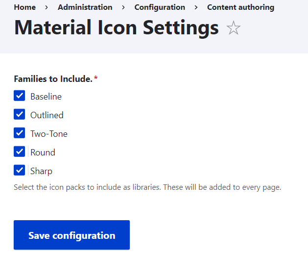
Google’s collection is represented in 5 styles — Baseline, Outlined, Two-Tone, Round, and Sharp, and the Drupal module fully supports this feature. So, with the Material Icons module installed and enabled on your Drupal website, you can proceed with configuring the icon styles by going to Configuration > Content Authoring > Material Icons.
The Baseline style family is the only one enabled out of the box. You can enable other styles by selecting their checkboxes. The selected packs will be added as libraries, so whenever you want to add an icon via your Drupal 10 website’s CKEditor 5 interface, you will be able to choose among those style packs.
2. Adding the Material Icons button to the CKEditor 5 toolbar
To use Materials Icons, you will also need to make the new button available on the CKEditor 5 toolbar:
- go to the “Text formats and editors” page
- click “Configure” next to the format you want to edit (Full HTML, Restricted HTML, or Basic HTML)
- drag the Material Icons button from the “Available buttons” to the “Active toolbar”
- click “Save configuration” at the bottom of the page
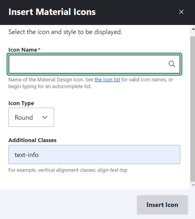
3. Adding icons to content in CKEditor 5
To use Material Icons in content, you can click the respective button in your Drupal 10 website’s CKEditor 5 toolbar and see a dialog box that enables you to:
- select the style family in the “Icon Type” dropdown
- optionally, add some CSS classes
- find icons via a search bar
- or follow the link to check out their entire list
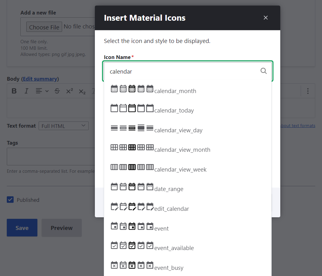
To find an icon, start typing its name or the name of the concept you want to depict. The relevant options will show up thanks to the autocomplete feature. Click on the icon you want to add and finalize the process with the “Insert icon” button. Done!
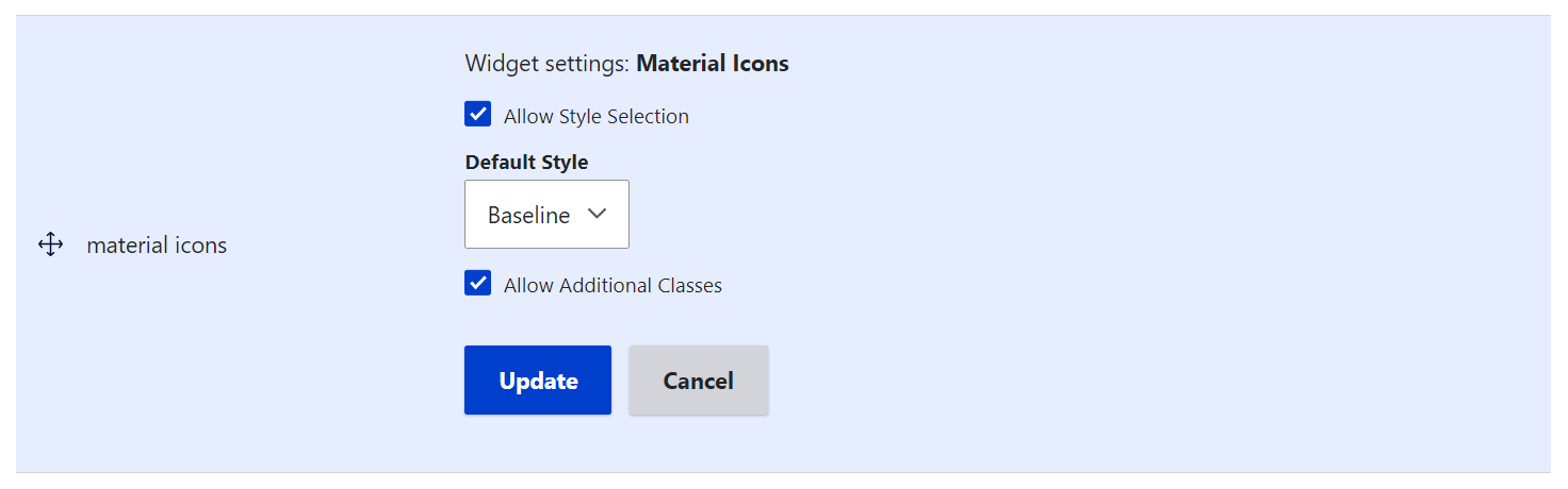
4. Beyond the inline use: a custom field type with a widget
The Material Icons contributed module is not limited by the inline use with CKEditor. The module also provides a custom field type, which can be added to the content structure. There is a field widget, which enables you to allow or disable style selection, select the default style, and allow or disable additional classes.
The CKEditor Bootstrap Grid contributed module
Next up is the Drupal module which enables you to create rows and columns in CKEditor based on the Bootstrap syntax. The Bootstrap framework is known for its great capabilities in building responsive, mobile-first pages. So the rows and columns that you build with the CKEditor Bootstrap Grid module by Bryan are meant to look perfect across all devices.
Version 2 of this contributed module has been a significant rewrite which made it more user-friendly and flexible. Starting with version 2.0.9, released on 19 May 2023, the module fully supports CKEditor 5. The maintainer has also taken care of 100% backward compatibility, which means you can use the module either with CKEditor 5 or for CKEditor 4 seamlessly.
1. Adding the CKEditor Bootstrap Grid button to the toolbar
When the module has been installed and enabled on your Drupal website, you need to add the Bootstrap Grid button to CKEditor’s active toolbar. The steps for adding a button are the same as the ones we have described earlier in this article — it’s all about drag-and-dropping it to the “Active toolbar” on the specific text format’s configuration page.
2. Adjusting the Bootstrap Grid settings per text format (optional)
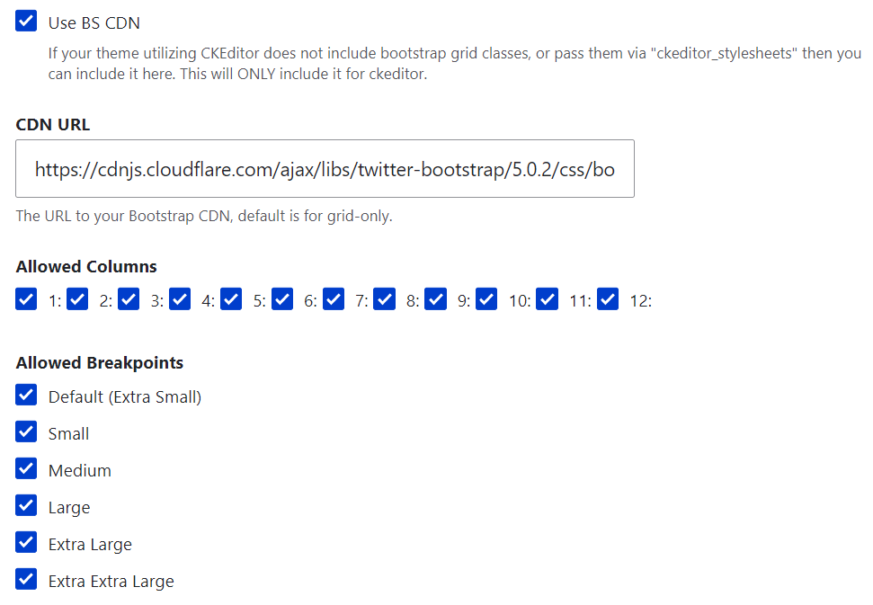
As you scroll down the text format configuration page after adding the button to the CKEditor toolbar, you will also see the CKEditor plugin settings for Bootstrap Grid. Here is where you can enable or disable the use of a Bootstrap CDN, and enable or disable the layouts with a specific number of columns, as well as specific breakpoints. By default, all the options are enabled here, and the CDN link is included, so you may not have to change anything.
These settings will apply specifically to the text format you are currently configuring. Be sure to click “Save configuration” at the bottom of the page once you have made your changes.
3. Detailed settings for Bootstrap Grid layouts (optional)
By going to Configuration > Content authoring > CKEditor Bootstrap Grid, you will be able to configure every detail of the grid layouts for all breakpoints. The default settings are very sensible, so there may be no need to adjust anything.
The breakpoints define at which width the grids should change their layouts to provide optimal viewing experiences based on the devices they are viewed from. It is essential to mention that the media queries, in this case, do not relate to the screen size but to the size of CKEditor, which is an iFrame inside a window.
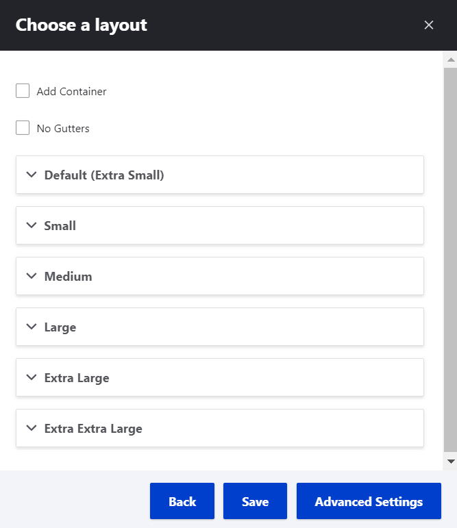
There are six breakpoints available out of the box — Extra Small (xs), Small (sm), Medium (md), Large (lg), Extra large (xs), and Extra extra large (xxl).
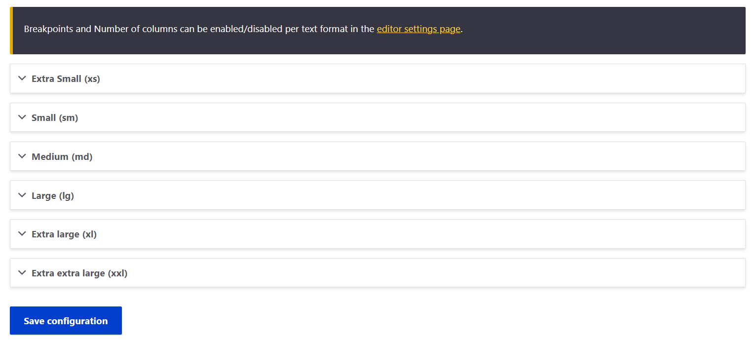
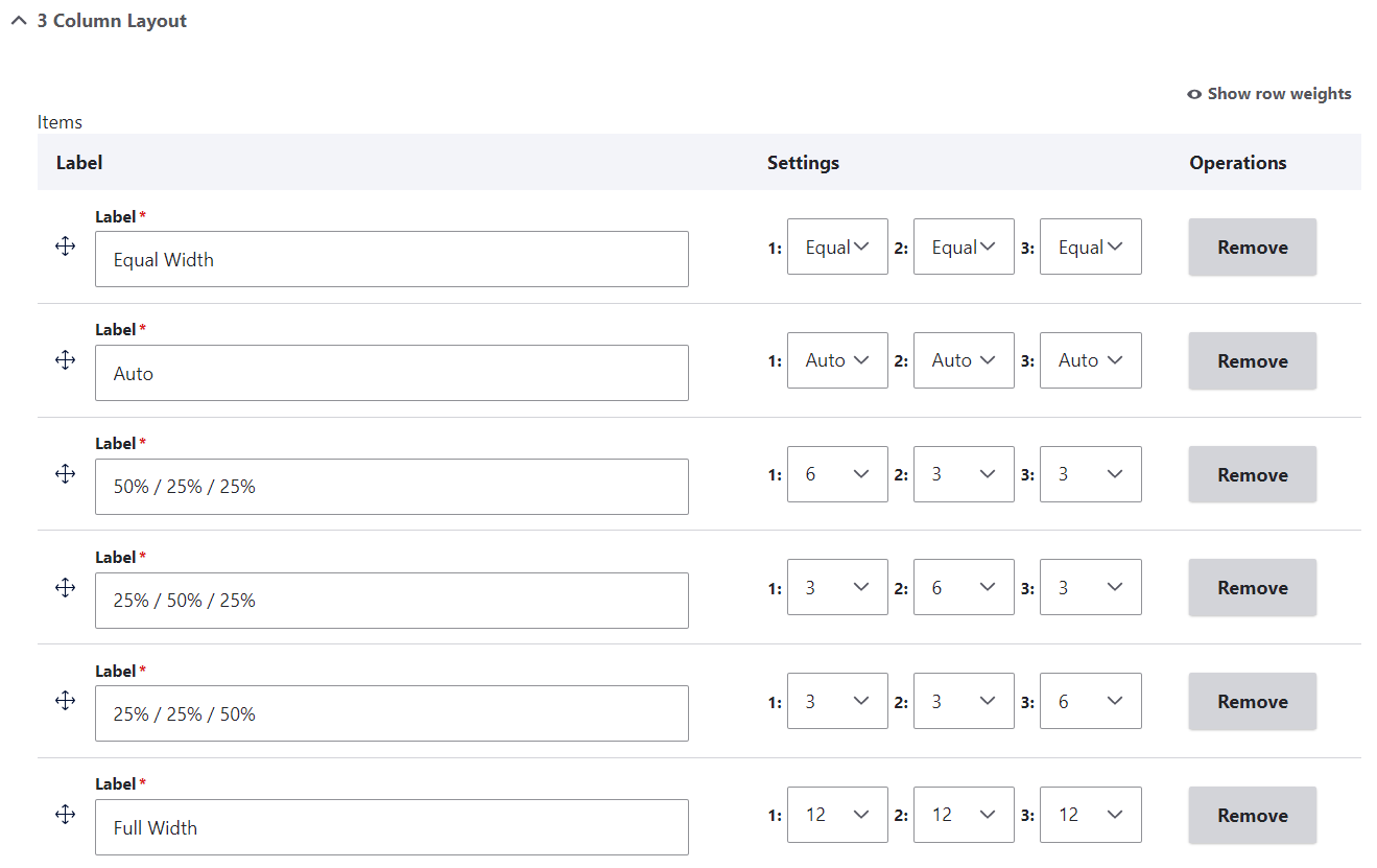
You can expand each breakpoint, edit its label, and adjust the layouts for each number of columns. This includes the equal width, the auto, and the full-width modes, as well as specific proportions between the columns.
4. Creating a Bootstrap grid in CKEditor
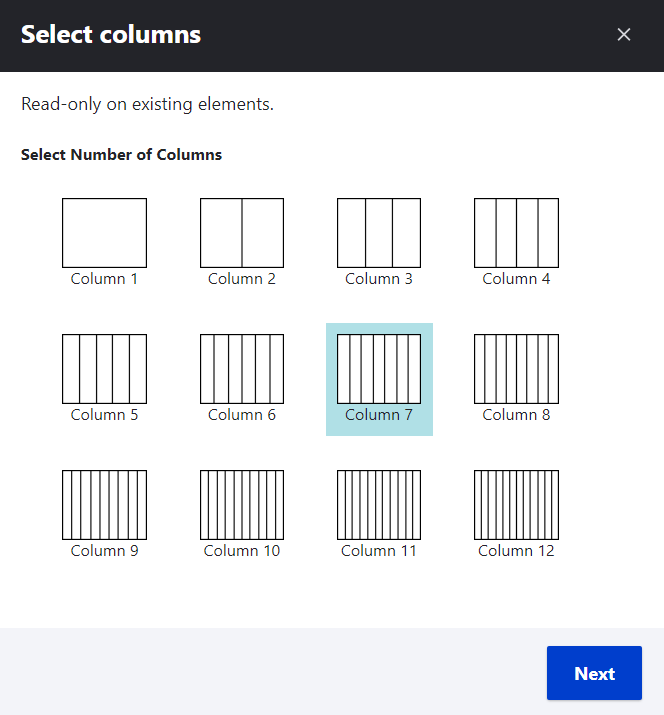
When in CKEditor, click the “Insert Bootstrap Grid” button on its toolbar. The dialog box will invite you to select the number of columns.
As you click “Next,” you will see the dialog box for choosing a layout. Optionally, you can click to add a container (default, fluid, or wrapper).
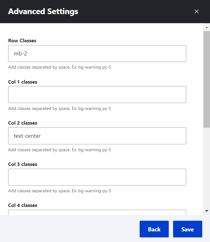
The advanced settings enable you to optionally add classes to the grid.
The CKEditor SVG Icon module
The next tool that we’d like to feature in this post is the CKEditor SVG Icon module by Aaron. It’s a brand new Drupal module — fresh out of the development oven, created in early 2023 specifically for CKEditor 5 in Drupal 10. The alpha version of the module is currently being actively developed, so we are anticipating new features and improvements in the near future.
The CKEditor SVG Icon module provides the functionality for inserting inline SVG icons via the CKEditor 5’s interface once you’ve added a collection of icons as a single sprite. The SVG (Scalable Vector Graphics) format is great for icons because:
- they can be scaled up or down without losing any quality, which makes them convenient for displaying at different sizes on different devices
- front-end developers can style SVG icons or add advanced effects to them using CSS or JavaScript
- SVG icons are also small in file size
- they are accessible to screen readers and other assistive technologies
With the CKEditor SVG Icon module installed and enabled on your website, you will need to make its button available on CKEditor 5’s active toolbar. Just like with the previous modules we’ve described in the article, this can be done on the “Text formats and editors” page for a particular text format.
Next, you’ll need to add a collection of SVG icons to your Drupal website that is going to be used in CKEditor 5. Currently, in the module’s 1.0.0-alpha1 version, this can be done by adding an SVG sprite (such as this one) to the website’s theme folder. However, the module’s creator is actively working on the option to add icon collections as a simple link via the Drupal admin dashboard. This option will soon be available in CKEditor 5 plugin settings, just below the toolbar configuration. By opening the “SVG Icon” plugin tab, you’ll find the SVG sprite path field for inserting the link.
With the button added to CKEditor 5’s active toolbar and a sprite of icons added to your Drupal website, you’ll be able to insert SVG icons via CKEditor 5’s UI. Just click the SVG button and put in the icon name/ID and size — Extra Small (xs), Small (sm), Medium (md), Large (lg), Extra large (xs), and Extra extra large (xxl).
It needs to be noted that the module does not support icon previews out of the box in CKEditor 5 — at least, for today. To have previews, you’d need to implement a hook, which can be found on the module’s drupal.org page.
Final thoughts
Extending CKEditor 5 in Drupal 10 with a wide array of features can greatly empower your editorial teams. It’s great to know the Drupal community creates useful contributed modules to extend CKEditor 5, and we at ImageX are happy to be involved.
Any use cases that are not covered by existing contributed Drupal modules can always be resolved through custom coding. Don’t hesitate to contact our Drupal development team whenever you need to set up some extra functionalities to CKEditor on your Drupal website.


