Want to Boost Leads and Conversions? Start by Improving Your Website Design
Is your company’s website working for you? Is it positioning you within your industry? Clearly defining what you do and how you do it? Driving lead generation and conversion? Keeping existing customers informed and engaged?
If you answered no to any (or all) of these questions, you’re not alone. Many businesses find it difficult to evolve their websites to meet rapidly changing shifts in consumer norms and expectations. But living through a global pandemic has underscored the importance of creating and maintaining a rock-solid online experience across all channels. Customers and prospects expect to easily navigate your company’s site and find what they’re looking for, whether on their laptop, tablet, or phone. And if it’s not a seamless experience, they’ll look elsewhere.
That’s why it’s vital to take a careful look at your website and make substantive changes. However, if your time and resources are limited, it can be challenging to know what to concentrate on in order to maximize the return on your investment.
We’ll walk you through where to focus your energy. Taking these three steps will dramatically improve your website’s ability to support your varied business objectives.
Step 1: As a Team, Establish Your Website’s Purpose and Goals
Your internal stakeholders look at your website through the lens of their experiences. Their departmental goals influence their opinion on what your website’s purpose is and how it should be structured. For instance, your C-suite sees your site as a vehicle for advancing the company’s overall strategy and positioning.
Meanwhile, the marketing team wants to tell stories that differentiate you from your competitors. Your products and services team urges you to highlight their innovation and expertise front and center. But the sales team would simply like more prospects to fill out contact forms so they can follow up on viable leads.

Trying to make all these goals a priority results in a website content strategy that is ill-defined at best and nonexistent at worst.
So the first thing you need to do in order to transform your website is getting your internal stakeholders on the same page. Hold a website strategy session with team members across departments to establish clarity about the overarching purpose of your website. Together, you will need to determine how to balance business needs with customer needs.
Your resulting plan will drive decisions around everything from what to put on the homepage to how you’ll invite customers to navigate deeper into your site.
Step 2: Transform your Homepage into an Agile Marketing Tool
Your homepage gives prospects their first impression of your business. And you only have seconds to capture their attention and demonstrate that they have landed in the right place. Therefore, it’s crucial to design your homepage using current UX strategies and forward-thinking design principles.
Too often, homepages are stuck in the past and become a repository for every piece of content that could possibly be important to any user anywhere. The result? Cluttered spaces that simultaneously overwhelm site visitors with too much content while failing to provide the information they want.
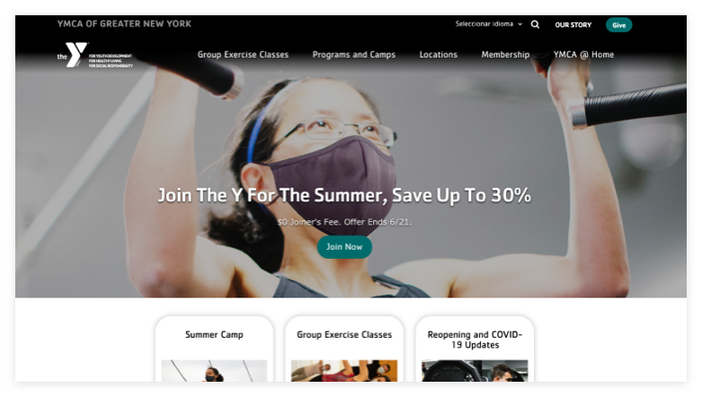
By contrast, modern websites construct the all-important homepage as a springboard that launches users into the areas of the site that are just right for them. To make this shift, you must make hard decisions about what belongs in the spotlight. To begin, you need a well-crafted hero area that grabs attention and begins the process of directing site visitors into deeper navigation.
Define (or Refine) Your Hero Area
A hero area is designed to give at-a-glance, big-picture information about who your company is and what you do. Your hero area can include a large image or design element and should expand across the entire width of your website. Most importantly, the hero area should distill your company’s purpose and value proposition into one or two sentences.

Keep in mind that, at this stage, readers skim and scan. This is not the time to provide in-depth content. Rather, your homepage and hero area should be lighter on the amount of content users need to consume while clearly providing intuitive navigation options for where to go next. And all of these pathways should be designed based on the goals and objectives your team defined in your strategy session.
Provide Navigation Pathways to Content Areas
From the hero area, your site visitors will naturally scroll down. This is where the notion of your homepage functioning as a springboard comes in. As you begin to offer users glimpses of your content and guide them deeper into your site, they will discover natural springboards into new content areas.

When scrolling, readers should be able to easily click areas of interest to learn more about your products, services, and methods. But don’t overwhelm them. It should feel like a natural progression. If you offer too much content too soon in the journey, users might give up. They don’t want to wade through content that doesn’t pertain to them. That’s why offering clear pathways is best.
Your goal should be to continually lead users to the next point in their journey. Then, once the user has progressed down their desired path, you can provide the in-depth content that aligns with the navigation choices they have made.
Use Storytelling to Increase Interest and Engagement
Stories are powerful. They humanize complex topics, bring dry concepts to life, and transform boring websites into interesting and stimulating spaces. On your homepage and throughout each pathway, use storytelling to draw your audience in and allow them to picture how you can meet their needs.
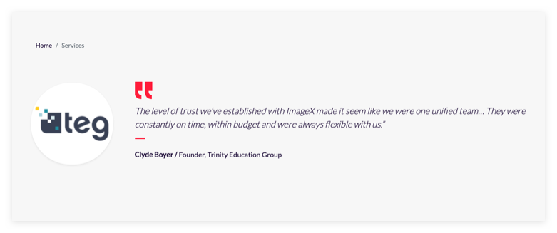
Whether it’s a glimpse of a case study that highlights how you solved a problem, a short quote from a satisfied customer, or an infographic that illustrates how your unique methodology works, find ways to turn facts and formulas into narratives that both educate and captivate your prospects.

Step 3: Take Your Website’s Search Functionality to the Next Level
Even if you have the most beautiful hero area and navigation pathways possible, your prospect could still leave your site frustrated if they can’t find what it is they are searching for. After all, at its core, your website exists to connect your prospects and customers with the products and services you provide.
The best way to improve your search functionality is to determine how users interact with your site. For example, how do customers search for your signature product? What keywords do they use? Will they search by industry or by the brand name of the product? Or, are they more likely to search based on what their problem is and count on your website to offer up solutions?
Use Google Analytics to answer these questions and make adjustments to your search functionality in response.

Don’t Delay: Make Your Website the Powerful Tool it Should Be
Although there are many more strategies you should eventually employ to improve your website design and experience, don’t be overwhelmed. Make the decision to start where you can. Because even if you tackle nothing else, focusing on developing an overarching website strategy, transforming your homepage, and improving search functionality will radically boost your website’s performance.
By focusing on the basics first, you will begin the process of unlocking the power of your website. Create an online experience that meets your prospects where they are and educates them about how your company can best serve them. Because ultimately, the new conversions and leads your website produces today could become tomorrow’s loyal customer base.


