
Hot New Feature in Drupal 10: Views Responsive Grids!
Author: Nadine Nykolaichuk
Responsive web design is the greatest invention for making websites look great on all devices, which is extremely important for website usability, conversions, performance, SEO, and more. The automatic readjustment of the layout based on the screen width often looks like magic but we know there is hard work by frontend developers behind it.
This new feature in Drupal 10 is meant to make website interfaces ultra-responsive through the use of modern CSS methods, with less hard work and more magic involved. So let’s start discussing Drupal 10’s new and exciting Views Responsive Grids.
Getting acquainted with Views Responsive Grids in Drupal 10
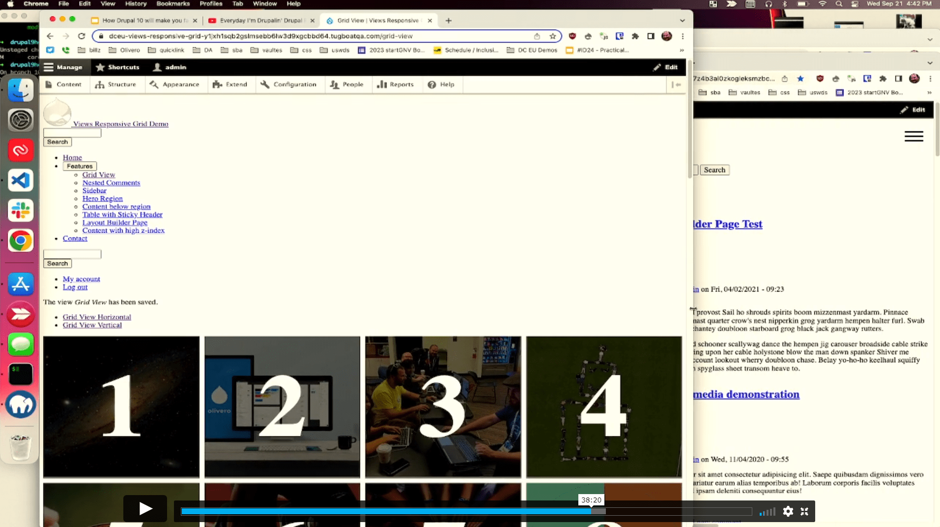
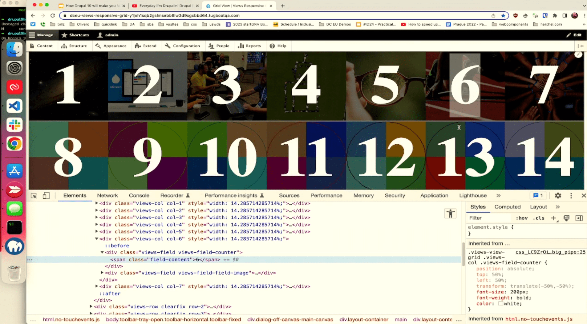
Views Responsive Grids is a new killer feature in Drupal 10 core that uses the power of modern CSS and provides a special format in the Views user interface for controlling the style options. A grid created in Drupal Views will automatically readjust itself to fit any screen width based on the maximum number of columns and the minimum grid cell width specified by a developer.
Responsive Grids enhance Drupal’s new frontend theme, Olivero. The feature was committed to Drupal 10 core in August 2022 and Mike Herchel, the lead developer of Olivero, announced the feature through his blog post. The Views Responsive Grids demo was shown at two sessions of DrupalCon Prague 2022 about the most exciting Drupal frontend features.
How Responsive Grids work
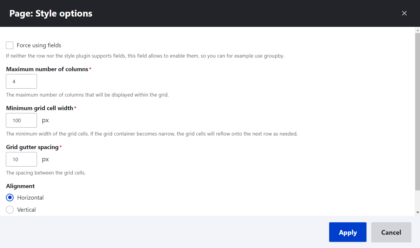
With View Responsive Grids, there is no longer a need to specify the number of columns based on screen widths. Instead of this, developers will specify the following values via the Views UI:
- the maximum number of columns
- the minimum grid cell width
- the gutter spacing between the grid cells
As the grid container gets resized, the cells resize as well to match the maximum number of columns allowed. However, once the minimum allowed cell width is reached, the grid reflows to have a lower number of columns. We have captured how it works from Mike Herchel’s CodePen and you can play around with grid containers there as well.
During his talk at DrupalCon Prague 2022 together with Andy Blum, Herchel was demonstrating Responsive Grids using the Stark theme in Drupal to show that the new feature was not dependent on the use of Olivero:
“It can work cross-browser and it’s just magical. As I resize this, you can see how it reflows. And it doesn’t take into account the screen width — it just fits. This is the super cool, super powerful stuff that I am really excited about,” — said Mike during the presentation.
At another DrupalCon Prague’s session that included the Responsive Grids demo (“How Drupal 10 will make you fall in love with Drupal theming” given together with Lauri Eskola), Mike said that the new feature was using the magic of CSS and no JavaScript for figuring out the required number of columns. He also mentioned the great time-saving opportunities offered by Views Responsive Grids:
“Every single project I work on, I rewrite some version of this. And this is going to save me hours of work,” — said Mike.
The same grid view can be used for wide and narrow regions, it just shows a different number of columns. This is achieved thanks to CSS not relying on the viewport width. The adjustment is made automatically, or “automagically,” as Mike put it in his blog post. The vertical alignment of the grid works just as well as the horizontal one.
“I know this is a killer feature because I have to write custom responsive CSS grids on every single client project. Ever. This is going to allow people to rip out lots of code (and associated technical debt)!” — wrote Mike about Responsive Grids.
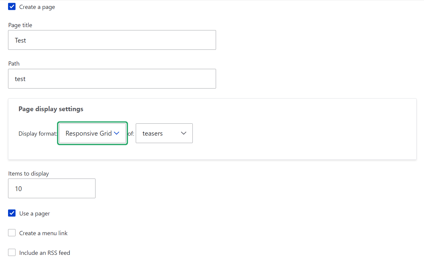
How to specify the grid values in the Views UI
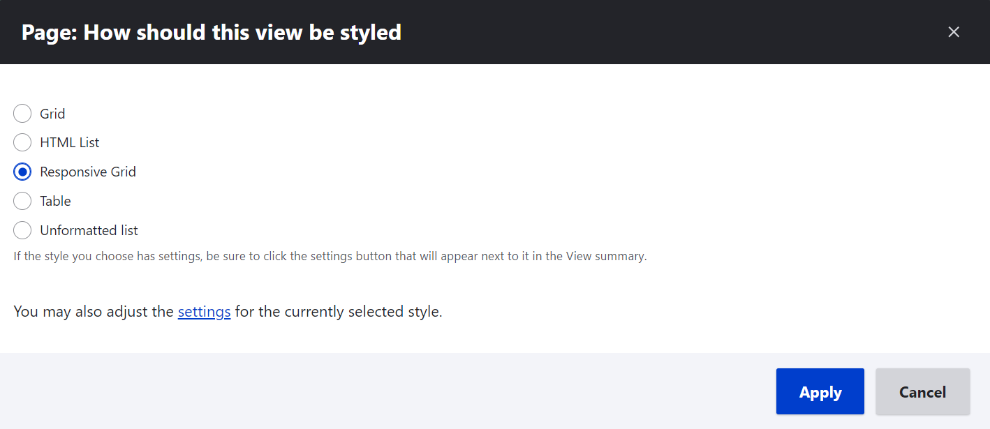
The above-mentioned maximum number of columns, minimum cell width, and gutter spacing for grids can be specified via the new display format in Drupal Views. When creating a new view, you will need to select “Responsive grid” as the display format under “Page display settings.”
Once the view is created, you can click on “Responsive Grid” under Format and adjust the grid style options in a few clicks. If you need a more detailed overview of Drupal Views and its interface, you can check out our blog post.
The old Views Grid system in Drupal
The old Grid format in Drupal Views had some stumbling blocks in it that did not allow the core developers to refactor the CSS and make it responsive. This is because the system was developed before responsive web design came into the scene. Every row or column in it was wrapped into a <div> element to which CSS classes were added.
“You can look at the old markup right here. You can see that each row is wrapped into a <div>, and it makes it impossible for it to be responsive,” — said Mike in his DrupalCon Prague presentation as he was showing the old system just before demonstrating the new Responsive Grids. “Sure enough, if I resize this, it doesn’t reflow.”
The arrival of the new Olivero theme finally gave Mike Herchel a chance to get rid of the <div> element in the old Grid format with no backward compatibility issues. “This was possible because Olivero is for new sites, and people won’t be upgrading to it,” — explained Mike in the blog post. However, there was also another big thing that prevented Drupal from fully using modern CSS, and that was the support for Internet Explorer 11.
New opportunities for Drupal’s frontend without IE11
The support for Internet Explorer 11 was stopped in Drupal 10, which received an ocean of applause in Drupal circles. This became a sea change for Drupal’s frontend because so many opportunities became available that were previously blocked by the need to support IE.
At DrupalCon Prague 2022’s session called All the cool things you can do when you don’t support IE11 (and how we can use these in Drupal core), Mike Herchel and Andy Blum talked about CSS custom properties, new CSS selectors, properties, and values, JavaScript optional chaining, and lots of other cool things you could do now that the “nasty and crafty” IE11has vanished into the past.

Obviously, Views Responsive Grids were among the new exciting changes that became possible thanks to the end of support for IE11. Mike Herchel was able to refactor Olivero’s Grid implementation and create the Responsive Grids feature with the help of other Drupal contributors, both with the frontend and backend expertise.
Final thoughts
Drupal is truly committed to providing outstanding user experiences across all devices. Views Responsive Grids are yet another big step in Drupal’s journey to perfection in this field. The new feature looks great and creates new opportunities in web design services, as well as making them more time- and cost-effective. Talk to our team if you need any help or have any questions about making your website responsive.