
The Bootstrap UI Kit Module for Drupal: All UI Elements at Your Fingertips
Authored by: Nadiia Nykolaichuk & Aaron Christian
The Bootstrap framework is one of front-end developers’ greatest allies in the mission to craft visually appealing and responsive web pages. By providing a wealth of ready-made UI components and other features, Bootstrap significantly speeds up and simplifies developers’ workflows.
While developers are the main audience of the framework, people with less technical expertise, such as content editors, can also use its features. We’ve recently described the CKEditor Bootstrap Grid module created by our team’s developer, which is a great example of how the power of the Bootstrap framework is brought directly to the text editor on Drupal websites.
We are proud and happy to support our devs’ efforts in creating modules that make various Bootstrap functionalities easily available for Drupal. The collection of these useful modules is already extensive and keeps growing, and we enjoy informing the Drupal world about them. This time, let us introduce the exciting Bootstrap UI Kit module built by our developer Aaron.
Read on to discover in every detail how the module gives you easy access to every single Bootstrap component on your Drupal website.
A glance at the Bootstrap framework
Before we move on to the Bootstrap UI Kit module, let’s give the Bootstrap framework some more attention. This powerful open-source framework is a treasure trove of ready-to-go, highly customizable, stylish, and user-friendly design templates based on HTML, CSS, and JavaScript. They provide any kind of components your website’s UI may need — a button, a card, a carousel, an alert, a form, a progress bar, a jumbotron, an accordion, a dropdown, a carousel, a modal, a navigation bar, and so much more.
The Bootstrap framework can boast outstanding responsive design capabilities. It ensures that web layouts look great and provide seamless user experiences regardless of the screen they are viewed from — be it a small smartphone to a widescreen monitor. Bootstrap wields a flexible grid system with columns that rearrange depending on the device's screen size. Websites built with Bootstrap also work smoothly across different browsers.
With Bootstrap, you can also rely on Sass for a modular and customizable architecture, add interactivity to your projects with powerful JavaScript plugins, use Bootstrap’s extensive SVG icon library, build and extend in real time with CSS variables, and much more.
The Bootstrap UI Kit module for Drupal
The main purpose of the module
Bootstrap components are numerous so wouldn’t it be great to have a centralized place for all of them on a Drupal website? The Bootstrap UI Kit module by our developer Aaron Christian will seamlessly provide it! With this module installed, you can have a clear representation of how all Bootstrap components on your Drupal website look and behave, all from the same place and in just a few clicks.
Designed for Bootstrap-enabled themes
It needs to be noted that the UI Kit works for Bootstrap-enabled themes — the themes that utilize the Bootstrap framework's HTML, CSS, and JavaScript components for creating the visual design and interactive elements of the Drupal site. This can be one of the following cases:
- You are using — or subtheming from — one of the contributed Drupal themes specifically designed to work with Bootstrap. They provide ready-to-use templates, layouts, and components, and often include additional Drupal-specific features, such as integration with Drupal's admin UI or support for Drupal modules. Examples include the Bootstrap theme, the Bootstrap Barrio theme, the Radix theme, and more.
- You have custom Bootstrap integration (the Bootstrap framework has been manually incorporated into your custom Drupal theme with the necessary Bootstrap files included).
Releases and compatibility
The Bootstrap UI Kit is a new arrival in the ecosystem of great Drupal modules for Bootstrap. It was released in 2023 and is currently in its alpha state of development. The module works not only with the latest major Drupal core release — Drupal 10 — but also with Drupal 9 and Drupal 8.
Viewing your Bootstrap components in the UI Kit
Right out of the box, the module provides a centralized place for all of your Bootstrap components at the /ui-kit URL address of your Drupal site (e.g. https://my-example-website/ui-kit). It uses your theme but removes its header and footer.

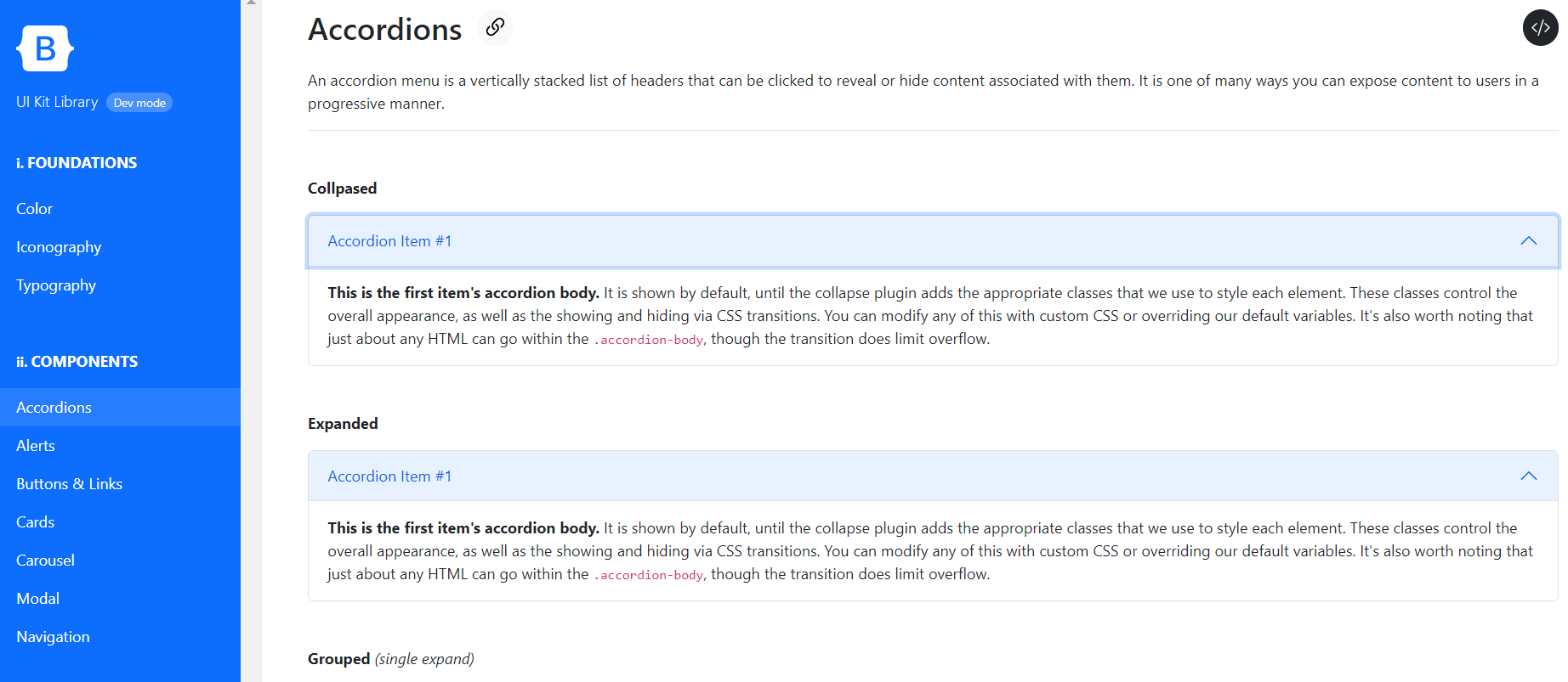
The UI Kit has a sidebar glossary menu of sections, which may vary based on your site’s customizations. Here is what UI Kit sections that you’ll have out of the box (with the exception of icons that will only appear there when you add them via the configuration page, which will be described further in this post):
- Fundations (Colors, Iconography, and Typography)
- Components (Accordions, Alerts, Buttons & links, Cards, Carousel, Modal, and Navigation)
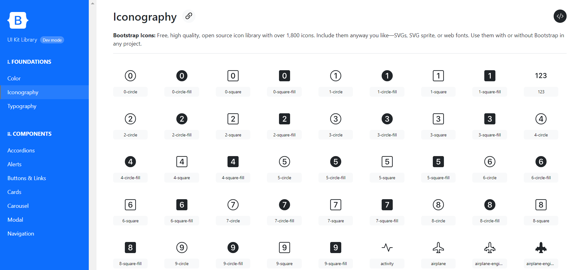
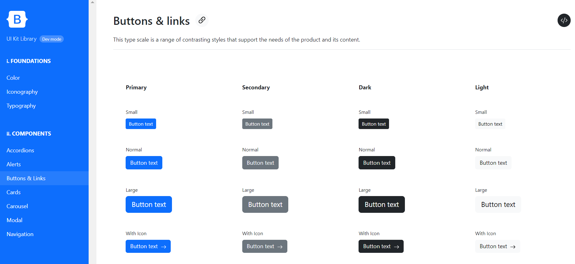
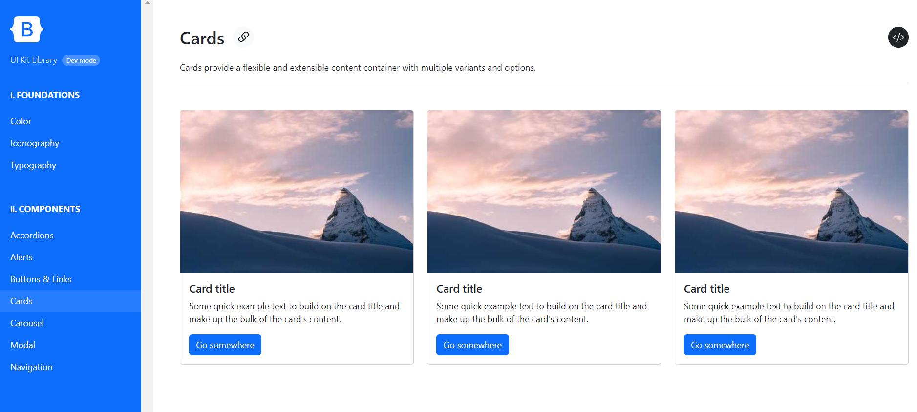
When viewing a specific section, you not only see how the elements look but also how they interact with the user — for example, how the buttons change their colors when hovered over, how accordion menus expand and collapse, how the carousel items are cycled through, and much more.
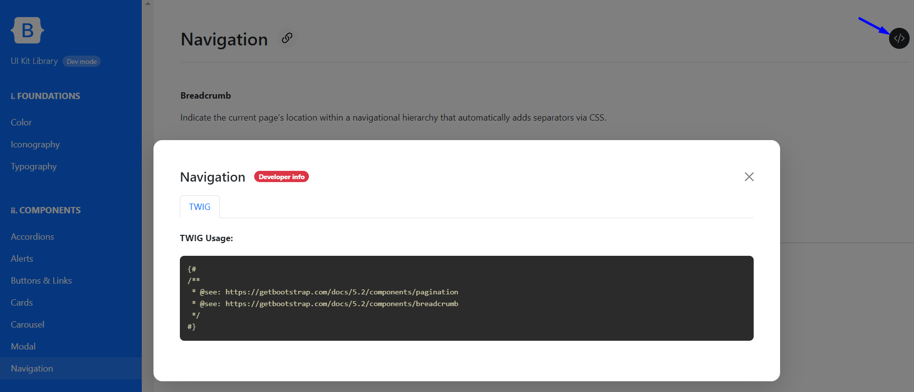
Developer mode with example code
Viewing how the elements look and behave is great, but you often need to dig a little deeper and see the underlying code. The Bootstrap UI Kit gives you this opportunity as you just click the </> icon at the top right corner of a page. It will open a modal window with additional developer information, which often includes the code snippet. For this feature to work, you’ll need to enable the developer mode on the configuration page, which we’ll discuss right next.
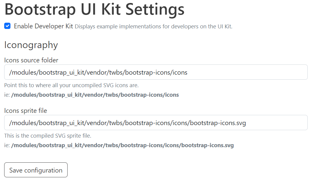
The Bootstrap UI Kit Configuration page
The configuration page for the Bootstrap UI Kit module is found at the Configuration > User interface > Bootstrap UI Kit page of the Drupal admin dashboard.
You can enable or disable developer mode on this page by checking or unchecking the respective box.
This page also allows you to add iconography to your Drupal website by providing:
- the icons source folder containing your uncompiled SVG icons
- the compiled SVG icons sprite file.
Example 1:
- the icons source folder: /modules/bootstrap_ui_kit/vendor/twbs/bootstrap-icons/icons
- the icons sprite file: /modules/bootstrap_ui_kit/vendor/twbs/bootstrap-icons/icons/bootstrap-icons.svg
Example 2:
- the icons source folder: /themes/custom/THEME_NAME/assets/icons
- the icons sprite file: /themes/custom/THEME_NAME/dist/images/icons.svg
Customizations for the UI Kit
You can change the look and feel of the UI Kit for your Drupal website to your liking by customizing the colors, fonts, paddings, margins, etc., with CSS3 variables. An example would look like this:
--bootstrap-ui-kit--sidebar-bg-color: var(--bs-primary, #180733);
Using the Twig template engine, you can also fully customize the structure of the UI Kit. Since its sections are built in Twig, it’s possible to override the defaults in your Drupal theme or module and then add, remove, or rearrange the sections to your liking. Currently, there is no functionality to do the same through the UI but it may appear in the future.
The GitLab repository for the Bootstrap UI Kit module is full of helpful Twig templates for your easy customizations. For example, there is a boilerplate for creating a custom section in the Bootstrap UI Kit, which you can grab and use, and here are the basic steps involved:
- Copy the directory @bootstrap_ui_kit/ui-kit/boilerplate to @:active_theme/templates/ui-kit/:section_id. You can also set a custom theme/module in the Twig glossary array.
- Rename the Twig template inside your new section to :key.html.twig, where :key represents the top-level category this section belongs to.
- Add theme libraries (JS/CSS) as you normally would, attaching them to your active_theme.libraries.yml file.
- Clear cache and refresh.
With this done, you’ll have successfully created a custom section in the Bootstrap UI Kit and can start building your own components. Among other things, you will be able to override the examples provided by the developer modal that will be displayed in the Kit.
All custom sections together with the docs will be auto-discovered by the module and provided with deep linking within the UI kit (e.g. /ui-kit#your-custom-section) without any additional effort on your part.
Other features of the module
The Bootstrap UI Kit module for Drupal can actually do more cool things than described above and, considering its dynamic development, it’s going to have even more capabilities in the future. Here are at least some examples of its other features:
- Based on the best practices of web accessibility, it uses the “Are My Colours Accessible” API for automatic color contrast checking.
- The module’s maintainer has great ideas for customizing the UI Kit per project. The current auto-discovery functionality for custom sections is just the beginning.
Final thoughts
We have walked you through using the Bootstrap UI Kit module for Drupal. Stay tuned for more publications and unlock the true power of your Drupal website in combination with top frameworks and tools. Whenever you need help with that, our experienced Drupal team is always here for you.