12 Best B2B Website Designs That Drive Results

Your B2B website decides whether prospects stick around or click away to competitors. Modern buyers spend months researching solutions, get eight stakeholders involved in purchase decisions, and expect websites that help them make smart choices.
Today's buyers are different. 71% are Millennials or Gen Z who grew up clicking through polished apps and websites. They won't put up with slow, confusing sites when they're evaluating vendors for important business decisions.
The best websites give prospects what they need without making them work for it. These sites look professional enough for the boardroom while helping people find answers and take action.
Here are 12 B2B websites that drive results plus the specific strategies and features that make them work.
Why B2B Website Design Actually Matters
B2B buying has changed. 63% of B2B leads take at least three months to decide, so your website needs to support people who are researching carefully rather than buying on impulse.
Multiple People, Multiple Priorities
B2B purchases involve different people who care about different things. The CFO wants cost numbers. The IT person needs technical specs. End users care about whether this thing will make their job easier or harder. Your website has to work for all of them.
This creates real design challenges. You need to organize information so different people can find what they're looking for fast and trust signals that work for security-conscious buyers who research vendor security track records before they'll even talk to sales.
ROI Pressure Drives Everything
57% of B2B buyers expect positive ROI within 3 months, which means you need to communicate value immediately. Your website has to grab attention and back up claims with real evidence.
The best B2B websites balance emotion with facts. They use compelling visuals and stories to get people interested, then support those claims with data, case studies, and detailed product information.
What Makes B2B Websites Work
Looking at websites that convert well reveals patterns that support complex buying processes while keeping people engaged.
Clear Communication and Smart Navigation
The best B2B sites tell you exactly what they do, who they help, and why you should care within seconds. Visitors get your value instantly. Vague messaging makes prospects work harder to understand what you're selling, and they'll just go somewhere else.
This clarity extends to how people move through your site. B2B websites need navigation that works for different research styles. Some people browse by industry. Others look for specific products. Good sites give you multiple ways to find the same information without making you feel lost.
The foundation works when messaging and navigation support each other. Clear value propositions guide navigation decisions, while logical site structure reinforces your core message. When someone lands on your homepage and immediately understands what you do, they know exactly where to click to learn more. When they reach product pages, the information architecture matches their mental model of how solutions should be organized.
This foundation is important for B2B sites because buying decisions involve multiple stakeholders with different information needs:
- The CFO needs clear cost structures and pricing transparency
- Technical evaluators need detailed specifications and integration details
- End users need to understand daily workflow impact
Great navigation serves all these needs without creating confusion.
The Conversion Formula: Content Depth + Trust + Action
B2B buyers read extensively during research. Case studies show real results. Whitepapers prove your expertise. Resource sections become bookmarks people return to throughout their buying process. But content depth alone doesn't convert visitors.
Trust signals matter more for B2B sites because one bad decision affects entire organizations:
- Security certifications and compliance badges
- Client logos and detailed case studies
- Awards and industry recognition
These elements work together to build confidence throughout the research process.
Conversion happens when you provide natural opportunities for action. Smart calls-to-action, demo requests, and trial offers capture interest when people are ready. The best B2B sites balance helpful content with opportunities to take action without feeling pushy.
This formula works because it mirrors how B2B buyers make decisions. They consume content to educate themselves, look for social proof to reduce risk, then take action when they feel confident. Sites that support this natural progression see higher conversion rates and better lead quality.
12 B2B Websites That Get It Right
These examples show different ways to solve common B2B website problems while keeping people engaged and moving toward decisions.
1. Trinity Education Group
Why it works:
Trinity needed to scale their online platform for millions of teachers and students. Their website shows how B2B education companies can explain complex technical capabilities without overwhelming people.
The site focuses on impact rather than technical details. Bold headlines and well-written case studies highlight real results while keeping the focus on educational outcomes that matter to buyers.
Standout feature:
Resource sections with clearly explained solutions and success stories that teach decision-makers what they need to know without requiring sales calls. Content reaches the right people while showing measurable impact.
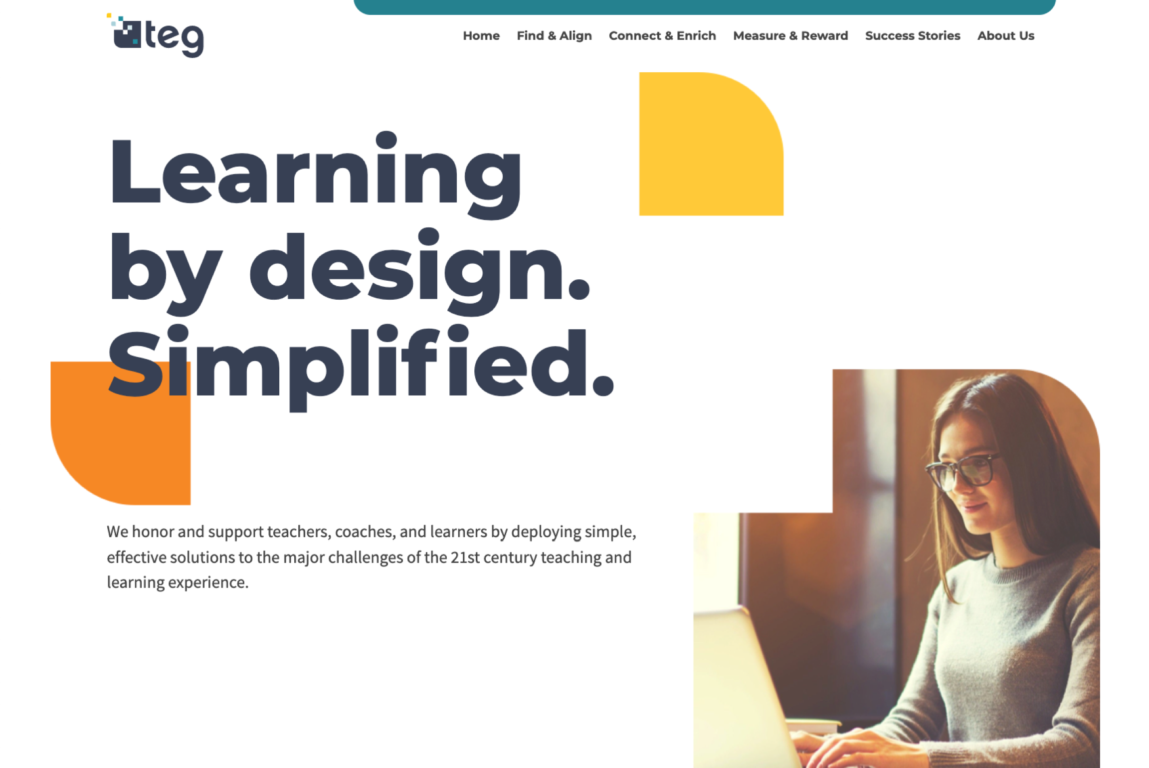
Visit Trinity Education Group
2. Verogen
Why it works:
Verogen sells specialized equipment to forensic labs and needs a website that balances technical credibility with explanations that help different people on buying committees understand complex solutions. They have a site that serves both scientific rigor and business decision-making needs.
The clean layout keeps focus on forensic genomics solutions. Simple design makes complex information digestible while maintaining the scientific credibility that matters to buyers. ImageX's approach focused on creating clear pathways for different user types without overwhelming technical audiences.
Standout feature:
CTAs tailored to the scientific community alongside resource sections that answer technical questions without requiring consultation requests.
Visit Verogen
3. Onset Data Loggers
Why it works:
When Onset needed to combine two different brands under one website, ImageX built a Drupal 9 solution that works for both technical buyers and business decision-makers.
The site organizes complex product catalogs while supporting different research needs. Clear paths help users navigate product lines based on what they're measuring and where they're using it without creating choice overload.
Standout feature:
Unified e-commerce platform built on Drupal 9 that prioritizes clarity and usability. Product comparison tools and application guides help technical buyers evaluate options efficiently while providing enough detail for confident decisions.
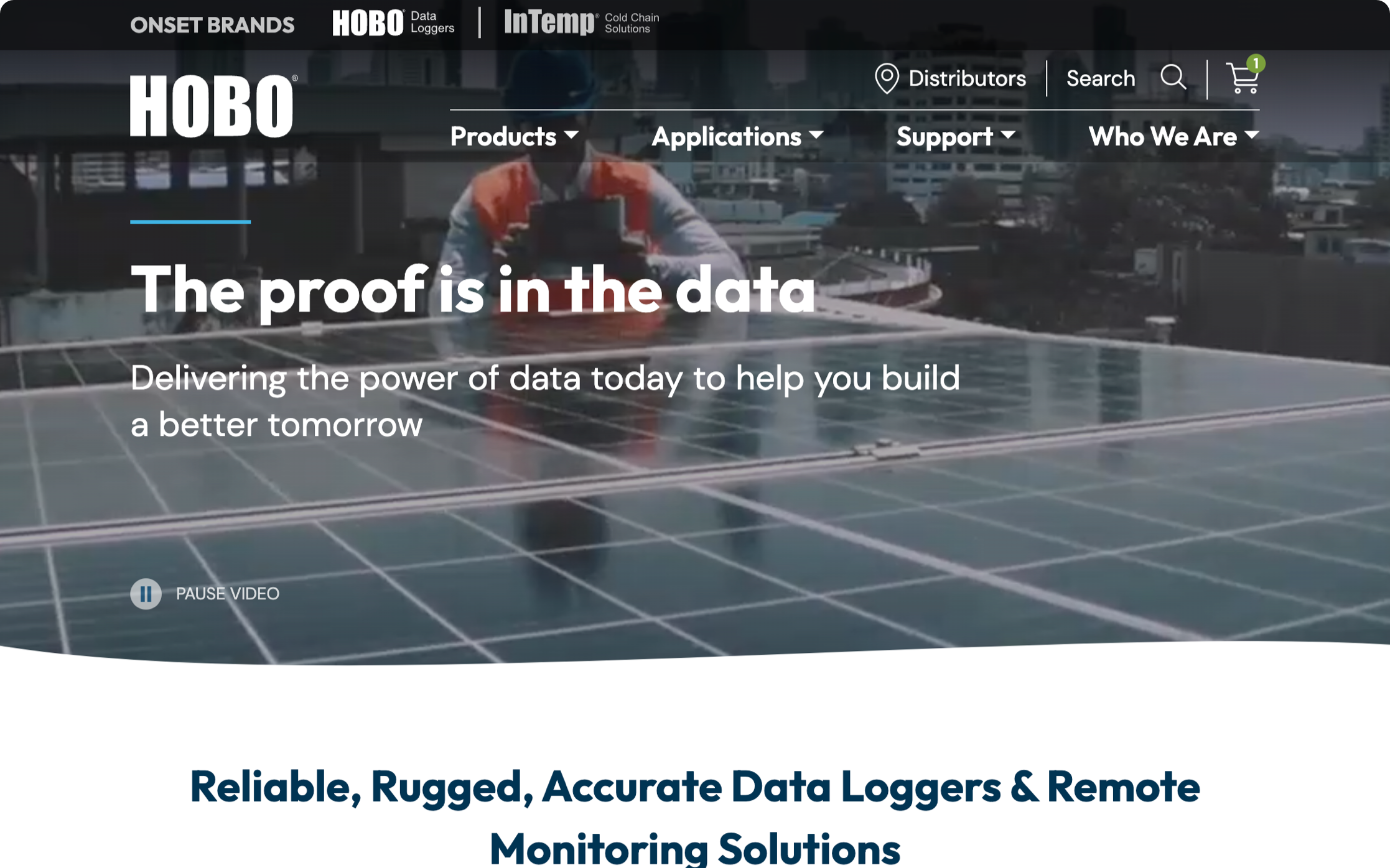
Visit Onset Data Loggers
4. Manning Elliott
Why it works:
This Canadian accounting firm needed to communicate trust and expertise while making complex services approachable for business owners. ImageX's redesign approach focused on balancing professional credibility with accessible service presentation.
Clear service organization helps prospects identify relevant expertise quickly. Professional imagery and clean layouts build credibility while maintaining an approachable personality that makes business owners feel comfortable reaching out.
Standout feature:
Resource section with tools, articles, and guides that show the firm's commitment to educating clients and supporting business goals beyond basic accounting.
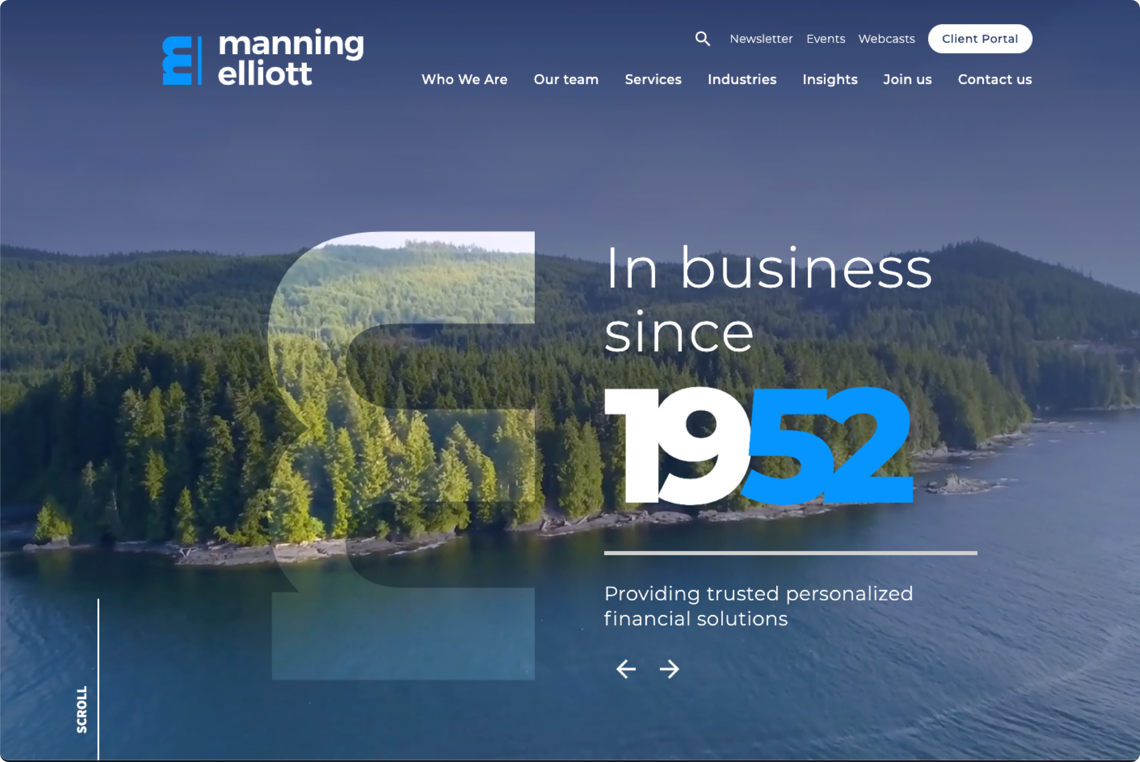
Visit Manning Elliot
5. NMS Labs
Why it works:
NMS Labs provides forensic and clinical laboratory testing services to complex B2B markets including law enforcement, healthcare, and legal professionals. ImageX's solution needed to serve diverse professional audiences while maintaining scientific credibility and regulatory compliance.
The site balances technical expertise with accessibility for different professional users. Clear service organization helps law enforcement officers, healthcare providers, and legal professionals find relevant testing services quickly without getting lost in scientific complexity.
Standout feature:
Comprehensive resource sections tailored to different professional audiences, providing the technical depth that forensic scientists need while remaining accessible to legal professionals who need to understand testing capabilities and limitations.
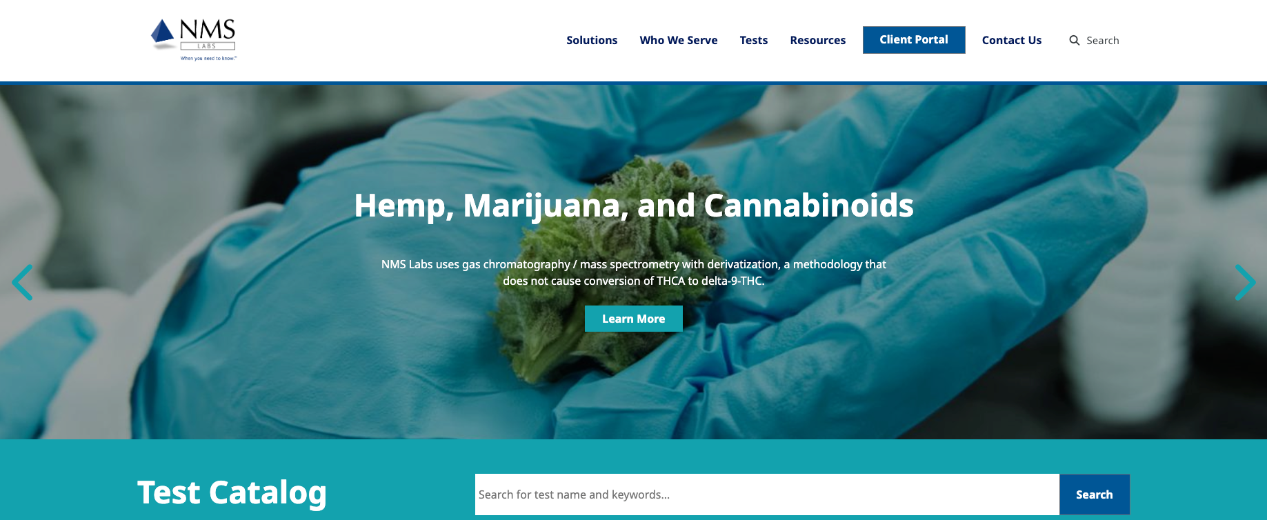
Visit NMS Labs
6. HubSpot
Why it works:
HubSpot sets the standard for B2B SaaS website design. The site is fast, intuitive, and packed with free tools that drive leads while showing platform capabilities.
Integrated approach lets users access templates, CRM demos, and educational content in one place. Perfect balance of product promotion and educational content keeps visitors engaged and coming back.
Standout feature:
Free tools and educational resources that provide immediate value while naturally introducing paid platform capabilities.
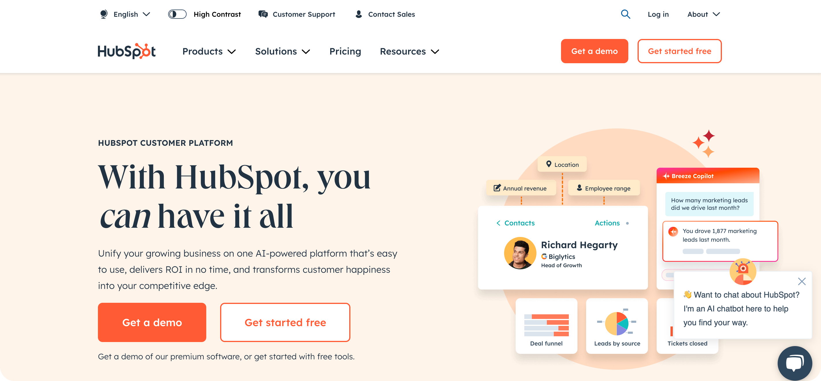
Visit HubSpot
7. Zendesk
Why it works:
Zendesk explains complex customer support solutions through clear visual hierarchy and straightforward messaging that resonates with operations teams.
Bold visuals highlight customer support solutions while maintaining clean, professional aesthetics. Segmented navigation provides clear paths for small businesses, enterprises, and developers.
Standout feature:
Interactive product walkthroughs that let users experience the platform firsthand through engaging demonstrations that reduce barriers to trying the product.
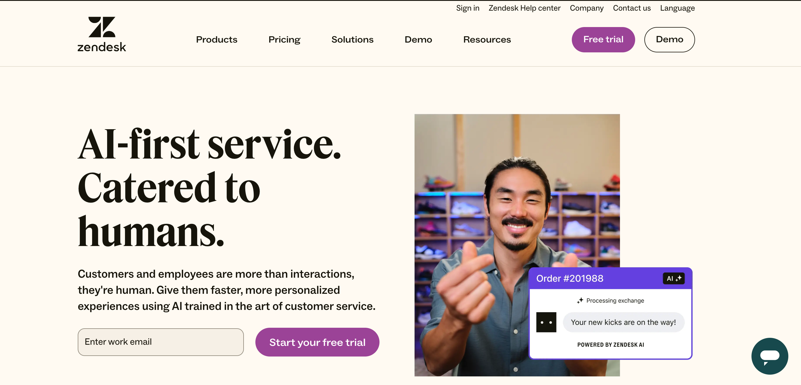
Visit Zendesk
8. Slack
Why it works:
Slack's website captures what the product actually does through simple, efficient design that shows team communication capabilities.
Live previews use animations and mock conversations to highlight the interface and key features. Users see real-world applications within seconds of landing on the site.
Standout feature:
Quick, actionable CTAs like "Try Slack for free" and "See how it works" funnel visitors directly to demos and sign-ups when interest peaks.
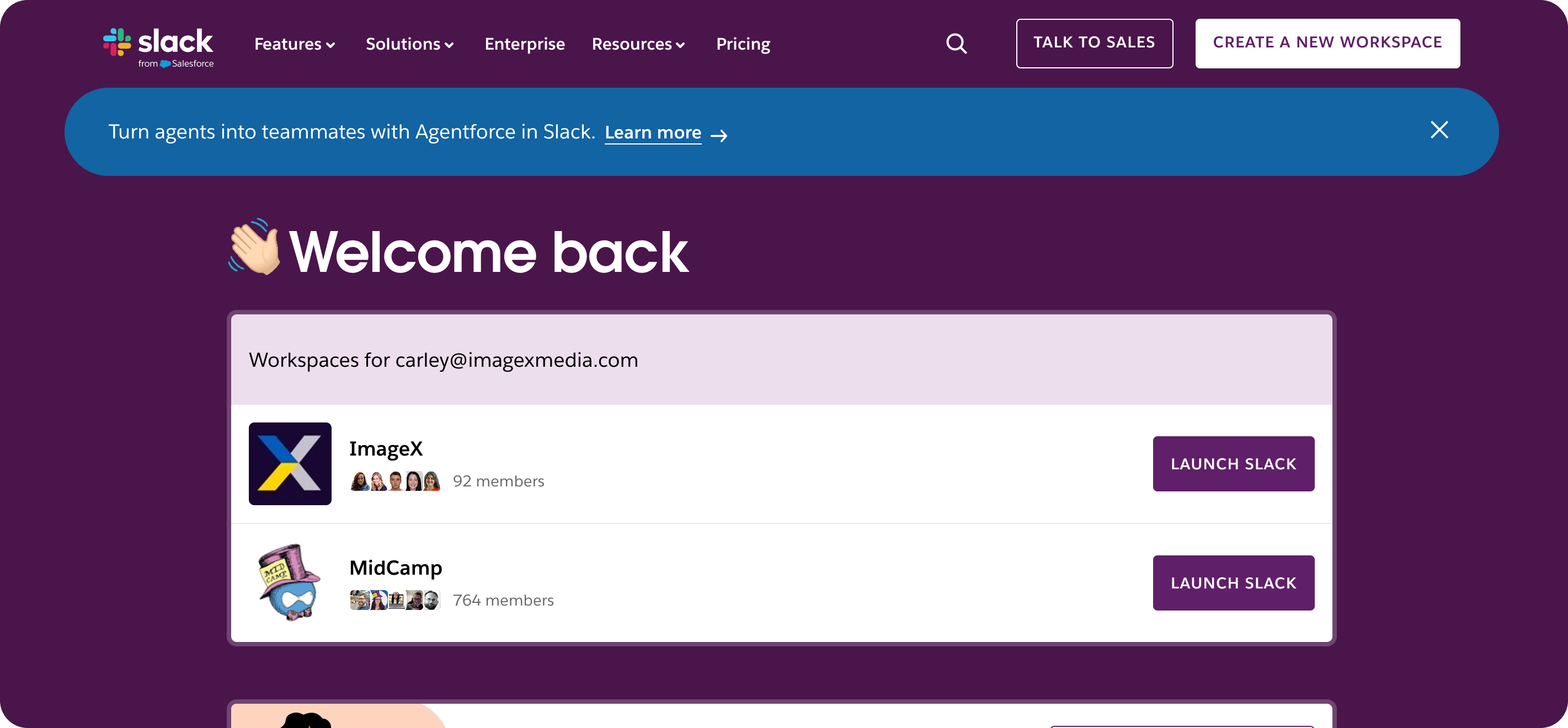
Visit Slack
9. Trello
Why it works:
Trello's website mirrors its product's visual, flexible approach to project management. The site appeals to teams of all sizes with a design that feels immediately familiar and engaging.
Dynamic use cases showcase different applications for businesses of all sizes. Interactive elements bring Trello boards to life with animated previews and clickable elements.
Standout feature:
Micro-interactions including hover effects and animated transitions that simplify navigation and encourage trial sign-ups by keeping users engaged.
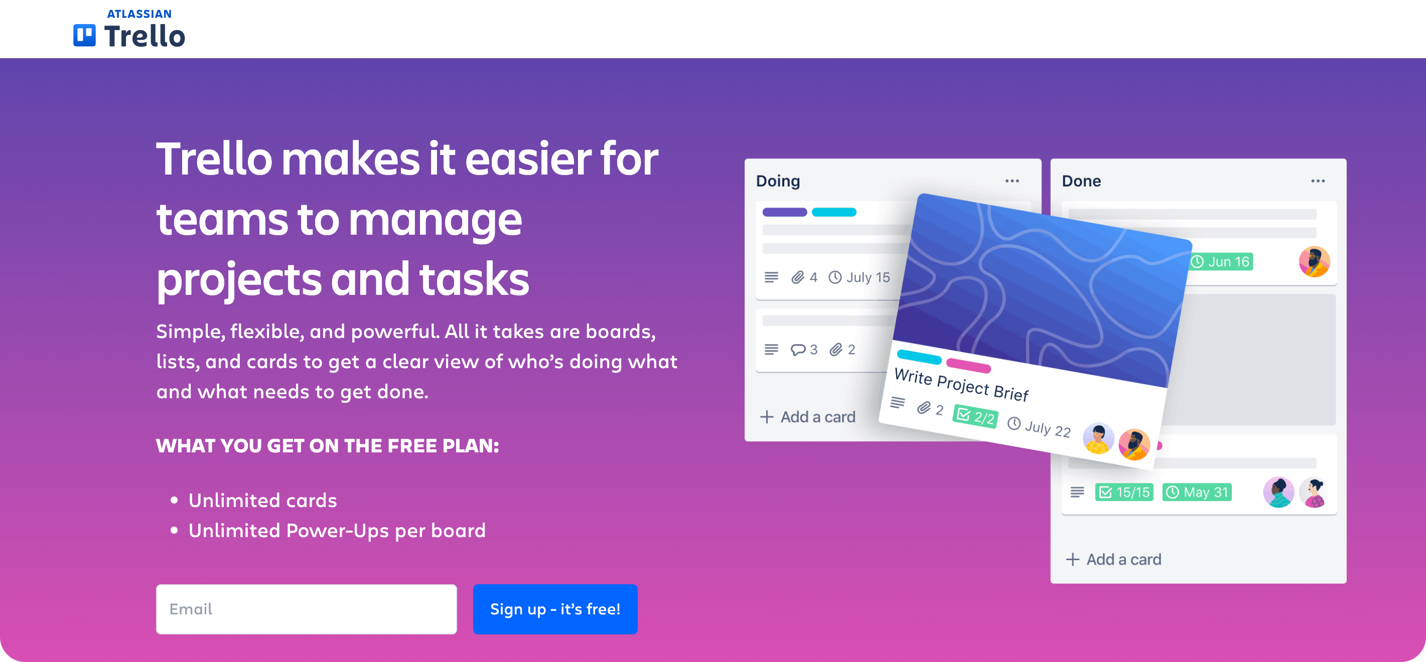
Visit Trello
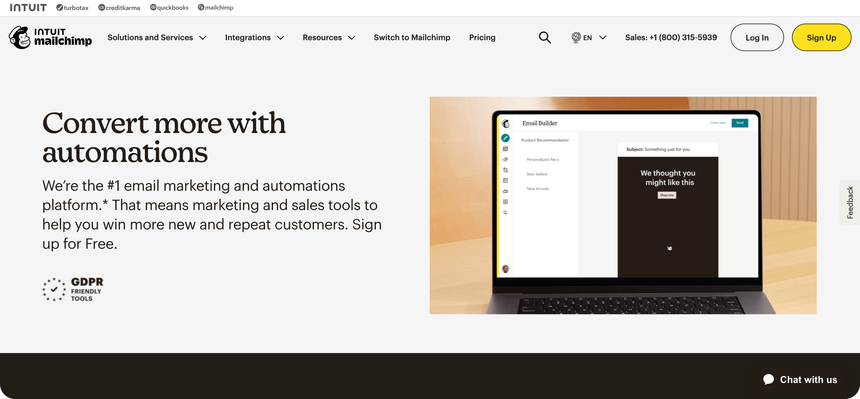
10. Mailchimp
Why it works:
Mailchimp combines creative visuals with intuitive navigation to make marketing automation approachable for businesses of all sizes.
Bold branding through playful illustrations and vibrant colors sets the platform apart while maintaining professional credibility. Clear value propositions like "Turn emails into revenue" immediately communicate business benefits.
Standout feature:
Resource-rich design filled with tools, templates, and case studies that educate users while showing the product's full capabilities.
Visit Mailchimp
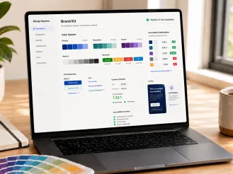
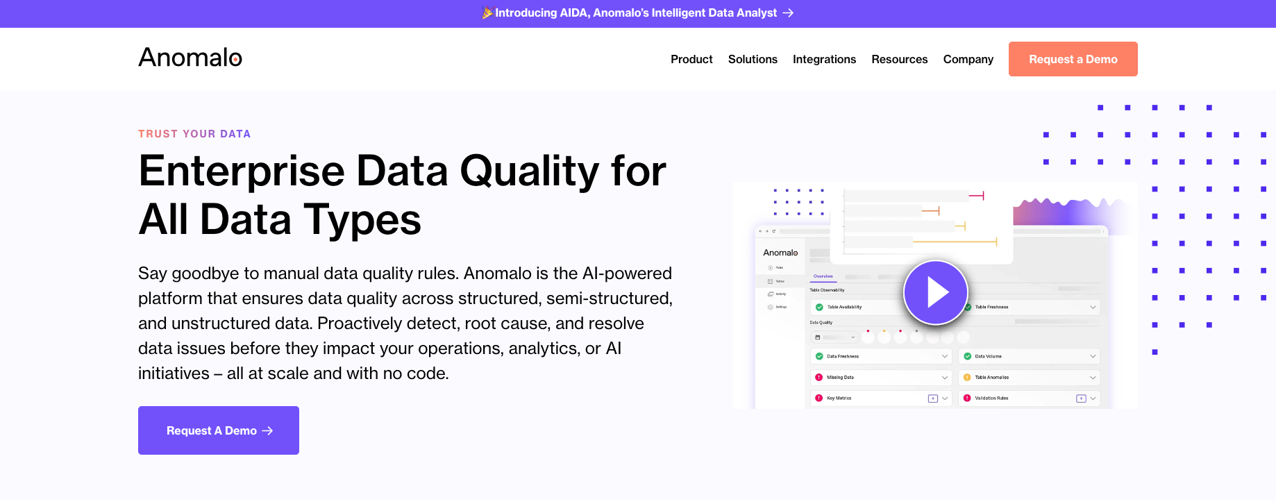
11. Anomalo
Why it works:
This data quality platform explains technical capabilities to data engineering teams while explaining business value to executives.
The site balances complex technical concepts with clear business case presentations. Clean design helps different audiences find relevant information without overwhelming technical or business users.
Standout feature:
Technical documentation integration that helps implementation teams evaluate feasibility while business case studies address ROI concerns for executives.
Visit Anomalo
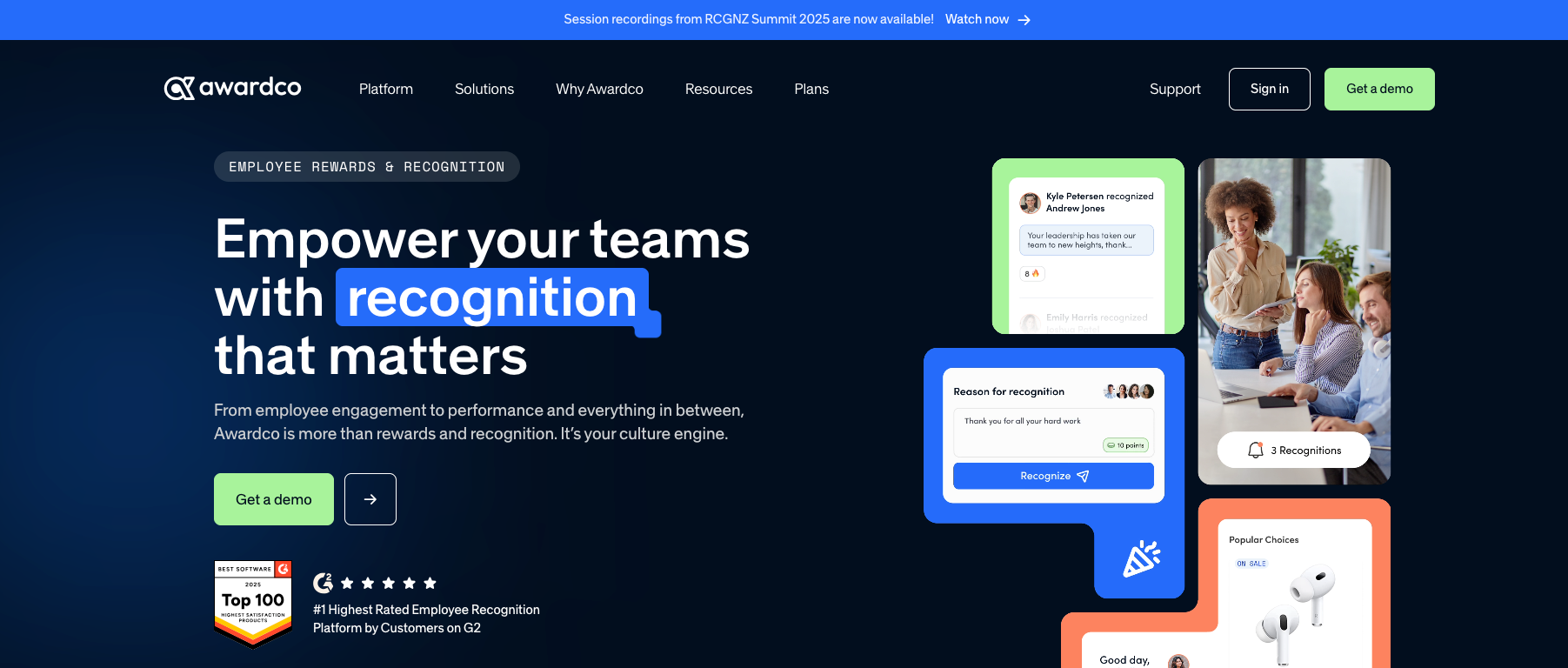
12. Awardco
Why it works:
Awardco's employee recognition platform balances HR decision-maker needs with employee experience considerations through thoughtful dual-audience design.
Clear value communication addresses both administrative efficiency and employee engagement outcomes. Professional presentation builds trust with HR professionals while engaging visuals appeal to end users.
Standout feature:
ROI calculators and implementation guides that address practical purchase factors while employee experience examples show daily value and engagement benefits.
Visit Awardco
Ready to create a B2B website that inspires and converts?
When it’s time to move from inspiration to execution, partnering with the right team can make all the difference.
At ImageX, we specialize in building enterprise-level websites that are as functional as they are impactful. Let’s work together to create a digital experience that drives your business forward. Get in touch today.