
Mastering Content Structure with Ease Thanks to Drupal’s Revamped Field UI
Authored by: Nadiia Nykolaichuk.
Whatever specific kinds of content your website needs — articles, news, testimonials, products, user profiles, events — fields help organize them into predefined structures or templates. This ensures consistency in how all items of a certain type are displayed and managed, and gives you ultimate flexibility in content modeling.
Achieving the perfect structural harmony through Drupal fields is now easier than ever before: the interface for creating, configuring, and re-using fields in Drupal has been revamped from the ground up to become incredibly user-friendly. The most remarkable part of the work done on the new Field UI is included with Drupal 10.2. Below we explore some of the best tweaks of the new interface in comparison to the old one.
Unlocking Drupal fields: an essential cheat sheet
Before we dive into the changes the new Field interface is bringing, let’s run through the key concepts of Drupal fields.
Fieldable content. The word “content” can be used here as a general term, but officially, Drupal has different entity types with a fieldable structure, which means they can be organized into fields. They are content types, media types, user accounts, taxonomy terms, block types, menu items etc.
Field types and field instances. Fields are classified into types based on what kind of data they can store. This includes text, images, numbers, dates, references to other data types (for example, the author of content), and more. Drupal provides several standard field types out of the box that cover the most common use cases. Contributed and custom modules can add their field types. Each specific field is an instance of a certain type.
Field settings. Each field has general, field-level settings. Examples of these settings are required/non-required status, default values, and allowed values (maximum file size, file types, and more).
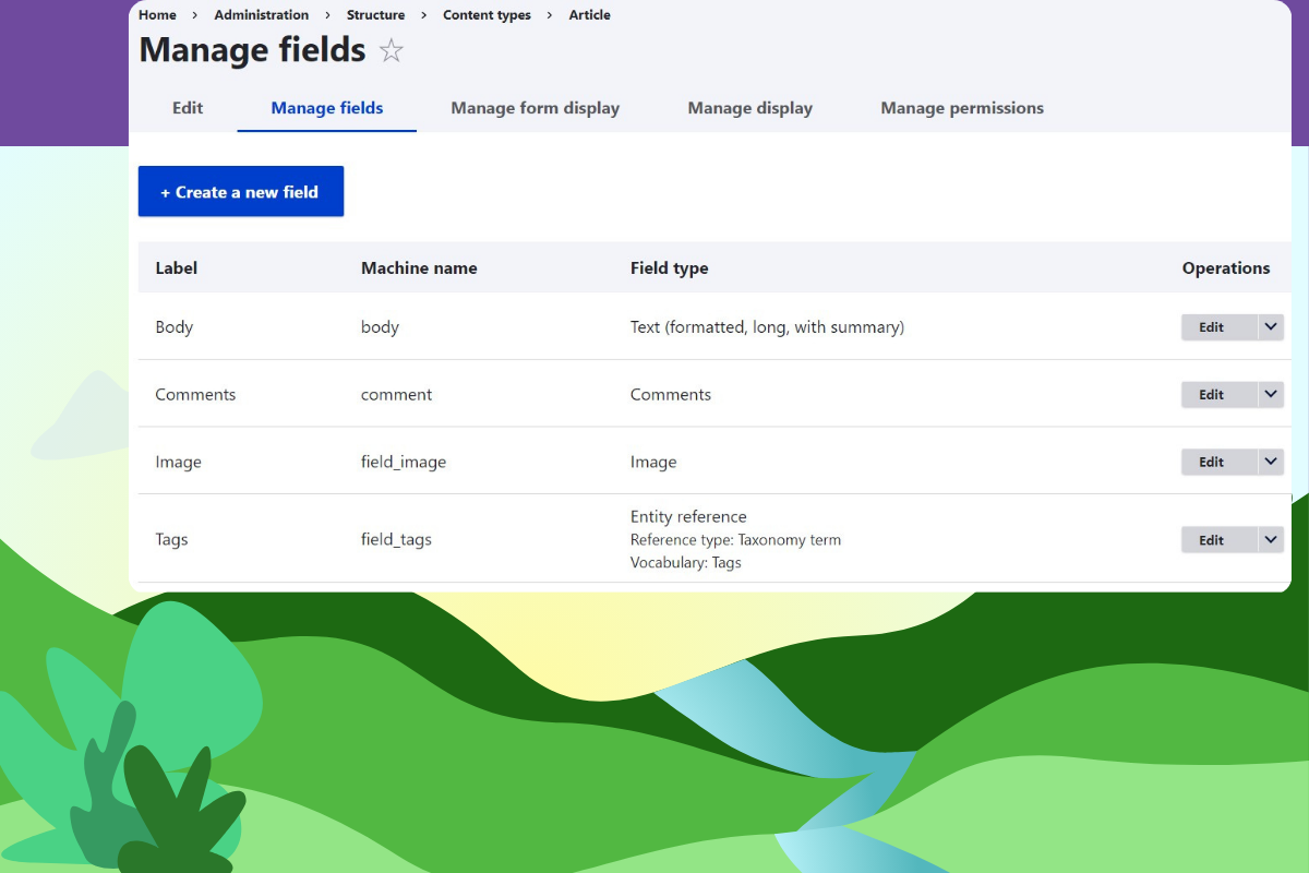
Field display. You can also configure how your field looks in a specific content type or even in a display mode within a content type (for example, a teaser of articles). The “Manage display” and the “Manage form display” tabs of a content type are designed to configure each field display for the front end and back end, respectively. Among other things, you can hide or show the label (such as the word “image”), and configure formatters and widgets:
- Field formatters. They determine how the field data is displayed to users as they view content on the front end. This might include trimming text to a certain length, displaying dates in different formats, and more.
- Field widgets. They define how website editors enter data into the field. This might include a select list, checkboxes, radio buttons, autocomplete, a file upload widget, and more.
Drupal’s new Field UI: utmost user-friendliness of field creation
The steps for creating fields used to be a little overwhelming and not always straightforward, but the tides have changed. Drupal creator’s keynote at DrupalCon Lille 2023 demoed a revamped field creation interface.
Delivering his presentation in the form of a fascinating fairy-tale about the Drupal village, Dries Buytaert mentioned the new Field UI as part of the promise given to the villagers to “create tools that are easy to use.” He invited Tim Plunkett (tim.plunkett), Drupal core developer and initiative coordinator, to introduce the new interface.
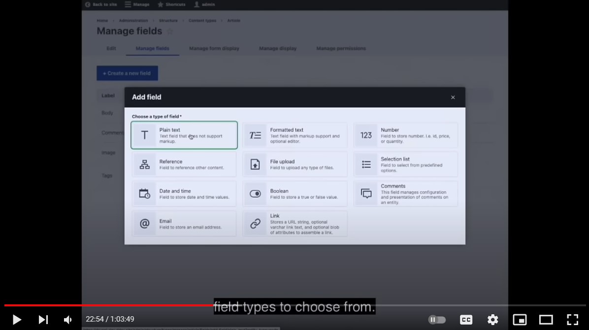
In Tim’s demo, we can see a handy modal window with the available field types. At the time of writing this article, the modal is not yet ready. It is part of the future roadmap, alongside keyboard accessibility and other nice improvements currently in the works.
Tim Plunkett told the audience that in early 2023, their team sought to better understand the user flow and specific pain points that contributed to the perception that Drupal was hard to use. They started with user research and, after analyzing and summarizing the feedback, they began working on two specific areas:
Despite more work still going on, the bulk of the revamped UI has already been gradually introduced in Drupal 10.1 and 10.2. The new modern interface makes everything easier to understand, eliminates overwhelming steps in the workflows, and helps users make more informed choices.
For example, as opposed to using the old dropdown menu, users can now quickly choose the needed field type thanks to user-friendly field grouping with icons and simple summaries. They can also specify additional details on the same form using clear explanations about them.
As far as field re-use, there is a new handy button for this and a page where users can discover all the details about each field before choosing to re-use it.
In the next part of the article, we will compare in every detail the old ways and the new ways of field creation and field re-use.
Detailed field creation comparison: the old and the new UI
1. Field creation in the old UI
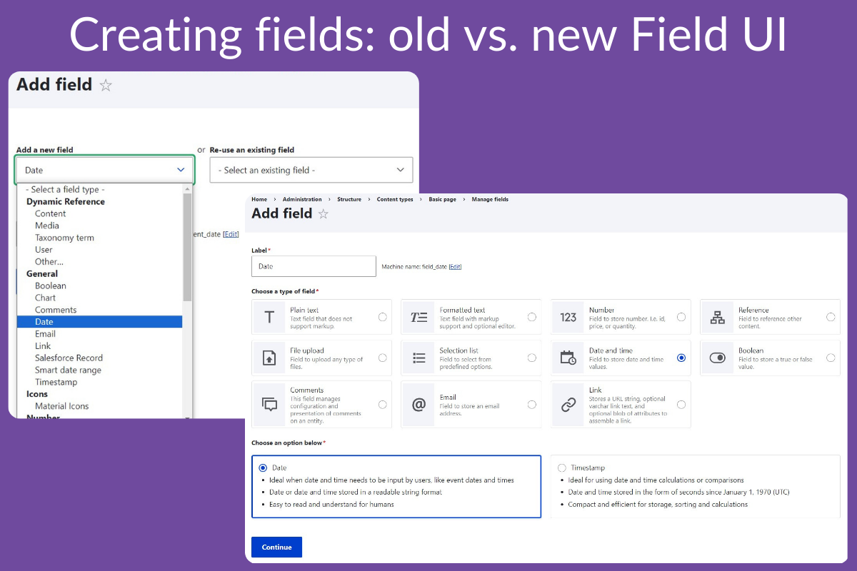
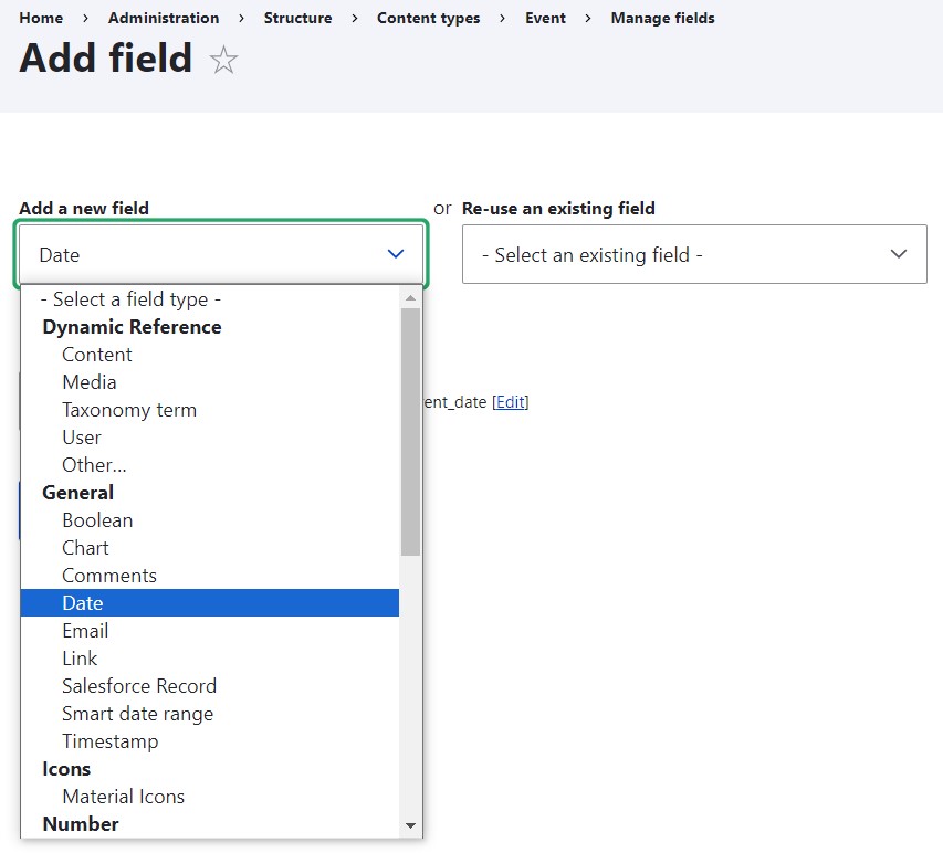
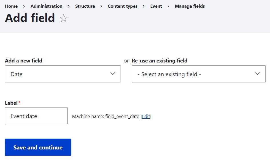
Whenever you need to create a new field via the traditional interface, you go to the Manage fields > Add field page of a content type, and see a long dropdown menu of available field types. You select the field type not always knowing for sure if it’s the right one. Then you give it a label for administrative purposes and click “Save and continue.”
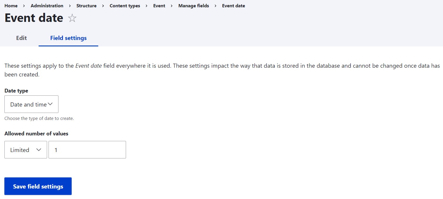
Then you get redirected to the next step of the settings that enable you to additionally select between the data type (if there’s any choice available) and set the allowed number of values to unlimited if needed.
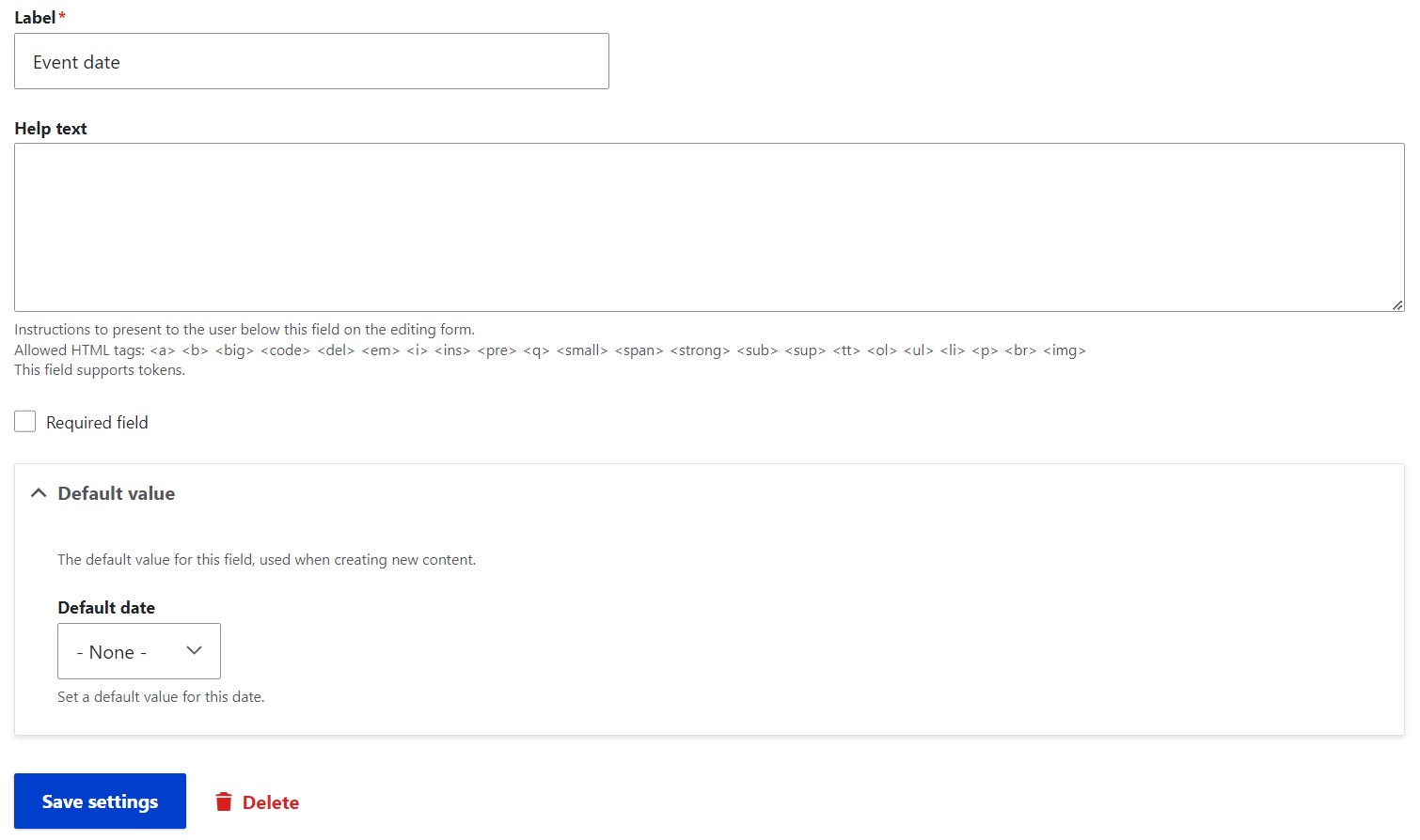
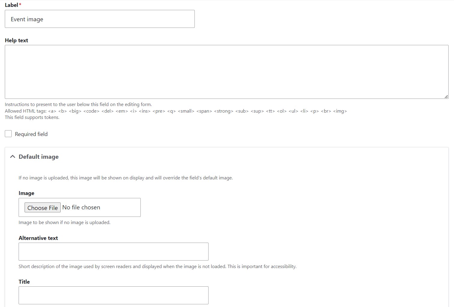
After clicking “Save field settings,” you arrive at yet another configuration page. It enables you to customize the label the way you want it to be displayed to users on the front end. You can also optionally provide a help text, check the “Required field” checkbox, and specify the default value. Finally, you can click the “Save settings” button, which marks the end of the process.
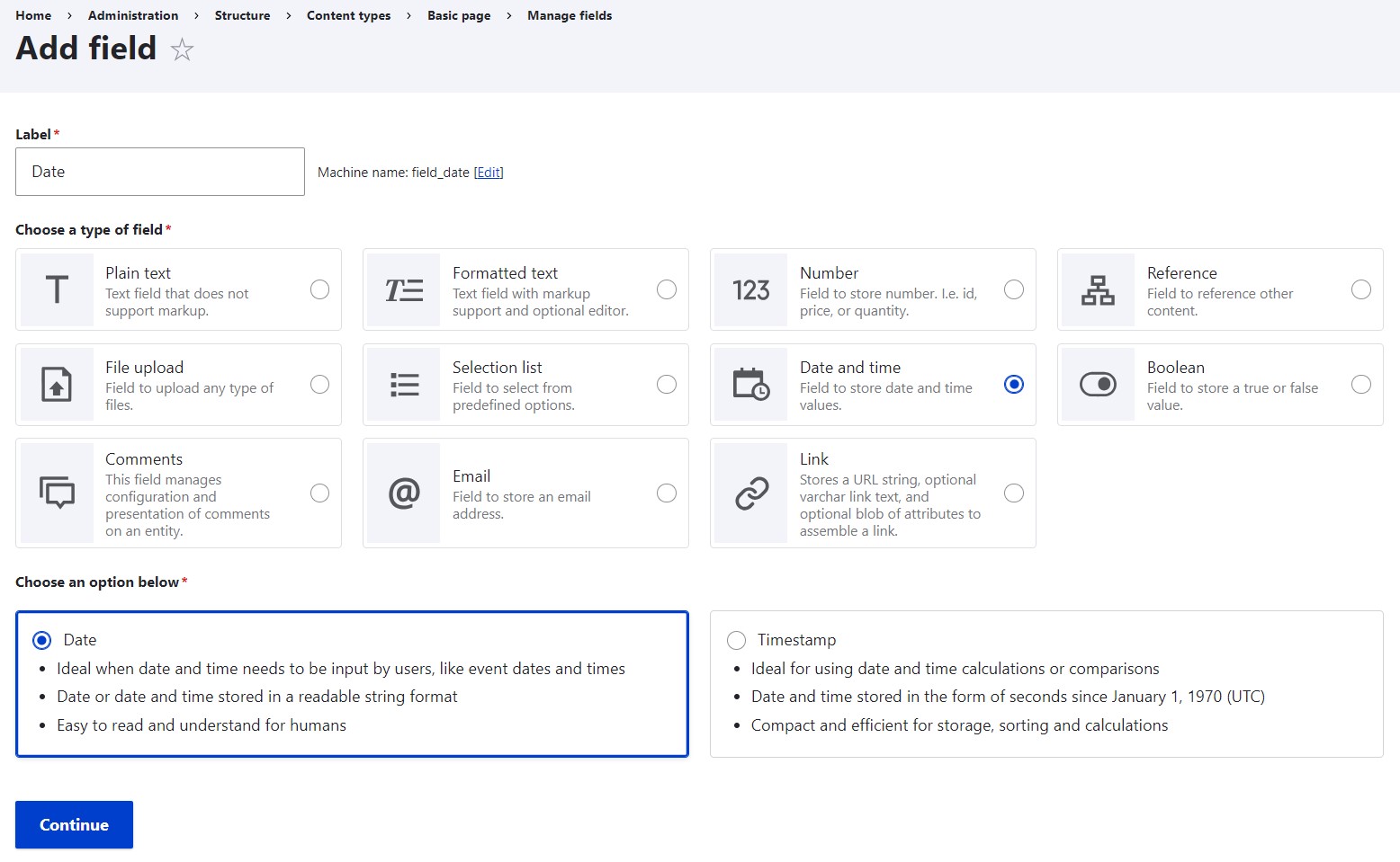
2. Field creation in the new UI
As you start adding a new field with the revamped Field UI available in Drupal 10.2, you can give your field a label and proceed to choose your field type. The available field types are introduced in user-friendly groups. Each group has an icon and a brief and simple description for better understanding. In Drupal 10.2 core, when no additional modules are installed, there are 11 field-type groups, which is a pretty reasonable number to avoid overwhelming the users.
You select the field type group and an additional “Choose an option below” section appears at the bottom of the page. It allows you to select a specific field type (if the group includes more than one). In our example where we chose “Date,” there is a choice between such field types as just “Date” and “Timestamp.”
And instead of a “blind date” in the Date field, the new Field UI lets you make an informed decision about adding it.
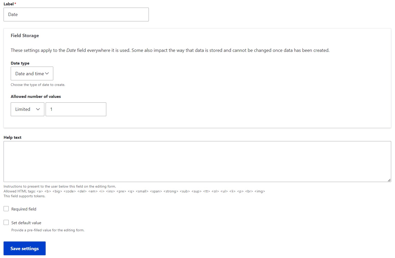
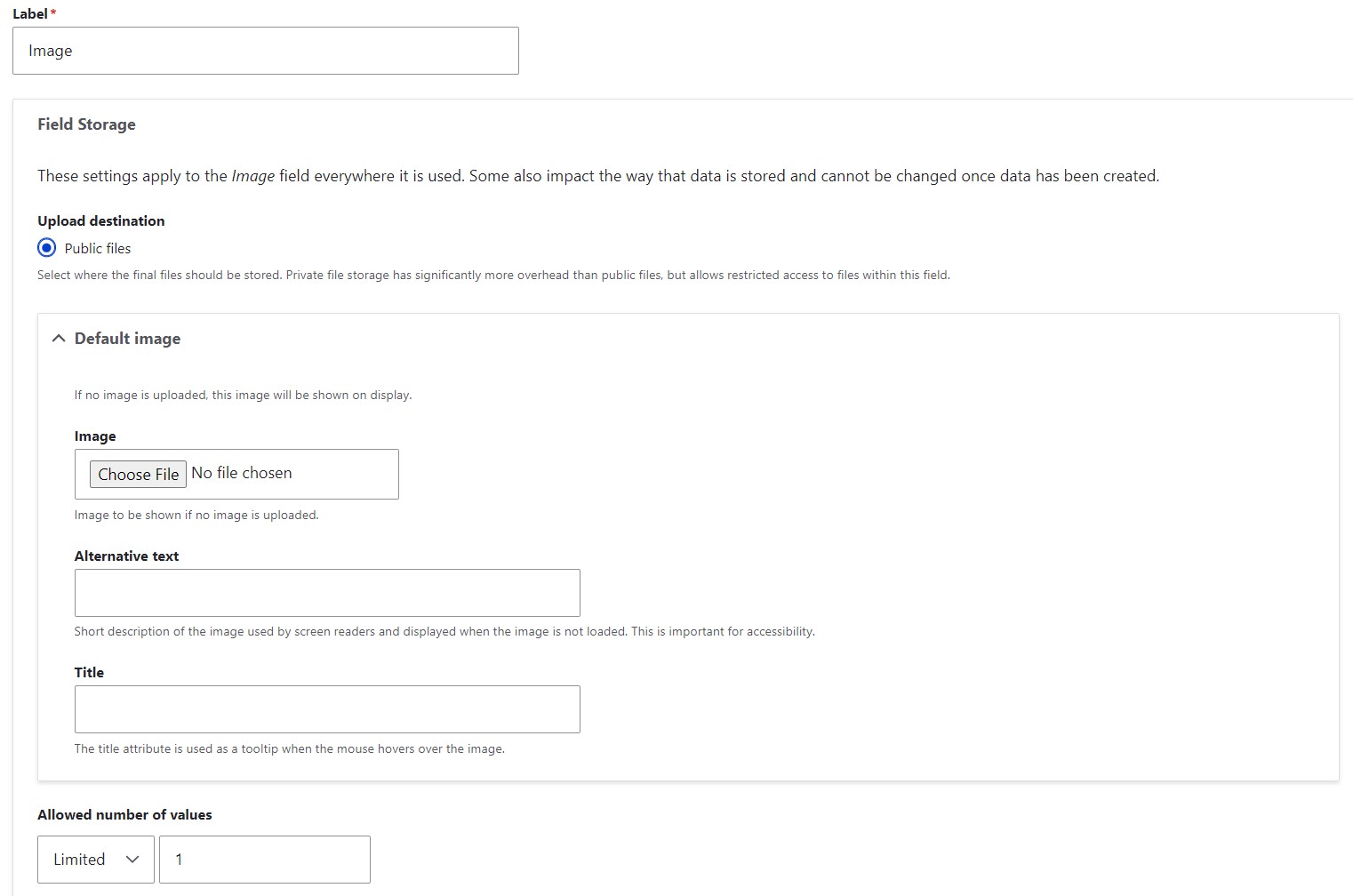
By clicking “Continue,” you arrive at the next page of the setup, which is luckily also the last one. It enables you to edit the field label the way you want it to look for users and select the data type if there’s any choice available. You can also optionally make the number of values unlimited, provide a help text, make the field required, and provide the default value for it. Click “Save settings” and that’s it.
Detailed field re-use comparison: the old and the new UI
1. Field re-use in the old UI
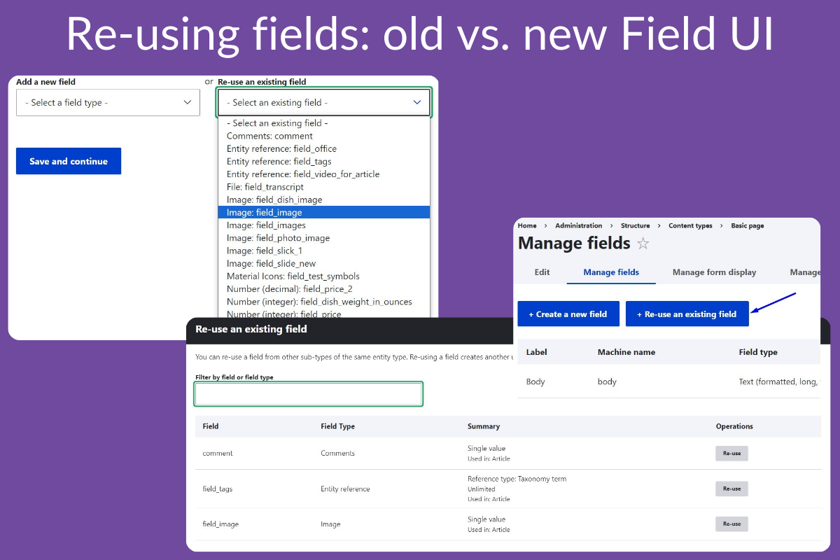
Next to the “Add a new field” dropdown on the Manage fields > Add field page of a content type, there is also the “Re-use an existing field” dropdown. It lists all fields without any information of where they are used.
When the field type is selected, you can specify the label.
By clicking “Save and continue,” you get redirected to the setup page.
2. Field re-use in the new UI
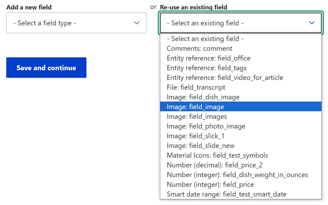
The new interface has a handy button “Re-use an existing field” that appeared back in Drupal 10.1.
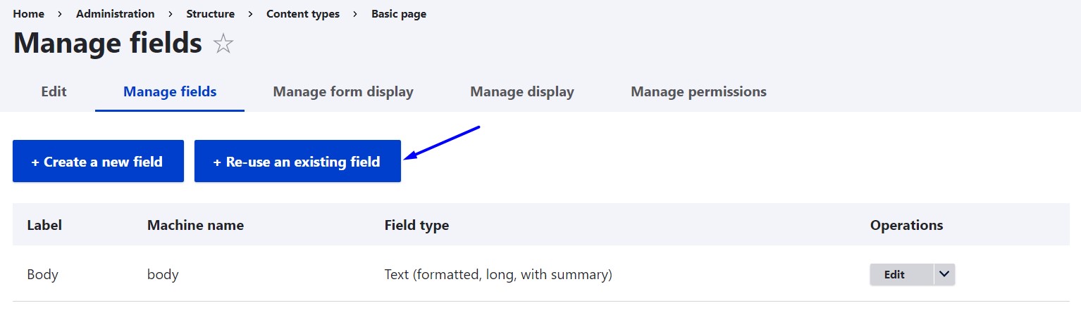
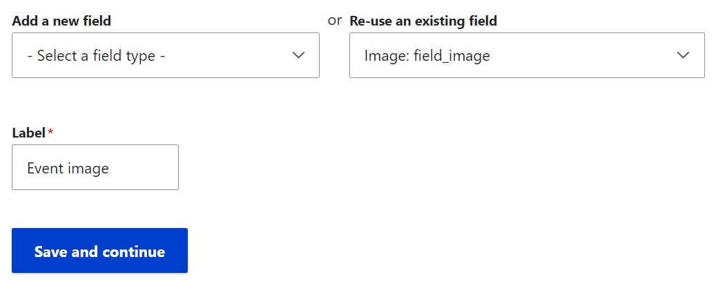
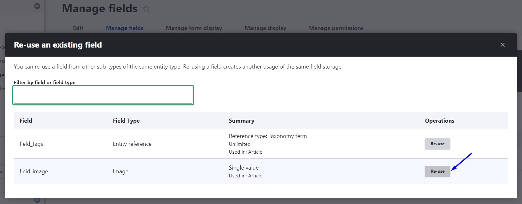
After clicking the button, you see a modal window with the list of available fields. You can see their machine names and types, and a quick summary of essential information about them (like where they are used and what number of values they have). You can use a search box to search for a specific field or field type. Once you have chosen the field, click the “Re-use” button next to it.
You’ll get redirected to the settings page to complete the setup.
Final thoughts
Each Drupal innovation is a huge step toward a brilliant future where CMSs are increasingly user-friendly. The revamped Field UI and other new functionalities look amazing and offer lots of advantages to users. There is perhaps only one disadvantage — when comparing the old and the new experiences, it’s very difficult to come back to old ways again. The good news is there’s no need to — update your Drupal website and benefit from all the new enhancements!