Managing Colour in Drupal: Practical Tools for Modern Websites

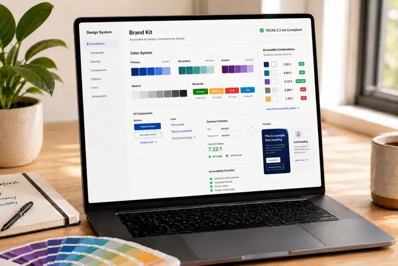
Colour brings life and vibrancy to your Drupal website and shapes how people feel when they visit it. The right palette can make your site feel bold and dynamic, warm and cozy, or reserved and professional. Colours enhance user experience by clarifying your website’s hierarchy and making interactive elements easier to recognize. That being said, colours are an essential part of a compelling Drupal website design.
The workflows for managing colours need to be consistent and streamlined. In this article, we’ll explore how Drupal handles colours and provide an overview of some useful modules that help you add all the colours your Drupal site deserves.
Different Ways to Control Colour in a Drupal Site
The choice of ways to manage colours in Drupal usually depends on who needs control over it (developers, site builders, or content editors) and how dynamic the site needs to be. Most real Drupal sites don’t rely on just one method, so various approaches often coexist in the same project.
1. Defining Colours in the Theme Via CSS
The most stable way to manage colour is through the website’s theme. The colours are defined via CSS (Cascading Style Sheets), the style sheet language used to control the look and feel of a website.
This approach is developer‑controlled and serves as the foundation of all other approaches, since every colour eventually builds on or overrides the theme’s CSS. By default, managing colours in the theme stays outside the editorial workflow, although additional setup can expose theme colours to non-technical users in a controlled way.
2. Customizing Theme Settings in the Drupal Admin Interface
Some Drupal themes have colour settings directly in the admin interface, often under the “Appearance” settings. These allow website administrators to configure colours without touching code. This method is limited to certain interface elements and is available only if the theme supports it.
The Gin theme, which has been widely adopted in Drupal projects and is now replacing Claro as Drupal’s default administration theme, has received lots of great feedback for the flexibility in colour adjustment. Among other things, it enables you to customize interface colours that are essential for accessibility best practices:
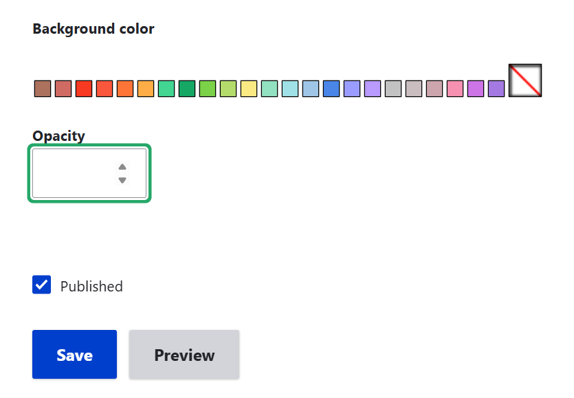
Accent colour. It’s a contrasting colour that draws attention to interactive elements like buttons, links, or input fields. The Gin theme lets you both select from available options or customize the accent colour with great precision, using the HEX palette or RGB values. (HEX is a six‑digit code that represents a colour using numbers and letters, and RGB is a combination of red, green, and blue values that mix to create a colour).
Focus colour. It’s the colour that is used to highlight an element that is currently selected or active. The Gin theme lets you select among the available options.
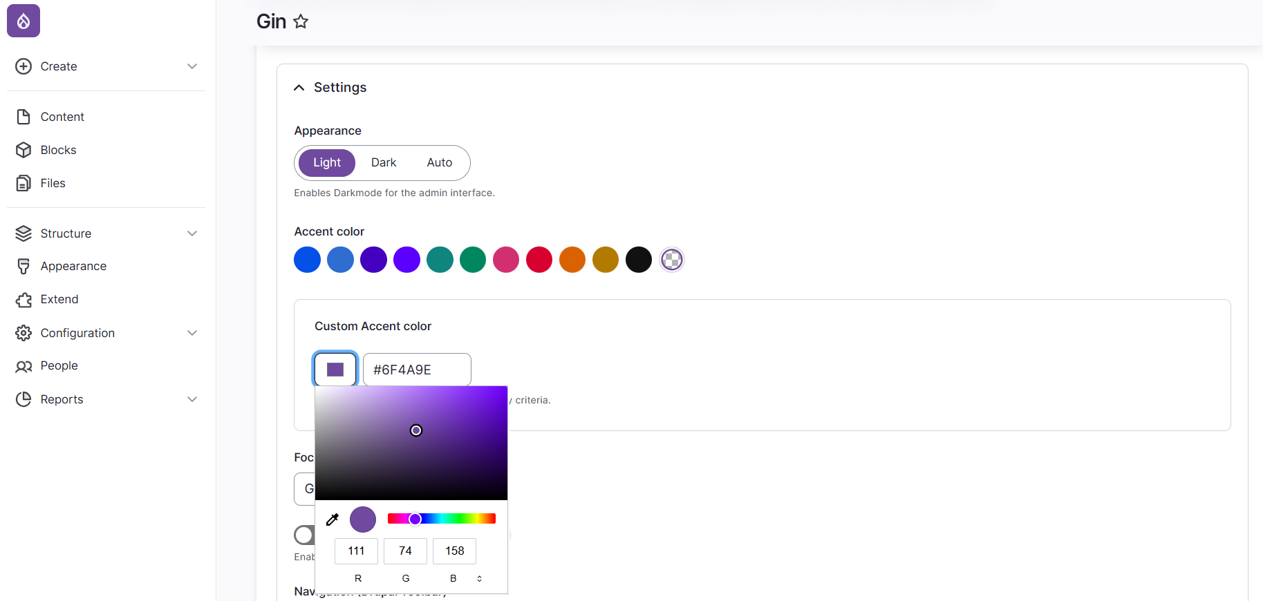
Customizing a Drupal website’s accent colour in the settings of the Gin admin theme
3. Storing Colours as Content Data
Another way to work with colour is to store it directly in content using fields. In this approach, colour is treated as data, not immediate styling. Colours can be attached to taxonomy terms, content types, and custom entities. For example:
Different categories can have different colours in listings (like “News” is always blue).
Specific content types can have different accent colours.
Cards or components can be visually grouped.
Modules like colourAPI and colour Field can be helpful for adding colours as data. However, Drupal does not apply these colours automatically: developers must build a rendering bridge in the theme (Twig, CSS variables, or preprocess logic) to turn the stored values into visible styling.
4. Applying Colours During Content Editing or Layout Building
With the right setup, colours can also be exposed directly during content editing, with no need to touch the source code. For example, site builders can configure a style dropdown, a colour picker, or a palette in CKEditor. In Layout Builder, editors can be enabled to adjust background or text colours in section or block settings.
These colour settings still need to be mapped to the theme for the colours to apply. Contributed modules like CKEditor 5 Font plugin, Layout Builder Styles, colour Fields, and others can be helpful in creating this kind of visual setup.
Some sites expose fields that let editors add CSS classes or attributes (like ‘colour-primary’) to components (buttons, cards, banners, Layout Builder blocks, and so on). This gives editors flexibility while still tying colours back to the theme’s design system. However, it requires careful configuration to avoid misuse.
5. Direct Colour Styling in Source Code
It’s also possible to apply colours by typing inline styles directly into the source code of a text block. This method works immediately because the browser interprets inline styles without needing any theme integration.
However, it’s not tied to the theme’s design system, so there are risks of inconsistent branding, accessibility issues, and harder maintenance. While possible, most site builders disable or discourage this approach in favour of controlled options.
Useful Tools for Working with Colour in Drupal
Drupal offers a set of tools that expand how colours can be handled across a site and bring more flexibility to various workflows. They can be used independently or combined, depending on the desired workflow. Next up are some of the most popular tools.
ColourAPI
The colourAPI module provides a foundation for handling colour in Drupal. Instead of saving colours as plain text (like just a HEX code), it stores them as complete colour definitions. Each colour can have a name (such as “Brand Purple”), a HEX value, and RGB/RGBA values. These are saved in your Drupal configuration, which means they can be reused consistently across your site.
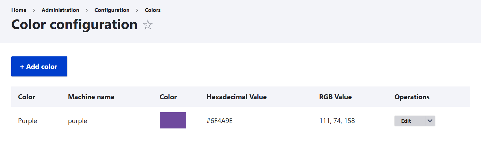
This module lets you create a site‑wide colour palette. If you update one colour definition, the change can cascade everywhere that colour is used. There is also a useful field type, so you can attach colours to content, taxonomy terms, or even user profiles. It must be noted that this module provides the data structure only and does not include a visual colour picker out of the box.
Colour Field
While colourAPI provides the structured foundation for colours, colour Field adds both the storage layer and the editor‑facing UI. It defines a field type for saving colours in HEX, RGB, or RGBA formats (with optional opacity), and offers multiple input widgets and display formatters to make those colours usable in content and theming:
The input widgets include an HTML5 colour picker, pre‑selected colour boxes, the default colour entry, a spectrum colour picker, and a colour grid.
The formatters include CSS declarations, colour text, and colour swatches.
The stored values don’t style the site automatically. They need to be interpreted by the theme or templates (like via CSS variables or Twig logic). That being said, to provide a full‑fledged colour workflow, you need either theme integration or other modules that interpret the stored values.
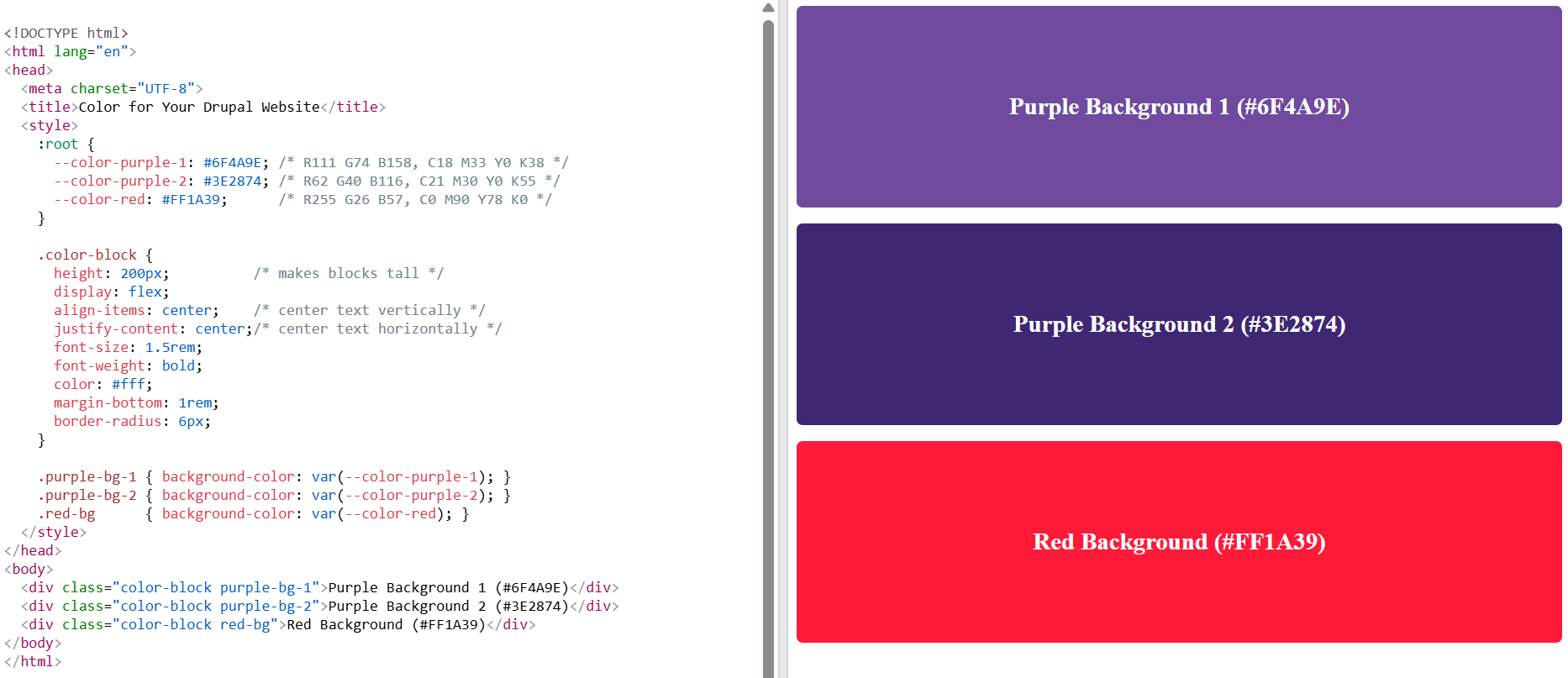
Layout Builder Styles
For the Layout Builder Styles module, colours are just one of many characteristics that editors can apply to blocks or sections in Drupal’s Layout Builder. First, site builders or developers create “style groups” (like “Colour Scheme” or “Background Options”) and actual “styles” (like “Purple Background,” “Red Background,” and so on).
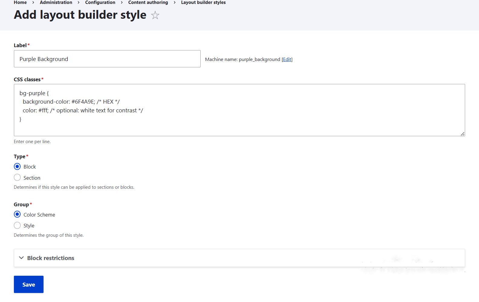
The grouped styles then become available for editors to select in Layout Builder. For example, in the block settings, they’ll see a “Colour Scheme” selection with available background colour options.
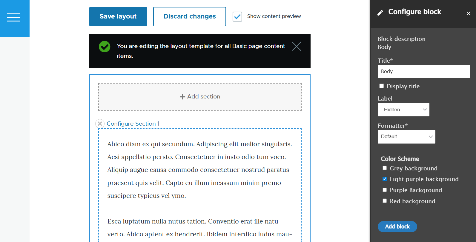
It’s possible to allow editors to pick one colour style per group or combine multiple styles. You can also restrict certain colour styles to specific block types or section layouts. These styles are reusable across all layouts on your Drupal website. Instead of free‑form colour picking, this approach enforces consistency because you can define brand‑approved colours.
To get the actual colours applied in Layout Builder, you’ll need to provide CSS rules that define what each style’s class should look like, either through your theme’s stylesheet or an admin‑side tool like Asset Injector.
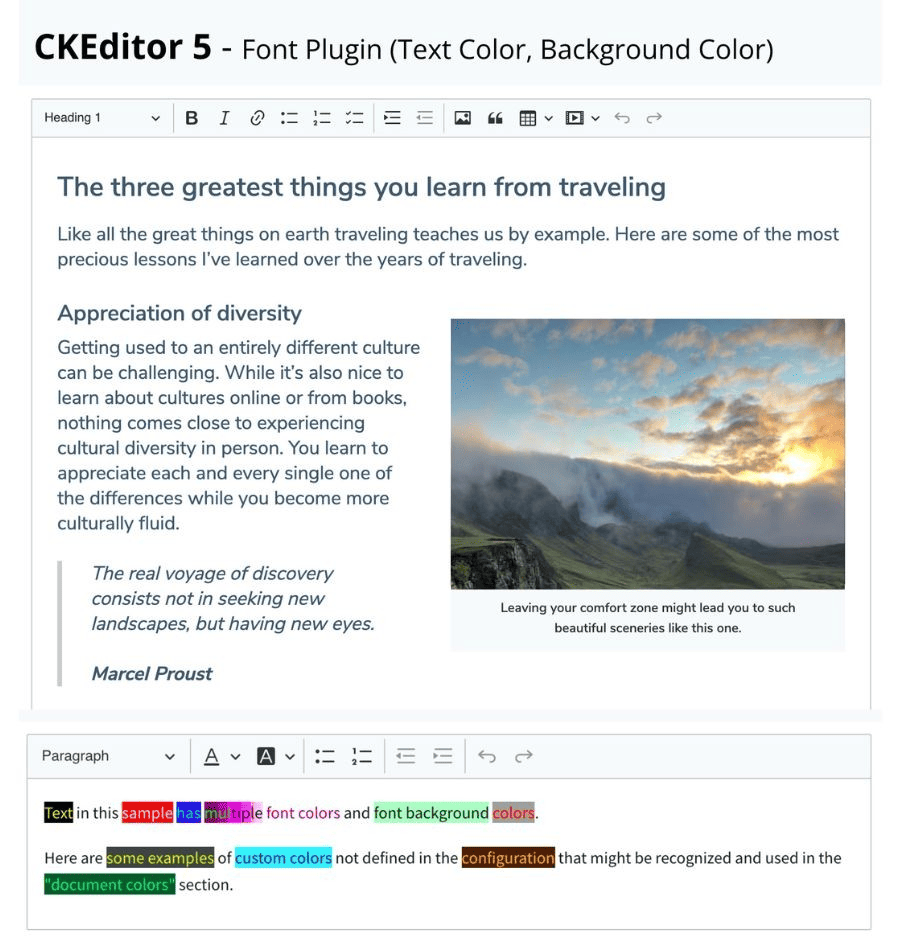
CKEditor 5 Font Plugin
Next up is the module whose full name is “CKEditor 5 - Font Plugin (Text colour, Background colour)”. It enables editors to apply text colour and background colour while creating content in CKEditor 5. It provides a customizable colour palette, so site builders can restrict choices to brand‑approved colours.
To set up this module, you’ll need to add the colour tools to the editor toolbar and, optionally, define a custom palette. Discover more about CKEditor 5 in Drupal, including the simple steps to add buttons to your toolbar.
The module is designed as the successor to the CKEditor Colour Button module, which works with CKEditor 4, the previous major version of the editor. The ‘CKEditor 5 Font Plugin’ module is popular with 2700+ installations, but it must be noted that it is currently minimally maintained and is not yet compatible with Drupal 11.
Single-Directory Components
No article about front‑end presentation would be complete without mentioning Single-Directory Components (SDC). They are Drupal’s modern way of keeping all parts of an interface component in one folder. This approach makes colour management more flexible and consistent across the site. SDC is an essential part of Drupal Canvas — the new-generation page builder, although they are not limited to it.
Here is how colour management is provided in SDC:
Component properties. Developers can expose colour options (like background, text, or accent colour) as configurable properties.
Visual editing. In Drupal Canvas, editors see these colour choices directly in the drag‑and‑drop interface, making it intuitive to apply and preview changes. Outside Canvas, the interface for choosing colours depends on how developers expose properties.
Reusable palettes. Brand‑approved colours can be defined once and reused across multiple components.
Modern theming. SDC often uses CSS variables or utility frameworks like Tailwind, so colours can scale across large sites and adapt to accessibility needs (contrast, dark mode, and more).
Final thoughts
Exploring Drupal’s colour‑handling modules and capabilities reveals just how many layers of control are available. These layers can complement one another, creating workflows tailored to your Drupal site’s needs. Beyond the approaches described here, there are even more tools and techniques for achieving a robust colour management setup. The right combination should be selected specifically for your website to ensure a consistent, editor‑friendly, and brand‑aligned configuration.