Boosting Drupal Website Management Workflows: New Administrative Toolbar Is Coming!
Authored by: Nadiia Nykolaichuk
The administrative navigation toolbar is an essential piece in the puzzle of your website’s overall capability to boost website management tasks. It serves as the guiding compass for your team, leading them across the administrative sections quickly and confidently. To achieve this, the toolbar needs to be intuitive, visually clear, straightforward, logically organized, and well-positioned.
Luckily, the makers of the Drupal CMS have recently been particularly committed to assembling the perfect puzzle of features for seamless website management. Among other things, there is a new, modern, and sleek administrative navigation toolbar currently in the works. It’s anticipating its glory moment to become one of the rockstar Drupal innovations in 2024. Let’s take a sneak peek at the initial designs for the new admin toolbar below.
The current Drupal administration toolbar: what’s the problem?
Currently, more than 70% of Drupal sites customize the administration toolbar to make it easier to use. Cristina Chumillas (ckrina), the Drupal core UX Maintainer, announced these statistics at DrupalCon Lille 2023’s keynote before presenting the new navigation to the public for the first time.
Indeed, the 3rd most installed contributed module in Drupal 10 is Admin Toolbar which provides faster access to all administration pages by turning the default menu into a dropdown. However, a genuinely user-friendly CMS needs to provide the best experiences out of the box.
The current Drupal toolbar was improved back at the time of the Drupal 7 release, and a lot of time has elapsed since then, bringing many changes both to Drupal and UX design patterns and best practices. Among the design limitations of the existing toolbar are:
- lack of clarity about which section the user is currently in
- no submenus in the horizontal mode
- the inability to use sticky regions that would always be available to the user
- a lot of unused empty areas
Users often feel dissatisfied and disoriented when navigating between different sections. In addition to UX design reasons, it’s also due to the fact that the section names are not always self-explanatory. The names mostly include authentic Drupal terms such as “Display modes,” “View modes,” “Form modes,” “Taxonomy,” “Content types,” “File system,” and more. This language might be great for seasoned site builders but might present a certain learning curve for content managers and website administrators who are new to Drupal.
New admin toolbar: on the way to perfect website management
The imperfections of the current administration toolbar inspired Cristina Chumillas and her fellow-thinkers to work on a new default toolbar. It should eventually replace the existing toolbar in Drupal core and be available out of the box to all users. The plan to improve administration navigation aims to:
- increase user satisfaction out of the box thanks to fewer clicks needed to reach the desired pages
- increase user confidence by helping them feel better oriented as to whether they are using the right section
- improve the initial impression from Drupal’s administrative toolbar
Thanks to all the hard work of the large team of contributors involved with the creation of the new administration navigation, it should hopefully appear as early as this summer in the Drupal 10.3 release.
The new toolbar will be an excellent addition to Drupal’s set of innovations that improve website management out of the box. Among them are the following:
- Tailored admin dashboards in Drupal with links to specific website management tasks for different user personas.
- New and exceptionally user-friendly Field UI — an interface for creating and managing fields. The bulk of the work for the Field UI is already included with the latest minor Drupal core version released in December 2023 — Drupal 10.2.
- Easier to build Drupal pages with Layout Builder thanks to a bunch of editorial improvements being implemented for it.
- And, of course, many Drupal users have already had a chance to see how website management has changed starting with Drupal 9.4 thanks to the modern, user-friendly, and accessible Claro admin theme.
Some exciting features of Drupal’s new administration toolbar
At the above-mentioned DrupalCon keynote, Cristina gave the audience a glimpse of the early designs for the new admin toolbar. Everything is yet subject to change and improvements based on feedback both from users and developers themselves. So here are a couple of great features:
- The left vertical sidebar
First of all, it’s planned to move most of the main admin navigation into a left vertical sidebar. In the demo, we can see a modern and sleek toolbar with icons to illustrate the menu sections. It uses the term “Bookmarks” instead of the previously used “Shortcuts.”
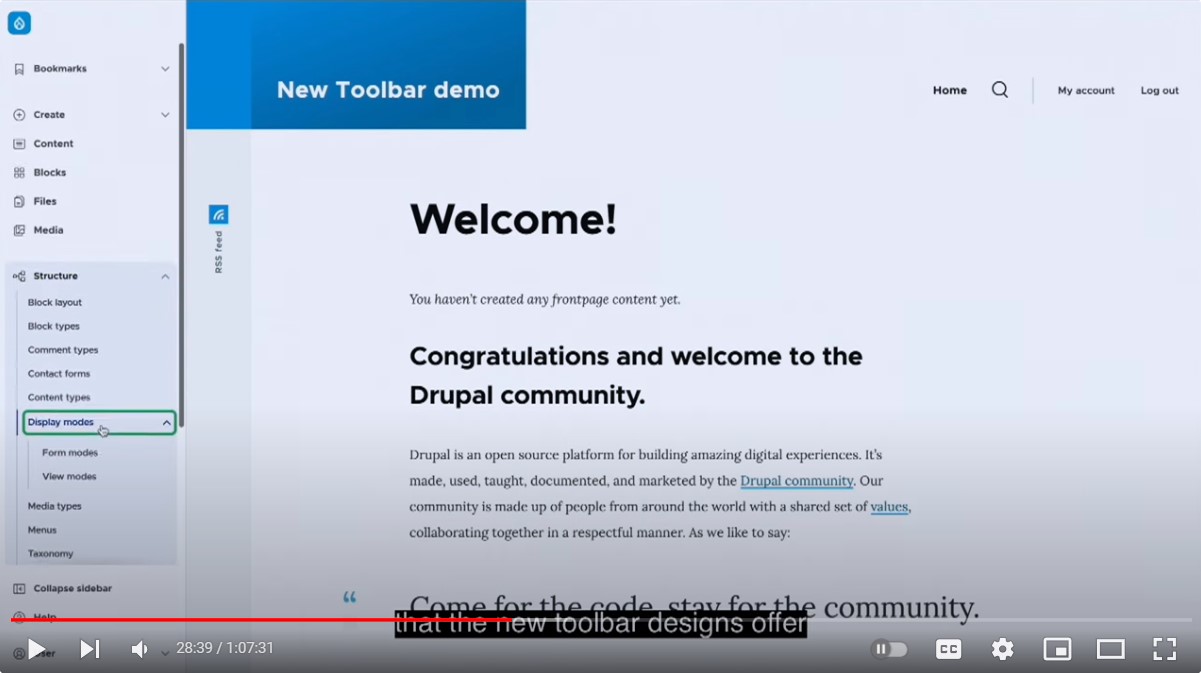
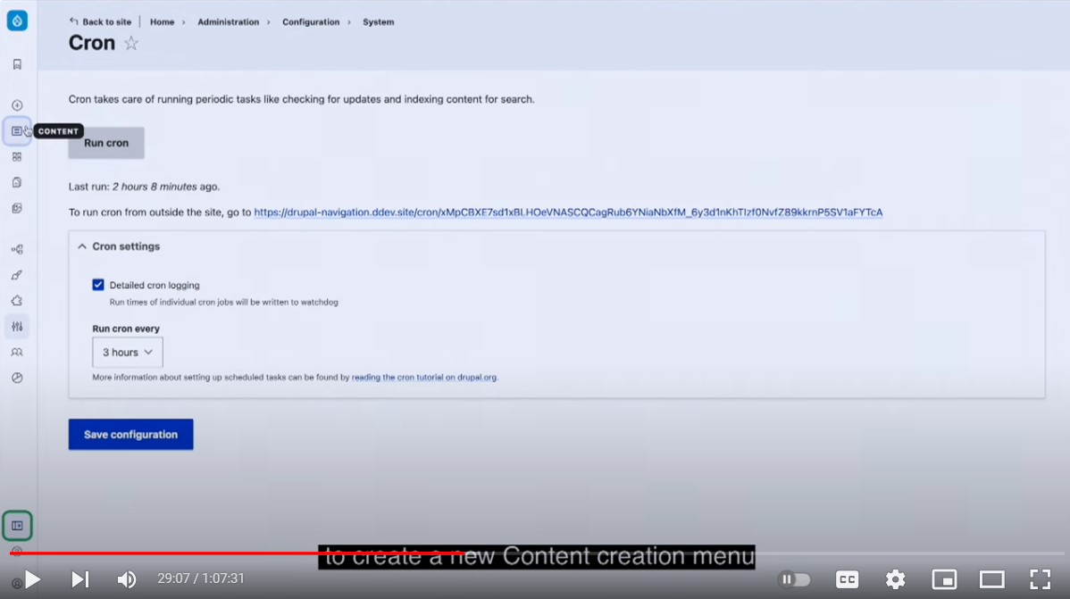
The toolbar is collapsible, so by clicking “Collapse” in its lower part, you turn it into a set of icons with tooltips that describe the sections. The “Collapse” button separates the “Help” and “User” sections from the rest of the toolbar.
- Direct links to content creation
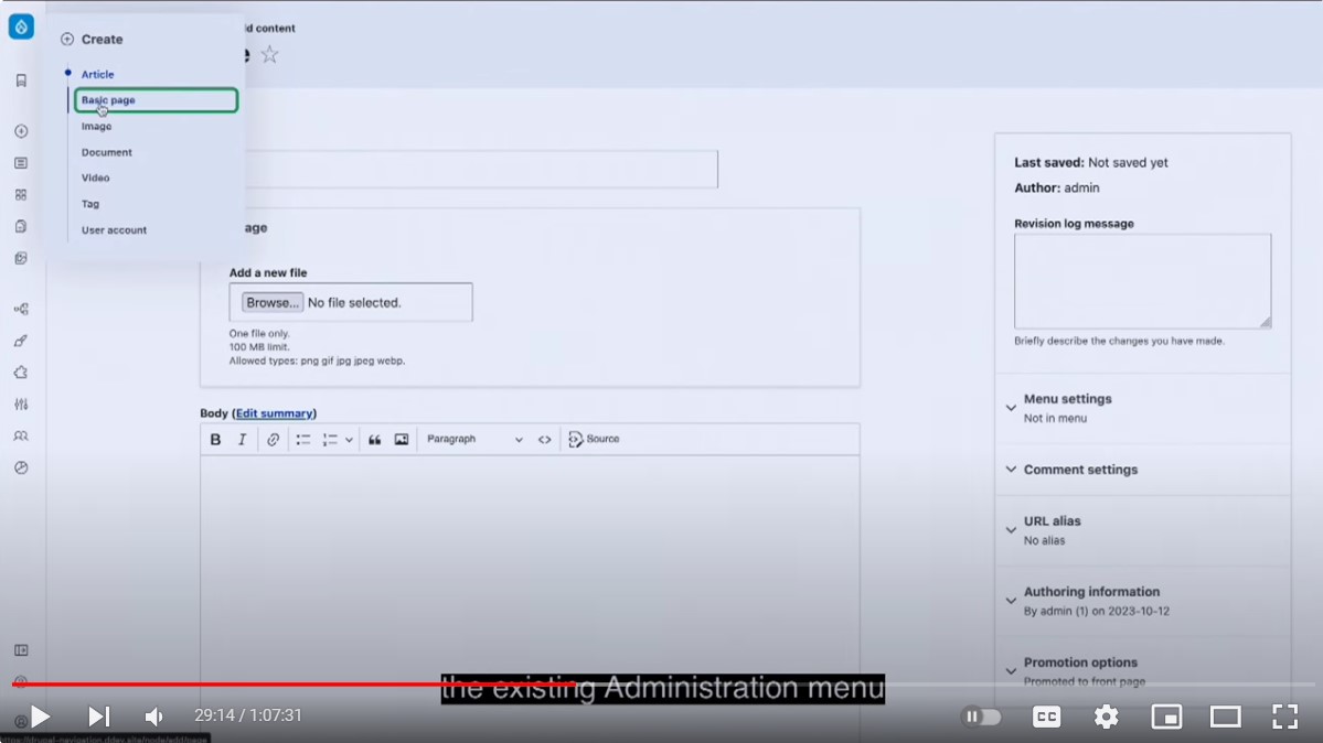
Currently, the creators of the new navigation are working on the proposal to create a new content creation menu. It should bring content creation/management tasks together for easier access, so they are not scattered across different sections. Managing user accounts also falls within this area of responsibility.
So we can see in Cristina’s demo that there’s a new “Create” link in the upper part of the toolbar with direct links to create content and users. It allows content editors to jump directly to creating an article, a basic page, an image, a document, a video, a tag, or a user account. However, the creators are currently thinking about what to include in this menu based on each website’s set of content types which can sometimes be very numerous.
- The top toolbar
Cristina also mentioned that the initial left navigation wasn’t addressing all the needs that they had for integrations with some modules. So there is a suggestion to also have a sticky, contextual top toolbar that would show extra tools based on where a user is in the interface. Various modules should be able to add their sticky action links to the top toolbar that should always be at a user’s fingertips during the performing of specific tasks.
- Rethinking the wording
In addition, work is being done on improving the administration menus by rethinking the words used on the link groupings. This should make it easier for any user to understand where they are regardless of their experience with Drupal.
- Mobile design
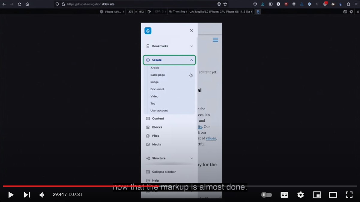
There is a process underway for testing the initial mobile designs so it is displayed properly, is accessible, and provides seamless user experiences on mobile devices.
- Toolbar customizations
Another great piece of news is that the creators of the new administration toolbar are figuring out how to make the menus customizable. This means it should be possible for each website to have specific links based on their team’s workflows. Managing links contained in the toolbar should be easy and user-friendly.
Thorough testing
As Cristina shared in the same presentation, the creators of the new toolbar based their initial designs and prototypes on research of competitors, industry standards, and previous UX studies on the topic. For a start, they built a prototype with hardcoded links that were used for usability tests to gather feedback from content users and site builders, but now they’re in the process of converting the hardcoded menu into a real one.
“We’ve done multiple rounds of usability tests and we’ve iterated the prototypes based on the results, which led us to several changes and improvements from our initial assumptions. Based on testing, we are confident that the new toolbar designs offer a better experience than the old core toolbar.”
— Cristina Chumillas, the Drupal core UX Maintainer, at DrupalCon Lille 2023
More usability and accessibility testing is ahead to make sure the new administrative toolbar meets the needs of the key user personas engaged in website management such as content editors, site builders, and website administrators. The maintainers welcome feedback from users to make the toolbar as great as possible.
It’s possible to test the new toolbar out by using the Navigation module or the Gin theme, which we’ll talk about in a little more detail below.
The new admin toolbar and the Gin theme
The new navigation might look very familiar to the users of the new admin theme — Gin. Indeed, some ideas for Drupal’s new toolbar have also been implemented in the Gin theme. Gin is a contributed theme built on top of the default core admin theme Claro but enriched with bolder functionalities such as the dark mode and more. It was created by Sascha Eggenberger (saschaeggi) who is also one of the maintainers of Claro and the Drupal Design System.
Sascha Eggenberger gave a session “Next Drupal admin UI improvements” together with Cristina at DrupalCon Lille 2023. At the session, Sascha said they wanted to bring “the best bits of Gin” into the new navigation but in a bit more refined version.
The most progressive ideas — and Drupal’s new toolbar is definitely one of them — need some kind of an “experimental playground.” “You can always think of the Gin admin theme as being an experimental theme, not in terms that it’s unstable,” said Sascha. “We want to try out things, gather feedback, and iterate on things”. As for Drupal core, they wanted to have “a rock-solid solution,” which is why the new toolbar is not yet being built directly in Claro.
Final thoughts
The new administrative navigation toolbar is further evidence that the new era of Drupal website management has already started, and the innovations are in full swing. By updating their websites to follow the new Drupal core releases, teams can make sure they are getting the absolute best things Drupal brings to the table!


