
Drupal 10 Demystified: an In-Depth Review of the New Features
Authored by: Nadiia Nykolaichuk & Anatolii Poliakov
The launch of Drupal 10 is a huge step forward in terms of Drupal's editor-friendliness, visual appeal, and modern powerful components under the hood. There are multiple tools available to help you build the versatile digital web experience you require to meet your users where they are.
This whitepaper shares everything you may need to know about Drupal 10, whether you’re a content editor, marketer, developer, or general user, we've collated the information so you don't have to.
We have carefully studied all the new arrivals in Drupal 10 and grouped them into three categories based on who they might be most interesting for:
- Drupal 10’s new features for general users
- Drupal 10’s new features for content editors
- Drupal 10’s new features for developers
1. Drupal 10’s new features for general users
Olivero default front-end theme
Anyone who launches a new Drupal 10 installation sees the modern and fresh default front-end theme Olivero. It has actually been available out of the box since Drupal 9.4, replacing Bartik, which had been the default theme for more than a decade and started to get outdated.
Dries Buytaert, the founder of Drupal, described Olivero as the most accessible theme Drupal ever shipped in its entire history, and the National Federation of the Blind also came up with some great feedback about the theme. Indeed, Olivero has been created with a big focus on accessibility, in cooperation with the Drupal Accessibility team and third-party accessibility specialists. Great work has been done to give Olivero an AA level of compliance with the WCAG (Web Content Accessibility Guidelines). The theme owes its name to a passionate accessibility advocate, Rachel Olivero.
Olivero’s fresh color palette is based on the bright blue, Drupal’s brand color, which is balanced out by neutral grays. Forms are easily identifiable thanks to a color bar on the left and are provided with clear field labels, checkboxes, and radio buttons. Buttons have a strong contrast, and vivid colors, and are easily distinguished as clickable elements. Likewise, all other design components such as typography, various header and navigation options, breadcrumbs, and messages, are simple, elegant, recognizable, accessible, and perfectly adjusted to mobile devices.
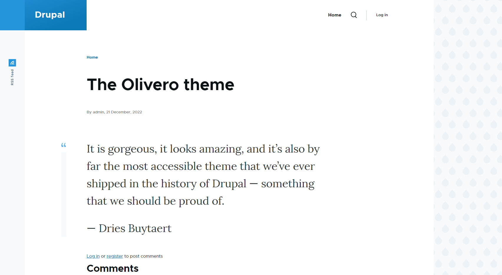
The RTL (right-to-left) support makes Olivero ready for websites with a wider range of languages such as Arabic, Hebrew, Urdu, etc. Olivero works great with all modern browsers with no need for customization. It has native support for CSS variables and uses Post CSS to compile CSS.
Claro default administration theme
“Claro” is what a Spanish-speaking person would say about something clear and understandable. Indeed, the default backend theme Claro is meant to make site management in the Drupal 10 admin dashboard easier than ever before.
Claro is not a brand-new Drupal 10 feature — it has become Drupal’s default backend theme starting with version 9.4. Claro replaced the old administration theme, Seven, which was getting outdated and didn’t ship with Drupal’s recent improvements associated with the adoption of modern JavaScript concepts.
The admin UI is the place where all site administrators and content editors spend most of their time. That’s why the creators of Claro have considered the results of a UX study in which Drupal editors shared their pains and expectations.
Claro doesn’t change the traditional functionality of the admin dashboard but focuses on increasing its usability and giving it a totally refreshed and modern look. Similarly to Olivero, Claro has accessibility as a priority. So here are some of the Claro theme’s key features:
- a high-contrast color palette
- minimalist icons
- precise shapes
- color-independent indicators to describe elements
- a clear hierarchy and relationships between the theme’s elements
- better keyboard control
- cross-browser compatibility
- optimal readability
- rational use of negative space
- support for Windows High-Contrast Mode
- responsive web design, which makes Claro easy to use on mobile devices.
Project Browser
Extending Drupal with contributed projects can be challenging for beginners or non-developers. This is especially true for Drupal 8 and higher because the golden standard for installing a new module involves using Composer.
Drupal 10 is going to make module installation genuinely easy with the new Project Browser tool. It is not yet in the core but the work is in full swing to include Project Browser in one of the next minor releases (for example, in Drupal 10.1).
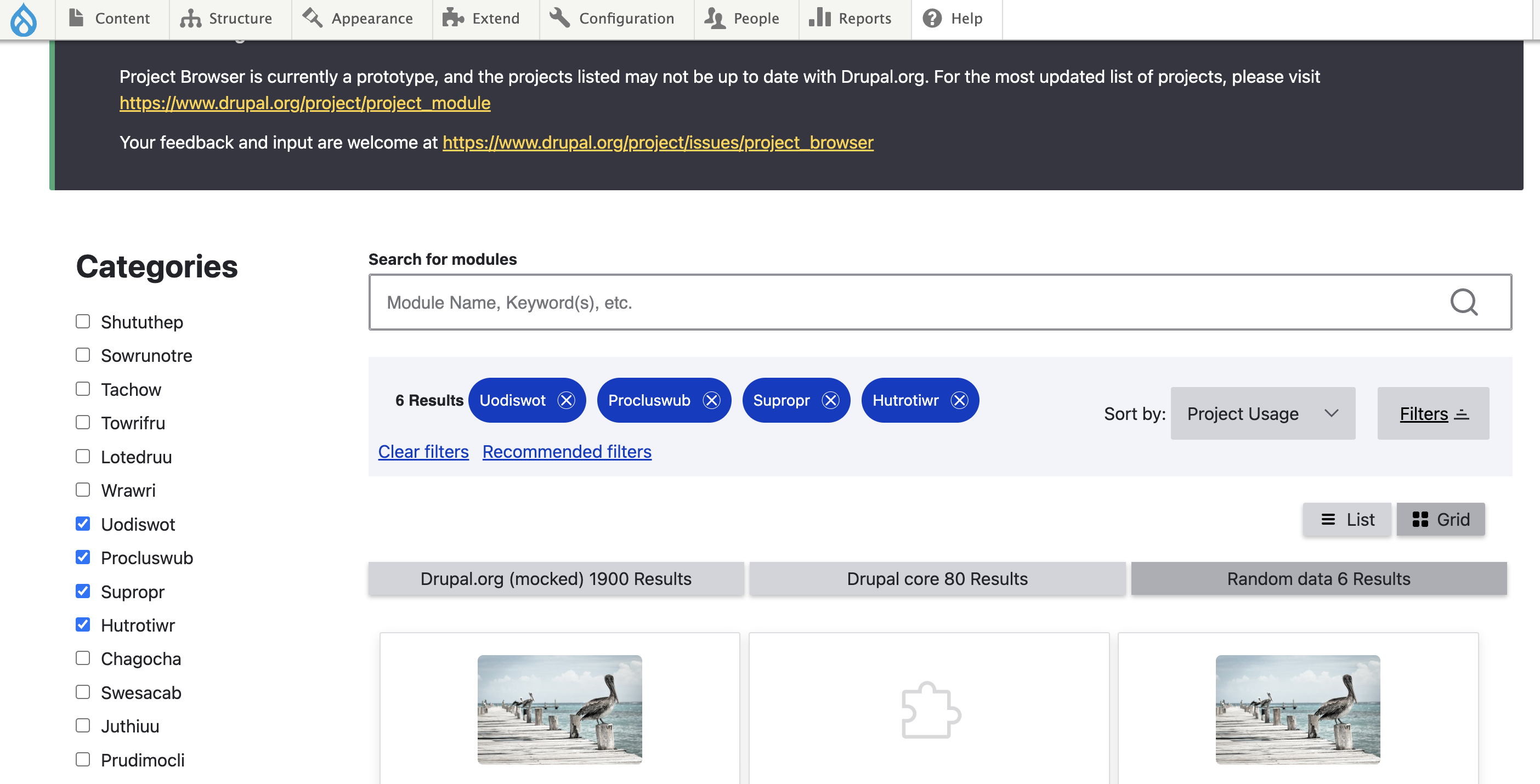
Project Browser ensures an easy process of finding and installing contributed projects from the Drupal admin dashboard. While helping users, it also helps the community highlight some great contributed modules and welcome more people.
Project Browser adds a new “Browse” subtab to the Extend tab of the Drupal admin panel. Users can then search for modules by keywords with the help of the search feature with no need to go to drupal.org. No worries about the right choice — the default filters will only display the modules that are compatible with the website’s core version and covered by the security policy. The most popular projects will show up first.
As a user finds the module they want to install, they see instructions to use Composer for installation. However, as the co-initiative leads Leslie Glynn and Chris Wells said in the session, they are very close to making Project Browser run Composer commands behind the scenes, with no need for users to deal with it.
Automatic Updates
Automatic updates have always been the number one requested feature for Drupal. Users have been dreaming of the option to update a Drupal website at a click of a button and leave technical workflows in the past.
This is becoming a reality in Drupal 10. The Automatic Updates functionality is currently being developed in the form of experimental modules. We expect to see it in the Drupal core in one of the future minor versions of Drupal 10.
Automatic Updates are meant to cover the updates for both the core and contributed projects. The initial version supports the core updates only, but the team is working hard on the option to update contributed modules and themes automatically as well, which is the mission of a hidden module — Automatic Updates Extensions. This exciting news has been shared by Ted Bowman, the technical co-lead of the Initiative, in his Automatic Updates demo.
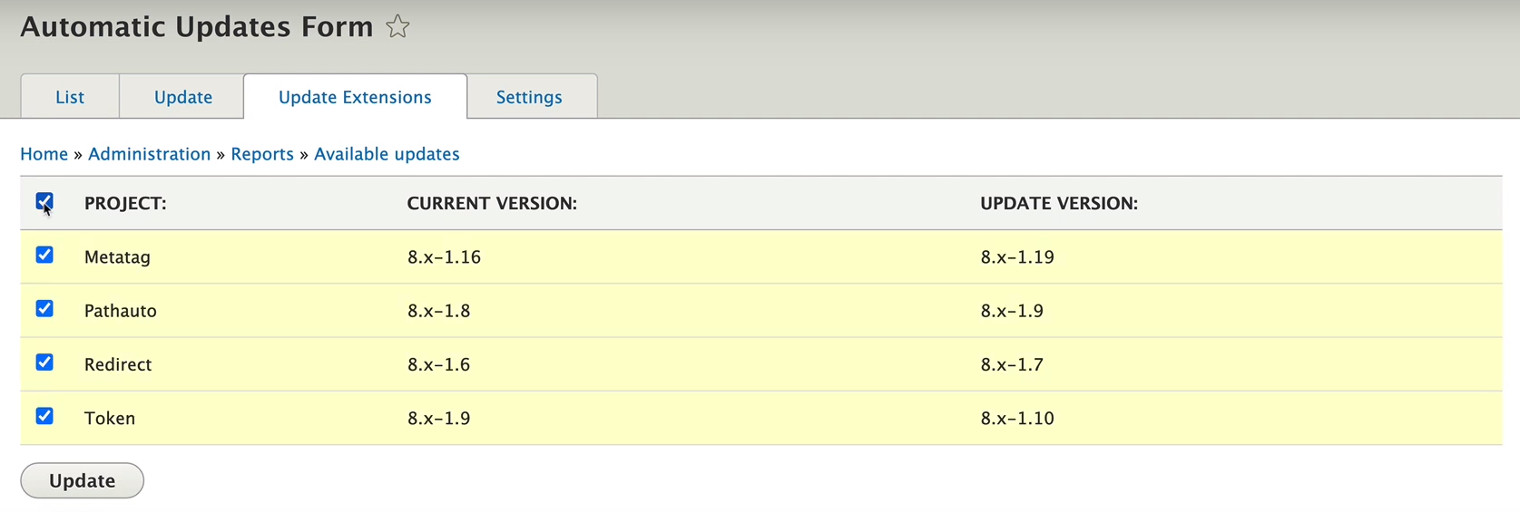
Automatic Updates provides users with a user-friendly UI with the Composer tool working under the hood. You can run updates in an attended mode (by clicking the “Update” button) and an unattended mode (by configuring Drupal Cron to do it regularly for you).
As the update process for any CMS is prone to risks of issues, there are special security measures applied. The tool first thoroughly checks your website’s readiness for the update, puts your website into maintenance mode, and creates its staged copy for running the update so you have a chance to confirm or cancel your actual website update.
2. Drupal 10’s new features for content editors
CKEditor 5
Drupal 10 changes and improvements are mostly focused on a better UX for people involved with content creation. Migrating to a new major version of the CKEditor changes a lot in an editorial team’s experience.
CKEditor 5 has been rewritten from the ground up in comparison with its predecessor, CKEditor 4. In Drupal 10, CKEditor 4 has become deprecated, so please check out the “Goodbye to some modules” chapter of this article.
Here are at least some of CKEditor 5’s exciting features in the Drupal 10 core:
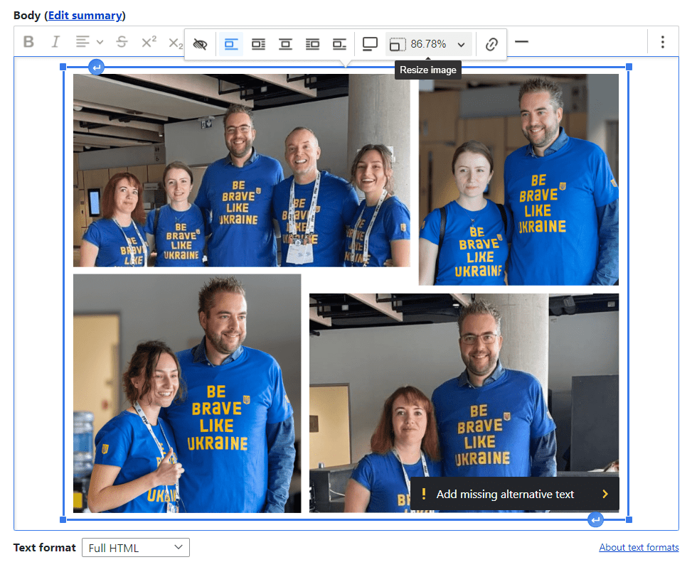
- a new dedicated balloon toolbar with the settings to align, resize, or caption the embedded media
- a new balloon panel to add ALT text for images, with a reminder to add the missing one, as well as an option to mark an image as “decorative”
- a new balloon panel to manage links
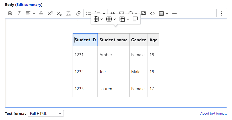
- a new dedicated dropdown to easily insert and style tables just like in Google Docs
- an updated collection of special characters
- the option to drag and drop images to CKEditor 5
- the option to upload images in bulk
- the option to insert a code block in any programming language
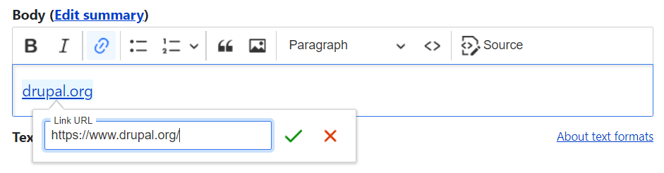
We’ve made a gif to show you that adding a link in CKEditor 5 is twice as fast and much more convenient than in CKEditor 4:
As we can see, the Drupal 10 core has incorporated some of CKEditor 5’s most common editorial features. However, more features can potentially be added to Drupal. CKEditor 5 has a plugin-based architecture, which means it is a collection of plugins, each of which provides its own piece of functionality.
CKEditor 5 plugins offer autoformatting, automatic text transformation (autocorrect), mentions (automatic suggestions for autocomplete), and much more. In addition, it has premium features — for example, the new collaboration functionality which is much discussed today. It enables multiple users to collaboratively review and discuss the text within the editor. The Track Changes, Comments, and Revision History features ensure the productive collaboration process in both asynchronous and real-time editing modes.
For seamless integration with various CKEditor plugins, there are contributed Drupal modules. It’s also important to note that the new CKEditor plugin system is not compatible with the old one. Currently, the maintainers of contributed modules are working to make them ready for CKEditor 5, which is a challenging task because of its totally new architecture.
Media and Layout Builder to become available out of the box
The above-described Claro theme has been a great example of how Drupal is becoming easier for everyone to use. There is a special Easy Out of the Box Initiative aimed at making some of the coolest usability-enhancing features available to every user from the start, which is especially important for content editors. Claro is one of the “3 pillars” of the Initiative, alongside Layout Builder and Media.
In the Drupal 10 core, Claro is available by default, while Layout Builder and Media still need to be enabled by anyone who would like to use them. The work is in progress to make both of them enabled out of the box in every Drupal installation. Here are their key features:
- Media
The Media system covers every aspect of creating, editing, publishing, and configuring multimedia — images, documents, YouTube videos, Instagram posts, and so on. Users can save media items in the super user-friendly Media Library for further reuse. There is a special icon in CKEditor for getting media from the Library and adding it to content in a few quick clicks. There is also the Media field that enables you to attach multimedia to content on the structural level.
Media are organized into customizable Media types that have fields just like Drupal content types do. You can use the default ones or create new ones. Each media type is based on a media source plugin that is best suited to work with specific multimedia.
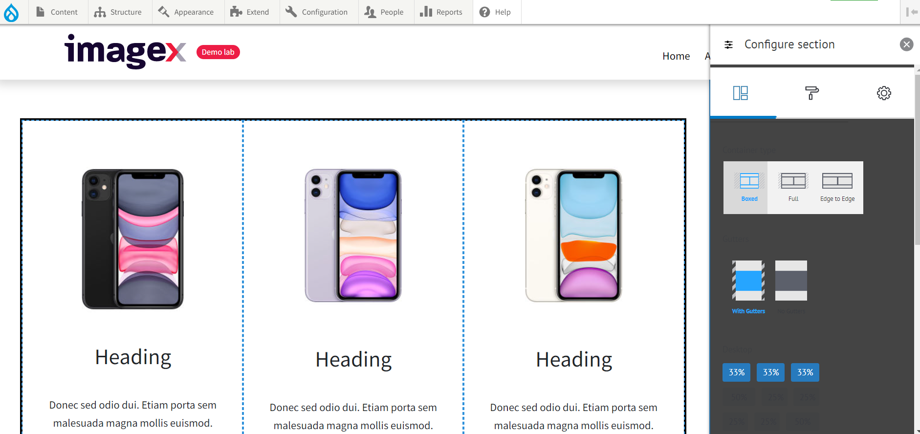
- Layout Builder
The Layout Builder is a drag-and-drop tool that significantly improves the content creation process by enabling site administrators and content editors to create or customize content layouts. Compared to Paragraphs or any other older approaches, content creators can see how content will look during the editing. It’s possible to create a standard layout for a content type so it applies to all nodes of that type. Or, if you need a unique layout for an individual landing page, the Layout Builder can do that as well.
In the Layout Builder’s UI, all layouts are made of sections, and sections are made of blocks. You just create a section based on the number of columns and then drag and drop any blocks or content fields to it. The available blocks and fields are conveniently displayed in a sidebar menu. Each of them can be fully customized. Users can rearrange the layout blocks to their liking by drag-and-dropping them across the sections.
3. Drupal 10’s new features for developers
PHP 8 and Symfony 6
Before we move on specifically to PHP and Symfony, it should be noted that Drupal 10 is Drupal 9 minus deprecated code. With a lot of “rubbish” cleaned up, Drupal 10 should be faster than Drupal 9.
Drupal 10 ships with the latest PHP and Symfony versions. Developers can take advantage of improvements in them, but they will also have to do some work to update the code that uses deprecated Symfony APIs and update PHP on the servers. Keeping PHP and Symfony updated is vital for website performance, security, and stability, as well as for the efficiency of the development workflows. So let’s see how the versions of Symfony and PHP have been updated in Drupal 10:
- PHP 7 > PHP 8.1
PHP 7.4 went end of life in November 2022 and Symfony 6.2 requires PHP 8.1 or higher. Those are the key reasons why the Drupal team decided to make PHP 8.1 the minimum supported PHP version for Drupal 10. In addition to PHP 8.1, PHP 8.2 is fully supported for Drupal 10 websites as well.
Version 8.1 is a major update of the programming language. It contains many new features such as enumerations, first-class callable syntax, readonly properties, fibers, new in initializers, pure intersection types, never return type, final class constants, explicit octal numeral notation, performance improvements thanks to opcache ("inheritance cache"), and more.
- Symfony 4 > Symfony 6.2
The Drupal core relies on a lot of reusable components and libraries of the Symfony framework. They are great for many common tasks so Drupal developers don’t have to reinvent the wheel, and they are based on the best web development practices and standards. Drupal 9 depends on Symfony 4, which became deprecated in November 2022. Drupal 10 embraces Symfony 6.2, which has a number of major improvements (routing, services, locales, multilingual aspects, etc.).
Modern JavaScript components replacing jQuery
For years, jQuery and jQuery UI in the Drupal core have been great assistants for developers in building interactive front-end features. However, there is an ongoing trend in the JavaScript community to use vanilla JavaScript instead of jQuery. JavaScript has improved a lot and become easier to use with no need for jQuery. Many tasks can now be performed more efficiently using native functions.
Consequently, the time has come for the Drupal community to make decisions on replacing some of the uses of jQuery and jQuery UI with more modern JavaScript where possible. The process of cleaning up jQuery is actively going on in Drupal 10. For example, the jQuery.once() method has been totally removed from the Drupal 10 core. The maintainers of contributed modules also follow the trend and replace jQuery with modern JavaScript in their projects.
The approach to JS in D10 is closer to the last ES standard, making Drupal's default front end more lightweight and fast. The change is also meant to provide a cleaner front-end output and improve developer efficiencies.
Single Directory Components
More great news for front-end developers is that the Drupal core is adopting the Single Directory Components approach (often abbreviated as SDC). It is going to be introduced as an experimental module in the 10.1.x release. Mike Herchel, one of the top Drupal contributors, called SDC the biggest paradigm shift in Drupal since the introduction of Twig in 2013, as well as the biggest leap of all that Drupal has made in the front-end sphere in recent years.
Single Directory Components are Drupal’s implementation of components — modular or reusable parts of a website page serving a specific purpose such as menus, forms, sliders, etc. SDC enables developers to gather all files that are necessary to render a component (CSS, JS, Twig, etc.) and group them in a single directory. SDC will automatically generate a library to load CSS and JavaScript when the component is called.
The new feature makes Drupal closer to design frameworks like Storybook — a frontend workshop that is used for building UI components and pages in isolation and works with JS frameworks such as React, Angular, Vue, and Svelte. In general, it means that Drupal design and development teams could collaborate more effectively.
Changes to the cache tags and settings.local.php
- Module and theme developers will be able to debug render caching more effectively thanks to the new debug setting. It will generate an output with caching-related issues for each rendered element. The elements will be wrapped with HTML comments. To make use of this feature, developers need to set the debug container parameter to “true” under renderer.config in the services.yml file.
- Another important detail that developers must pay attention to is that the \Drupal\Component\Assertion\Handle::register() function has gone deprecated in Drupal 10.1. That’s why the example.settings.local.php file has been updated to change the default assertion. To ensure forward compatibility and consistency, any development site that uses this file needs an update in its workflow based on the new change from:
assert_options(ASSERT_ACTIVE, TRUE);

\Drupal\Component\Assertion\Handle::register();
to:
assert_options(ASSERT_ACTIVE, TRUE);

assert_options(ASSERT_EXCEPTION, TRUE);
No more support for Internet Explorer 11
One of the happiest updates in Drupal 10 for front-end developers is the drop of support for Internet Explorer 11. Internet Explorer was lagging behind more modern browsers because Microsoft has long since stopped actively developing or updating it. The browser was a stumbling block that prevented Drupal from embracing advanced front-end features and technologies. The use of IE was steadily declining, so there was no need to continue to support it.
The decision to remove this support in Drupal 10 became a wind of change for the CMS. Leading Drupal contributors Mike Herchel and Andy Blum gave a session at DrupalCon Prague 2022 about the cool things that became possible in the front-end area without the “nasty and crafty” Internet Explorer 11. Among those cool things is the Views Responsive Grids feature which we are going to discuss right away.
Views Responsive Grids
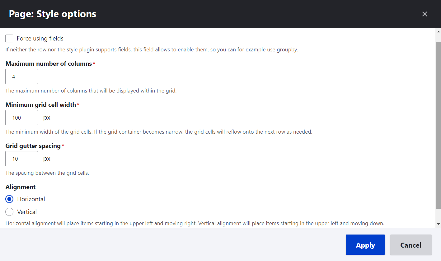
Views Responsive Grids is a new hot feature in the Drupal 10 core for creating responsive pages with the help of modern CSS tricks. But the key secret is that a person even doesn’t have to know CSS — they can just select the new Responsive Grid format in the Views UI and the ultra-responsive magic will be applied under the hood.
Anyone familiar with Drupal Views can easily find the Responsive Grid format alongside the traditional Grid, Table, HTML List, and Unformatted List in the Display settings for a page or a block. In the next step, all a user needs to do is specify a couple of parameters for the responsive grid directly in the Views UI (or just rely on the default ones):
- the maximum number of columns
- the minimum grid cell width
- the gutter spacing
- the horizontal or vertical alignment
The responsive content grid automatically reflows to stay perfect on any device it is viewed from. For example, if the size of the grid container increases, the grid expands to include as many columns as allowed, while keeping the grid cell width above the minimum allowed level. However, once the minimum cell width is reached, the grid reflows to display fewer columns. Mike Herchel, the creator of the feature and the lead developer of Olivero, built a CodePen where anyone can see the magical transformations of the responsive grid.
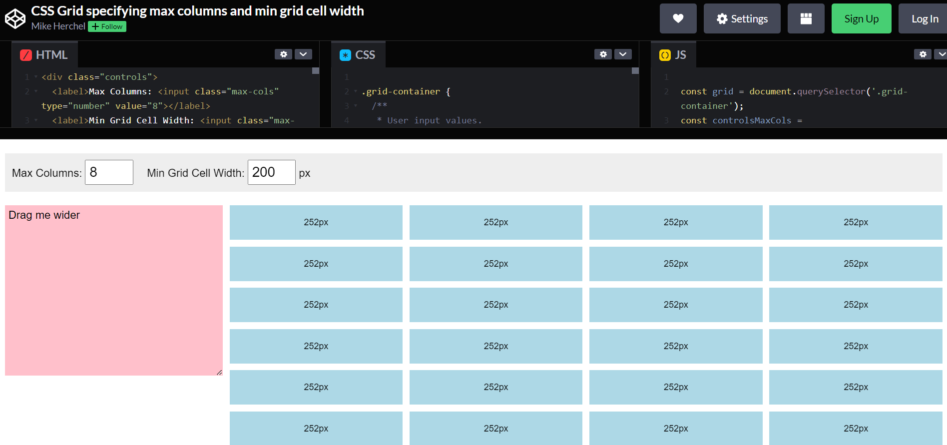
There is no need to specify the breakpoints or the actual grid sizes. Since the CSS is not reliant on the viewport width, it’s possible to display the grids in wider or narrow regions of the website’s theme.
New Theme Starterkit Tool
Drupal 10 comes packed with the new Theme Starterkit Tool, a game changer in theming. The new exciting tool gives front-end developers a great starting point whenever they need to create a theme for a Drupal 10 website.
Traditionally, developers build new themes with the help of sub-theming — creating a subtheme on the basis of another theme. Oftentimes, the core Classy theme was used as a basis. The new theme inherits all the parent’s theme code and functionality in the runtime. Applying changes to the parent theme might break backward compatibility, so considering a great number of subthemes that depended on Classy, no changes have been made to Classy since Drupal 8.0.0 for safety reasons.
With the Theme Starterkit Tool in Drupal 10, there is no longer a need to worry about breaking anything. You don’t inherit the markup and CSS from the parent theme. Instead, the new tool forks the base theme and copies its templates and CSS into the newly created one. The process is very straightforward — you can generate a new theme with the help of a simple command in the CLI. With the Theme Starterkit Tool introduced, the Classy theme has become deprecated in the Drupal 10 core.
Decoupled Menus
Next up is another interesting feature that is currently in progress but should be released in later versions of the Drupal 10 core. It’s called Decoupled Menus, and the Initiative for its creation was introduced back in 2020 at Dries Buytaert’s DrupalCon Europe’s 2020 keynote. Gabe Sullice, one of the Decoupled Menus Initiative’s coordinators, explained its key goals as follows:
- give Drupal the best JavaScript developer experience than any other CMS has;
- make Drupal the best decoupled CMS overall.
To reach these goals, the Drupal team needs to establish a pattern for building, shipping, and maintaining JavaScript packages, as well as make sure these packages are high quality and easy to use. It’s also important to provide an excellent non-developer experience even in the decoupled architecture, explained Gabe.
These goals were very ambitious, so the team focused on a single use case — a JavaScript menu component. Drupal should feature configurable JavaScript menus that would be easy for
any front-end developer to consume in their applications. They need to be able to render the navigation without hardcoding anything, and even non-developers need to be able to manage the menus without writing code.
Goodbye to some modules
In his Plan for Drupal 11 blog post, Dries Buytaert informed the readers about the proposed initiative on making Drupal core smaller. As part of this, more modules need to move from the Drupal core to the contributed space. As Dries explained, this should mean less code to maintain in the Drupal core and allow Drupal to focus on innovation. It’s also good for contributed modules because certain modules innovate faster when they are independent.
We can already see several modules and themes deprecated in Drupal 10. In most cases, they can be safely uninstalled with no impact on the website. Those who wish to continue using them need to add a dependency to the respective contributed module.
Here are the ones that have become available as contributed projects (with the links to the project pages where you can now find them if you wish):
- Aggregator
- CKEditor 4. It is recommended that most websites using CKEditor 4 upgrade to CKEditor 5, and drupal.org provides instructions here and here for doing it. You could also opt for using the contributed CKEditor 4 project, but it will only be supported until late 2023. So this choice is only good if you are using some other modules that provide CKEditor 4 plugins and don’t have CKEditor 5 equivalents yet.
- Color
- Hypermedia Application Language (HAL). The JSON:API module in the core can be a great replacement for what HAL used to do.
- Quick Edit
- RDF
Here are the core modules that have become obsolete and are no longer available in any form:
- Entity Reference
- Migrate Drupal Multilingual. The core Migrate Drupal module will take care of all the work that Migrate Drupal Multilingual.
The easiest migrations in Drupal history
Upgrading from Drupal 8 to 9 became exceptionally easy in comparison to cumbersome upgrades from Drupal 7 to 8. However, moving your website from Drupal 9 to 10 is even easier, so the first prize for the easiest upgrade in the history of the CMS now goes to Drupal 10.
Based on the State of Drupal presentation by Dries Buytaert as of September 2022, contributed modules are getting ready for Drupal 10 much faster than they were for Drupal 9. When he compared the number of ready modules at the beta-1 release stage for both versions, he found out that 3 times as many modules were ready for Drupal 10.
Significant automation and improved functionality of upgrade tools are making things much easier, which is great news for both developers and users. In his DrupalCon Prague 2022’s keynote, Dries Buytaert included a video with a user story about upgrading a website to Drupal 10. Among the tools featured in this video is the Upgrade Status contributed module. Even the installation of the module became easier for the user in the video thanks to the new Project Browser tool. Moreover, the Upgrade Status module now has a much more helpful version than before. It is oriented towards suggesting the next steps, including the advice to run automatic code fixes with Drupal Rector where possible.
Drupal Rector, the tool that automatically fixes deprecated code, has reached an especially high level of efficiency in making websites ready for Drupal 10. Initiative coordinator Gábor Hojtsy wrote about a 95% coverage of deprecated Drupal APIs by the tool.
Time to upgrade to Drupal 10!
Drupal 9 will hit end of life in November 2023. It is highly recommended to upgrade your website to Drupal 10 because of the end of life of Drupal 9's key third-party dependencies. An upgrade will provide more stable and reliable work for your website, make sure it’s bug-free, and, of course, give it a chance to use all the amazing Drupal 10 features we have been discussing in this article. If you need help with your upgrade, you can always reach out to our professional Drupal team.