Bold, Sleek, and Endlessly Customizable: the Gin Theme for Next-Level Drupal Admin Experiences

Drupal’s administrative interface has undergone incredible changes in recent years. Just one look at the new default admin theme, Claro, is enough to make the old Drupal backend’s design seem like drawings on cave walls. It’s one of the things that makes a visual comparison between Drupal 7 and Drupal 10 so strikingly in favor of the latter and inspires users to speed up the upgrade ahead of Drupal 7’s end of life.
While Claro undoubtedly does an amazing job in providing seamless, accessible, modern, and efficient admin experiences, Drupal has yet another gem in this sphere — Gin. It’s already used on 56,500+ Drupal websites.
Gin, a contributed admin theme, was built on top of Claro but has evolved into a project that adopts the boldest experiments and the most progressive ideas. It boasts brand-new navigation, a dark mode, sticky control buttons, infinite options to customize the appearance, and much more. Let’s dive in and explore Gin in more detail — the creation, the intriguing name origin, whether or not it’s going to replace Claro, and, of course, the cool features it offers out of the box and via extra modules.
Gin: getting acquainted with the theme
The creation of Gin
The Gin theme was created by Sascha Eggenberger (saschaeggi) — one of the lead designers of Claro and Drupal Design System. At DrupalCon Amsterdam 2019, Sascha, along with the co-creators of the new Drupal admin experiences, discussed potential improvements for the future. They outlined some early design explorations and when showcasing them, the feedback was overwhelming.
Sascha shared this and many other insights on the “Talking Drupal” podcast. He explained that the 1.x branch of Gin primarily allowed users to change the theme's accent color. Instead of the standard “Claro blue,” you could choose green, red, orange, or any color you preferred.
So Gin started as a small customization layer and has grown into a wonderful independent theme that readily embraces innovation, has a totally new design, and is fully customizable.
What about Claro?
Gin builds up on Claro but goes further than what can be achieved with Claro. However, according to Sasha, there is no intention to get Gin into Drupal core. The intention is to have Claro grow and improve over time with an iterative approach.
“I still believe that Claro on its own is a huge improvement over what we had and Gin basically lives more on the edge of things,” — said Sascha.
He mentioned that while the default Drupal core theme will continue to be called Claro, its design might evolve to resemble the current style of Gin. There are discussions as to various features that might be ported over to Claro from Gin.
Why not build all those admin experiences in Claro from the start? The reason is that it’s essential for the default core theme to be stable, so it cannot iterate fast enough and is not a place for bold experiments. Here is where the Gin theme comes in! Its maintainers experiment with different approaches and get feedback from users to decide which features should go to Drupal core.
Gin: a tribute to content editors
Although site builders are the primary focus during the site's build, it’s the content editors and admins who will use Drupal throughout the product's lifespan. They are also the people we need to convince that Drupal is the right tool, said Sascha. If content editors are not really comfortable with the product, the adoption of Drupal in the future is not guaranteed.
“Having in the future a bigger eye on the content editor as a persona, as a target group, besides site builders, will be crucial for the success of Drupal,” — said Sascha Eggenberger, regarding the feedback he got from content editors that it was difficult for them to find things in the admin UI.
The oriGin of the name
The theme’s name keeps inspiring jokes related to the famous drink. According to Sascha, the name derives from the word “origin” — because the Gin theme’s origin, or the base theme, was Claro.
However, to avoid confusion with a well-known company name, “Origin,” Sascha opted for just “gin.” “And I also like gin the drink, so I basically combined both together. The intentional naming was not the drink itself,” — said Sascha.
Radical redesign: “Is this really Drupal?”
Sasha wrote in his article that when he presented the admin theme to people, one of the most common reactions was “Is this really Drupal?”. That’s because of the radical redesign which should delight content editors, site builders, and site admins.
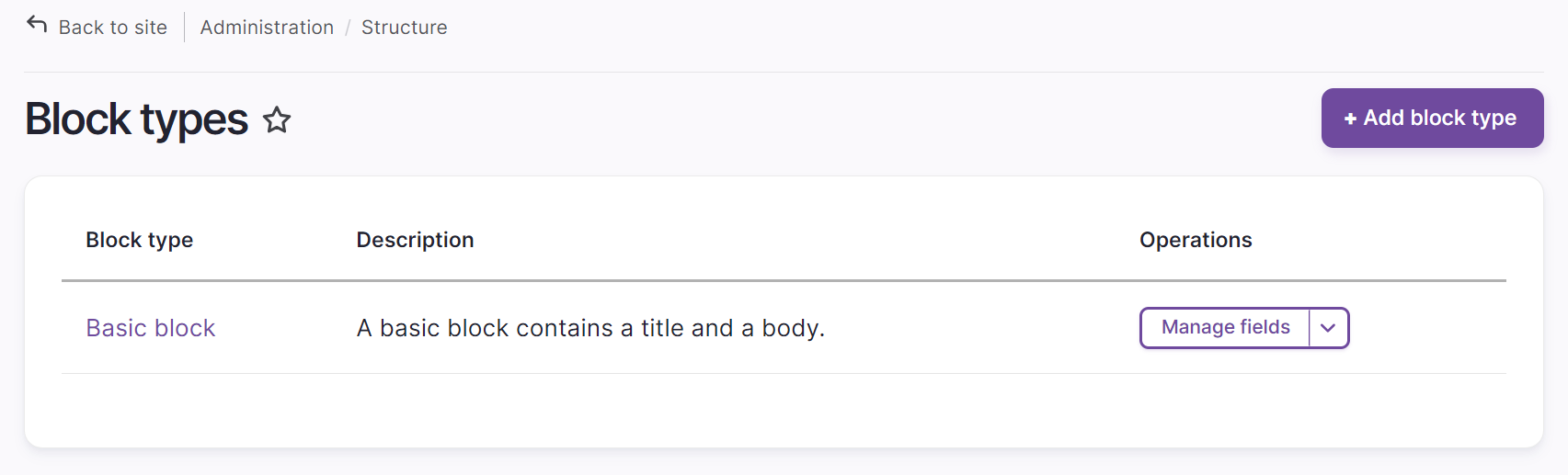
Exploring the features of the Gin admin theme
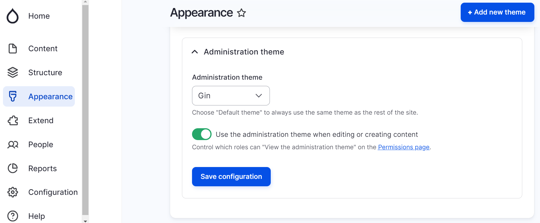
If you’d like to use or try out the Gin theme, you need to install it and select it as your Drupal administration theme on the Appearance page.
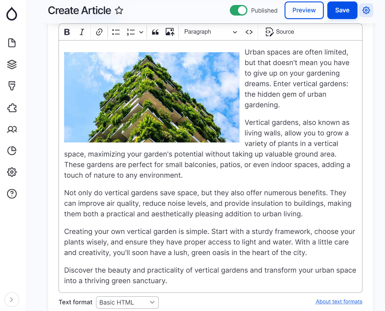
Sticky action buttons and headers
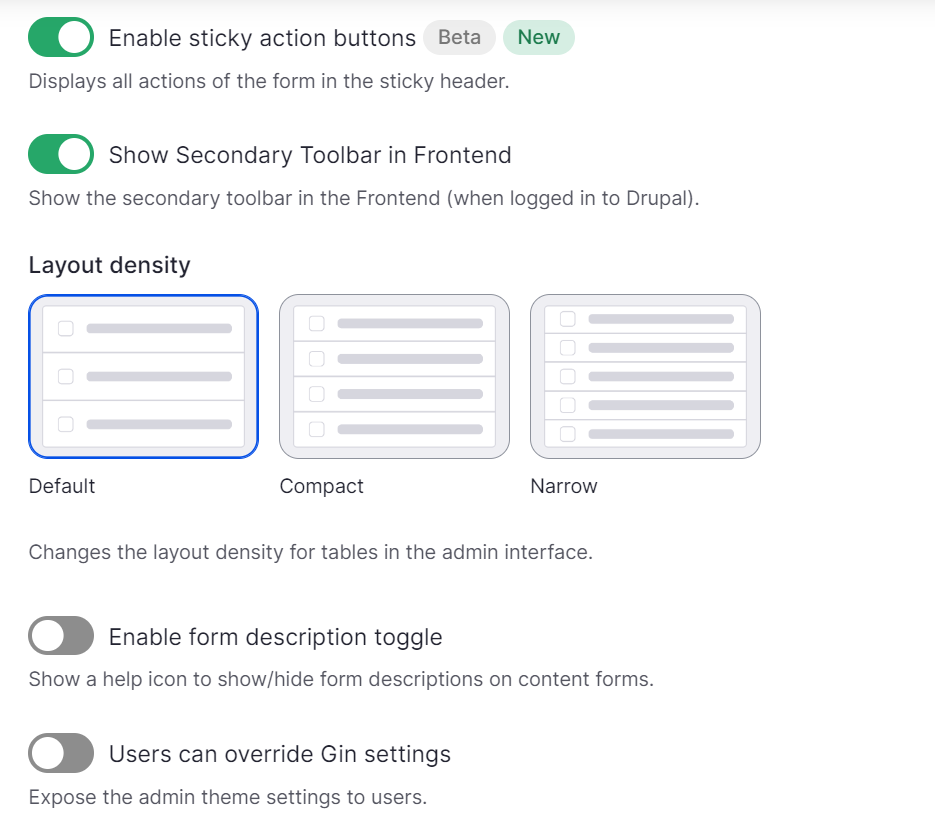
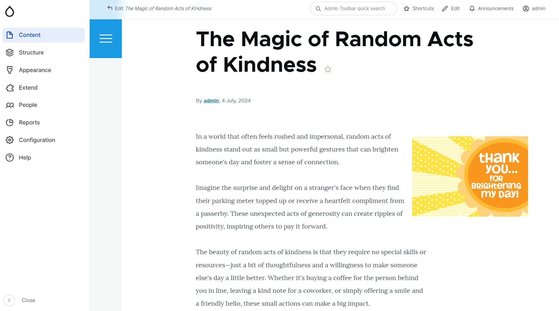
One of the things you’ll notice when navigating through the admin pages is that the most important action buttons and headers are always within easy reach. They are sticky on top of the page. This helps you always see which page you’re on and take important actions without having to scroll.
One of the brightest examples is the content editing form. You can proceed with editing an article and always see the “Preview” and “Save” buttons on top along with the “Published/Unpublished” toggle.
Dark mode
Dark mode has become an increasingly popular feature in many digital interfaces because it resonates with many users. The availability of dark mode has become a signature feature of the theme.
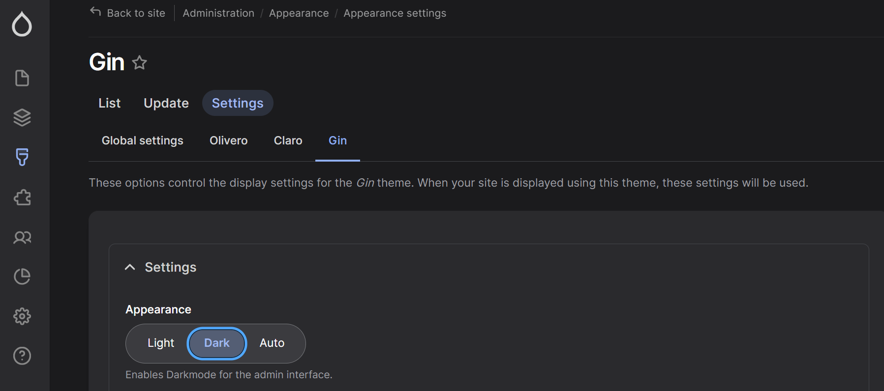
By default, the mode is light but you can change it by navigating to Appearance > Appearance Settings > Gin where there are 3 modes available:
- Light. In this mode, your background is light and the text is dark.
- Dark. In this mode, the background is dark and the text is light.
- Auto. This mode automatically adapts to a color scheme defined in the operating system.
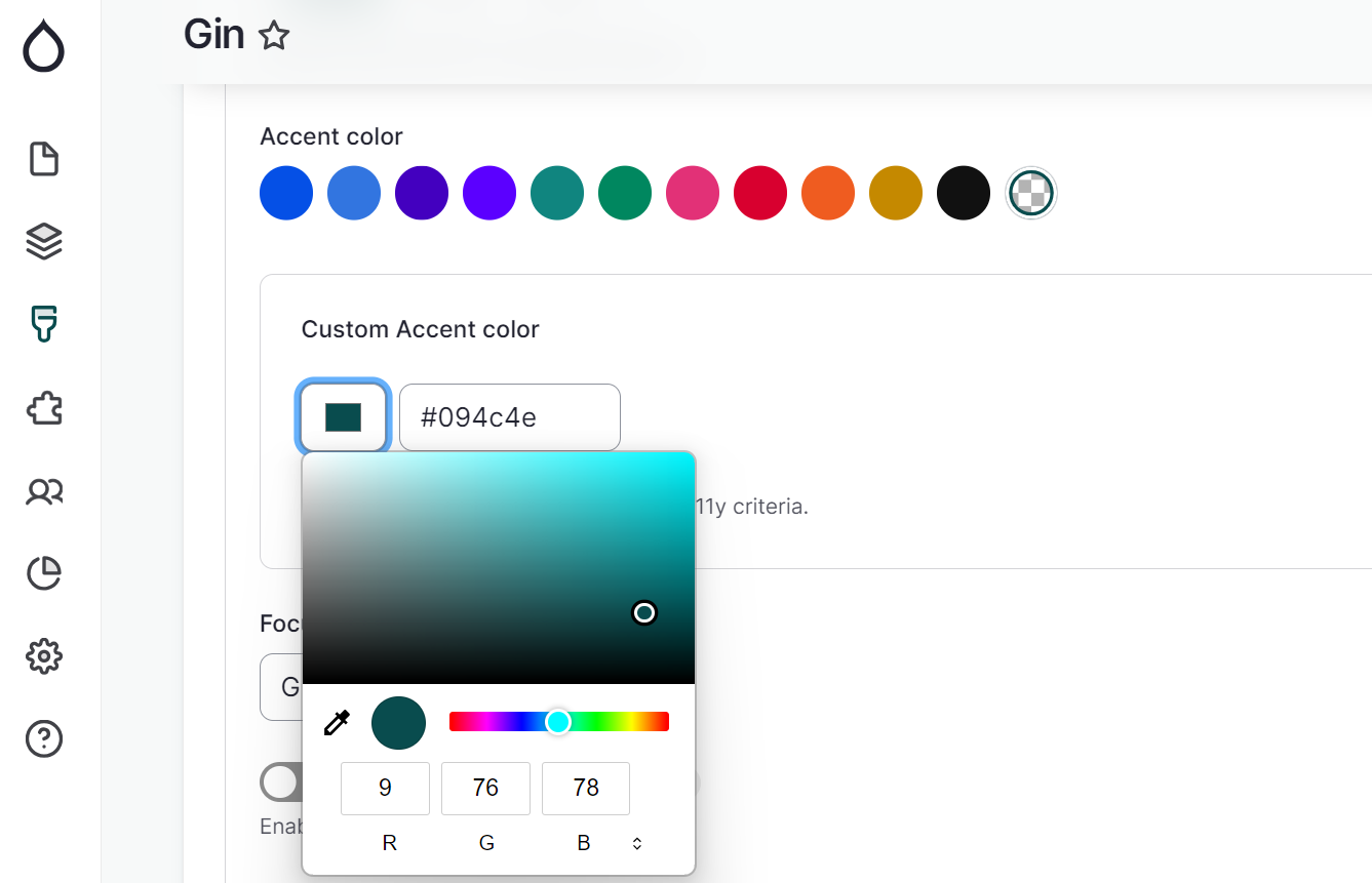
Any accent and focus colors you prefer
You can make sure the colors in your theme exactly match your branding or preferences. Gin enables you to customize the accent and the focus colors. The color settings come right after the dark/light/auto mode.
Accent color
The accent color is a contrasting color used to draw attention to key elements on a website, such as buttons, links, and other interactive components.
At the end of the standard color selection, there is a button to add a custom color using its HEX value. Please make sure it meets the accessibility requirements for contrast (and the theme’s settings will remind you about it).
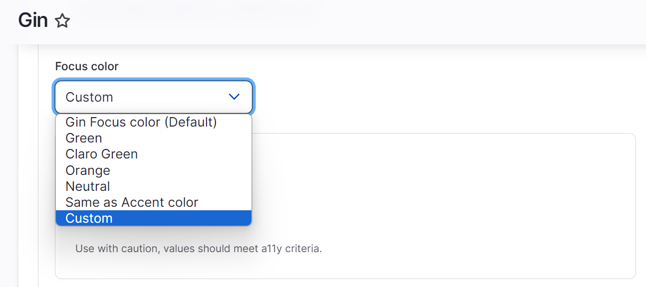
Focus color
The focus color is used to highlight an element that is currently selected or active. This highlight might be a border or background change on buttons, input fields, links, or other interactive elements. The focus color is a vital element of accessible forms and keyboard accessibility.
In the theme’s settings, you can select among the out-of-the-box focus colors.
- Gin Focus color (Default)
- Green
- Claro Green
- Orange
- Neutral
- Same as the Accent color
- Custom (you will be presented with a HEX color palette if you click on it)
If you have set your accent color as custom, you can select the “Same as Accent color” from the list and the focus color will be set as the same (including custom colors).
Increased contrast
Contrast is a vital accessibility factor. In Gin’s settings, you can toggle to the high-contrast mode, which will add borders to certain interface elements (field sets, forms, tables, etc.) for better visibility. This feature is currently experimental.
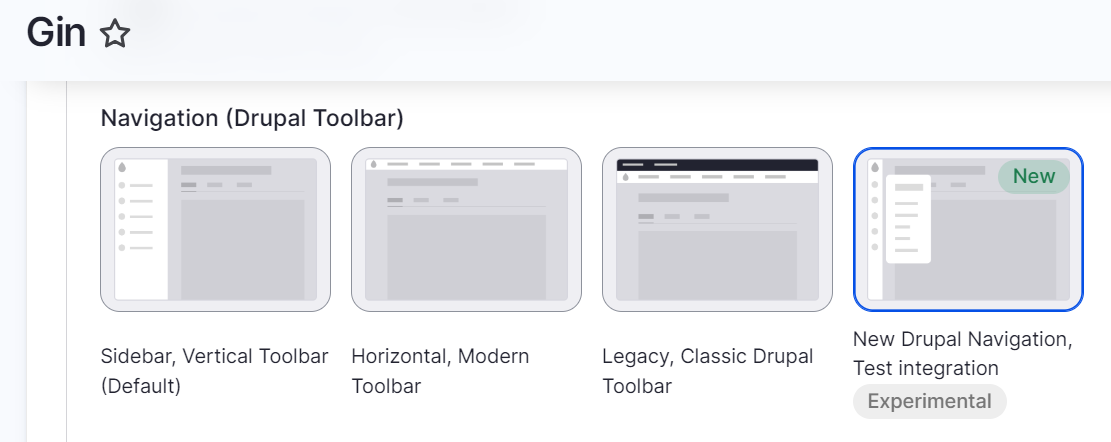
Brand-new navigation
You might have already noticed in all the screenshots that Gin’s navigation looks very sleek and interesting. It’s a left-aligned vertical sidebar that can collapse into a set of icons. Next-level items open easily as you hover over the previous-level items. There are quick-access links to content editing tasks.
Gin’s default navigation is very similar to Drupal’s totally revamped navigation toolbar that recently landed in Drupal 10.3 core on an experimental basis. This shouldn’t come as a surprise because Sascha Eggenberger has also been involved in the making of the Drupal toolbar.
You can also choose to enable the new Drupal toolbar in Gin, which currently has an experimental integration. Gin was an early adopter of Drupal’s new navigation.
To enable Drupal navigation or select any other, scroll to “Navigation (Drupal Toolbar)” in the theme’s settings. You’ll see four toolbar options:
- Sidebar, Vertical Toolbar (default)
- Horizontal, Modern Toolbar
- Legacy, Classic Drupal Toolbar
- New Drupal Navigation, Test integration
And more settings
The Gin theme has plenty of other settings such as showing the secondary toolbar on the front end, having the option to show the logo and favicon supplied by the theme, configuring the layout density, showing user pictures in posts, and so on.
Using the Gin toolbar on the front end
Even more can be achieved through extra Drupal modules for Gin. By additionally installing the Gin Toolbar, you can enable the toolbar for the front end. However, it will only work if you’re logged in as an administrator. Alternatively, it allows it to use the legacy toolbar with some improvements.
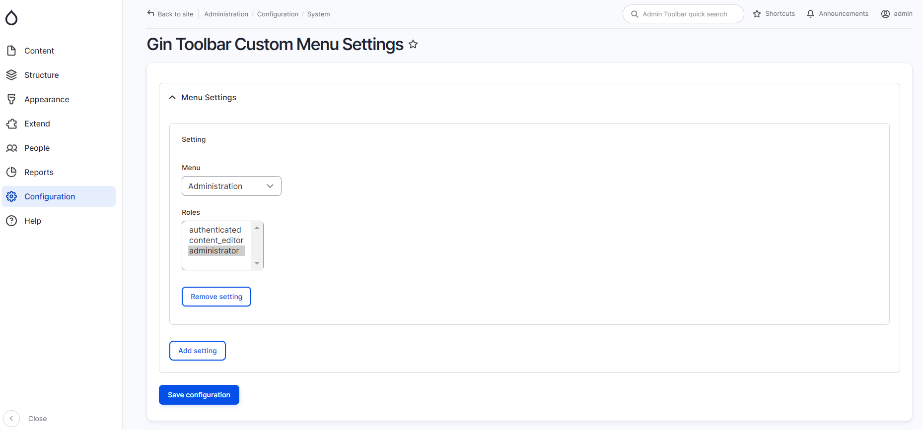
Customizing the Gin Toolbar for user roles
The Gin Toolbar Custom Menu module enables you to customize the toolbar menu for specific user roles to make admin experiences more tailored. By going to Configuration > System > Gin Toolbar Custom Menu Settings, you can configure which menus should be shown to which user roles.
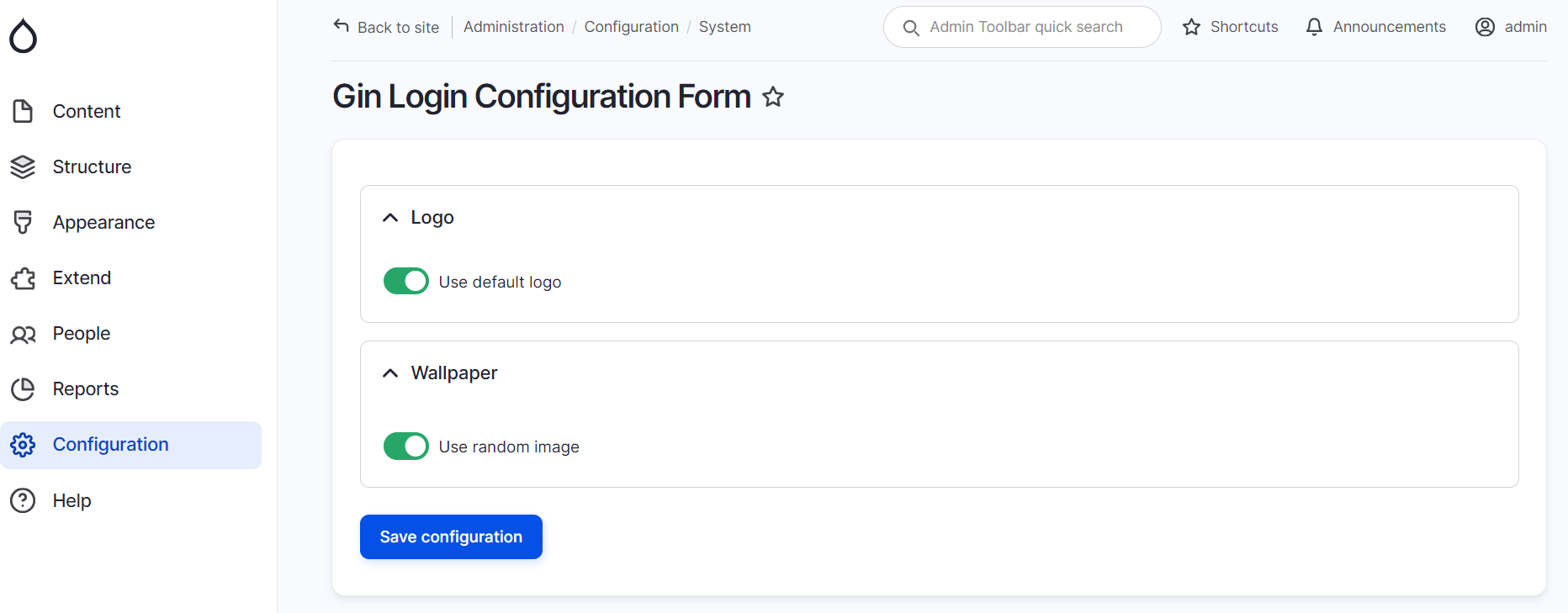
A customized login screen
With the Gin Login module, you can set up a customized login screen for the user login, registration, and password recovery pages in both Gin and Claro. This module supports the dark mode. It also plays well with decoupled Drupal setups.
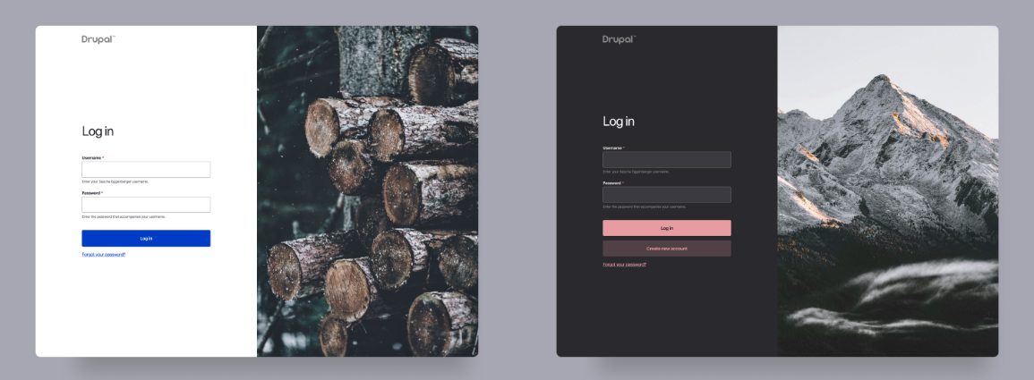
By default, it will use random wallpapers but you can also upload your own graphics.
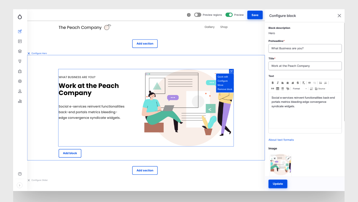
Using Layout Builder in Gin
By installing the Gin Layout Builder, you will be able to build your pages in the Gin theme with the famous Drupal core layout creation tool, Layout Builder. Layout Builder enables you to add sections, populate them with blocks, drag-and-drop them around, configure them, and preview how they will look on the front end.
Using Gutenberg editor in Gin
The Gin Gutenberg module provides integration between the theme and the Gutenberg Editor. Gutenberg is an alternative tool for building content pages from reusable blocks. It is characterized by user-friendliness and rich visual experience enabling users to add blocks (paragraphs, buttons, quotes, etc.) to a blank canvas.
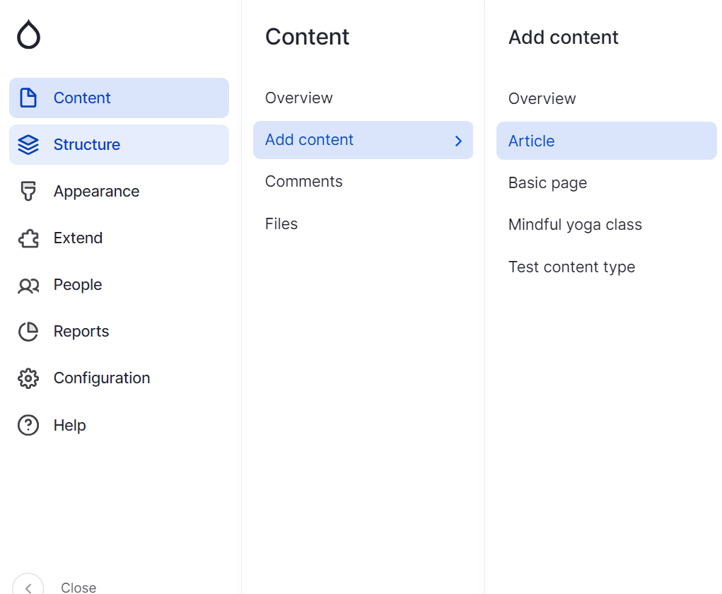
Creating a tray with content types
You can also give a try to the Gin Type Tray module — an implementation of the Type Tray module specifically for this theme. It helps present various content types in a grid or list, grouping them by categories with icons and thumbnails, which is especially useful for content-rich websites.
Final thoughts
The creative thinking of Drupal’s lead designers and developers is truly inspiring. With Gin, you can see that nothing is impossible for your website’s theme. You can create admin experiences that meet your team’s expectations while embodying the latest design trends. Additionally, custom coding can add the final brush strokes to enhance your theme’s uniqueness, usability, functionality, and visual appeal.