
Accessibility Elements, Part 4: Accessible Keyboard Navigation in Drupal
Authored by: Nadiia Nykolaichuk.
Since Douglas Engelbart invented the computer mouse in 1963, it has become a popular device that many people use for browsing the Internet today. However, there are still a great number of people who cannot afford the comfort of using a mouse. A wide range of temporary or permanent impairments make them rely on keyboard-only navigation.
Compared to 1963, the year 2023 is in a new era of web experiences where web accessibility is a top value, and keyboard navigation is one of its keystones. Websites need to provide the same navigation and interaction experiences to keyboard-only users as they do to mouse users. Our series on essential accessibility elements continues with a deep dive into accessible keyboard navigation. We promise you, it will be as insightful as the previous pieces dedicated to alt text, semantic HTML and WAI-ARIA, and accessible forms. A special focus will be made on how accessible keyboard navigation works in the Drupal CMS.
When users rely on keyboard navigation
The reasons why users might be unable to properly use a mouse are abundant. It’s usually a matter of inability to comfortably hold or click a mouse, or see the clickable area on the screen. This might be caused by lack of motor coordination, loss of muscle control, tremors, or visual impairments. As a result, users resort to keyboard-only navigation, which, depending on the specific situation and preferences, can be used in combination with screen readers, voice input devices, touch devices, and so on.
In addition to people with actual impairments, accessible keyboard navigation might come in handy for users who don’t have a mouse available at the moment.
The best keyboard accessibility practices
Providing accessible keyboard navigation is basically about making a website’s content and functionality properly reachable via the keyboard. Keyboard-only users need to be able to freely navigate through all key website elements (menu links, buttons, form controls, etc.) and interact with them when needed. Let’s take a closer look at the main aspects for achieving this.
- Logical tabbing order
As a user navigates a web page using the “Tab” key, certain interactive elements receive keyboard focus. Focus is usually indicated by a distinctive color outline around the focusable elements.
The sequence of the elements should align with the visual layout of the page and the interaction order that makes the most sense. Users need to progress from the top to the bottom of the page and from the left to the right, except for websites with RTL (right-to-left) languages. The tabbing order is determined by the ‘tabindex’ attribute for HTML elements, as well as with the help of JS features like Tabbing Manager in Drupal which we’ll discuss soon.
As part of keyboard accessibility testing, you can click through your website’s elements with the “Tab” key and make sure their order is proper. The reverse action, usually “Shift + Tab,” moves the focus in reverse.

- Focus styling
The above mentioned visual indication of the focus element is essential for keyboard navigation, and is referred to as focus styling. Browsers often have default styles for focused elements, but developers can customize them by defining their own styles in the page's stylesheet or theme. This gives them more flexibility and control over the appearance of focused elements to match the specific website’s design guidelines. Focus styles should be consistent across the UI elements and contrast properly against the rest of your website.
- Semantic HTML for page structure
Semantic HTML tags contribute to the logical structure of a page, which is essential for keyboard users who navigate through a page using the “Tab” key. When a webpage is well-structured with semantic HTML elements like <header>, <main>, <footer>, etc., these elements create natural landmarks that keyboard users can navigate to.
Menus need to have a ‘nav’ element, which provides a clear indication of the section’s purpose. HTML heading tags (from <h1> to <h6>) establish a clear hierarchy of content, from main headings to subsections.
- Skipping to main content
By including a “Skip to Main Content” link at the beginning of the page, you enable keyboard-only users to bypass navigation menus, headers, and other content that may be repeated across multiple pages and jump directly to the main content.
- Descriptive links
When a user navigates a web page using the “Tab” key and encounters a link, they need to know the purpose or destination of the link. So it’s necessary to provide clear, meaningful, and concise link descriptions. An example of a good link description would be “Explore our range of services” and an example of a bad one — “Click here.”
- Interaction with the focused elements
Users often need to make specific interactions with the website’s elements that come into focus. This involves additional keys other than the “Tab” key. For example, arrow keys help users navigate the list of options or between items in a menu, a carousel, or a slider. Another example is that the “Enter” or the “Spacebar” key activates the element, like opening a link or clicking a button. The specific keys depend on the browser and the operating system, as well as the implementation on a website or in a CMS.
A closer look at keyboard accessibility in Drupal
The Drupal CMS supports accessible keyboard navigation out of the box. The best practices of semantic HTML5 are extensively used in it, the “Skip to Main Content” link is included at the beginning of pages, consistent focus styling is present across all elements in its core themes, the proper tabbing order is in most cases defined out of the box, and so on. All default elements already work with the keyboard accessibility support, so developers basically need to only take care of it when creating custom ones.
Tabbing Manager
One of the prominent features that helps developers make sure they create keyboard accessible web pages is Drupal.tabbingManager. It is a JavaScript class that enables developers to create a logical navigation flow, helping users quickly access the needed elements. The Tabbing Manager was introduced in Drupal 8 as part of an outstanding “wave” of massive accessibility enhancements.
Tabbing Manager is particularly useful when you need to guide the user through completing a particular task, like filling out a form or interacting with a specific feature. In this case, you want to limit the focusable elements that can be navigated using the “Tab” key. Instead of having to tab throughout the entire page, the user can only use those that are relevant to the current context. This approach is referred to as constrained tabbing, sometimes referred to as capturing and trapping keyboard focus. At the same time, there must be a clear and accessible way to move focus out of the area with the help of standard keyboard methods, making sure the user isn’t literally trapped there.
Tabbing Manager relies on two methods to implement constrained tabbing:
- The constrain method. When a set of elements is passed to this method, pressing the “Tab'' key will provide navigation within this set of elements only.
- The release method. This is the method to remove the tabbing constraint once the user has completed the specific task.
It needs to be noted that when a tabbing constraint is active, you need to use the Drupal.announce() feature to aurally inform the screen reader user of the constraint and what key to use to exit it.
Here is an example implementation from drupal.org for using the constrain and the release methods, as well as creating live announcements.
// Constrain to the "edit mode toggle" and contextual links.
var tabbingContext = Drupal.tabbingManager.constrain($('.contextual-toolbar-tab, .contextual'));

// Announce the tabbing constraint.
var args =  {
  '@contextualsCount': Drupal.formatPlural(Drupal.contextual.collection.length, '@count contextual link', '@count contextual links')
};
Drupal.announce(Drupal.t('Tabbing is constrained to a set of @contextualsCount and the edit mode toggle.', args));
Drupal.announce(Drupal.t('Press the esc key to exit.'));
// The task was completed; release the tabbing context.
tabbingContext.release();

// Depending on the use case, announce this as well.
A step-by-step example of a keyboard-only workflow in Drupal’s CKEditor
One of the most vivid examples of keyboard accessibility in the Drupal core is the workflow for embedding media from the Media Library to Drupal’s CKEditor. Let us walk you through this process without ever touching the mouse.
This example is in CKEditor 5 but the functionality is fully operable in CKEditor 4 as well. Please note that for this to work, you’ll need to make sure the Media Library button is dragged to the active toolbar in “Text formats and editors” for the format you’re using (e.g. Full HTML) and the “Embed media” filter is enabled down the same page.
NB. Please note that the use of the keys might depend on the settings of the web browser and the operating system. In our example, the Chrome browser and the Windows OS are used. You might want to make sure your browser is configured to use the <Tab> key to move between links and fields:
- The “Press Tab to highlight each item on the webpage” checkbox must be checked on the Advanced tab of the Safari browser settings.
- The “Use the tab key to move focus between form control and links” checkbox must be checked on the General tab of the Firefox browser settings.
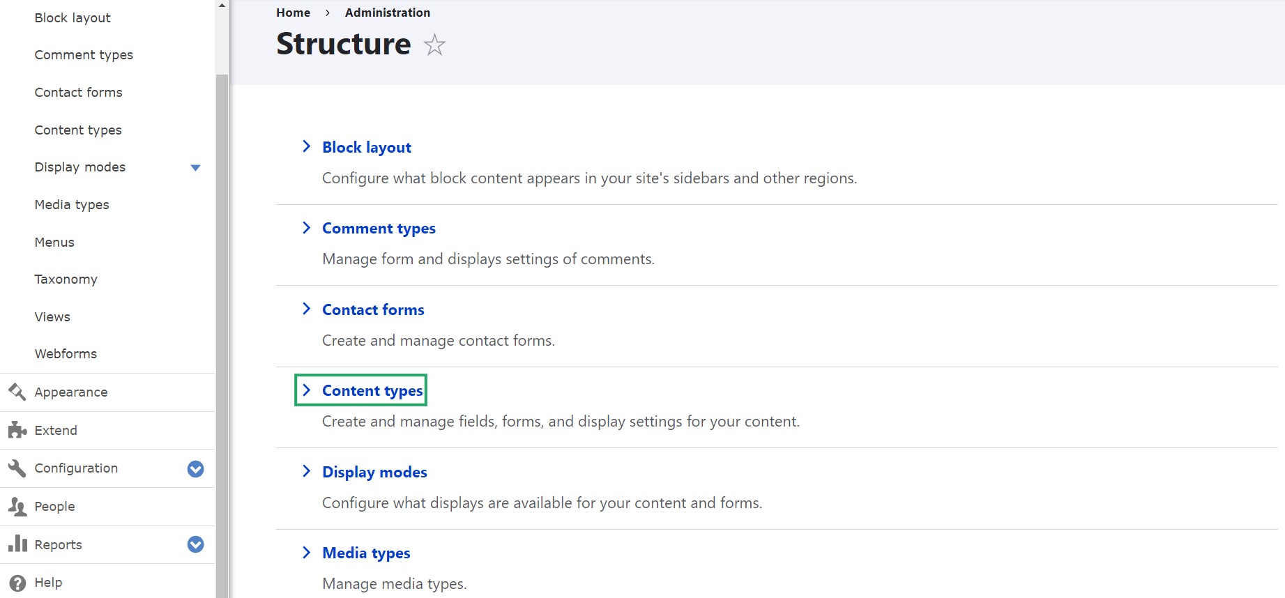
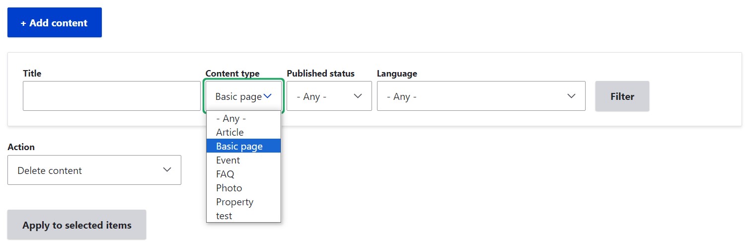
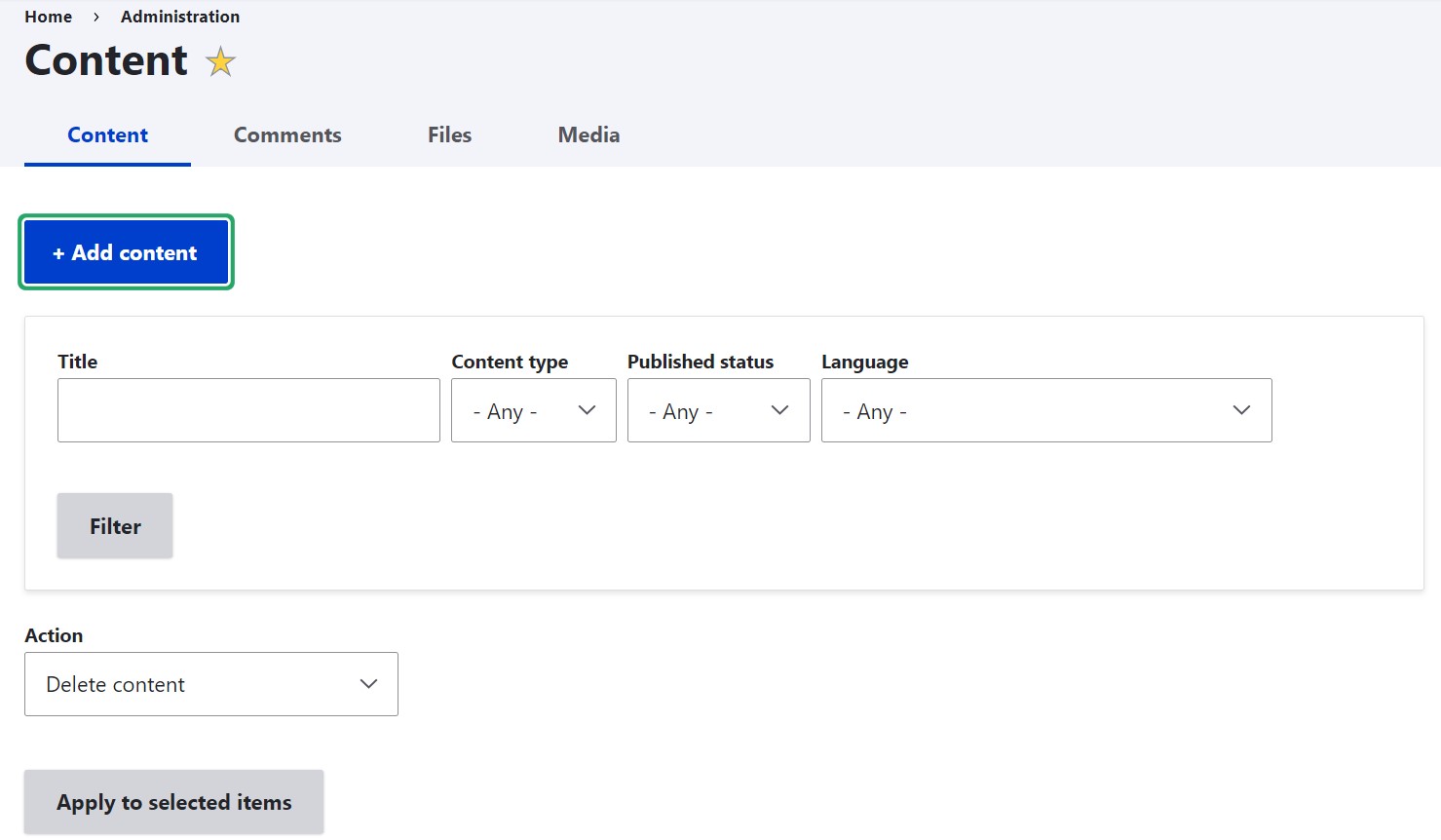
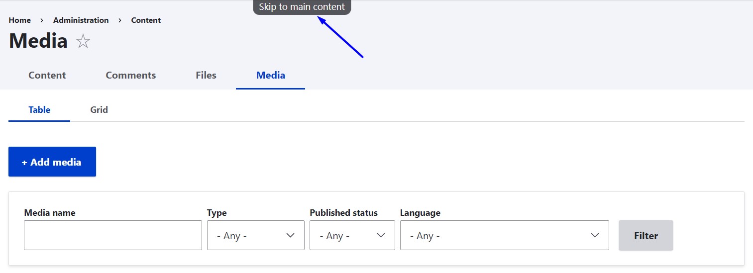
Coming back to our example, when you are on the Content page of your Drupal admin dashboard, you can use your keyboard to do the following:
- Tab to the “Add content” link and hit “Enter” to open it.
- Tab to the “Article” link on the “Add content” menu and hit “Enter” to open it.
- (Optional) If you need to change the text format (e.g. Full HTML), tab to "About text formats" and click “Tab” + “Arrow,” then use “Arrow” to select the needed text editor from the dropdown.
- Click “Shift” + “Tab” twice, which will take you to the “Text formats” help link and then to the “Body” area in CKEditor.
- Click “Alt” + “F10” to jump to the CKEditor toolbar for Windows (this might be the “Fn”+ “Option” + “F10” on Mac OS).
- Use “Arrow” keys to go through the toolbar icons and reach the Media Library icon.
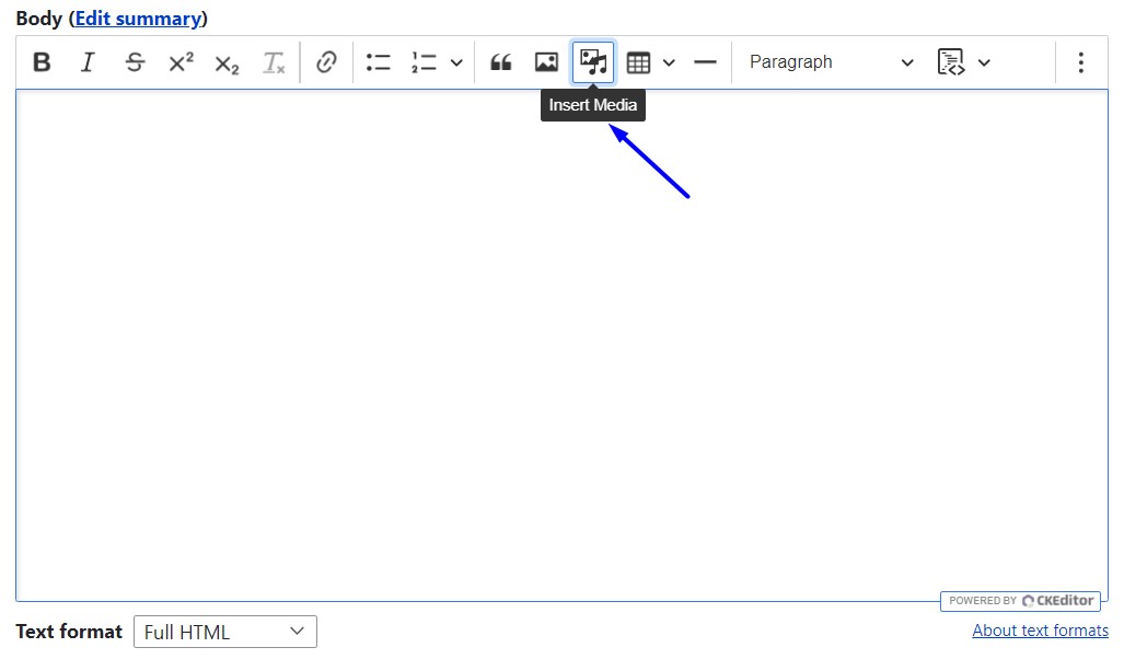
- Click “Enter” to click the icon, which will open the Media Library.
- Tab through the Media Library to choose the specific media item (in this example, an image), then click “Space” to select it.
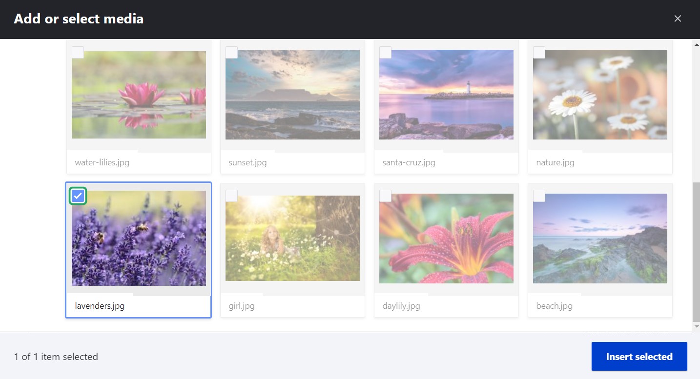
- Click “Tab” + “Enter” to give focus to the “Insert selected” button, then click “Space” to embed the image in CKEditor.
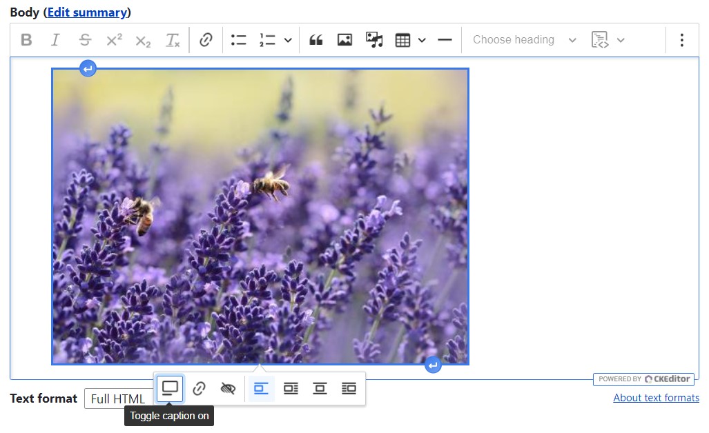
- Use “Alt” + “F10” to give focus to the media toolbar. Use “Arrow” keys to move between the media toolbar options for adding a caption, adding a link, overriding the Alt text, and adjusting the image. Click “Enter” to activate the specific option.
Examples of keyboard accessibility in contributed Drupal modules
The Drupal core as well as contributed projects strive to adhere to keyboard accessibility standards. A great example would be the Better Mega Menu module, which is one of the most popular contributed Drupal modules for menu creation. It provides an admin UI for creating dropdown menus that enrich Drupal menu items with other elements such as internal and external links, images, videos, and more.
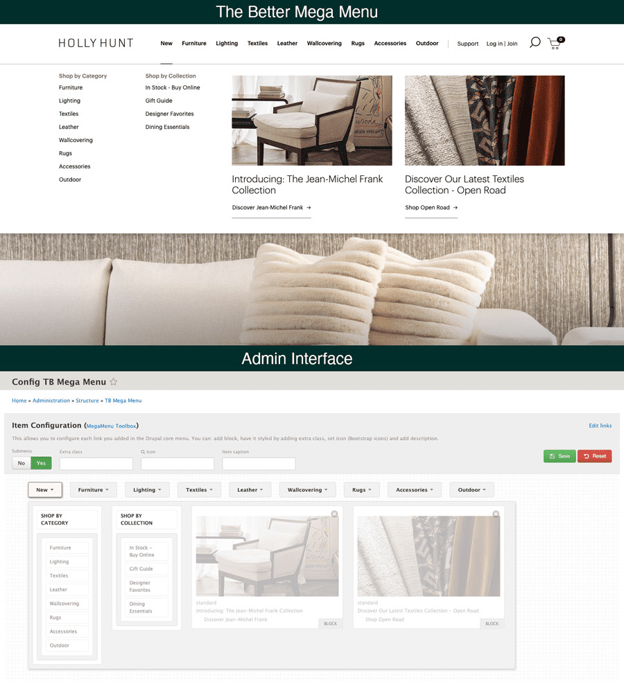
The Better Mega Menu module has a separate documentation page dedicated to its keyboard accessibility features for efficient navigation across the top-level menus and submenus using the Tab, the Left/Right Arrow, the Return, the Esc, the Up/Down, the Home, and the End keys.
Some contributed modules that improve keyboard accessibility
- Devel Accessibility
The Devel Accessibility module simplifies the using and testing of keyboard accessibility functionalities. Among other things, it can log the Drupal.announce announcements to the browser console and visually indicate the reachable elements when tabbing constraints are applied by Drupal.TabbingManager.
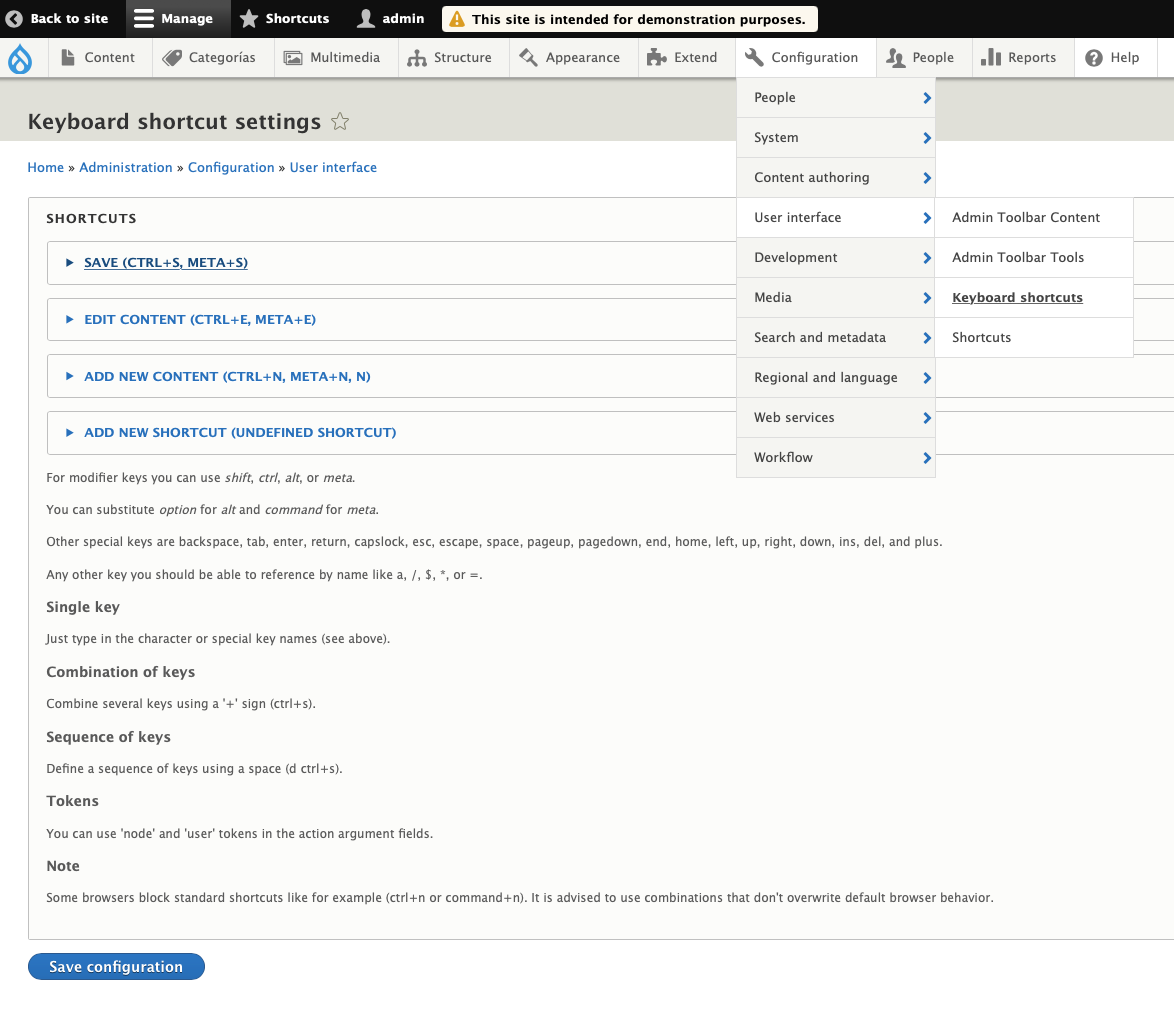
- Keyboard shortcuts
With the help of the Keyboard shortcuts module, you can create shortcuts for various actions on a Drupal website. The shortcuts can be configured for single keys, combination of keys, sequences of keys. For example, it can be configured that “CTRL + N” anywhere on the website opens the “Add content” tab. There is also the support for tokens such as {user} and {node}.
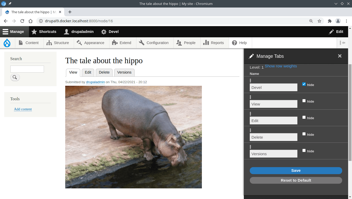
- Tab Manager
The Tab Manager module enables you to hide, reorder and rename tabs for accessing specific tasks in the Drupal admin dashboard. This helps tailor keyboard navigation experiences to specific needs, making them more efficient.
- General accessibility modules
When it comes to improving or testing keyboard accessibility with the help of contributed modules, you might find it useful to check out general accessibility modules such as Accessibility toolkit, Editoria11y, CKEditor Accessibility Auditor, and others.
Final thoughts
It’s time to make sure your Drupal website provides accessible keyboard navigation experiences to all users. Unlock your website’s capabilities by allowing every action that is available on a mouse hover to also have the appropriate key on a keyboard. Luckily, the Drupal CMS is equipped with the right tools and practices for implementing this flawlessly.