Building Government Websites People Actually Want to Use: Examples and Strategies
Planning a government website redesign? You're not alone. After months of stakeholder meetings, budget approvals, and strategic planning, you've finally reached the exciting part: seeing what's actually possible.
The best government website design doesn't just look professional. Great government sites make complex information feel simple and guide citizens to what they need without the usual bureaucratic maze. When design works properly, citizens can actually accomplish what they came to do.
The following government website examples demonstrate these principles in action, showing how strategic design decisions create exceptional user experiences that serve both citizens and organizations.
Let's dive in and get inspired.
What Makes Great Government Website Design?
Think about your last visit to the DMV. Chances are you saw teenagers getting their first licenses, parents updating registrations, and seniors navigating new requirements. Government website design serves this same diverse crowd, and that creates a fascinating challenge.
Designing for everyone
How do you help both the teenager who expects everything to work like Instagram or TikTok and the senior who's still getting comfortable with websites? The best sites prove you don't have to choose. They're both visually appealing and intuitive to use.
This isn't just about being nice. In the US, State and local governments must meet WCAG 2.1 Level AA standards by April 2026 or 2027. But smart design solves real problems, not just compliance requirements. When someone with low vision needs to apply for benefits, or when a person with motor disabilities has to renew their vehicle registration, accessibility features become lifelines.
The best government sites use large, readable fonts as the default. They provide high color contrast that works for people with vision impairments. They make sure every function works with keyboard navigation for users who can't operate a mouse. These are design decisions that make sites better for everyone.
Cross-device experiences that work
Great design features of government websites work for different users in different situations. Someone might start renewing their business license on their phone during lunch, then finish it on their work computer that afternoon. The site saves their progress automatically and looks just as polished on both screens.
This matters more for government sites than commercial ones. People don't shop for permits or apply for benefits on a whim. These are tasks they need to complete, often within specific deadlines. When mobile devices account for nearly 60% of web traffic, government sites that don't work seamlessly across devices create real barriers to essential services.
Visual hierarchy and trust
Visual hierarchy guides users to their goals while creating trust through professional appearance. The most important actions stand out immediately, whether you're looking at clean typography, well-organized layouts, or carefully chosen colors that meet accessibility standards.
Trust matters differently for government sites. When someone submits their Social Security number to renew benefits, or uploads tax documents for a business license, they're making themselves vulnerable. Professional visual design signals competence before anyone reads a single word.
Sloppy typography suggests sloppy data handling. Inconsistent branding raises questions about legitimacy. Poor visual organization makes people wonder if their information will be processed correctly. Beautiful and intuitive design becomes essential when government processes can determine whether someone keeps their job or gets the help they need.
Navigation that matches how people think
Citizens don't care that permits come from three different agencies. They just want to start their business. The best government sites organize around life events and common tasks, using design elements that make complex processes feel straightforward.
When someone moves to a new city, they think about "what do I need to do after moving?" They don't think about which department handles voter registration versus which one updates vehicle records. Smart government sites group related tasks together, even when they're handled by completely different departments behind the scenes.
9 Government & Public Websites That Get Design Right
These sites prove that government digital experiences can be both visually compelling and highly functional. Each example demonstrates different approaches to solving common challenges while maintaining the professional credibility citizens expect. From international leaders to innovative U.S. agencies, these websites show what's possible when design and usability work together.
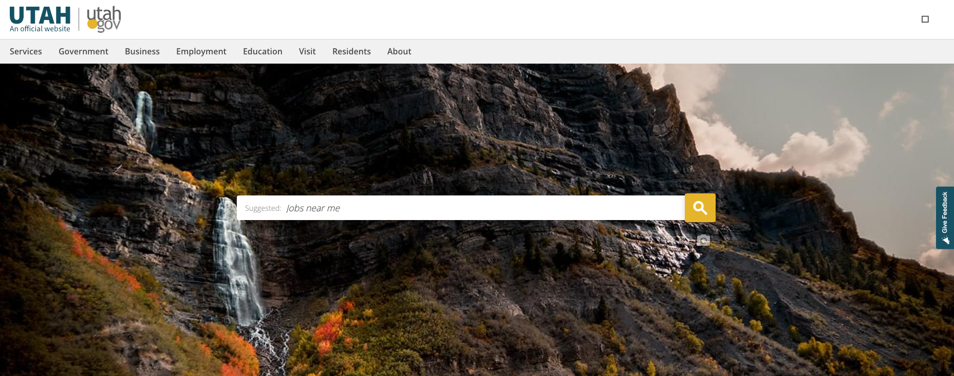
Utah.gov
Utah.gov sets the standard for innovative government website design through its exceptional use of visual storytelling and user-focused functionality. The site showcases Utah's natural beauty while providing efficient access to government services, proving that government websites can be both beautiful and highly functional.
Utah excites us through their focus on:
Innovative visual design: Stunning high-quality photography of Utah's landscapes creates an immediate emotional connection with visitors.
Seamless user experience: Intuitive navigation and well-organized content make finding information and completing tasks effortless.
Brand consistency: The design perfectly captures Utah's identity while maintaining professional government standards.
Performance optimization: Fast loading times and smooth functionality demonstrate technical excellence alongside visual appeal.
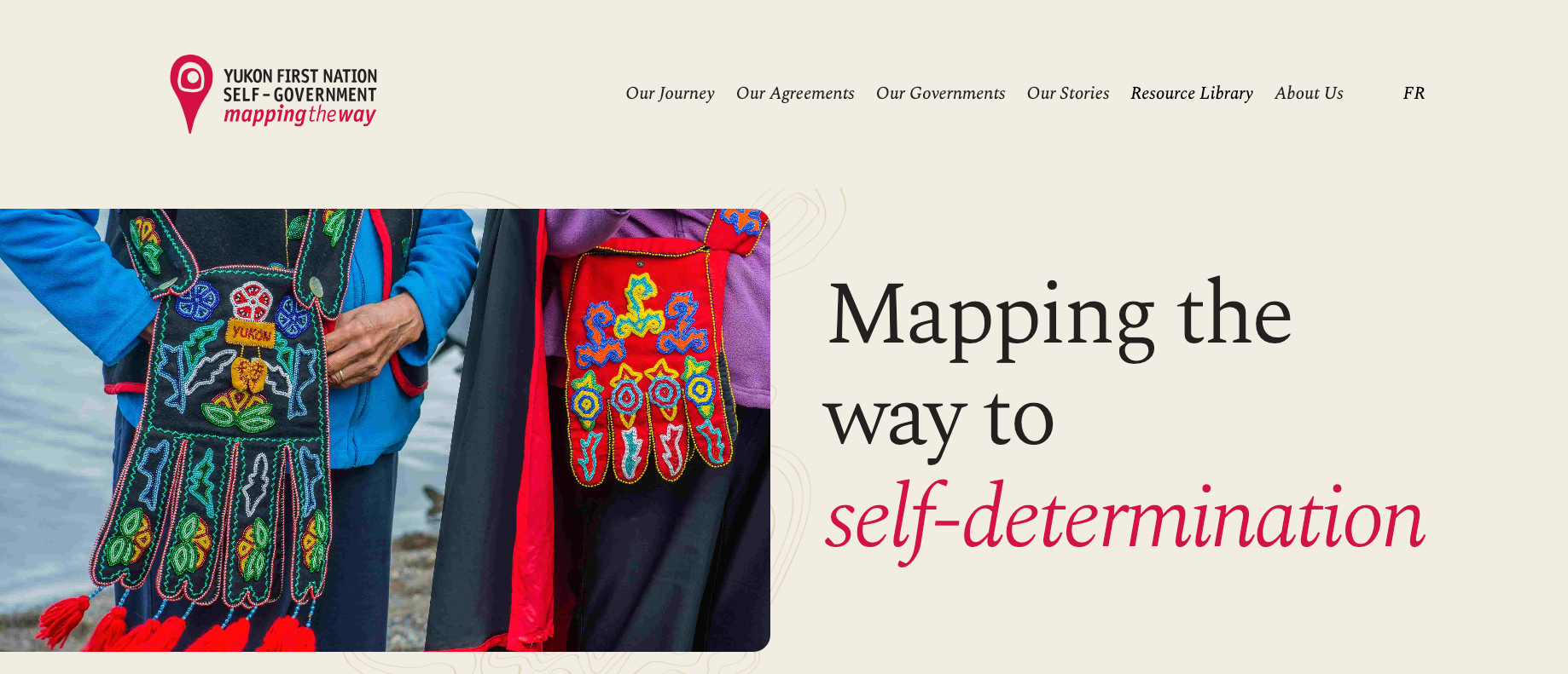
Mapping the Way
Mapping the Way is a non-partisan initiative that raises awareness of self-government agreements and celebrates the cultures of the Yukon First Nations. This government project demonstrates how public sector sites can combine immersive storytelling with important educational missions.
Why we love Mapping the Way:
Map-inspired aesthetic: The layout creates a sense of exploration and movement, perfectly conveying the First Nations' vital relationship with the land.
Thoughtful imagery: Black and white photos highlight historical context while vibrant colored photos celebrate present-day achievements and culture.
Strategic color use: Red accents draw attention to important elements while beige tones create an organic feel that evokes connection to the land.
Seamless information architecture: Tags categorize and connect stories, communities, and agreements, allowing for dynamic user journeys that feel natural and engaging.
Bilingual accessibility: The site meets WCAG AA standards and allows users to switch effortlessly between English and French.
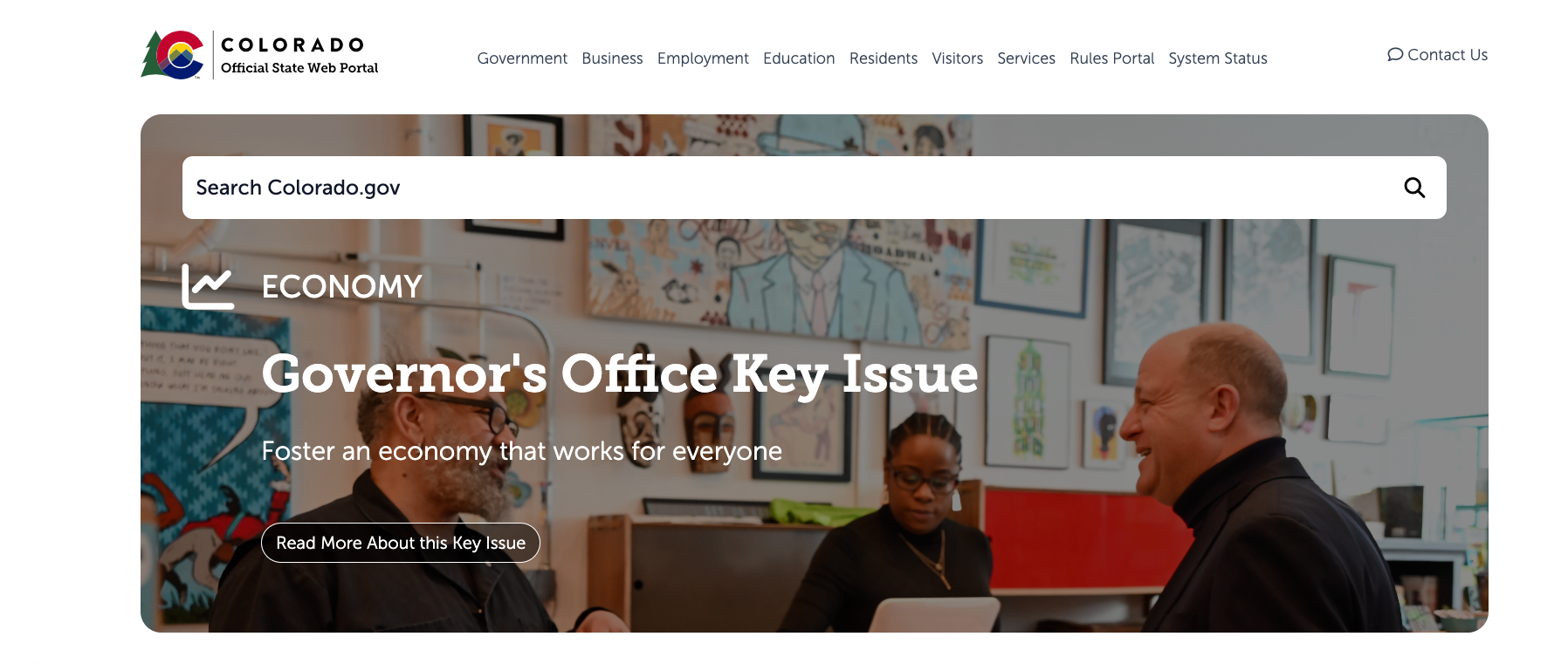
Colorado.gov
Colorado.gov design focuses on making government services more accessible and efficient for Colorado residents. The site highlights key issues and news updates, ensuring that visitors can quickly find relevant information. Additionally, the integration of tools like the myColorado app and a chatbot enhances user interaction and support.
Why we love Colorado.gov:
Aesthetic Layout: A well-organized structure with a balanced use of space, making it visually appealing and easy to navigate.
Color Scheme: A harmonious color palette that reflects the state's identity and enhances readability.
Typography: Clear and legible fonts that contribute to a professional and polished look.
Imagery: High-quality images that capture the essence of Colorado, adding visual interest and context.
Consistency: Uniform design elements across pages, creating a cohesive and seamless user experience.
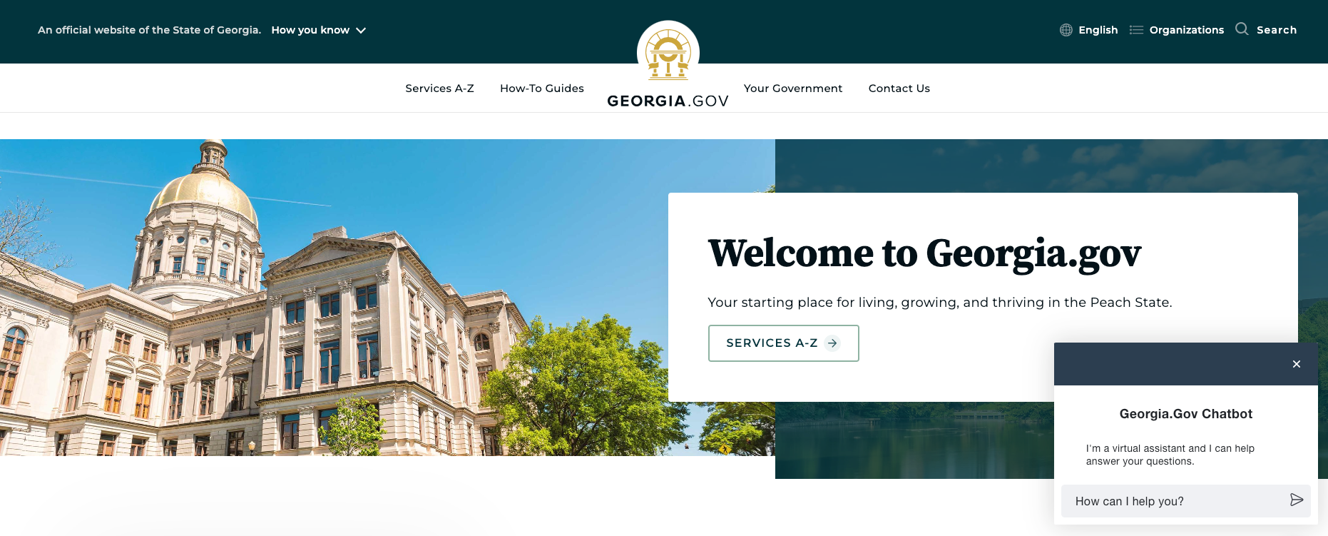
Georgia.gov
Like Boston Logan International Airport, Georgia.gov was built on Drupal. This website is beautifully designed with a clean, modern layout that prioritizes user accessibility and ease of navigation. Essential services and information, such as election details and top-accessed services, are organized in a straightforward manner. The site uses clear headings, intuitive menus, and engaging visuals to guide users, making it both functional and visually appealing.
The site's standard features include:
Clean and Modern Layout: The site's simple, uncluttered design enhances readability and user experience.
Intuitive Navigation: Clear menus and headings make it easy for users to find information quickly.
Prominent Service Access: Essential services and information, like election details and top-accessed services, are prominently displayed for easy access.
Responsive Design: The site is optimized to ensure a seamless experience across desktops, tablets, and smartphones.
Engaging Visuals: Use of relevant images and icons to enhance the visual appeal and guide users effectively.
Informative Content: Well-organized content with clear calls to action helps users engage with the site efficiently.
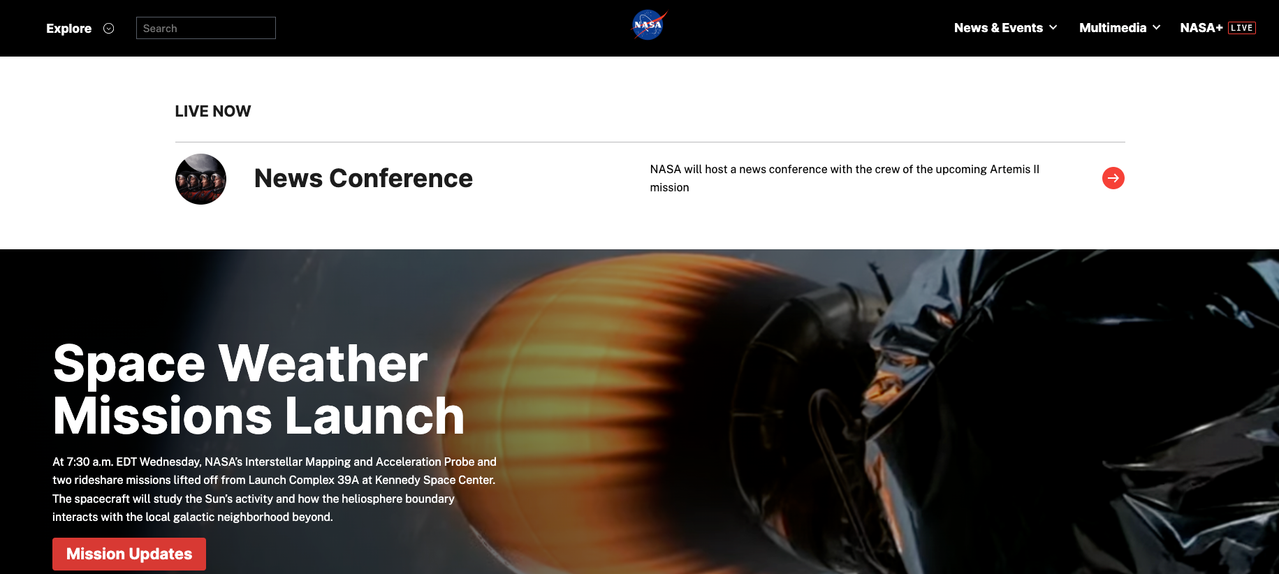
NASA
We couldn't help but include NASA on our list, and for good reason. The site is often praised for its stunning visuals, featuring high-resolution images and videos of space that captivate visitors.
Why we love NASA's site:
Engaging Content: Rich multimedia content including images, videos, and interactive elements that capture interest.
Educational Resources: Provides extensive educational materials and resources for various audiences.
Intuitive Navigation: Easy-to-use navigation structure helps users explore a wide range of topics.
Cutting-Edge Design: Reflects the innovative nature of NASA with a high-tech, forward-looking design.
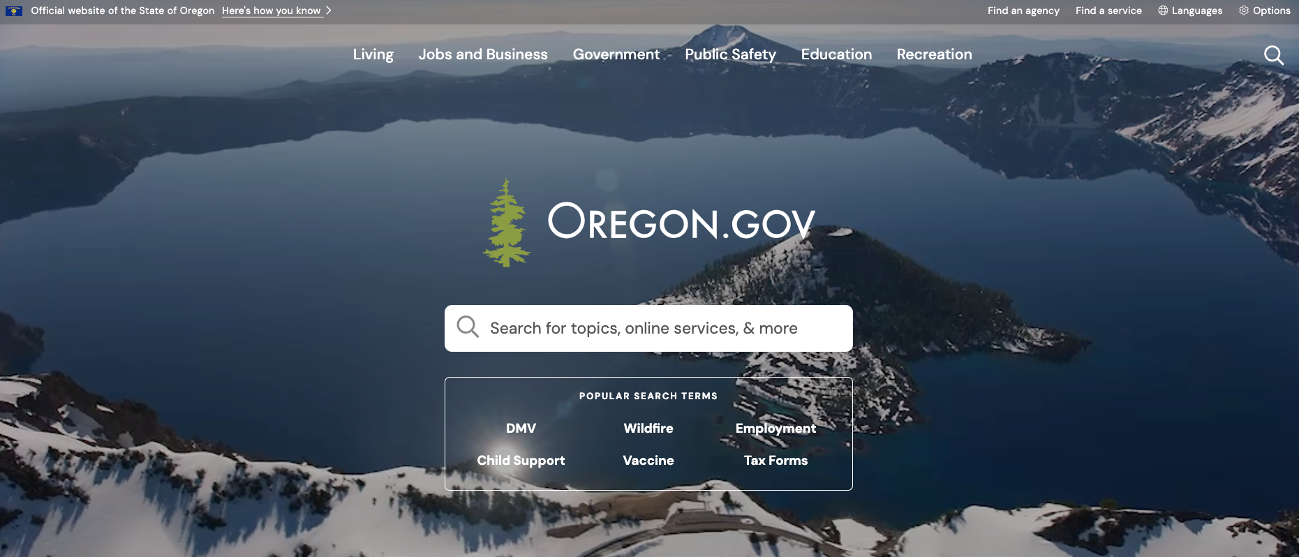
Oregon.gov
Oregon.gov, a beautifully designed site with a focus on simplicity and functionality. Oregon.gov offers a clean, uncluttered layout, user-friendly navigation, and engaging visuals.
Why we love the state of Oregon's site:
Clean Layout: The site uses a straightforward, uncluttered design that enhances readability and user experience.
User-Friendly Navigation: Clear menus and search options make it easy for users to find state agencies and services.
Engaging Visuals: The use of images and interactive elements, like the #MyOregon Instagram feature adds a personal and engaging touch.
Responsive Design: Optimized for various devices, ensuring a seamless experience across platforms.
Informative Content: Well-organized sections for news, services, and initiatives provide easy access to important information.
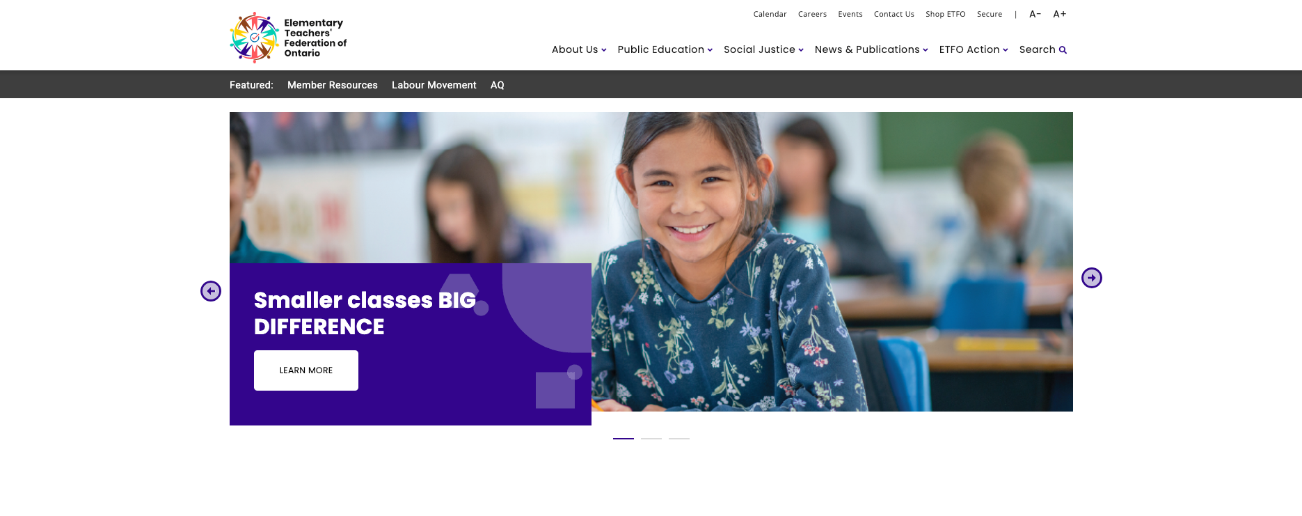
ETFO (Elementary Teachers' Federation of Ontario)
ETFO's website design effectively serves its 83,000 members through clear organization and intuitive navigation. The site demonstrates how professional associations can balance comprehensive information with user-friendly design, creating an experience that works for both seasoned educators and new professionals.
Why we love ETFO's site:
Clean Layout: The uncluttered design makes it easy for users to focus on finding the information they need without distractions.
Accessible Design: Strong contrast and readable typography ensure the content is accessible to users with varying needs and abilities.
Responsive Functionality: The site adapts seamlessly across devices, supporting users whether they're in classrooms, offices, or on the go.
Logical Information Architecture: Clear navigation categories help users quickly locate resources, news, and professional development opportunities.
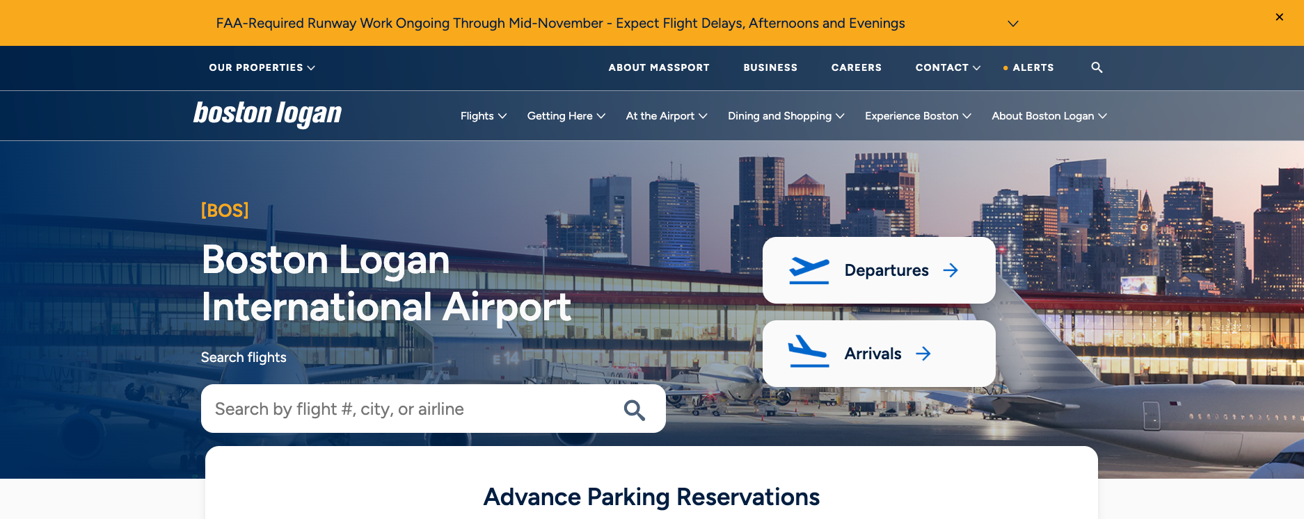
Boston Logan International Airport
A well-designed airport website serves thousands of travelers daily with critical, time-sensitive information. Boston Logan International Airport's Drupal-built site demonstrates how complex transportation hubs can create digital experiences that reduce stress and improve user outcomes through thoughtful design and functionality.
Additional features of this Drupal-built site include:
User-Centered Navigation: Clear sections for flights, parking, and transportation prioritize the most common user tasks and information needs.
Interactive Functionality: Features like interactive maps and the FlyLogan app enhance the user experience by providing practical tools for navigation and planning.
Comprehensive Service Information: Detailed information about dining, shopping, and amenities helps travelers make informed decisions and plan their time effectively.
Professional Design Standards: Clean, accessible layouts help users focus on critical information while maintaining the airport's professional brand image.
Multi-Device Optimization: Responsive design ensures travelers can access essential information whether using smartphones while rushing to gates or laptops while planning trips.
Visit Boston Logan International Airport
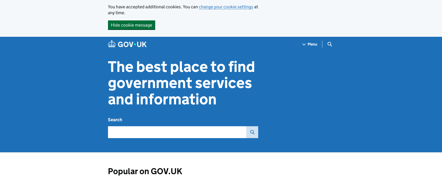
GOV.UK
Gov.uk is internationally recognized as the gold standard for government digital services. The UK government revolutionized how government websites work by organizing content around user needs instead of government structure, making it easy for citizens to complete tasks quickly and efficiently.
Why we love GOV.UK:
User-centric structure: The website is organized around what users need to accomplish, not how government departments are structured, making navigation intuitive and task-focused.
Minimalist design: The clean, uncluttered interface removes distractions and focuses users on completing their goals efficiently.
Plain language: Complex government information is presented in clear, accessible language that anyone can understand.
ask simplification: Information is broken down into digestible steps that reduce cognitive load and guide users through processes seamlessly.
Government Website Design: Challenges, Solutions & ROI
Local government website design faces unique challenges including limited budgets, diverse stakeholder needs, and strict compliance requirements. These obstacles mirror those faced in B2B environments, and proven frameworks for website redesign planning can help government teams manage complex stakeholder requirements and project timelines.
Budget constraints vs. quality expectations
You need enterprise-level functionality on a public sector budget. Users expect the same seamless experience they get from private sector websites, but government budgets often can't match private sector spending on digital projects.
The solution is phased implementation. Start with user research to find your biggest pain points, then fix them systematically. Open source platforms like Drupal give you powerful capabilities without licensing fees, meaning more budget goes to design and user experience.
The ROI payoff: Digital forms cut processing time from days to hours while eliminating transcription errors. A permit application that once required three staff members and two weeks can become a streamlined online process completed in an afternoon.
Stakeholder alignment and approval processes
Government projects involve multiple departments with different priorities and approval chains. Department A wants prominent placement for their services. Department B needs specific compliance features. Department C controls the budget but doesn't understand web development.
You need clear decision-making authority from day one. Create stakeholder maps that show who approves what, then build consensus around shared goals like citizen satisfaction and operational efficiency. Regular check-ins and progress demonstrations keep everyone aligned.
The ROI payoff: Streamlined decision-making prevents costly scope creep and timeline delays. Projects that might have taken 18 months can be completed sooner with proper stakeholder alignment.
Compliance and citizen satisfaction
Government websites currently average 307 accessibility violations per page. These violations mean real people can't access government services, and organizations face legal liability under ADA requirements.
The solution is building accessibility into your design process from day one, not retrofitting it later. Choose platforms and partners with proven compliance track records. Plan regular audits to maintain standards over time.
The ROI payoff: People now rate government websites 10 points higher than call centers for satisfaction. When citizens complete tasks online instead of calling, you reduce call center volume and staff time for routine requests. 81% of residents prefer self-service options, but many government sites don't offer these capabilities yet.
Long-term strategic value
Many government organizations run on systems built when flip phones were cutting-edge technology. These systems contain decades of critical data you can't afford to lose, but weren't designed for modern web experiences.
Migration strategies should prioritize data preservation while enabling new functionality. Build your new website to connect with existing systems through APIs, so you can modernize gradually without shutting anything down. Choose a flexible platform that lets you add new features as your needs change.
The ROI payoff: Well-designed websites adapt to changing needs without complete rebuilds, protecting your investment while reducing ongoing maintenance costs. Public trust matters more than most metrics can measure. When people can easily access information and complete transactions, it builds confidence in government competence and community satisfaction that benefits every initiative.
Public Organizations We’ve Helped
At ImageX, we've helped government and public sector organizations transform their digital presence through strategic design and development. Our experience spans municipalities, health organizations, and advocacy groups, each with unique challenges and requirements. We’ve included below a couple of recent projects.
Empowering the Federation of Canadian Municipalities with a Scalable Drupal Website
The Federation of Canadian Municipalities (FCM) represents Canada's municipalities in their interactions with other levels of government and manages a federally-funded infrastructure investment fund that helps municipalities build resilient and sustainable infrastructure, with over one billion dollars of projects.
We built a new website with a full migration and upgrade from Drupal 7 to Drupal 9 and fixed the existing bugs while developing additional features. Because of the positive partnership established, FCM continues to expand the scope of the partnership to include additional services such as enhancements and consultation, analytics, SEO, and tracking of KPIs.
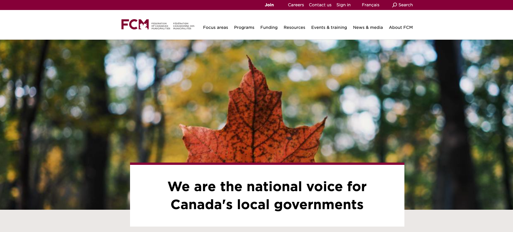
Read more about our work with the Federation of Canadian Municipalities
Enhancing NHBC with a User-Centric, Data-Driven Drupal Platform
The New Brunswick Health Council (NBHC) was created by legislation in 2008 to report publicly on the performance of the provincial health system and to engage citizens in the improvement of health services quality. In addition to engaging with and reporting to New Brunswickers, the NBHC makes annual recommendations to the ministry of health. NBHC manages a large dataset and extracts useful metrics for researcher and public usage.
ImageX was selected as the web agency of choice to make improvements to the website and assist the NBHC with further website planning. We provided feature development and ongoing Drupal support for a public health website. We now currently support New Brunswick Health Council (NBHC) through ongoing improvements to functionality and user experience.
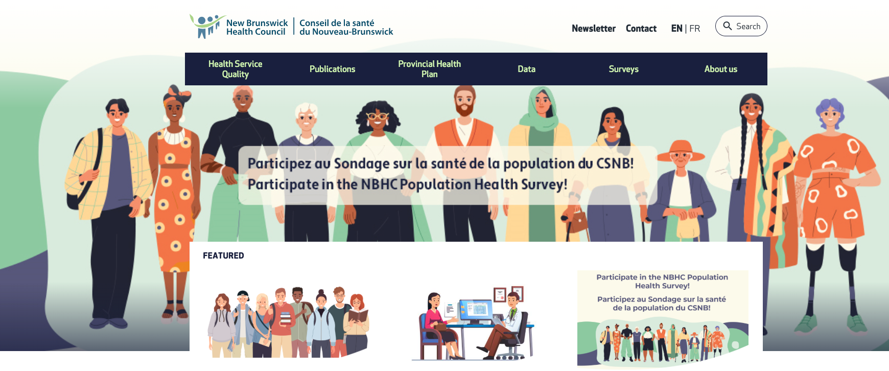
Read more about our work with New Brunswick Health Council
Let us Help Build a Compelling Website For Your Public Organization
Governments, municipalities, and public sector organizations aim to promote the common good while keeping citizens informed, engaged, and connected. Since people often seek answers online before turning to other channels, it's important for public sector marketers to provide an exceptional digital experience to stay ahead.
To meet your diverse goals, you need a flexible and adaptable CMS that can scale with your evolving needs. Our expertise in public sector web design helps organizations navigate complex requirements while creating exceptional user experiences. Drupal is used by over 150 countries to power their government and intergovernmental agency websites. As a top Drupal agency, we're eager to assist you. Connect with us today and explore how we can elevate your digital strategy and web design together.