
23 Best Nonprofit Website Designs That Drive Impact and Inspire Action in 2026

Great nonprofit websites serve as digital headquarters for your mission, turning visitors into supporters, volunteers, and lifelong advocates. The best nonprofit websites combine compelling storytelling with seamless user experience to maximize donations and engagement.
After analyzing hundreds of nonprofit website examples, we've identified 25 of the top nonprofit websites that excel in design, functionality, and impact. These nonprofit website design examples showcase diverse approaches across sectors, budgets, and audiences.
Whether you're launching a new site or redesigning an existing one, these examples demonstrate what's possible when strategy meets great design.
What Makes the Best Nonprofit Websites Stand Out
The most effective nonprofit websites share common elements and best practices that drive engagement and conversions. Here's what separates the winners from everyone else.
Clear Mission Communication
Your visitors need to understand your mission within seconds of landing on your site. The strongest nonprofit sites lead with clear statements that immediately communicate impact and urgency. Skip the fluff and jargon that sounds impressive in board meetings but confuses real people.
Use clear messaging that actually resonates with your audience. When someone visits your homepage, they should instantly understand what you do, who you help, and why it matters. Organizations that nail this see higher engagement rates and more conversions across the board.
Mobile-First Design
Mobile traffic accounts for over 50% of website visits and we’ve seen as high as 80% for some of our community focused clients, so your site needs to work perfectly on phones and tablets. Top nonprofit websites prioritize mobile-responsive designs with streamlined navigation that works on small screens.
Think about how your supporters actually use their phones. They're probably checking your site while standing in line, sitting on the bus, or taking a quick break at work. Your mobile experience needs to be fast, simple, and focused on the most important actions you want people to take.
Authentic Visual Storytelling
Stock photos kill engagement faster than anything else. Those generic images of people pointing at whiteboards or shaking hands tell visitors nothing about your actual work. Authentic imagery and compelling videos create real emotional connections with visitors.
The most successful nonprofits invest in actual photos of their work, communities, and beneficiaries to tell their story. Real faces, locations, and impact resonate with supporters in ways that staged photography never will. These authentic visuals help people understand what their support actually accomplishes.
Streamlined Donation Experience
Your donation process needs to be smooth and simple, period. Best nonprofit websites feature prominent donation buttons that are easy to find, with checkout processes that people can complete without frustration or confusion.
Test your donation flow regularly. If it takes more than three clicks to complete a donation, you're losing supporters. Remove unnecessary form fields, offer multiple payment options, and make sure the entire process works flawlessly on mobile devices.
Performance and Accessibility
Fast loading speeds matter for keeping visitors engaged. People abandon websites that take more than three seconds to load, and that's especially true for mobile users with slower connections.
Accessibility features help you reach more supporters while demonstrating your organizational values. Simple changes like proper color contrast, readable fonts, and keyboard navigation make your site usable for people with disabilities. You'll serve your community better while also staying compliant.
Best Nonprofit Website Examples by Category
These nonprofit website design examples show what excellence looks like across different sectors and organizational sizes. Each site has something unique to teach us about engaging supporters and driving action.
International Relief/Development
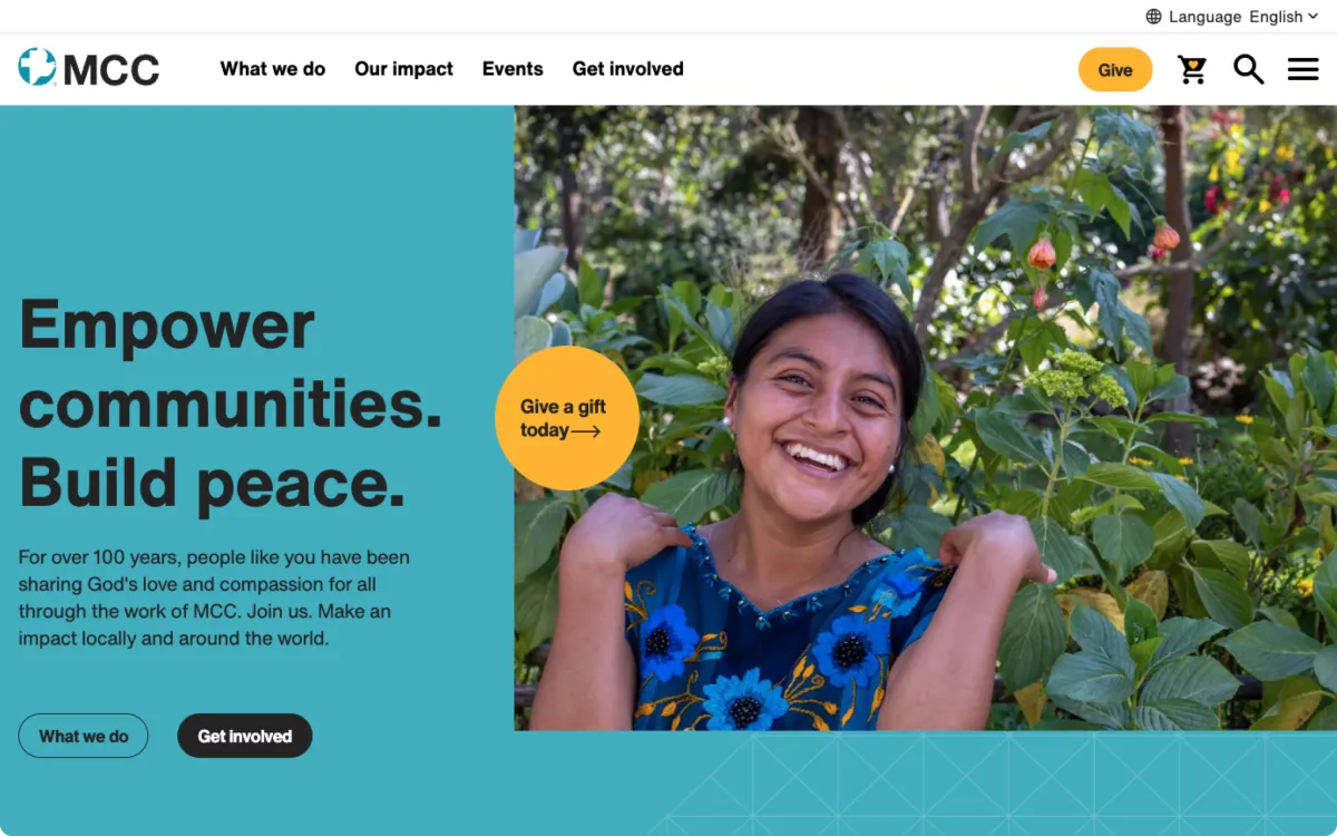
1. Mennonite Central Committee (MCC)
Why it stands out: MCC proves that global nonprofits can organize complex information without making visitors' heads spin. The homepage features an engaging story carousel that highlights key details like location, type, and theme, making it simple for visitors to connect with specific initiatives.
- Smart search functionality: A faceted search feature helps both users and content editors find and manage information efficiently, especially important for organizations with massive program portfolios
- Cross-border integration: The site seamlessly serves both US and Canadian audiences with unified design that reflects their global mission
- User-friendly storytelling: Complex international work is presented in digestible, relatable formats
Key takeaway: Thoughtful organization and smart search features can make even the most complex nonprofit work feel accessible and engaging.
Read the full MCC case study to see the project details and results.
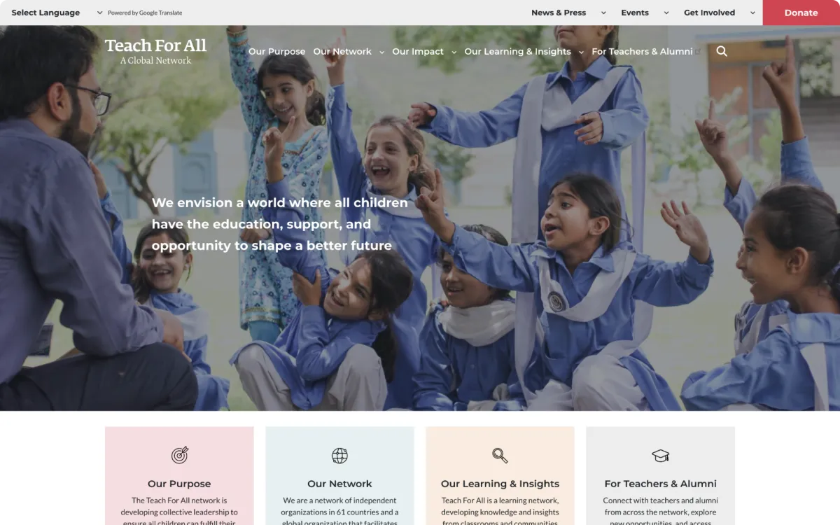
2. Teach For All
Why it stands out: Operating in 62 countries is no joke, but Teach For All makes it look easy. Their shared backend framework powers multiple regional sites while maintaining consistency across the entire network.
- Scalable architecture: The system easily adapts to new partner organizations as the network grows
- Smart audience segmentation: Clear pathways for educators, donors, and local stakeholders prevent information overload
- Unified brand experience: Consistent design across regions while allowing for local customization
Key takeaway: Global nonprofits can build for expansion without sacrificing user experience or brand consistency.
Read the full Teach For All case study for the project details.
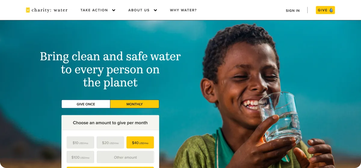
3. Charity: Water
Why it stands out: There's a reason Charity: Water appears on every "best nonprofit website" list. Their digital strategy masterfully combines storytelling with transparency, immediately focusing on donor impact rather than organizational ego.
- Transparency tools: Project tracking capabilities show exactly how contributions create change
- Compelling visual narrative: Impactful imagery maintains a positive story about changing the world
- Multiple engagement pathways: Various ways to get involved beyond just writing checks
Key takeaway: Transparency builds trust, and trust drives donations. Show people exactly where their money goes.
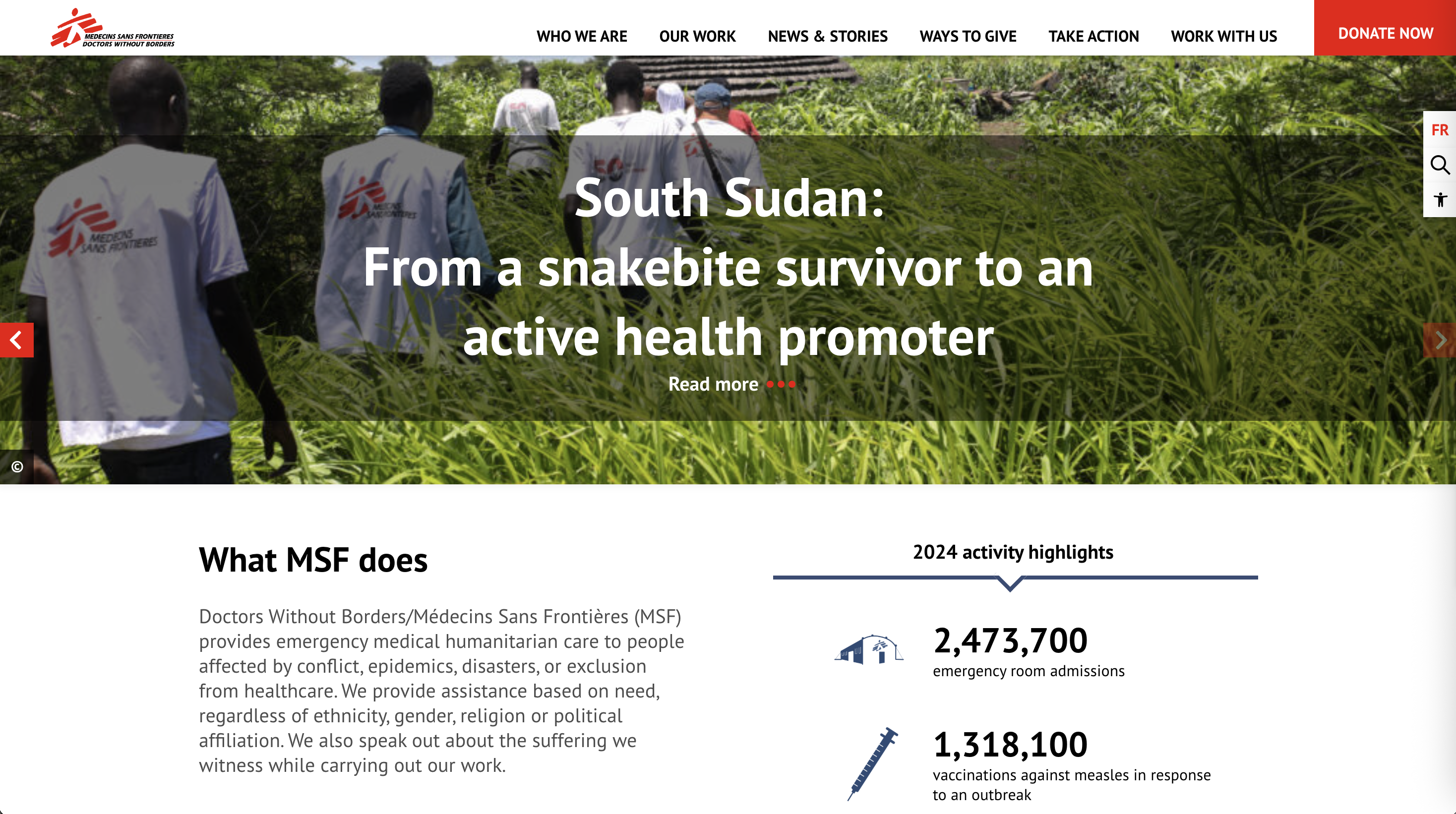
4. Doctors Without Borders
Why it stands out: When your work involves life-and-death situations, your website needs to reflect that urgency. Doctors Without Borders nails the mission-first approach with prominent donation buttons and real-time field updates.
- Urgent, authentic messaging: Content reflects the critical nature of humanitarian work
- Strategic CTA placement: Donation buttons appear prominently across all pages
- Real-time content: Timely updates from active operations keep supporters informed and engaged
Key takeaway: Match your website's tone and urgency to your mission. Authenticity resonates.
Environment/Conservation
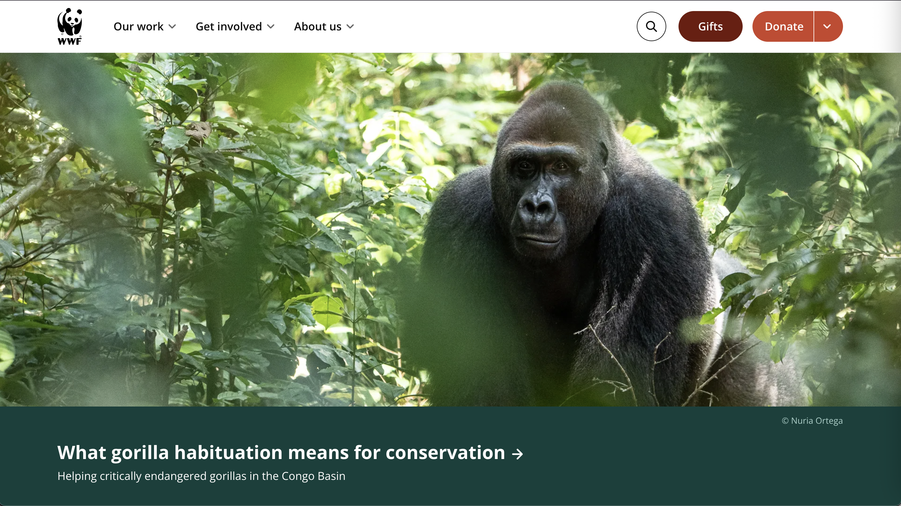
5. World Wildlife Fund (WWF)
Why it stands out: WWF proves that you can balance emotional appeal with solid functionality. Their website connects supporters to global conservation efforts through absolutely stunning imagery that makes you want to save the planet immediately.
- Immersive photography: Wildlife images create instant emotional connection
- Intuitive navigation: Thoughtfully organized menus make finding campaigns effortless
- Clear action steps: CTAs like "Adopt an Animal" make participation tangible and fun
Key takeaway: Great photography is a powerful tool for emotional connection and action.
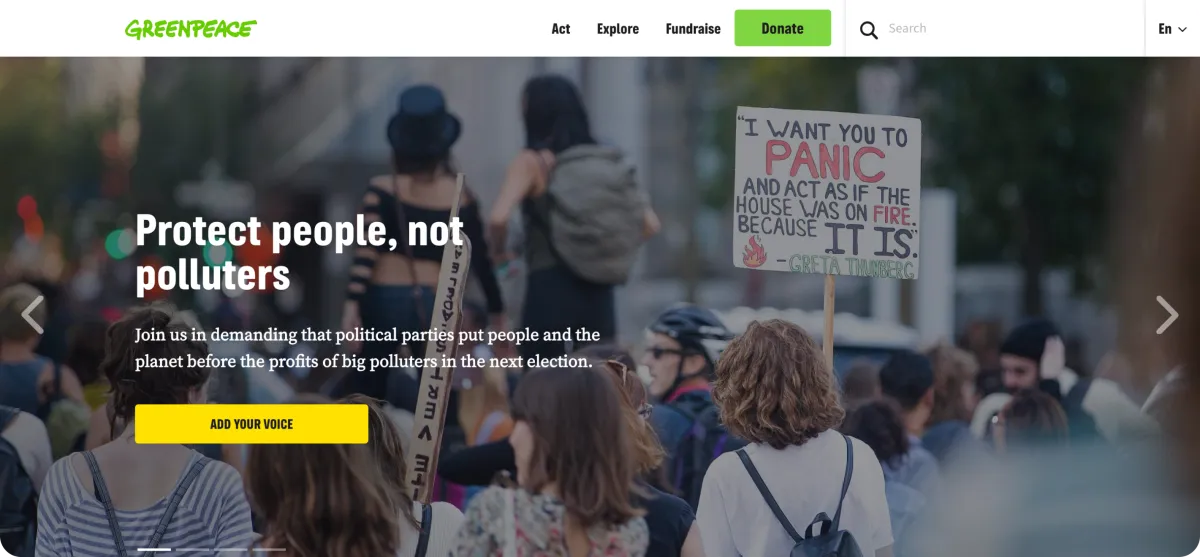
6. Greenpeace
Why it stands out: Greenpeace's bold, action-driven website perfectly matches their reputation for direct activism. Hero images and campaign videos create immediate urgency and emotional connection.
- Bold visual design: Campaign imagery creates urgency and drives action
- Interactive engagement: Petition forms and donation options take center stage
- Global accessibility: Multilingual content reaches international audiences effectively
Key takeaway: Your website should reflect your organization's personality, bold nonprofits need bold digital experiences.
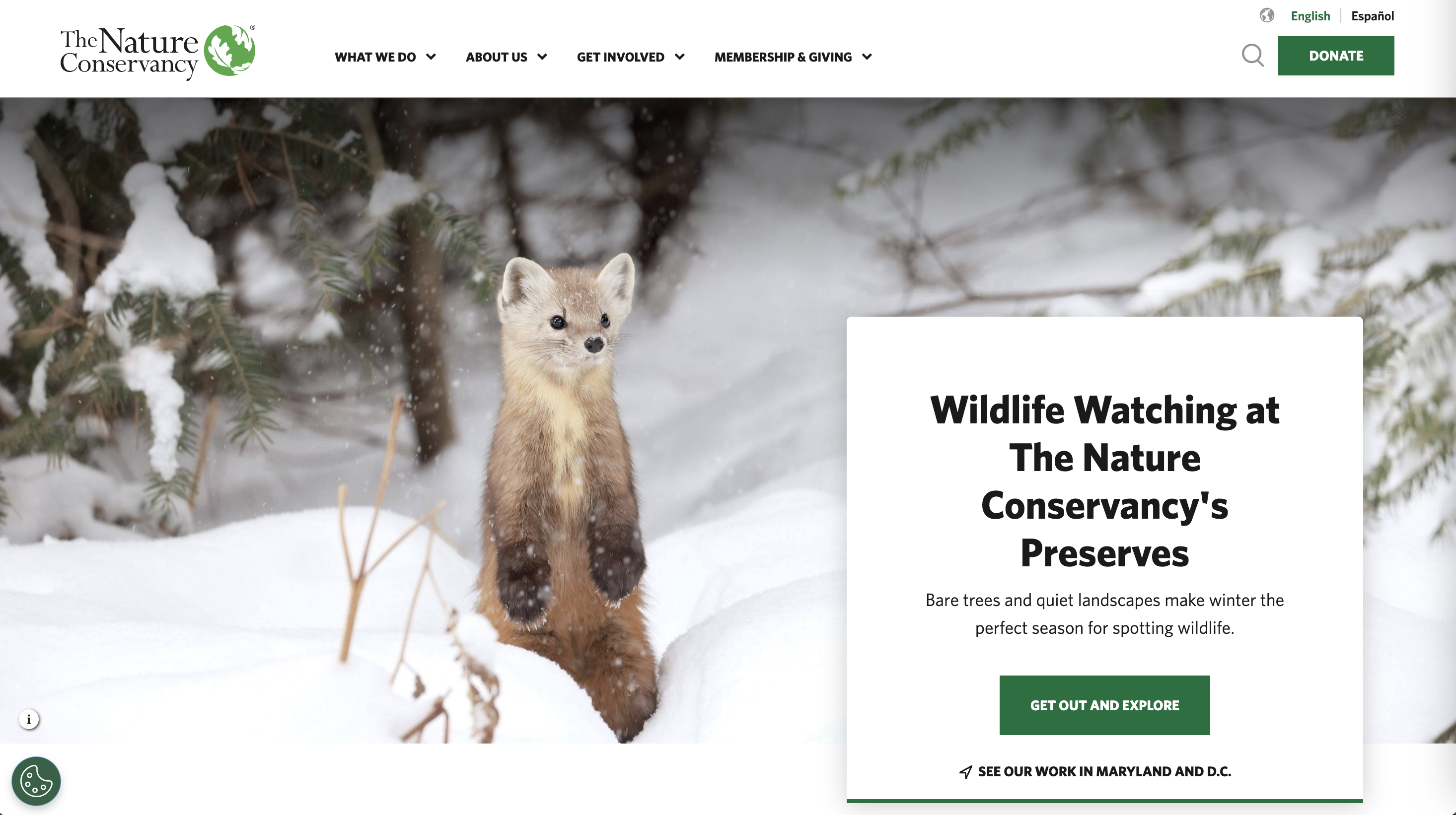
7. The Nature Conservancy
Why it stands out: The Nature Conservancy website showcases how powerful photography can make conservation work feel personal and achievable. Their use of geolocation technology is particularly clever.
- Geolocation personalization: Shows visitors relevant local conservation projects based on their location
- Stunning landscape imagery: Creates emotional connection with nature protection efforts
- Personal impact stories: Individual narratives make large-scale work feel relatable
Key takeaway: Personalization helps supporters connect global missions to their local communities.
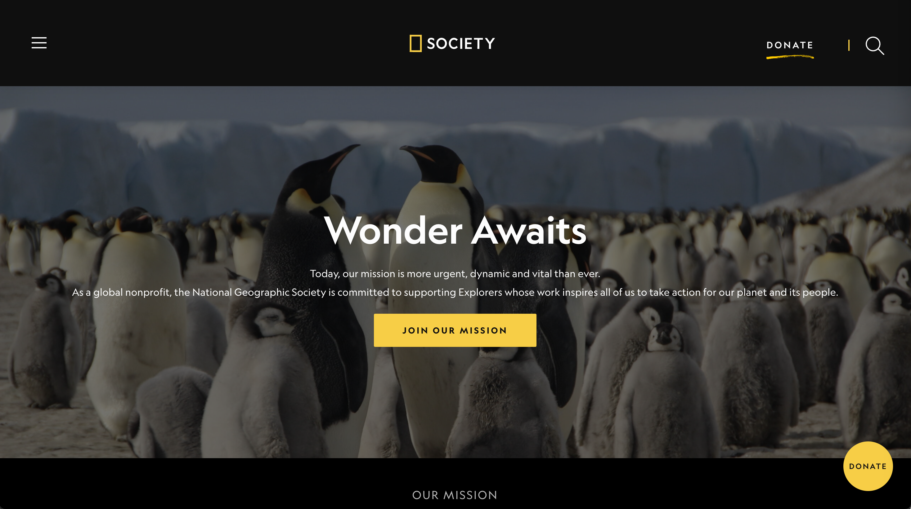
8. National Geographic Society
Why it stands out: That iconic black and yellow branding creates instant recognition, but the mobile-first design philosophy is what really makes the National Geographical Society site work across all devices.
- Iconic branding: Instantly recognizable visual identity builds trust
- Mobile-first design: Optimal user experience across all devices
- Streamlined navigation: Clean hamburger menu keeps focus on content
Key takeaway: Strong branding combined with excellent user experience creates powerful digital presence.
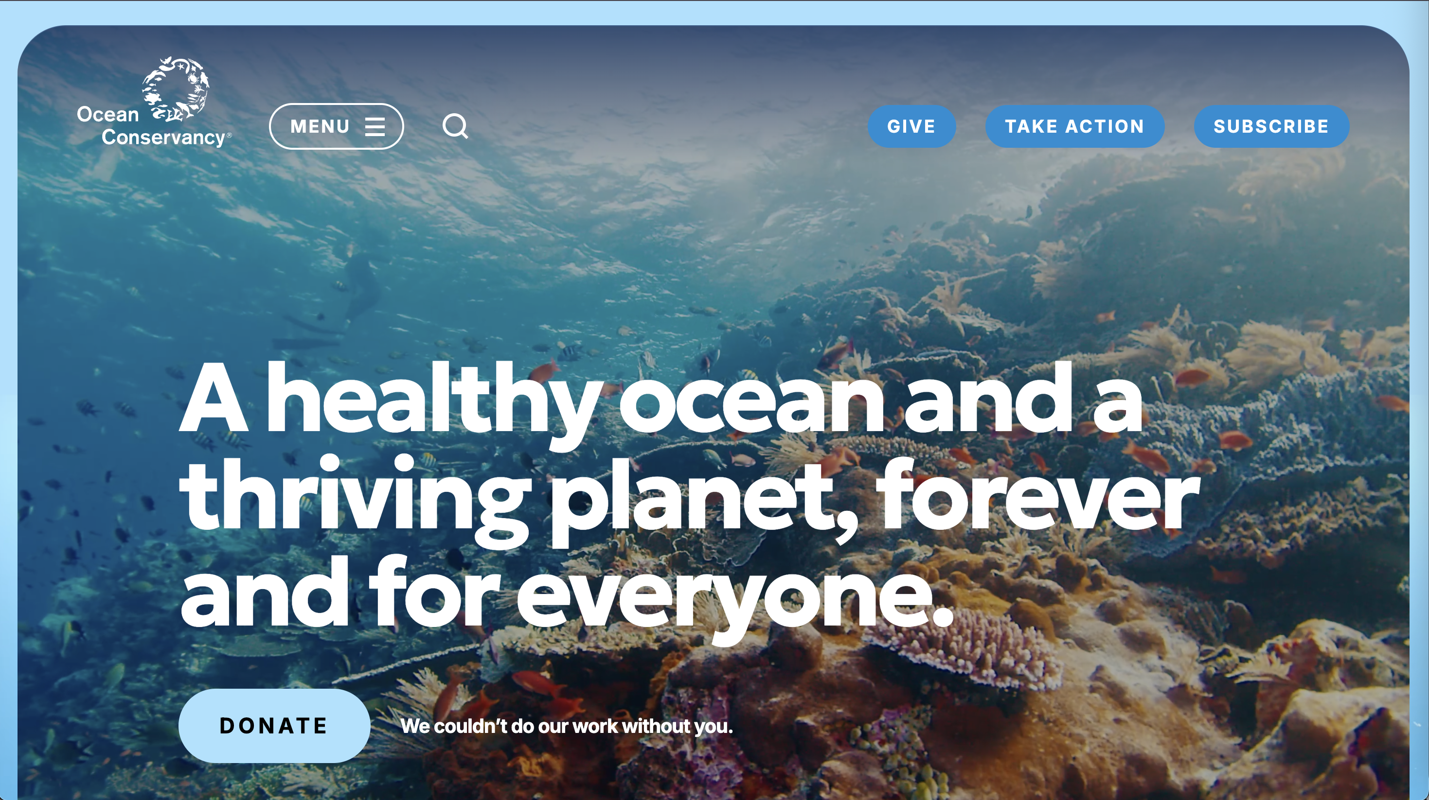
9. Ocean Conservancy
Why it stands out: Possibly one of the most visually beautiful sites on the web, Ocean Conservancy effectively uses marine imagery to create emotional connections while maintaining clean, professional design that doesn't overwhelm visitors.
- Natural beauty focus: Ocean photography creates immediate emotional appeal
- Interactive elements: Help visitors understand conservation challenges and solutions
- Educational balance: Informative content paired with clear action steps
Key takeaway: Let your cause's natural beauty speak for itself, then provide clear ways for people to help.
Education/Schools
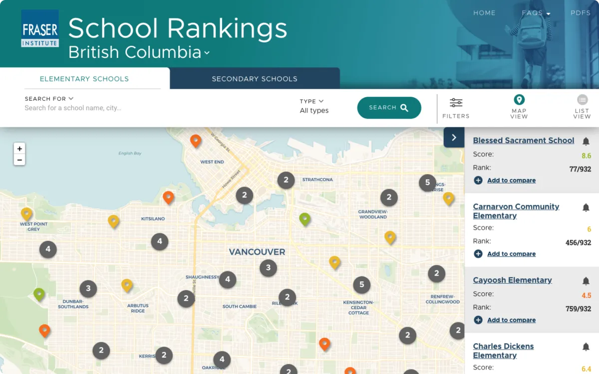
10. Fraser Institute
Why it stands out: Fraser Institute transforms boring policy research into engaging, accessible content. Their Compare School Rankings tool is particularly impressive, it makes complex data feel like a useful app.
- Data visualization: Interactive tools make complex information accessible
- Mobile-friendly interface: Research data presented in app-like format
- Performance optimization: Handles heavy datasets without sacrificing speed
Key takeaway: Even the most complex information can be made accessible with smart design and data visualization.
Read the full Fraser Institute case study for the project details.
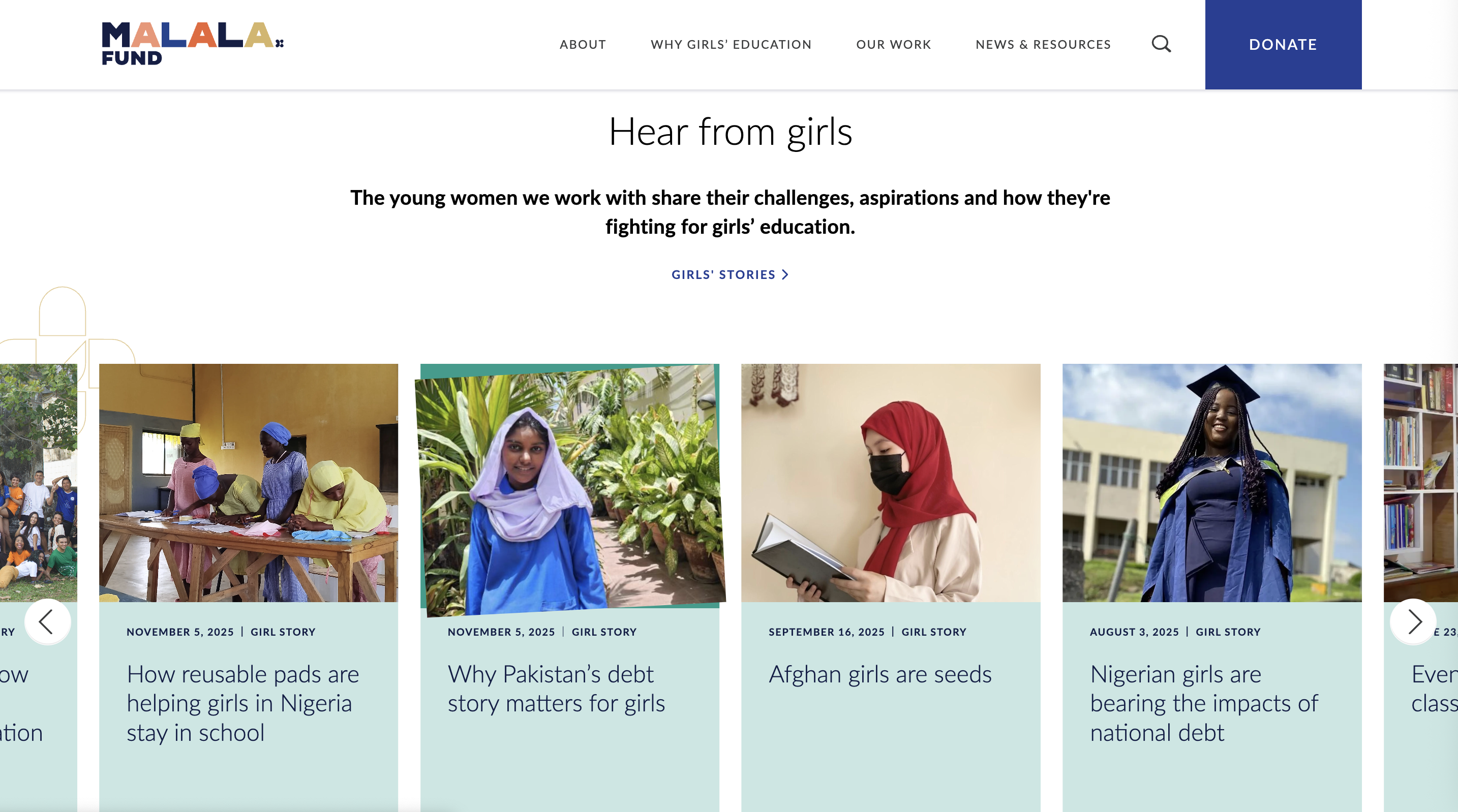
11. Malala Fund
Why it stands out: The Malala Fund website combines elegant design with powerful advocacy messaging. The crisp, modern aesthetic creates an immediately compelling visual experience that matches their inspiring mission.
- Sophisticated design: Professional aesthetic that commands respect
- Video storytelling: Engaging content showcases real impact stories
- Global accessibility: Appeals to diverse international audiences
Key takeaway: Elegant design can amplify powerful messaging, presentation matters for serious causes.
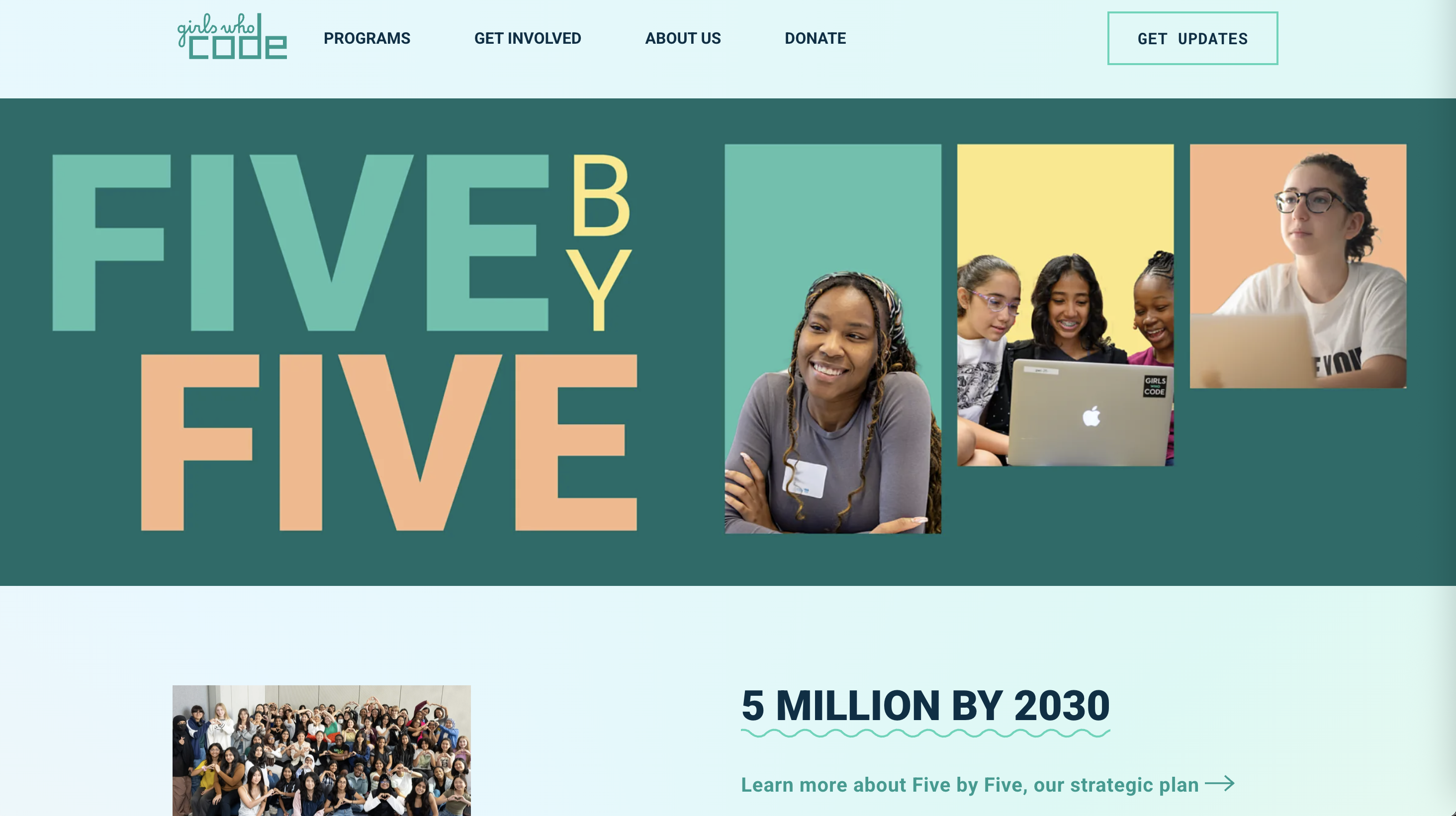
12. Girls Who Code
Why it stands out: Girls Who Code uses vibrant colours and modern typography that actually appeal to their target audience while maintaining professional credibility. The interactive coding elements are genius.
- Audience-appropriate design: Vibrant colours and modern typography appeal to young women
- Interactive demonstrations: Coding examples make technology feel accessible and fun
- Inclusive messaging: Dynamic approach to closing the gender gap in tech
Key takeaway: Know your audience and design specifically for them, one size doesn't fit all.
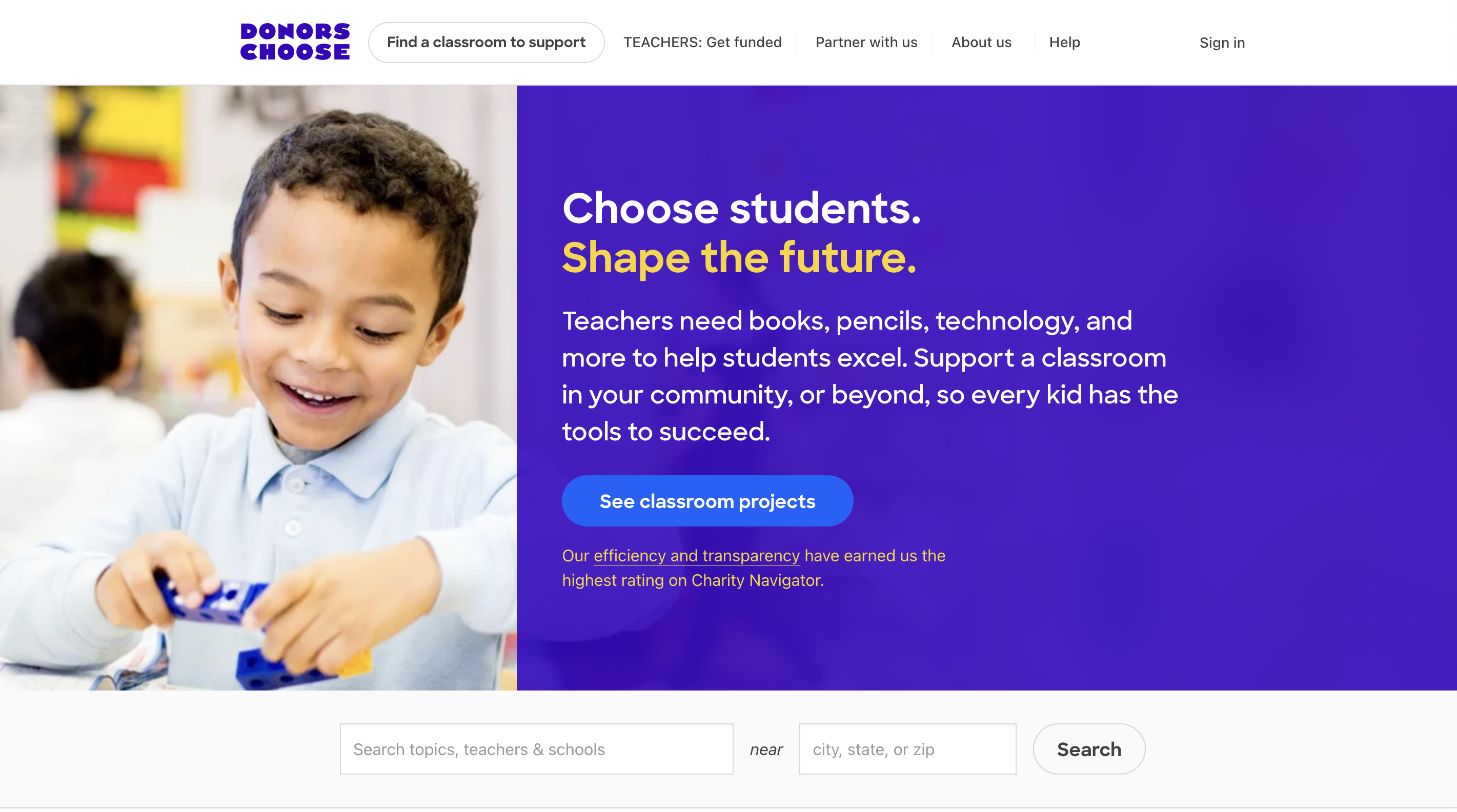
13. DonorsChoose
Why it stands out: DonorsChoose revolutionized education philanthropy by making giving personal and transparent. Their project browsing system creates direct connections between donors and classroom needs.
- Direct connection: Teachers and donors connect through specific project requests
- Complete transparency: Detailed project descriptions and teacher profiles build trust
- User-friendly marketplace: Easy browsing by location, subject, or funding level
Key takeaway: Transparency and personal connection can transform how people think about charitable giving.
Healthcare/Medical
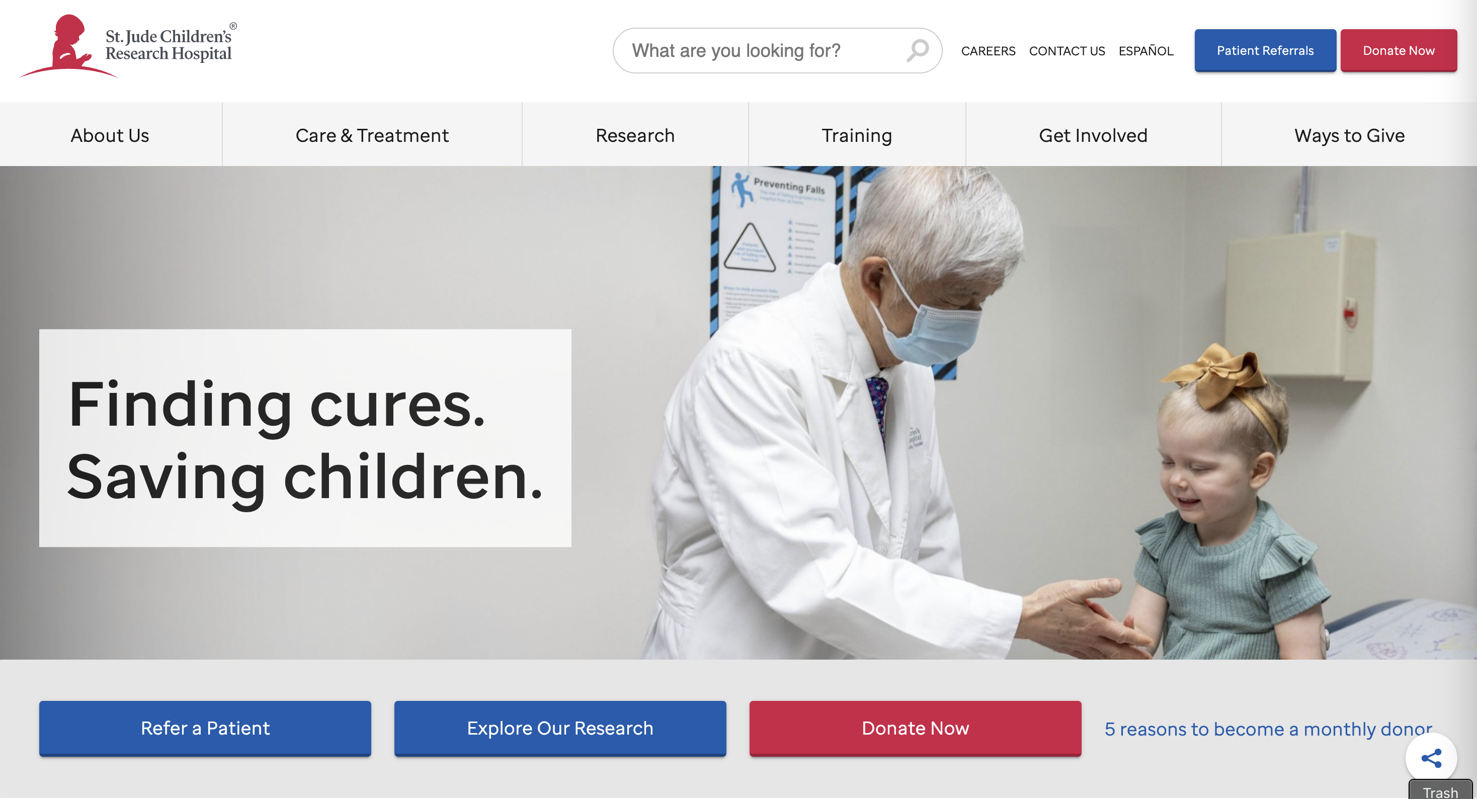
14. St. Jude Children's Research Hospital
Why it stands out: St. Jude masterfully combines emotional storytelling with transparency about their groundbreaking research. The clear messaging about never billing families is incredibly powerful.
- Emotional storytelling: Patient and family stories create immediate connection
- Clear value proposition: Families never pay bills, donations make this possible
- Multiple engagement options: Various ways for individuals and corporations to support
Key takeaway: Combine emotional appeal with crystal-clear messaging about your unique value proposition.
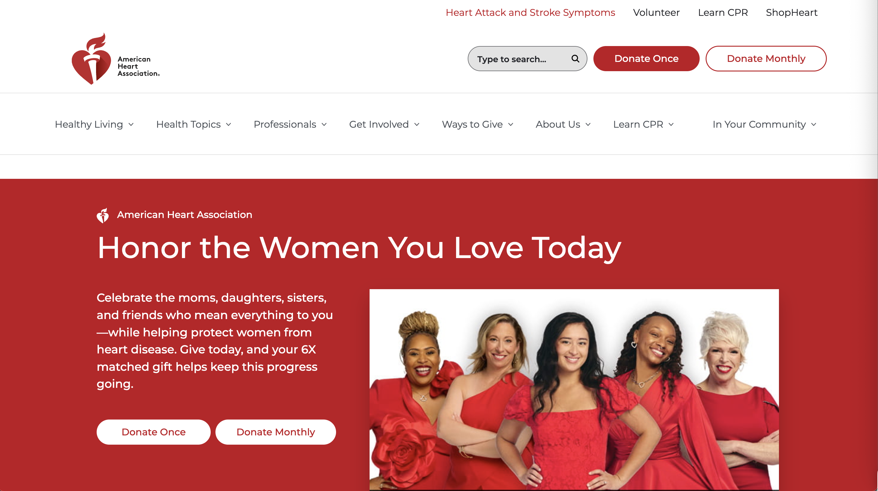
15. American Heart Association
Why it stands out: The American Heart Association successfully serves multiple audiences like patients, healthcare professionals, and donors, without making the site feel cluttered or confusing.
- Multi-audience approach: Successfully serves patients, professionals, and donors
- Educational authority: Health resources establish credibility and trust
- Balanced messaging: Education and fundraising appeals work together seamlessly
Key takeaway: You can serve multiple audiences effectively with smart navigation and clear content organization.
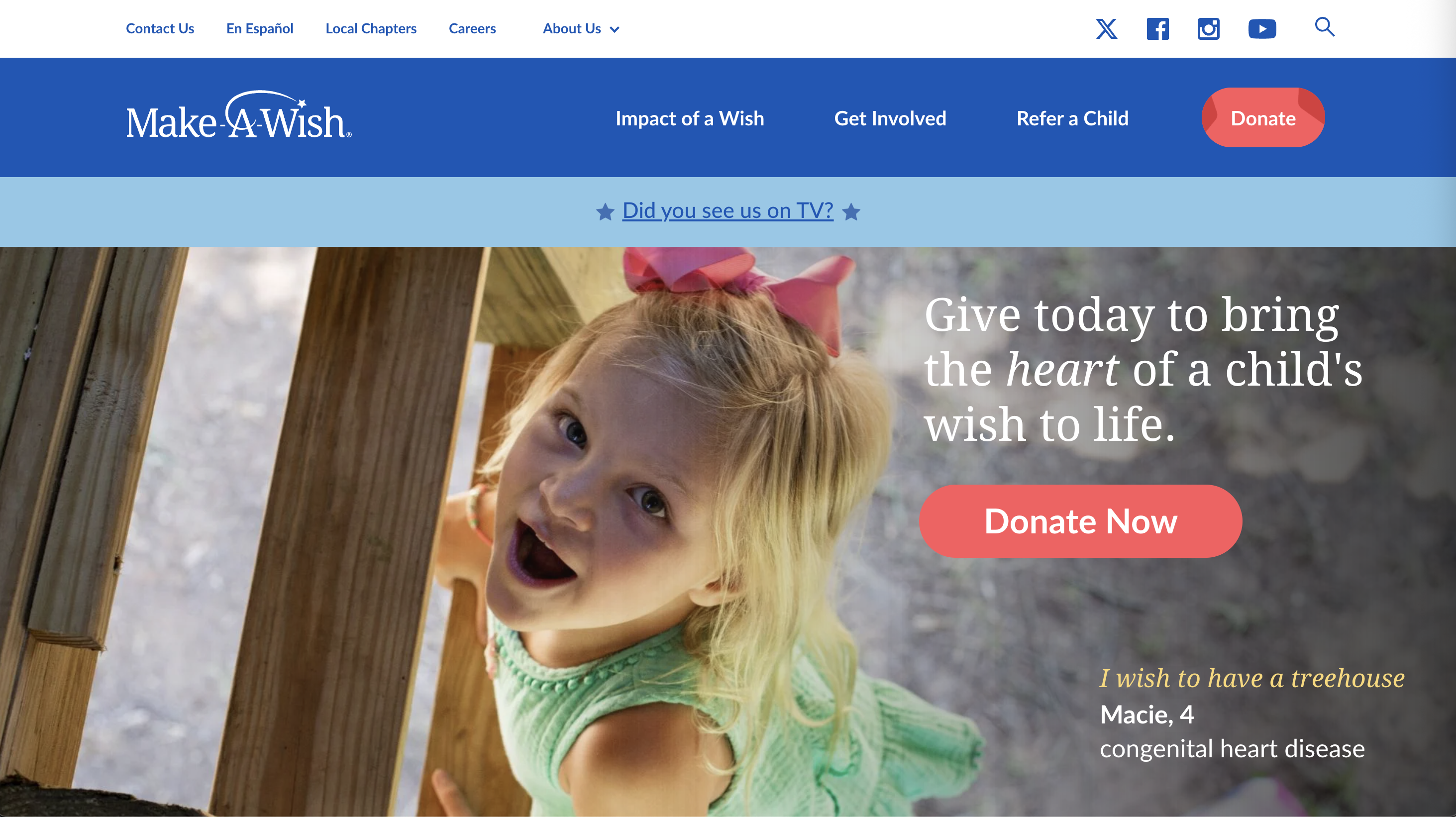
16. Make-A-Wish Foundation
Why it stands out: Make-A-Wish uses authentic testimonials from children to immediately communicate their mission's emotional impact. The kid-friendly design elements reinforce their target beneficiary audience.
- Authentic testimonials: Real quotes from children show genuine impact
- Kid-friendly design: Visual elements appeal to their beneficiary audience
- Impact focus: Clear connection between donations and wish fulfillment
Key takeaway: Authentic voices from your beneficiaries are more powerful than any marketing copy you could write.
Social Services/Community
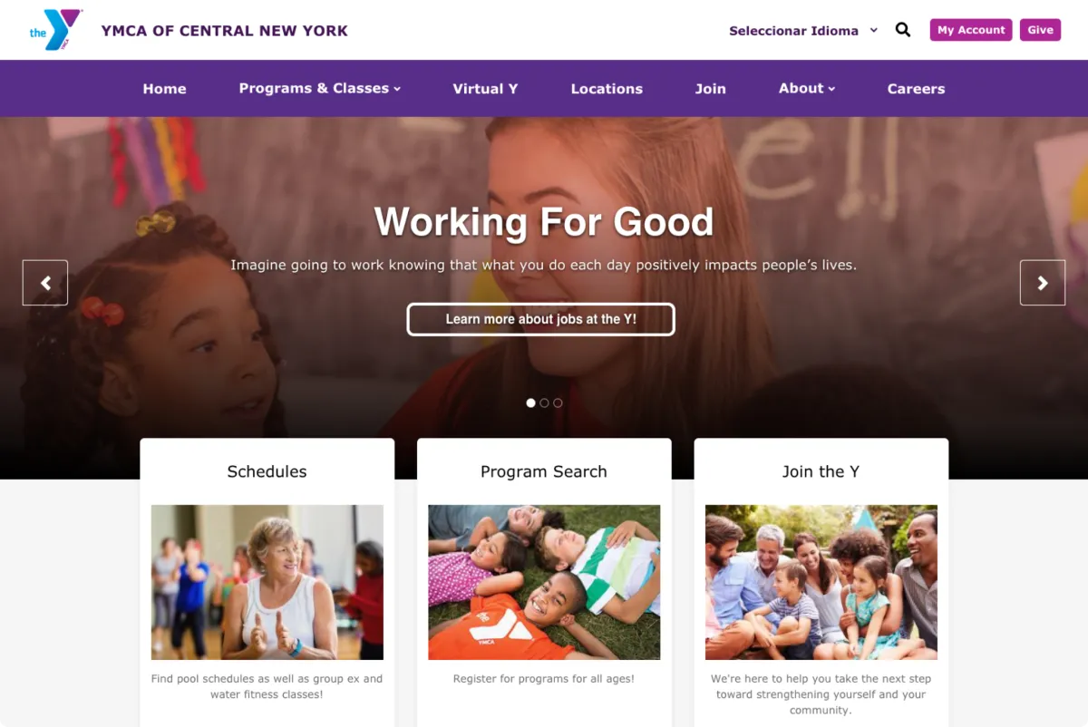
17. YMCA of Central New York
Why it stands out: Built on a platform designed specifically for YMCA organizations, this site shows how the right technology can empower staff to keep content fresh and relevant without constant technical support.
- Dynamic content management: Local teams can quickly update program information
- Multi-program support: Effectively organizes diverse community offerings
- Scalable platform: Grows with the organization's changing needs
Key takeaway: The right content management system can empower your team to maintain engaging, current content.
Read YMCA of Central New York full case study.
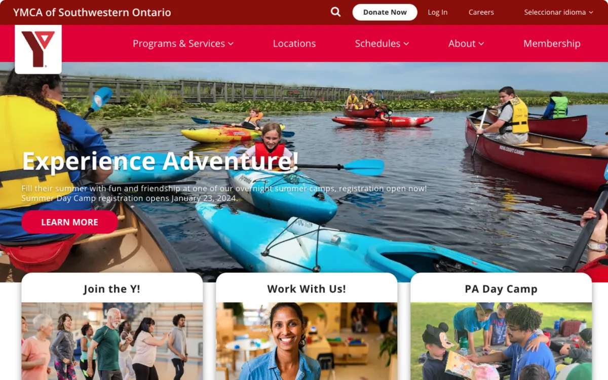
18. YMCA of Southwestern Ontario
Why it stands out: This Canadian YMCA successfully merged two separate websites into one cohesive platform, proving that website consolidation can actually improve user experience rather than complicate it.
- Successful site merger: Two separate sites became one cohesive experience
- Interactive features: Custom elements make program discovery engaging
- Content empowerment: Internal teams can maintain current, relevant information
Key takeaway: Website consolidation done right can simplify user experience while reducing maintenance complexity.
Discover the full web design project in the YMCA of Southwestern Ontario case study.
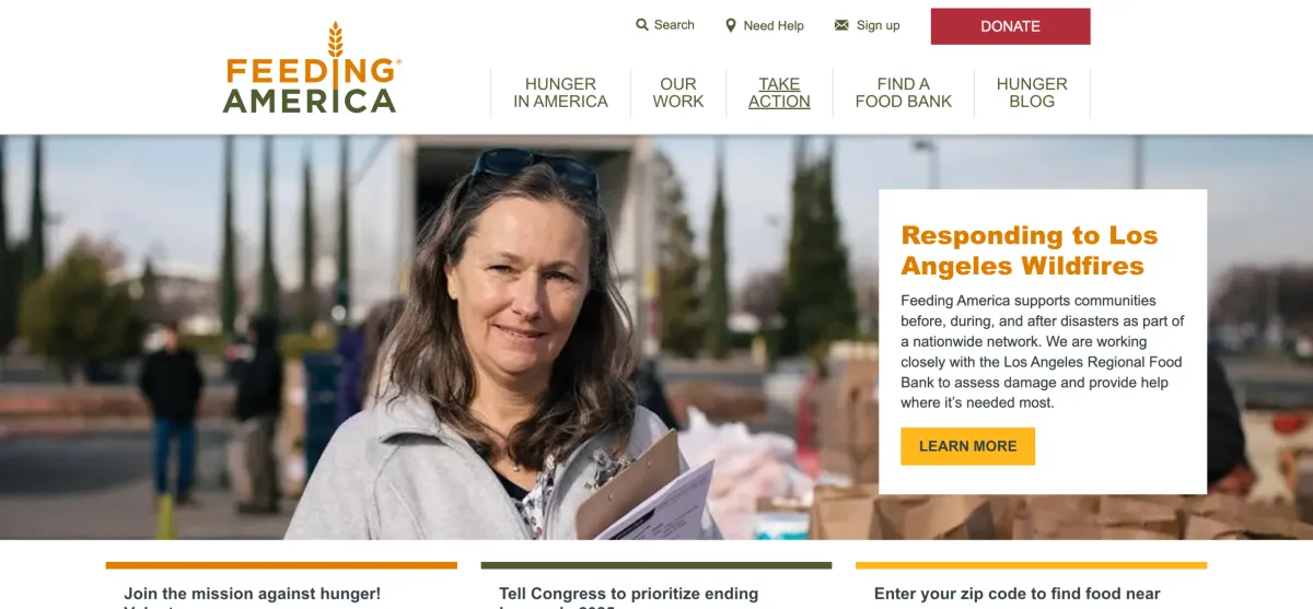
19. Feeding America
Why it stands out: Feeding America uses data-driven visuals to make the massive scale of hunger in America both understandable and actionable. Their interactive maps connect national missions with local opportunities.
- Powerful data visualization: Statistics make hunger crisis tangible and urgent
- Local connection: Interactive maps link national mission to local food banks
- Multiple engagement options: Volunteering, donations, and advocacy opportunities
Key takeaway: Data visualization can make large-scale problems feel both urgent and actionable.
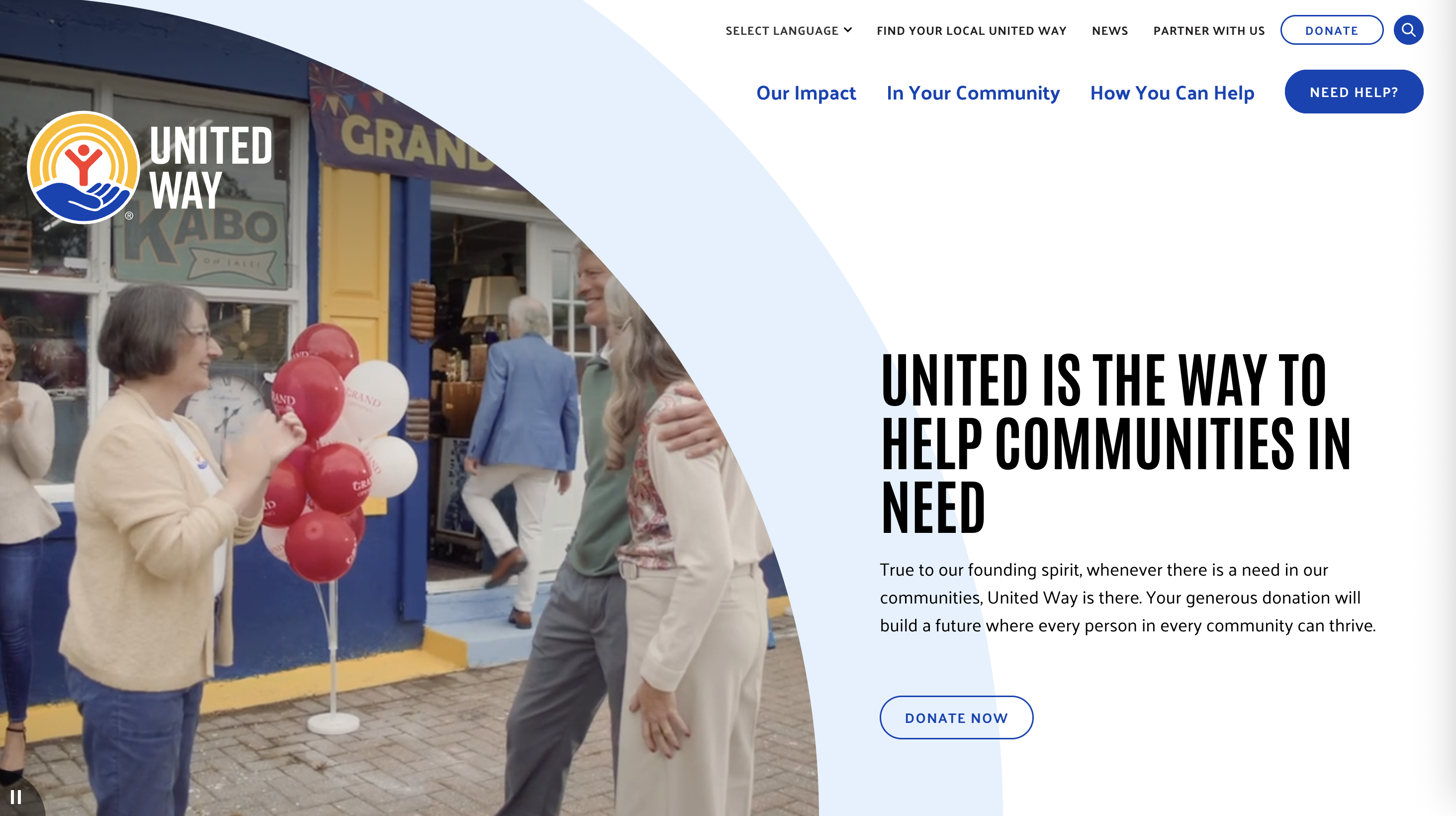
20. United Way
Why it stands out: United Way brilliantly balances national organization messaging with local chapter integration, showing how federated nonprofits can maintain brand consistency while enabling local customization.
- Federated structure: National branding with local chapter flexibility
- Multiple engagement pathways: Volunteering, donations, workplace giving, advocacy
- Community focus: Connects broad mission to specific local impact
Key takeaway: Federated organizations can maintain strong national branding while empowering local chapters.
Human Rights/Advocacy
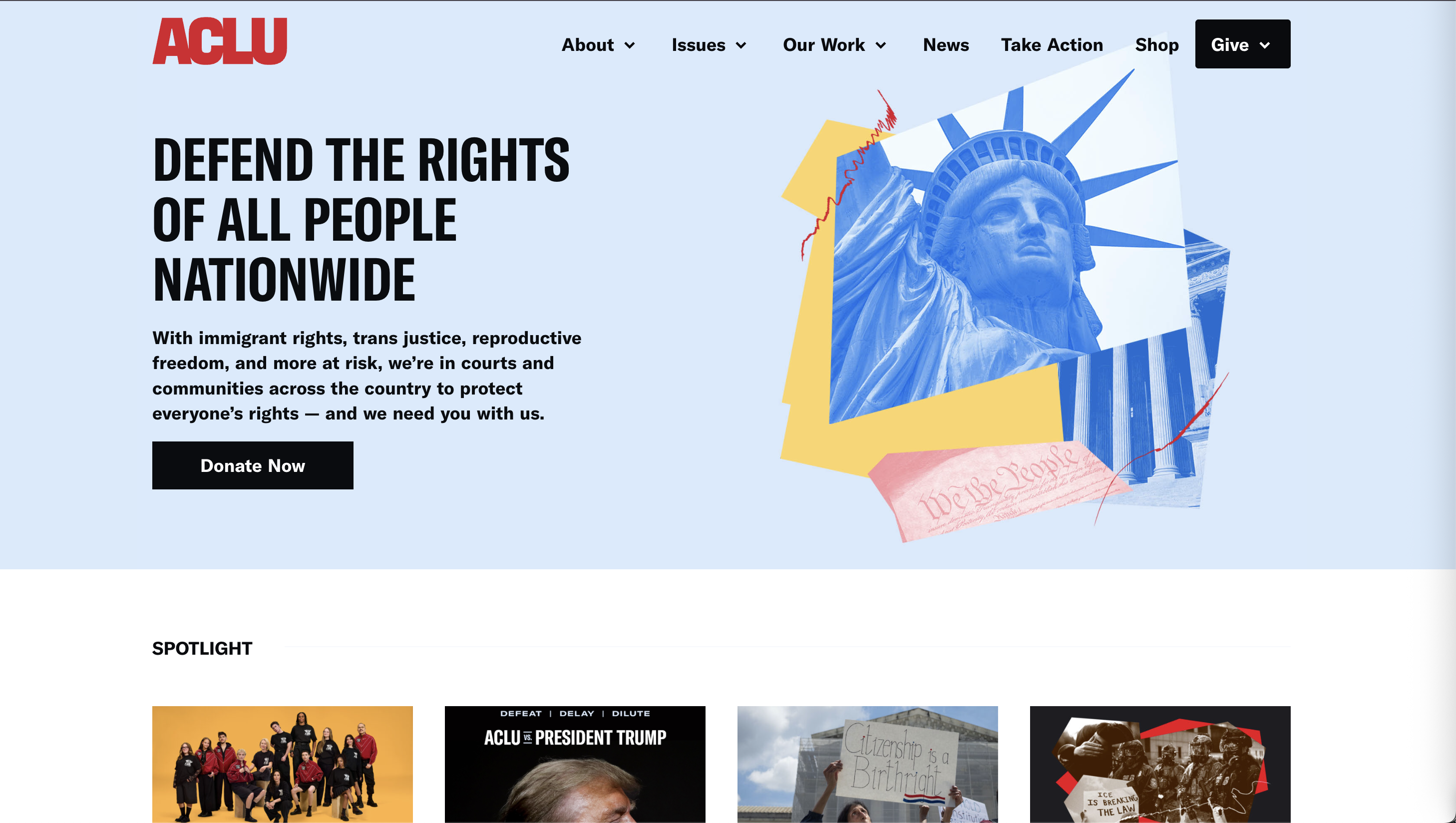
21. ACLU
Why it stands out: The ACLU website demonstrates how advocacy organizations can create urgent, action-oriented digital experiences that translate complex legal work into accessible advocacy.
- Urgent messaging: Bold design reflects mission to defend constitutional rights
- Action-oriented design: Interactive elements provide immediate advocacy opportunities
- Legal transparency: Complex legal work presented in accessible format
Key takeaway: Urgent causes need urgent design, your website should match your mission's intensity.
Arts/Culture
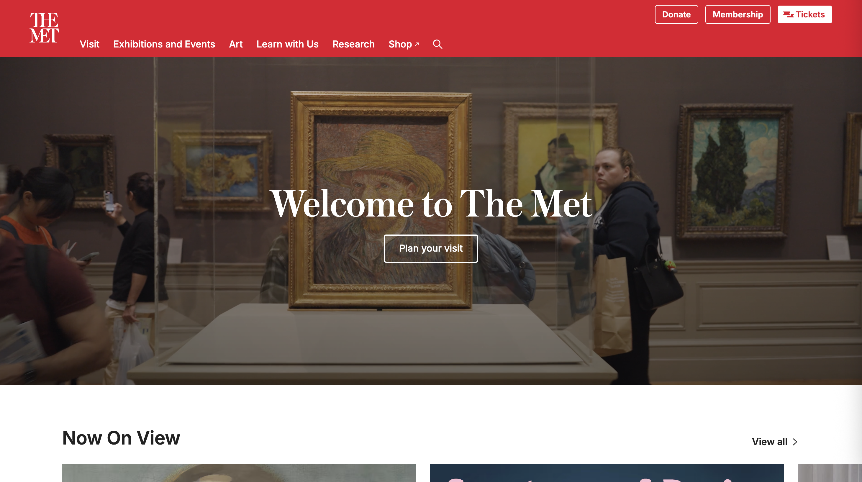
22. Metropolitan Museum of Art
Why it stands out: The Met showcases how cultural institutions can create engaging digital experiences that complement physical visits while serving researchers and casual art lovers equally well.
- High-quality imagery: Artwork photography serves both visitors and researchers
- Integrated membership: Donation and membership pathways throughout the site
- Educational content: Cultural preservation and public education messaging
Key takeaway: Cultural institutions can use digital experiences to extend their physical mission online.
Animal Welfare
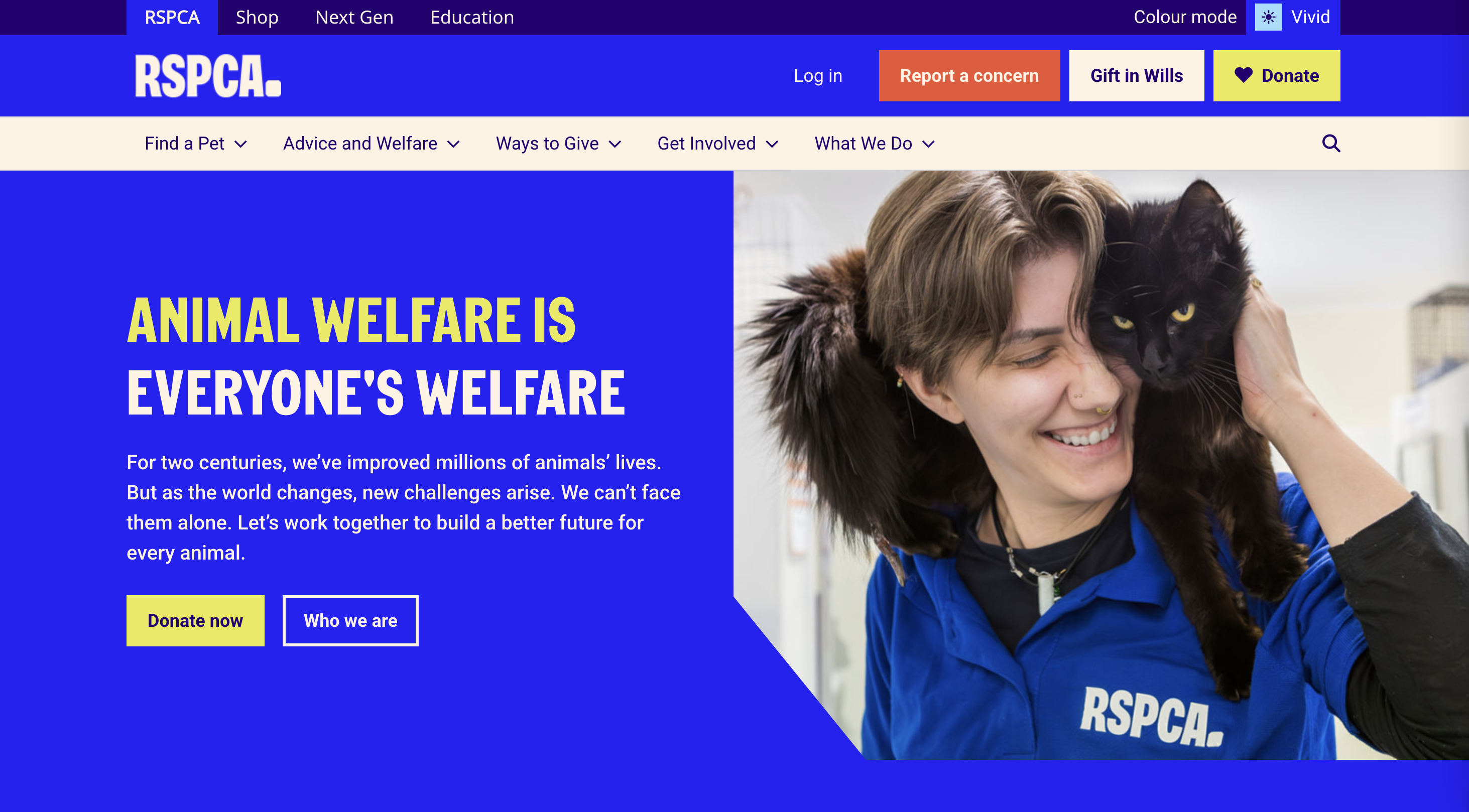
23. RSPCA
Why it stands out: The RSPCA uses compelling real-life photography to create immediate emotional connections. That prominently placed "Donate" button within the header users through the site maximizes conversion from emotional engagement.
- Emotional photography: Animal images create immediate connection and urgency
- Strategic donation placement: Prominent "Donate" button visible throughout navigation, the fun use of a heart helps build an emotion link too
- Multiple fundraising programs: Various engagement options from birthday campaigns to events
Key takeaway: Emotional imagery combined with strategic donation placement can significantly boost conversion rates.
Building Your Own High-Impact Nonprofit Website
Creating a website that matches these nonprofit website design examples requires strategic planning and smart execution. Here's how the most successful projects actually get done.
Start with Strategy and Planning
Define what success looks like before you design anything. More donations? Increased volunteers? Better service delivery? Every design decision should support these primary objectives, not just look impressive.
Survey your supporters, interview volunteers, and dig into your analytics data. Understanding how different people actually use your site guides every major decision. Balance organizational priorities with visitor needs. The most effective nonprofit websites give people what they want while naturally leading to engagement.
Choose platforms and hosting that match your technical skills, budget constraints, and growth plans. Don't over-engineer solutions you can't maintain, but don't under-invest in capabilities you actually need.
Focus on User Experience
Create wireframes showing how different visitors will navigate your site. This planning prevents major navigation problems before they happen. For complex user journey mapping, professional website design ensures every pathway serves your supporters effectively.
Design for mobile users first, then enhance for larger screens. Mobile-responsive design drives better engagement across all devices because that's how most people access websites today.
Connect your website to donation processors, email platforms, and supporter databases from the beginning. Seamless integrations improve both user experience and operational efficiency. Fast loading speeds, search engine optimization, and reliable functionality directly impact conversion rates and supporter satisfaction.
Key Takeaways from the Best Nonprofit Websites
After analyzing these nonprofit website examples, clear patterns emerge among the most successful digital strategies. Here's what drives results.
Design That Converts
Think like visitors, not like org charts. Users want to donate, volunteer, or get help. They don't care about your internal department structure, so organize your site around what people actually want to accomplish.
Nail the basics first. Consistent colors, fonts, and imagery across all pages build trust faster than any testimonial. With mobile devices generating most website traffic, successful nonprofits design for phone users first, then enhance for desktop.
Put donation buttons where people actually look for them. Many successful nonprofits use sticky donation buttons that follow users throughout the site, and it works because people can donate the moment they feel inspired.
Content That Connects
Stock photos kill engagement. Organizations that invest in original photography of real beneficiaries, volunteers, and programs see dramatically higher engagement rates than those using generic imagery.
Great nonprofits recognize that donors, volunteers, and beneficiaries need different information. The best sites provide clear pathways for each group without overwhelming anyone with irrelevant content.
Technical Performance That Matters
Google research shows that pages loading within one to three seconds have the highest conversion rates. Slow sites kill donations because people abandon websites that don't load quickly.
Accessibility features help you reach more supporters while demonstrating your organizational values. Beyond legal compliance, these features expand your potential audience significantly.
Organizations that invest in content marketing and search optimization see steady growth in supporter acquisition without paying for advertising. Good SEO brings the right people to your site naturally.
Ready to Transform Your Nonprofit's Digital Presence?
These nonprofit website examples prove that smart design drives real results: more donations, increased volunteers, and stronger community engagement. The most successful nonprofits treat their websites as strategic investments, not just technical necessities.
Great digital experiences don't happen by accident. They result from thoughtful planning, user-focused design, and ongoing optimization based on actual supporter behaviour. Explore our nonprofit website services designed to amplify your mission's impact.