Tips and Best Practices for Nonprofit Websites
Authored by: Nadiia Nykolaichuk
The nonprofit organizations we work with are so dedicated to their mission that we, in turn, strive to support them in every way we can. One of these ways — in addition to designing great nonprofit websites — is sharing helpful tips based on our experience. That’s why we decided to combine the best of our insights into a collection that nonprofit website marketers might find useful. Read on for our web development team’s tips and best practices for nonprofit websites.
Nonprofit website best practices and tips
Make your website a hub for digital-first supporters
Maintaining relationships with donors is common practice in nonprofit organizations. But if most of your organization’s funding comes as a result of its personal significance to specific donors, what’s then the role of your website? This role could be the leading one, and here is why.
The digital era is becoming a game-changer in the ways prospective donors approach their funding decisions. They increasingly practice independent online research to find the causes that will help them make an impact. This also applies to prospective volunteers and members who search the web to discover organizations that align with their personal values.
Does your website provide all the information this audience is looking for? Does it have a compelling story to tell? See practical tips, best practices, and real-life examples from our team to help you make your nonprofit website a springboard for digital-first supporters.
Rethink your nonprofit website’s content strategy
It follows from the above that a large portion of your nonprofit website’s success rests on high-quality content. Unfortunately, content gets outdated with time, loses its relevance, and no longer serves an organization’s goals (or, in many cases, it never did).
Does your content strategy need a revamp? This challenging task might make you feel overwhelmed because sometimes it’s not even clear where to start. This is especially true for large websites that nonprofit organizations usually have.
Some nonprofit marketers practice the outsourcing of their content strategy and some do everything on their own. In any case, there is groundwork only your team can lay. We are sure it’s a possible mission for you and we’ve got you covered! Discover 5 tips to revamp your nonprofit’s content strategy without breaking the bank.
Pressed for time and staff? Try smart ideas for getting content
If you are a nonprofit marketing leader, your to-do list is always overwhelmingly long, so there is no way you can produce fresh and engaging content on a regular basis. It’s a task for a rock star team that writes compelling articles, shoots exciting videos, and creates eye-catching images.
The great news is that you don’t have to hire all these rock stars in house to have your website’s message reach your audience’s heart. You can achieve this with smart content curation.
This article by our team describes what content curation is, what benefits it might have for your nonprofit website, and what the best practices are for employing the strategy. Let this help you increase awareness of your mission, inspire more donations, and attract new members to your nonprofit organization.
Rely on the capabilities of a strong platform
Your website's platform could work wonders for you when it comes to being competitive in the noisy digital landscape and leveling up your online presence. Given the highly digitized lives of your current and prospective donors, members, and volunteers, this is very important if you want to get them involved and capture the attention you deserve.
You are especially lucky your platform is Drupal (if not, it’s never too late to migrate). Drupal can be a real driving force of your digital efforts. Next up is the article from our experts where they explore how Drupal can help your nonprofit website compete in the digital-first era.
Check it out to discover Drupal’s capabilities and best practices for smooth editorial workflows, the quick launch of digital marketing campaigns, seamless integrations with fundraising and event-management platforms, and so much more.
Stick with the best accessibility practices
Following accessibility standards is a way to extend your nonprofit website’s outreach to a much wider group of users. And, of course, it is a way to show your commitment to accessibility and inclusion, as well as to protect your organization from potential lawsuits.
Even if your website has been built — or optimized — with accessibility in mind, the picture is not complete unless you use the best accessibility practices in your editorial workflow. In this case, a site could be compared to an office building. Imagine one that has been architected to be accessible for people with physical disabilities, but the staff clutters the ramp with debris, hangs decorations on the accessible doors, or otherwise negates the built-in accessibility.
You can make improvements by checking out 10 accessibility tips for editors. The article describes the use of straightforward language, headings and subheadings, ALT tags, captions and transcripts, and many other vital everyday accessibility practices.
Consider personalization techniques
Personalized web pages look more relevant and appealing to your nonprofit organization’s supporters. The needed information is easier to find, and people are more likely to support your cause.
Many companies shy away from implementing personalization techniques so they miss opportunities to seriously increase conversions and user satisfaction. However, personalization doesn’t have to be too complicated. What you need is an understanding of your audience in combination with helpful tools.
Discover more about website personalization and the crucial steps for implementing it. They include identifying your audience, collecting data from marketing automation tools, and personalizing user experiences based on localization, user personas, demographics, and so on.
Make your membership functionality great
Many nonprofit organizations and associations are using — or would be interested in building — a membership feature on their websites. It can create a stronger sense of community, ignite brand recognition, increase member loyalty, and foster long-term relationships.
Your membership functionality should be well-designed so it streamlines many of your processes, makes sure your content is properly organized and accessible, as well as enables members to easily find what they are looking for.
The article by our team’s Senior Technical Solutions Architect and Digital Experience Solutions Director will cover the best practices for website design for membership organizations and the ways the Drupal CMS could help.
Discover exciting examples
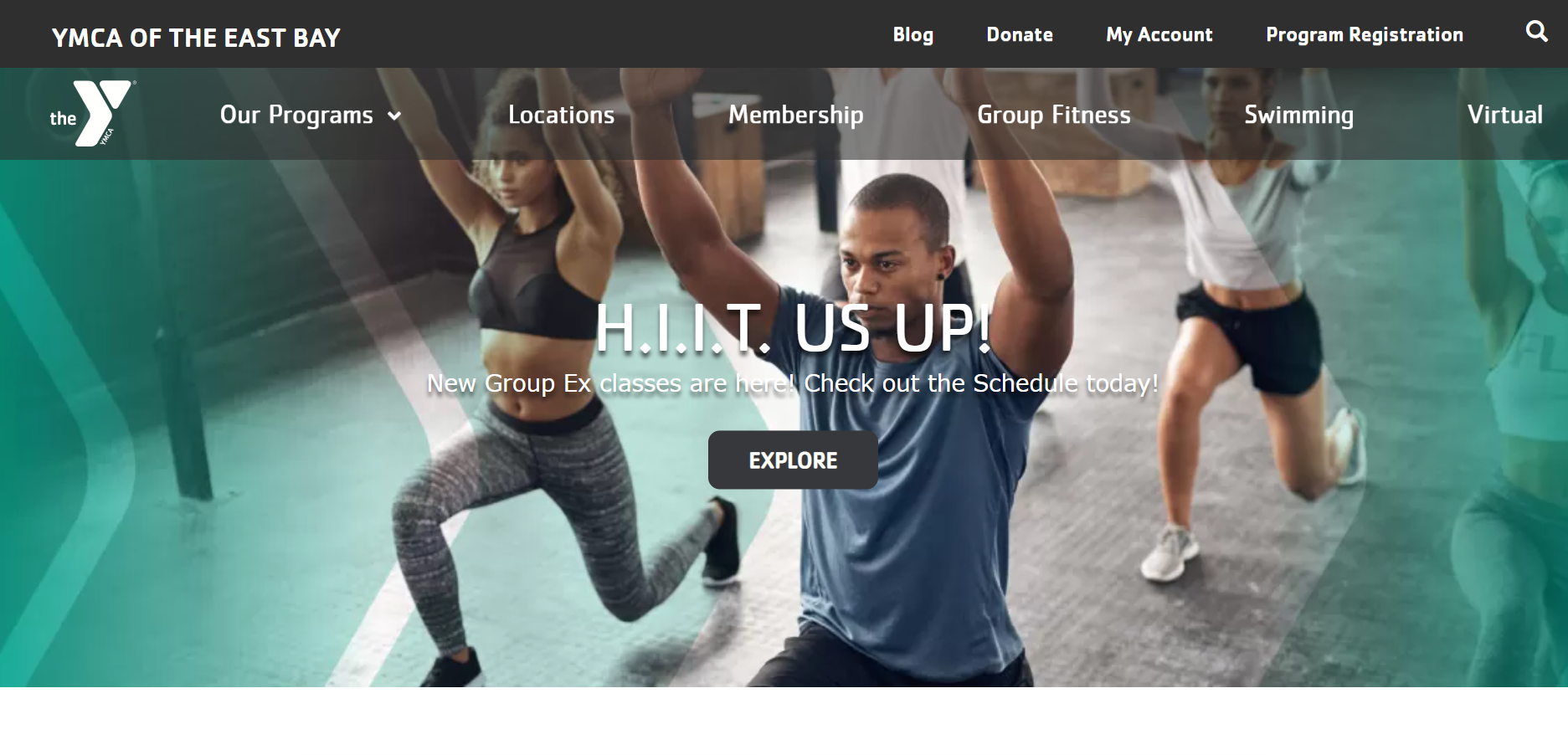
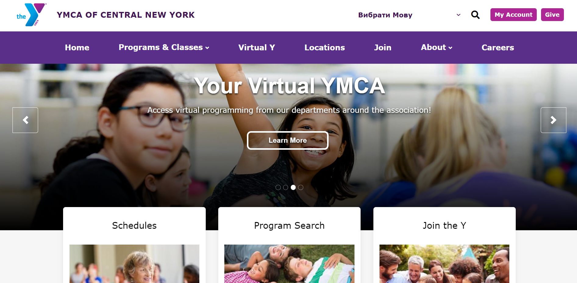
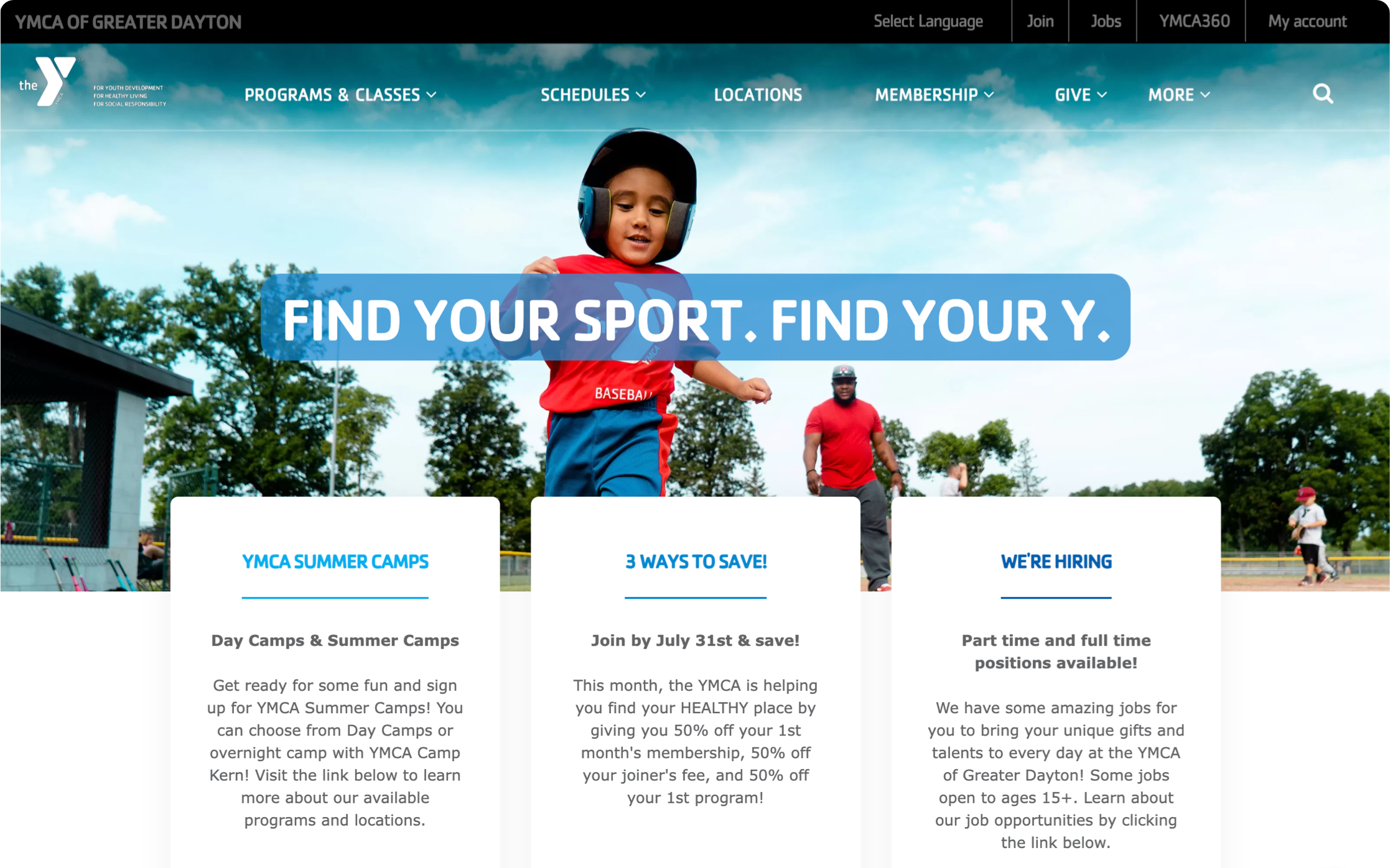
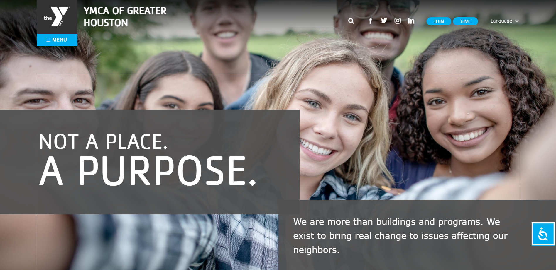
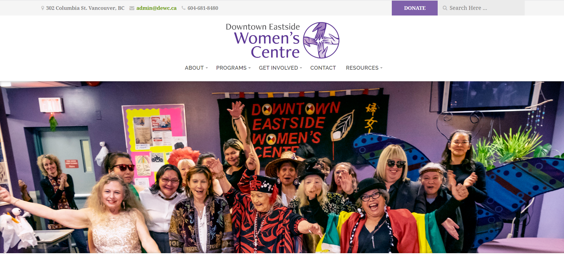
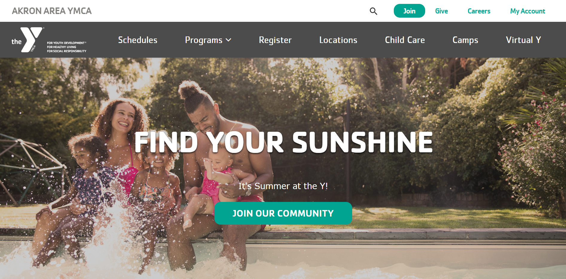
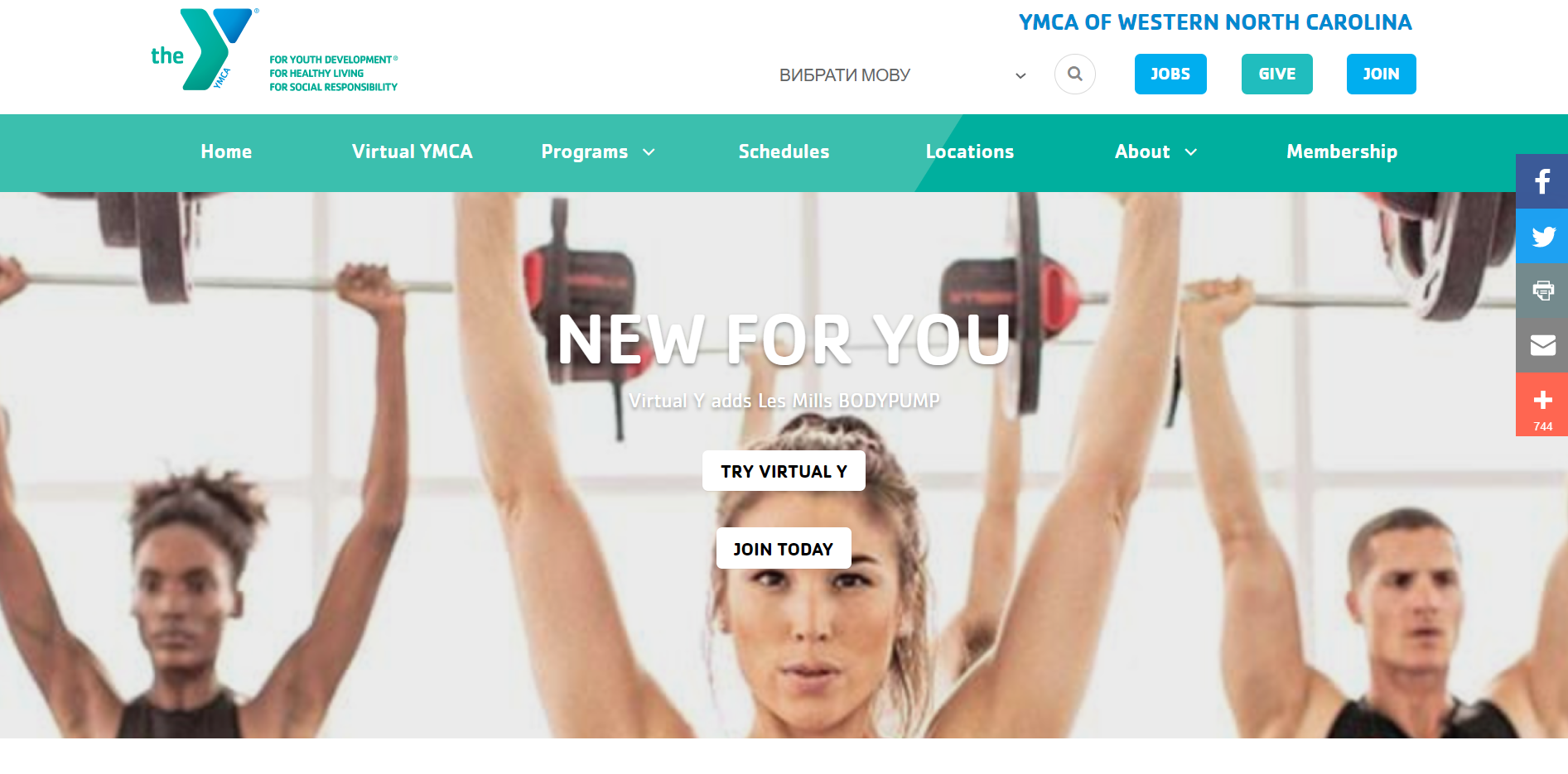
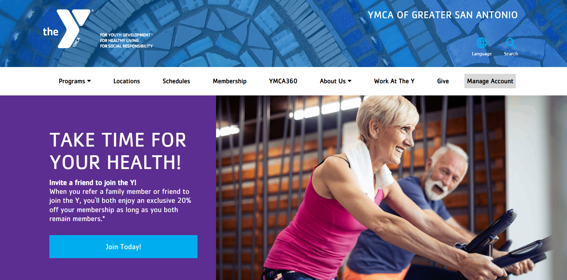
Nonprofit marketers who are reading this now and thinking of optimizing their website or building a new one from scratch might appreciate some great real-life examples. So we decided that our collection would be incomplete without showcasing some of our team’s work from our portfolio.
To sum up
Hopefully, our collection of tips and best practices for nonprofit websites will help you unlock your site’s full potential. We welcome any questions, comments, ideas, or doubts — this creates an opportunity for us to have a fruitful discussion. Contact our Drupal development team and let’s chat about how we can make your website rock!


