3 Signs It’s Time to Rebuild or Redesign Your Higher Ed Website

Authored by: Bjorn Thomson, C.J. Pagtakhan and Matt Pettifer.
Is your website meeting your institution’s complex needs as well as it possibly can? If not, it can be difficult to know whether you should optimize the site you have or invest in an entirely new solution.
For most higher education institutions, budgets are tight, and timelines are even tighter. These are good reasons to extend the life of your current site for as long as possible. And if you only need to accomplish something simple — like updating your website theme without touching anything else — undergoing a complete rebuild would be like using large excavating machinery when all you need is a shovel.
However, there are scenarios that absolutely call for a ground-up redesign or custom solution. In these situations, a new surface-level visual design or SEO optimization strategy won’t be sufficient. And since your ability to reach your enrollment targets greatly depends on the digital experience you create, it’s imperative to heed the warning signs that your current site is not up to snuff.
At ImageX, we always make a right-fit recommendation for each prospective client’s particular needs. If tweaking your existing website will do the trick, we’ll tell you that. But when we see the following red flags, we know it’s time to start talking about a major digital transformation.
1. Your Business Goals and Audience Needs Are Evolving Beyond What Your CMS Can Handle
Your higher ed website is a tool to reach your business goals. And if that tool isn’t enabling you to meet your audience where they are and draw them in, it’s not doing its primary job. This is true even if it looks beautiful and visually appealing at first glance.
Perhaps your vision for your website includes:
- Using it as a sophisticated digital experience platform to create, manage, optimize, and deliver digital experiences across multiple channels and touchpoints.
- Rebranding your site in a way that affects your website’s entire messaging and storytelling strategy.
- Enabling and equipping content editors across your organization to create student-focused content.
- Reaching an entirely new audience with a different set of needs (e.g. international students whose first language is not English).
Whatever your business goals and future vision entail, you need a CMS that can grow, extend, and flex with you. So if you’re already hitting the limit of what your current website can do, that’s a telltale sign it’s time to invest in something new.
The good news is a flexible CMS like Drupal can grow at the same pace you do. That means you don’t have to create a solution that meets every future objective or audience requirement right now. Rather, you can take an incremental approach to continuous website improvement.
This is often less overwhelming for your internal stakeholders, and it also allows you to spread your resources out over several fiscal years.
Ashland University implemented a story-focused content strategy to resonate with their users.
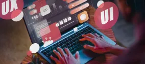
2. Your Website Design Isn’t User-Centric
Website design isn’t just about your site’s visual appearance, although that is an important element. A well-designed website is equally as concerned with functionality (the way it’s structured and organized) as it is with form (the way it looks).
Unfortunately, it’s common for higher ed websites to function poorly because they cater to internal stakeholders instead of external users. That’s not because anyone made an intentional decision to prioritize internal needs over external ones. It’s the unintended result of too many competing internal objectives and unclear, undefined, and/or unenforced website governance.
Here are a few indicators that your website isn’t currently designed with your primary audience in mind.
Critical KPIs Are Stagnant or Declining
Your most important objective as a higher ed marketer is to lead prospective students through the decision funnel. So if students aren’t exploring your site in-depth, requesting more information, scheduling an in-person or virtual visit, and — ultimately — applying, that’s an indicator that your site isn’t resonating with them the way it should.
Your Information Architecture Is Confusing
Good information architecture (IA) makes intuitive sense to anyone visiting your site — even those who are unfamiliar with your organization. By contrast, bad IA (and the poor navigational experience bad IA creates) is the most common reason users become frustrated and abandon websites prematurely.
Therefore, when your IA starts feeling more like a maze than a thoughtful journey map, it’s usually best to create a new structure from scratch.
Your Content Strategy Has Spiraled Out of Control
Higher education websites tend to become easily bloated with too much content. Perhaps content editors have too much freedom to create their own content and they’re not familiar with your institution’s content governance guidelines. Maybe you’ve amassed hundreds – even thousands — of pages over the years, and culling your site would take longer than simply creating fresh, new content.
Whatever the case may be, if you can’t get your arms around your content, chances are your users can’t either.
You Haven’t Conducted User Testing Lately
Conducting user testing is the absolute best way to uncover problems and impediments that internal stakeholders are often unable to see. So if no one conducted user testing when designing your current site — or if it’s been several years since you’ve actively sought user feedback — your site is almost certainly falling short of meeting your audience’s needs.
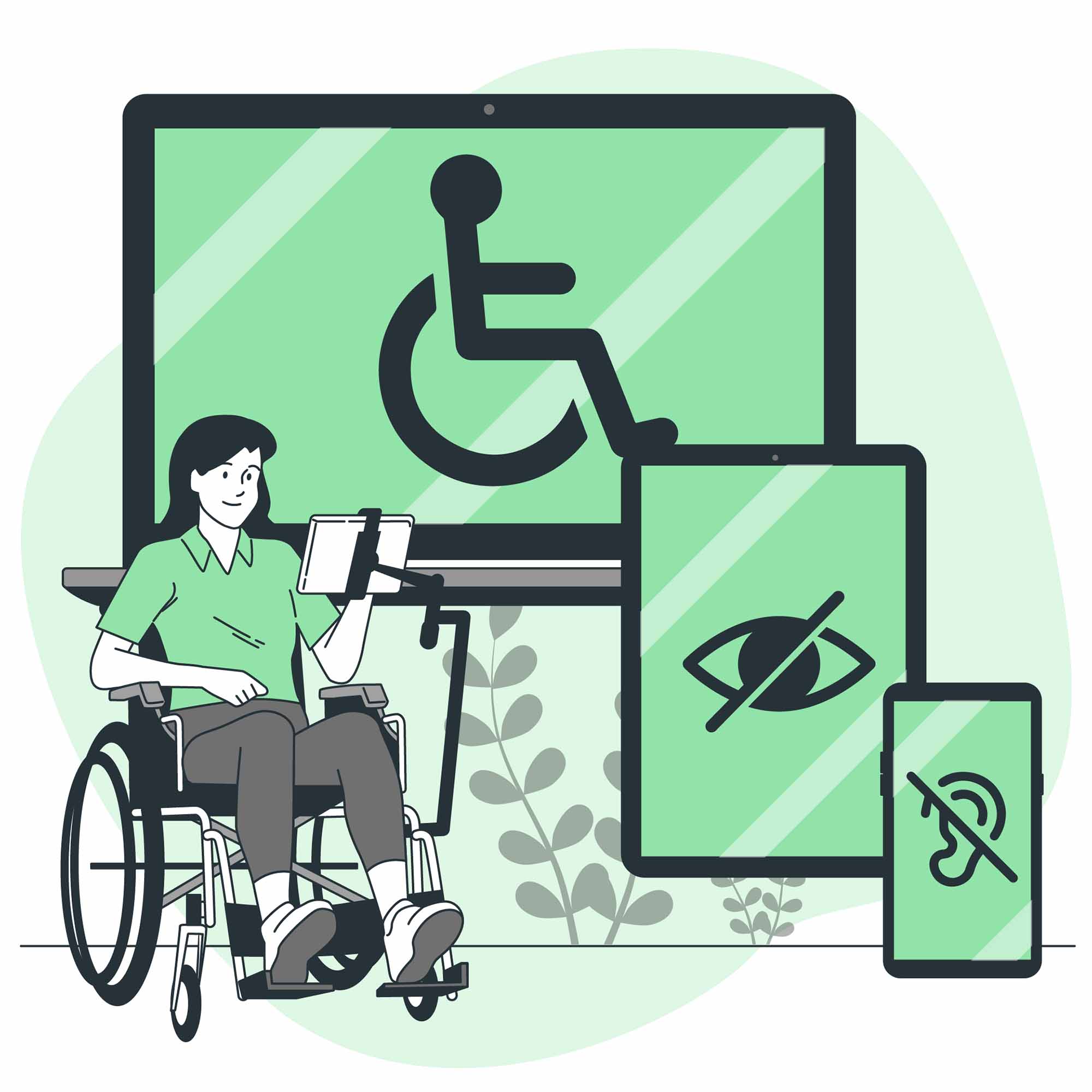
Your Website Isn’t Inclusive and Accessible for All Users
You’re undoubtedly familiar with the minimum standards of accessibility your higher ed website must meet. But is your site truly creating an inclusive experience for everyone you’re trying to reach? And have you specifically designed your site through this important and impactful lens?
If your content sounds like a Ph.D. is needed to read it, then it’s likely not accessible. And if you’re quick to convert important information into a PDF rather than display it using HTML, your site is definitely not as accessible as it could be.
Designing your site with your users in mind often requires an organization-wide paradigm shift. A good way to get everyone on the same page is to begin the redesign process with robust discovery and exploration exercises.
3. Old Technology and Manual Workarounds Are Slowing You Down
The digital landscape continues to evolve rapidly. And if you’re working with a dated tech stack or are still using manual processes rather than automating your workflows, there’s no way your institution is competing at the level you otherwise could.
Technical debt and outdated tools won’t get you where you need to go — it’s as simple as that. You need sophisticated digital solutions, the ability to create a long-term roadmap for where you’re headed, and a community of support to help you along the way.
An open-source CMS like Drupal checks all of those boxes. With a good web development partner at your side, you can create the modern, future-focused, savvy digital experience ecosystem that sets your institution up for long-term success.
We’d love to help. So if you’re seeing signs that it’s time to invest in a website redesign project, let’s talk.
Contributors