
Higher Education Website Best Practices: A Guide to Strategy, Design, and Development
- Higher Ed Website Redesign: Signs Your Site Isn't Performing
- Website Strategy for Higher Education: A Simple Framework
- Create Student Personas for Your Website
- Get Buy-In for Your Web Development Project
- Drupal for Higher Education Websites
- Final Thoughts
Your website is the most visible piece of your institution's digital presence, and it's working in a tougher environment than it was five years ago. Trust in higher education has declined steadily over the past decade, and while the sharpest skepticism targets elite institutions, the ripple effects reach every college and university. Prospective students, parents, and donors bring that broader skepticism with them when they visit your site for the first time.
That means your site carries more weight than ever. It has to recruit, inform, and build trust fast enough that someone who has never set foot on campus still feels compelled to apply, donate, or engage.
This guide covers the practices that make higher education websites work harder: how to spot the warning signs that your site is underperforming, a strategy framework you can adapt to your institution, and the platform decisions that set you up for long-term growth.
Higher Ed Website Redesign: Signs Your Site Isn't Performing
Most higher ed websites don't fail dramatically. They degrade slowly. Pages pile up, traffic drifts, and prospective students leave without taking action because nobody is watching the right numbers. Here are five signs your site needs serious attention.
Analytics Tell a Story You Can't Ignore
Your analytics dashboard holds the clearest picture of how well your site serves its audience. A few patterns that signal trouble:
- High bounce rates on key landing pages: if prospective students land on your admissions page and leave without clicking anything, the page isn't giving them what they came for.
- Low conversion rates on forms: inquiry forms, application starters, and event registrations should be tracked closely. If people visit these pages but don't complete the action, friction is winning.
- Declining organic traffic to program pages: when your most important content stops attracting search traffic, your site might be losing ground to competitors who are doing this better.
Healthy engagement looks different for every institution, but the directional signals are universal. When key pages aren't attracting visitors, and visitors aren't taking action, the website becomes a liability.
Your Site Fails the Mobile Test
Over 60% of global web traffic comes from mobile devices, and for Gen Z that number skews even higher. Prospective students are researching your institution on their phones during lunch, between classes, on the bus.
Google now uses the mobile version of every site as the basis for crawling, indexing, and ranking. If your mobile experience is a stripped-down version of your desktop site, search engines see a stripped-down version of your institution. Responsive design is a start, but true mobile readiness means fast load times, touch-friendly navigation, readable text, and forms that don't punish people for using a small screen.
There's also a legal dimension. Public colleges and universities must meet WCAG 2.1 Level AA standards by April 2026, covering websites, mobile apps, and digital course content. Institutions that haven't started auditing their digital properties need to start now. For a starting point, take a look at our accessibility checklist for higher ed.
Content Updates Are a Bottleneck
Content bottlenecks show up in different ways. Maybe every page update requires a support ticket to IT, or your templates technically let editors publish, but they're so rigid that the finished page can't support the calls to action, media, or layouts the content needs.
Either way, the result is the same: outdated event listings, last semester's deadlines still on admissions pages, and department news that hasn't changed in months.
Marketing teams and department editors need the ability to publish without developer intervention, approval workflows that move at the pace of the academic calendar, and a content management system that treats them like contributors.
Navigation Is Built Around Your Org Chart, Not Your Users
Most universities have their top-level navigation in reasonable shape. The homepage links to Admissions, Academics, Student Life, and the other categories prospective students expect. The problems start a level or two deeper where department pages follow their own logic. Program details live in different places depending on which college owns them. Financial aid information requires three or four clicks from where a prospective student would naturally look for it.
The deeper someone goes, the more the site reflects internal structures rather than student goals. A prospective student comparing programs across two colleges within the same university shouldn't have to learn two different navigation patterns to find the same type of information.
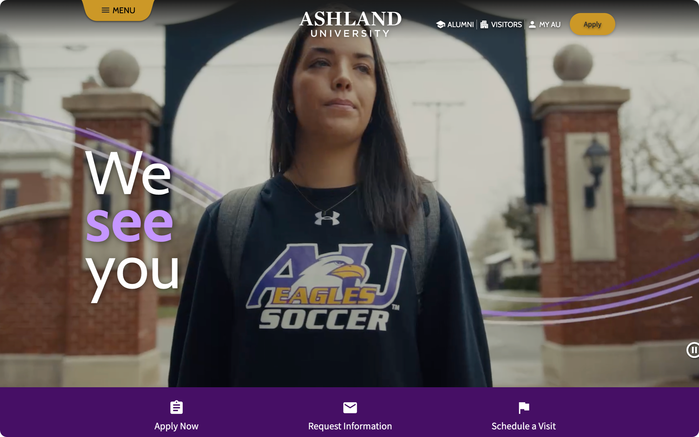
Student-first information architecture fixes this by organizing content around tasks and goals rather than departments. When Ashland University restructured their site around a story-focused content strategy and student-centered IA, organic search traffic increased 230% and referral traffic jumped 282%.
Content Has Accumulated Without a Governance Plan
Large university websites accumulate content the way old houses accumulate junk in the attic. Pages get created for one-time events and never removed. Departments publish overlapping information with slightly different details. PDFs from 2017 still rank in internal search results. The clutter confuses visitors, hurts SEO, and erodes trust when prospective students hit dead ends or conflicting information.
A content audit is the first step. Identify what's outdated, duplicated, and missing, then build a governance plan that assigns ownership, sets review cycles, and establishes clear standards for what gets published and when it gets archived. For a deeper look, explore our guide to student-centered content strategy.
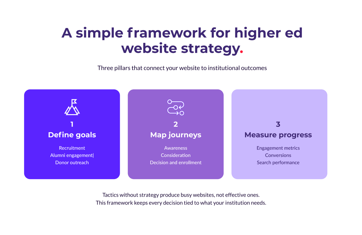
Website Strategy for Higher Education: A Simple Framework
Tactics without strategy produce busy websites, not effective ones. Before diving into redesign decisions or platform evaluations, step back and build a framework with three parts:
- Define your priorities, goals, and long-term needs
- Map the journeys your audiences take
- Decide how you'll measure progress.
Define Your Goals
Every higher education website serves multiple audiences, and the question is which goals take priority. Recruitment usually leads the list, with prospective students needing fast paths to program details, applications, and campus life content. Alumni engagement requires different content and calls to action, focused on networking, impact stories, and reasons to stay connected. Donor outreach depends on surfacing relevant giving opportunities and showing clear evidence of impact and financial stewardship.
Trying to serve every goal equally on every page leads to clutter. Define which goals matter most, then design each section of the site with a primary audience in mind.
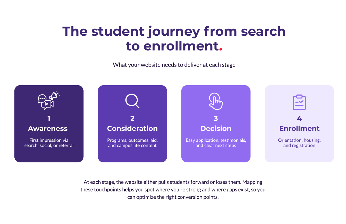
Map the Student Journey
The recruitment journey doesn't happen in one visit. A prospective student might first encounter your institution through a search result, spend weeks browsing program pages, attend a virtual event, then finally start an application. Each of those touchpoints either pulls them forward or loses them. A simplified version of the journey:
- Awareness: the student discovers your institution through search, social media, or a referral. The site needs a strong first impression with clear positioning and easy-to-find program information.
- Consideration: they're comparing you to other schools. Program details, student outcomes, financial aid information, and campus life content do the heavy lifting here.
- Decision: they're ready to apply. The application process needs to be straightforward, supported by testimonials, outcome data, and clear next steps.
- Enrollment: after acceptance, the site shifts to onboarding with orientation details, housing information, and registration tools.
Mapping these stages helps you spot gaps. Maybe your site is strong on awareness content but weak on decision-stage material, or maybe the application process has too many steps.
Understanding the journey lets you optimize each conversion point rather than redesigning blindly. For institutions tackling this kind of strategic overhaul, our higher education team has deep experience guiding the process from research through launch.
Measure What Matters
Pageviews and session duration tell you something, but they don't tell you whether the site is doing its job. Track the metrics tied directly to institutional outcomes: inquiry form completions and application starts for recruitment, return visits and event registrations for alumni, giving page conversions and average gift size for donors.
Search performance matters too. If your program pages aren't ranking for the terms prospective students are searching, you're invisible during the most critical phase of the journey. Pair your analytics with regular search performance audits to catch issues before they cost you applicants.
Create Student Personas for Your Website
Strategy frameworks work best when they're grounded in a clear picture of who your users are. Student personas give you that picture.
A persona is a fictional profile built from real data, representing a meaningful segment of your audience and combining demographic details with behavioral patterns, motivations, and pain points.
Personas aren't the same as demographic segments. "18-to-22-year-old undergraduates" is a segment. "Jordan, a first-generation college student from a rural area who works part-time and does most research on a phone" is a persona.
The difference is that a persona gives your team a specific person to design for, write for, and test against.
Building Personas That Drive Decisions
Good personas come from multiple data sources layered together:
- Admissions data: where applicants come from, what programs they're interested in, and where they drop off in the funnel.
- Website analytics: how different audiences navigate the site and where they leave.
- Surveys and interviews: motivations, concerns, and decision-making processes that quantitative data can't capture.
- Search data: what prospective students are looking for and the language they use.
For each persona, define the dimensions that will influence design and content decisions:
- Goals: a prospective undergraduate wants program details and campus culture, while an adult learner wants schedule flexibility and career outcomes.
- Tech comfort: a Gen Z student navigates intuitively on mobile, while a parent researching schools may prefer desktop with more detail visible at once.
- Emotional state: a high school senior exploring options is excited and overwhelmed, while a transfer student leaving another institution may be frustrated and skeptical.
Place in the journey: early-stage visitors need broad inspiration, while late-stage visitors need specifics and reassurance.
Stress-Testing Personas Across Scenarios
Once you've built your personas, put them to work.
Can Jordan, researching on a phone during a break at work, find program costs in under three taps?
Can Priya, an international student comparing institutions, find visa support and virtual tour content without hitting a dead end?
Can David, a parent trying to understand financial aid, navigate from the homepage to a clear breakdown of costs and scholarships?
These scenarios expose gaps that aggregate analytics miss. They show where navigation assumptions break down, where content is organized for the institution rather than the user, and where calls to action are missing or misplaced.
Get Buy-In for Your Web Development Project
Identifying the need for a new website is one thing. Getting budget approval at a higher education institution is another. Decision-making involves multiple stakeholders with competing priorities, and the process can stretch over months or even years. Three strategies that help move things forward.
Understand How Budgeting Works at Your Institution
Before building your case, understand the financial landscape. A few questions worth answering early:
- Will this be treated as a capital expense or an operational expense?
- Is grant or donor funding available for digital infrastructure projects?
- What have peer institutions spent on similar projects?
Reaching out to peers who have recently completed web projects can surface practical insights about timelines, unexpected costs, and lessons learned.
Build a Business Case Your Stakeholders Can't Ignore
Stakeholders respond to specifics. "Our website needs updating" is easy to defer. "Our admissions inquiry rate has dropped 15% year over year while peer institutions with redesigned sites have seen increases" is harder to ignore.
Ground your business case in the problems the current site creates, then connect proposed improvements to goals the institution already cares about: enrollment targets, retention rates, donor engagement, operational efficiency.
Use qualitative research to strengthen the case. Surveys, interviews, and focus groups with prospective students, current students, and staff provide concrete evidence of friction points that numbers alone can't capture.
Bring Key Stakeholders Into the Process Early
Identify an executive sponsor (a provost, VP, or dean with influence across departments) who can communicate the project's importance to leadership. Then invite respected faculty, department heads, and administrative staff to participate as project ambassadors.
Early involvement reduces friction at approval time and builds a group of advocates across the institution who feel ownership over the project's success.
Drupal for Higher Education Websites
Higher education website development at the enterprise level means managing vast, complex sites with dozens (sometimes hundreds) of contributors across an institution. The platform powering that ecosystem matters enormously. Drupal has been the platform of choice for universities for good reason.
Here are the specific capabilities that make it effective at scale.
Content Workflows That Scale Across Departments
A university website might have hundreds of contributors: admissions staff updating program pages, faculty publishing research news, marketing teams running campaigns, student organizations promoting events. They all need to publish, and they need guardrails.
Drupal's content workflow system lets you define review and approval processes that match your institution's structure. This balance between autonomy and consistency makes large-scale content management sustainable.
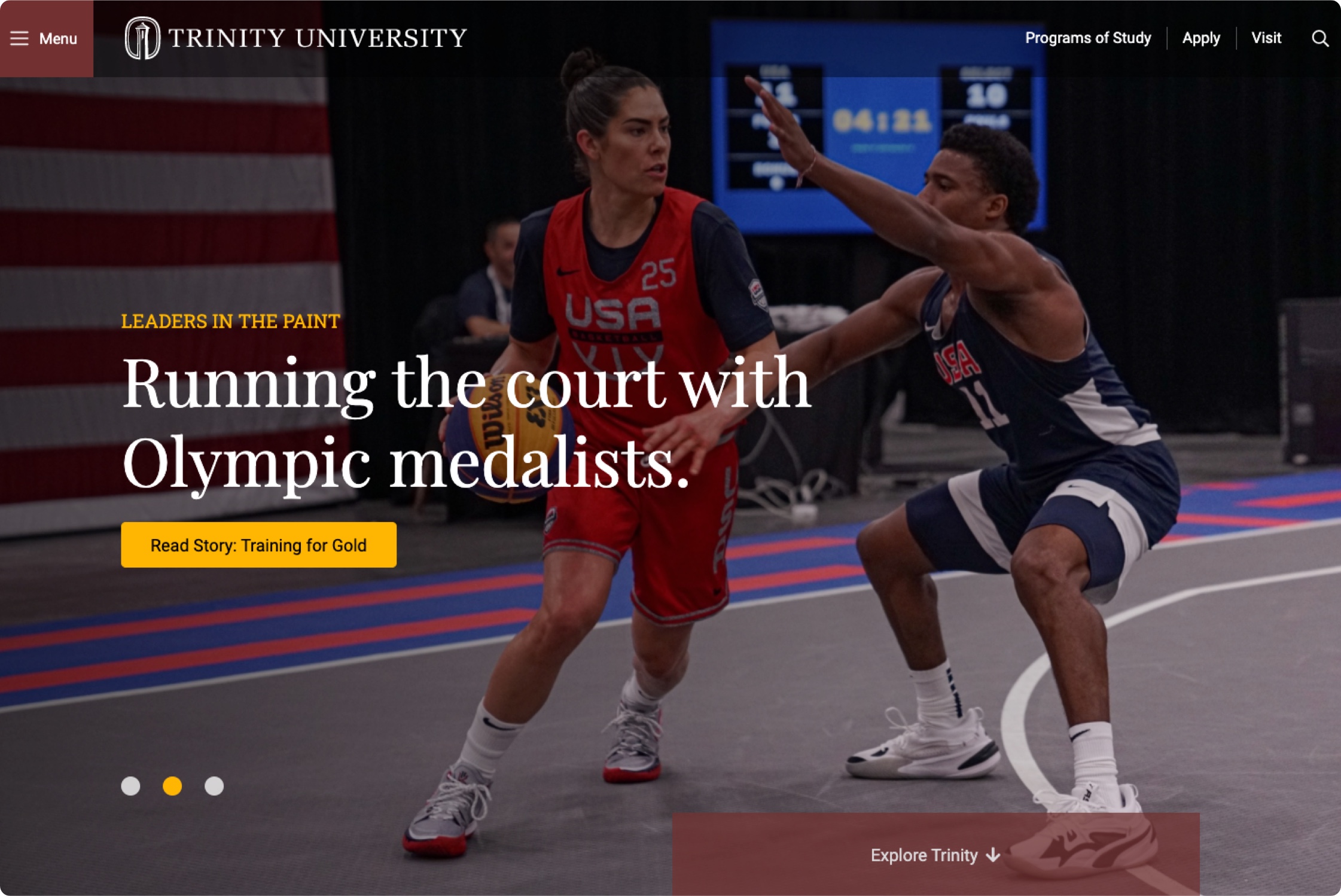
At Trinity University, faculty members who had stopped using the website because it was too difficult to edit returned to the main domain after the CMS experience was reworked, and content publication increased significantly.
Multi-Site Management for Complex Institutions
Most universities have dozens or hundreds of websites: one for each college, department, research center, library, athletics program, and administrative office.
Drupal's multi-site architecture lets institutions manage all of them from a shared foundation, giving departments their own editorial control while inheriting institutional brand standards, security updates, and shared components.
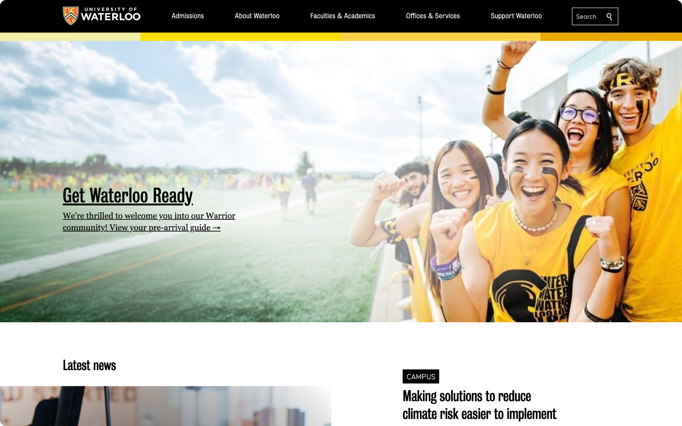
The University of Waterloo manages 1,100 websites serving 7 million monthly page views. ImageX helped build reusable components that work across departments, so new departmental sites now launch in weeks while maintaining brand consistency across the entire ecosystem.
Integrations With Your Existing Tech Stack
A university website doesn't operate in isolation. It connects to student information systems for enrollment data, learning management systems for course content, CRM platforms for recruitment pipelines, and payment gateways for tuition and donations. Drupal's API-first architecture makes these integrations possible without fragile workarounds, creating a unified digital ecosystem where the website serves as the front door to every service the institution offers.
A Platform Backed by a Global Community
Open-source software lives and dies by its community, and Drupal's is one of the largest in the CMS world. Thousands of developers contribute modules, security patches, and performance improvements on an ongoing basis. For higher education specifically, 80% of the top 100 universities use Drupal on at least one of their websites, with 40% running more than 10 Drupal sites. That critical mass means the platform evolves in response to the challenges higher ed institutions face, and the community shares solutions that benefit the entire sector.
Final Thoughts
A higher education website that performs well does so because someone thought carefully about strategy before design, and about design before technology. The institutions that get the best results start with clear goals, build around their users' needs, and choose a platform that can grow with them.
If your current site isn't delivering the engagement, applications, or donor activity your institution needs, reach out to our team to talk about what's possible.