Discover Drupal 10: 5 Articles You Shouldn't Miss
As part of the never-ending release cycle, older Drupal versions eventually reach their end of life and stop receiving due support. At the same time, the newest Drupal version incorporates the most vibrant and innovative of its features and becomes the most future-proof option for a website upgrade. Drupal 10 was released in December 2022, which marked an exciting new chapter in the CMS’ growth and development.
In its 10th major release, Drupal relies on the latest versions of PHP and Symfony, wins the hearts of content creators with the brand-new CKEditor, shines with modern front-end and backend themes, and has many other goodies for all users and developers. We’ve been celebrating the arrival of Drupal 10, exploring its valuable features, and covering them in various articles. So, we invite you to explore our top 5 insightful articles about Drupal 10.
A hot new feature in Drupal 10: Views Responsive Grids
Responsive web pages have a near-magical capacity of adjusting themselves to the sizes of the screens they are viewed from. This provides the best viewing experiences for users, increases the chances of conversions, improves website performance on mobile devices, and has a positive impact on SEO.
Having adopted a mobile-first philosophy back in the 8th release, Drupal boasts some powerful features for creating responsive layouts (among them, the Responsive Image and the Breakpoint modules). Drupal 10 has brought us yet another exciting option — the capability to build ultra-responsive content grids in Drupal Views in just a few clicks, a feature known as Views Responsive Grids.
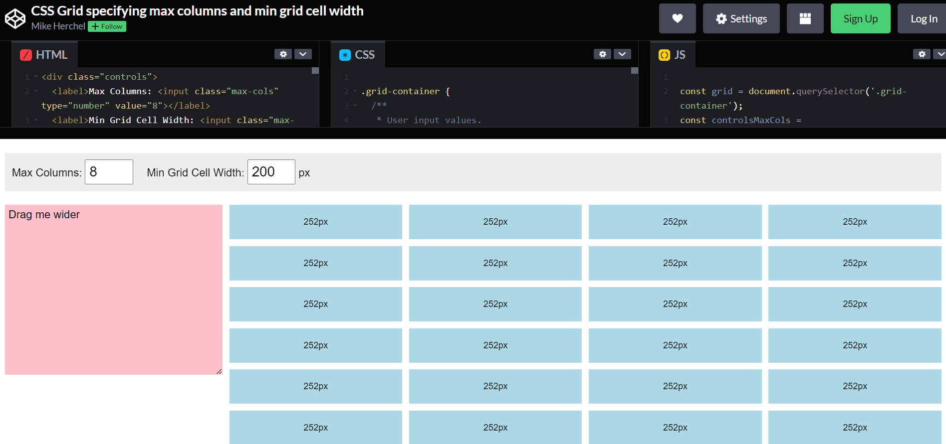
The brand-new feature in Drupal 10 adds a special format in Drupal Views with a respective name — Responsive Grid. After selecting it, a developer or a site builder just needs to specify a few settings for a content grid via the Drupal Views interface. The key ones are the maximum number of columns and the minimum grid cell width.
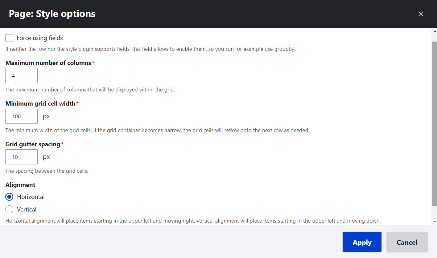
A responsive grid automatically reflows based on the size of its container — for example, a region in the website’s theme. When reflowing, the grid constantly keeps a perfect balance between the maximum number of columns and the minimum allowed cell width. See many more exciting details of these transformations in our article on Views Responsive Grids in Drupal 10. The article also includes demos and comments from top Drupal front-end experts.
Automatic Updates in Drupal: the #1 Requested Feature
In the course of Drupal 10’s development, we will witness a milestone moment. Automatic Updates, the feature that has been expected and requested by thousands of Drupal users, is going to finally make its way to the Drupal core. Currently, it is in the works, but we can look forward to seeing it in one of the upcoming Drupal 10’s minor version releases (presumably, Drupal 10.1 or 10.2).
It’s inspiring to hear about the possibility of “updating the Drupal core and all the contributed modules without ever having to touch the command line.” That’s how Ted Bowman, one of its technical leads of the Automatic Updates Initiative, described his experience with the new functionality.
One of the best things about Automatic Updates is that they have Composer running behind the scenes while users just need to click on a couple of intuitive buttons in the Drupal admin dashboard. The unattended mode is also available, so it’s even possible to choose the option for running website updates once they are available, without a user’s input.
It’s also great to know that contributed modules and themes are eventually going to be auto-updated, even though the initial version of the functionality has been focused on auto-updating the Drupal core. You’ll find much more in our Automatic Updates article. The article includes additional specifications, quotes by the feature’s creators, and step-by-step demos of how it all works.
Drupal’s Front-End Theme Olivero: Beauty and Accessibility Out of the Box
When launching a new Drupal 10 website, a user can easily fall in love at first sight with its new default front-end theme Olivero — a gorgeous, modern, and fresh theme that came to replace the outdated Bartik theme in the Drupal core.
“Love at first sight” can equally be love at first touch or first sound if a user is relying on assistive devices. This is because Olivero is more accessible to differently-abled users than any other Drupal theme has ever been in the entire history of the CMS. Olivero was created with accessibility as the number 1 priority, in a collaborative effort with top accessibility specialists both within and outside the Drupal community.
All of Olivero’s elements from typography to headers and breadcrumbs are simple, modern, clean, and elegant. Olivero showcases the best of Drupal's functionalities, among which are Layout Builder, Media, right-to-left text direction for multilingual websites, and many more. The theme is compatible with all modern browsers and supports modern CSS features.
Olivero became the default theme ahead of Drupal 10’s release — in Drupal 9.4. Still, it is often mentioned as one of the gems of Drupal 10. We couldn’t resist dedicating an entire article to the Olivero theme where we explored the story behind its creation, as well as the theme’s elements and features. Of course, following our best practices, we enriched our article with direct comments from the team that has worked on it.
Extending CKEditor 5 in Drupal 10: a Couple of Great Contributed Modules
Great times have come for Drupal content creators thanks to one of the most powerful new arrivals in Drupal 10 — CKEditor 5. It’s a new major release of the text editor. Content creators will love interacting with its brand-new UI, including new contextual balloon panels for quick inline editing, dedicated toolbars, tooltips, labels, and more.
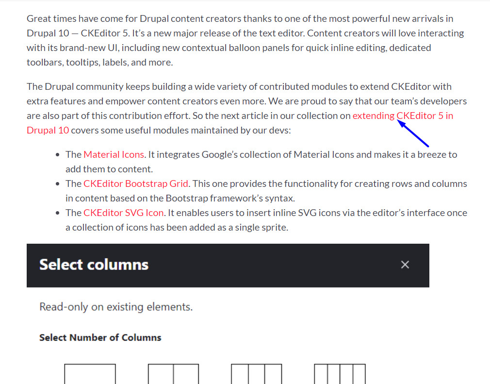
The Drupal community keeps building a wide variety of contributed modules to extend CKEditor with extra features and empower content creators even more. We are proud to say that our team’s developers are also part of this contribution effort. So the next article in our collection on extending CKEditor 5 in Drupal 10 covers some useful modules maintained by our devs:
- The Material Icons. It integrates Google’s collection of Material Icons and makes it a breeze to add them to content.
- The CKEditor Bootstrap Grid. This one provides the functionality for creating rows and columns in content based on the Bootstrap framework’s syntax.
- The CKEditor SVG Icon. It enables users to insert inline SVG icons via the editor’s interface once a collection of icons has been added as a single sprite.
The CKEditor.
The article provides step-by-step instructions on configuring and using the above-mentioned tools. As a bonus, the readers of the article will learn how to add more buttons to their CKEditor 5 toolbar even if they are just using the Drupal 10 core.
Drupal Module Installation To Become Easy Forever With Project Browser
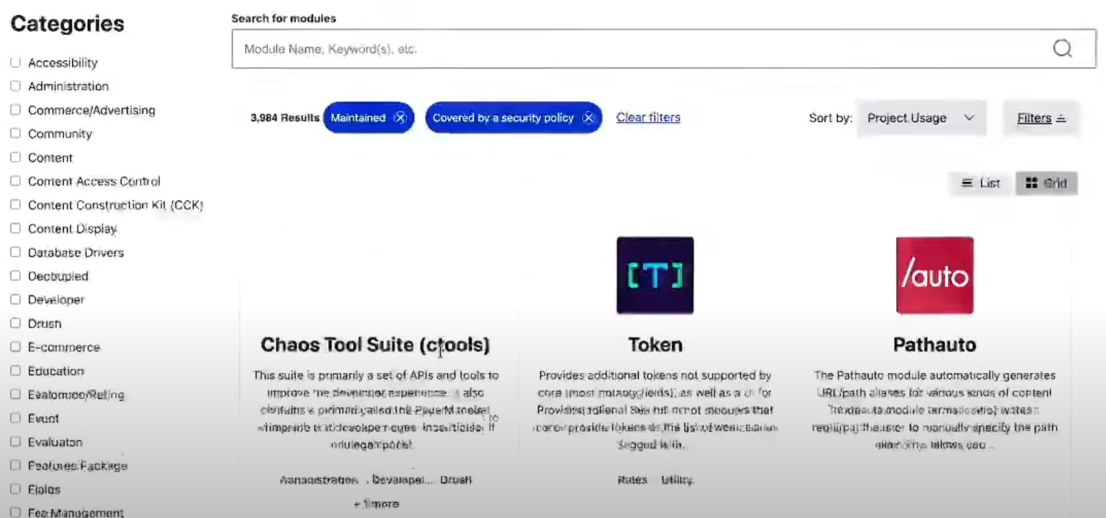
It’s awesome to see the transformational changes in Drupal that make it increasingly friendly for non-technical users. One of these changes is the upcoming arrival of the tool that should help anyone seamlessly find and install contributed modules for their Drupal websites. The tool is known as the Project Browser, and it is expected to join the Drupal core in one of the next minor releases of Drupal 10.
As the name suggests, Project Browser is meant to enable users to browse for the modules they might want to install. Everything will be happening in the comfort of the Drupal admin panel, with no visits to drupal.org needed. Furthermore, Project Browser in Drupal 10 will free users from the risk of installing the wrong version of a module — the tool will automatically filter the right ones for their websites. Another useful filter will make sure a user sees only the modules that have security coverage.
Leslie Glynn, one of the Project Browser Strategic Initiative’s co-leads, compared finding the right modules to shopping in a grocery store. Creative comparisons and useful explanations from the top contributors make it even more interesting to learn more about Project Browser’s work. Check all of this out in the article about Project Browser. It’s one of the Drupal articles that our team contributed to opensource.com.
Final thoughts
We are going to continue writing articles about Drupal 10 so you could expand your knowledge about the latest major release of Drupal. So stay tuned for more insights on various Drupal 10 features. Furthermore, if you want to see those features in action on your enterprise website and fully benefit from them, you are always welcome to reach out to our Drupal development team for a seamless upgrade.