
Meet Drupal Canvas: A Faster, Smarter Way to Build Content

The latest chapter of content management within Drupal officially started with the release of Drupal Canvas. And we have to admit, the pages in this chapter look fantastic!
Canvas is a visual, drag-and-drop page builder for Drupal. It is part of Drupal CMS 2.0, a version of Drupal with multiple pre-built functionalities, instantly ready for non-tech users to work with. However, Canvas is also an open-source project, so it can be installed on standard Drupal websites starting with Drupal 11.2.
Read on for a practical tour of how Drupal Canvas works in practice. We’ll explore the key tasks involved in building and managing content pages.
How to use Drupal Canvas for authoring experiences
Start with ready-made Canvas pages
When creating content pages, you don’t have to start from scratch: instead, you can build on pre-designed sample pages.
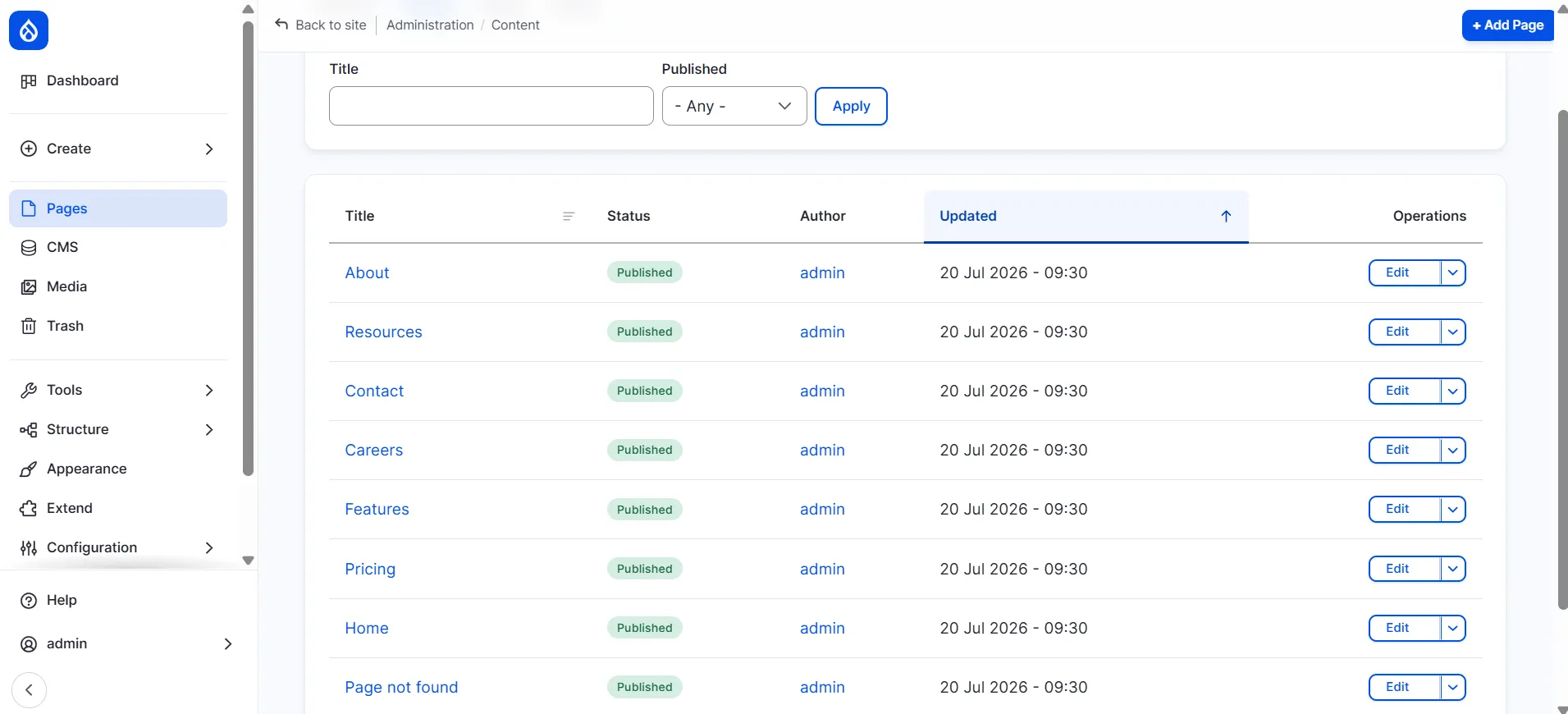
For example, in our demo, we’re using Drupal Canvas with the Byte site template included in Drupal CMS 2.0. Byte comes with several pre-built pages, including the homepage and other pages such as:
About
Resources
Contact
Careers
Features
Pricing
Home
Page not found
These pages cover the most common business use cases and showcase different combinations of layouts and components, providing a convenient foundation for your own content. They also include realistic placeholder text and imagery.
You can access the list of pages from the Content page in the Drupal administration dashboard. Just click to edit any of them to make your customizations. You can also switch between pages directly in Canvas.
Prefer to start with a clean slate? Simply click the “Add Page” button to create a blank page and assemble it from reusable components in the Library.
Build Canvas pages visually with components
Components are the individual building blocks for a page. As you open a content page for editing, or create a new page from scratch, you can click “+” on the left sidebar to open the Library of components.
The exact selection of available components depends on your Drupal Canvas implementation, site templates, installed recipes, and modules. Custom development can provide additional components and layouts tailored to your organization’s needs.
In this example setup with the Byte template, there is a great variety of components like:
Base components: Button, Heading, Image, Text, Video, Blockquote, Anchor, Badge
Cards: Icon card, Image card, Logo card, Pricing card, Testimonial card
Heroes: Hero Billboard, Hero Blog, Hero CTA, Hero Side-by-side
Layouts: Accordion, Accordion Container, Footer, Group, Navbar, Section
Lists (Views): All Blog Posts, Latest Blog Posts, Related Blog Posts
Menus: Footer, Main Navigation, Secondary Navigation, Social Menu
And more
To add a component, select it in the Library and click “Insert.” For example, let’s insert a Button component into the team section beneath the existing team photo and description. We’ll proceed to customization options right now.
Customize Canvas components
As you add new components or configure existing ones, you can customize their settings. Just click on a specific component in Canvas, and you’ll see its settings panel to the right. For example, we customized our newly added button by changing its label to “Drop us a line.”
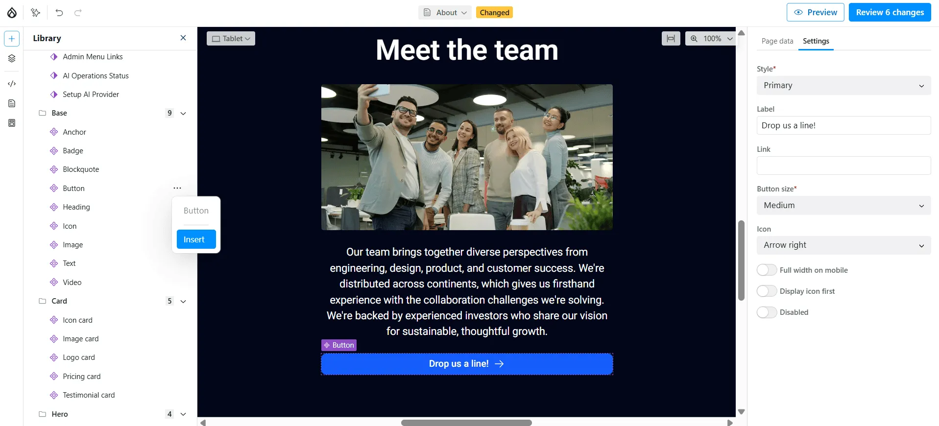
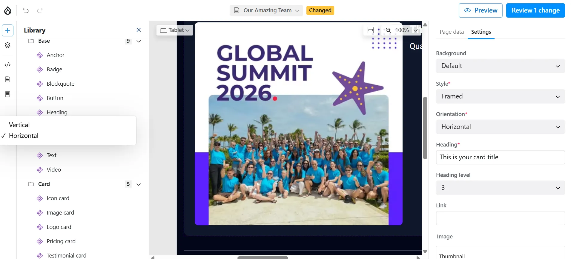
There are plenty of customization options depending on the component. Among other things, you can change:
heading or body text
heading level
text size, color, and alignment
link text and URL
images from the Media Library
image orientation (vertical or horizontal)
image style (framed or full-width)
background color (primary, secondary, accent, or muted)
button label, size, and icon (arrows, carets, and more)
quotation text, author’s name, author’s role, and link
icon name, size, and alignment (the Byte template uses the Phosphor Icons library)
Customize Canvas sections
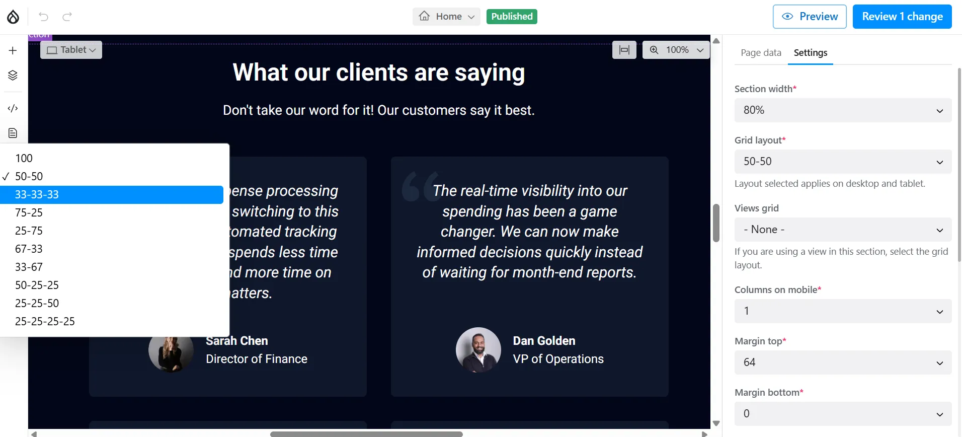
Sections are larger page areas made up of one or more components, grouping related content into a cohesive part of the page. To customize the entire section, click outside a specific component that belongs to it. The section settings will open to the right. Among the available settings are:
section width
grid layout
views grid (if a view is used in this section)
columns on mobile devices
margin and padding
background image
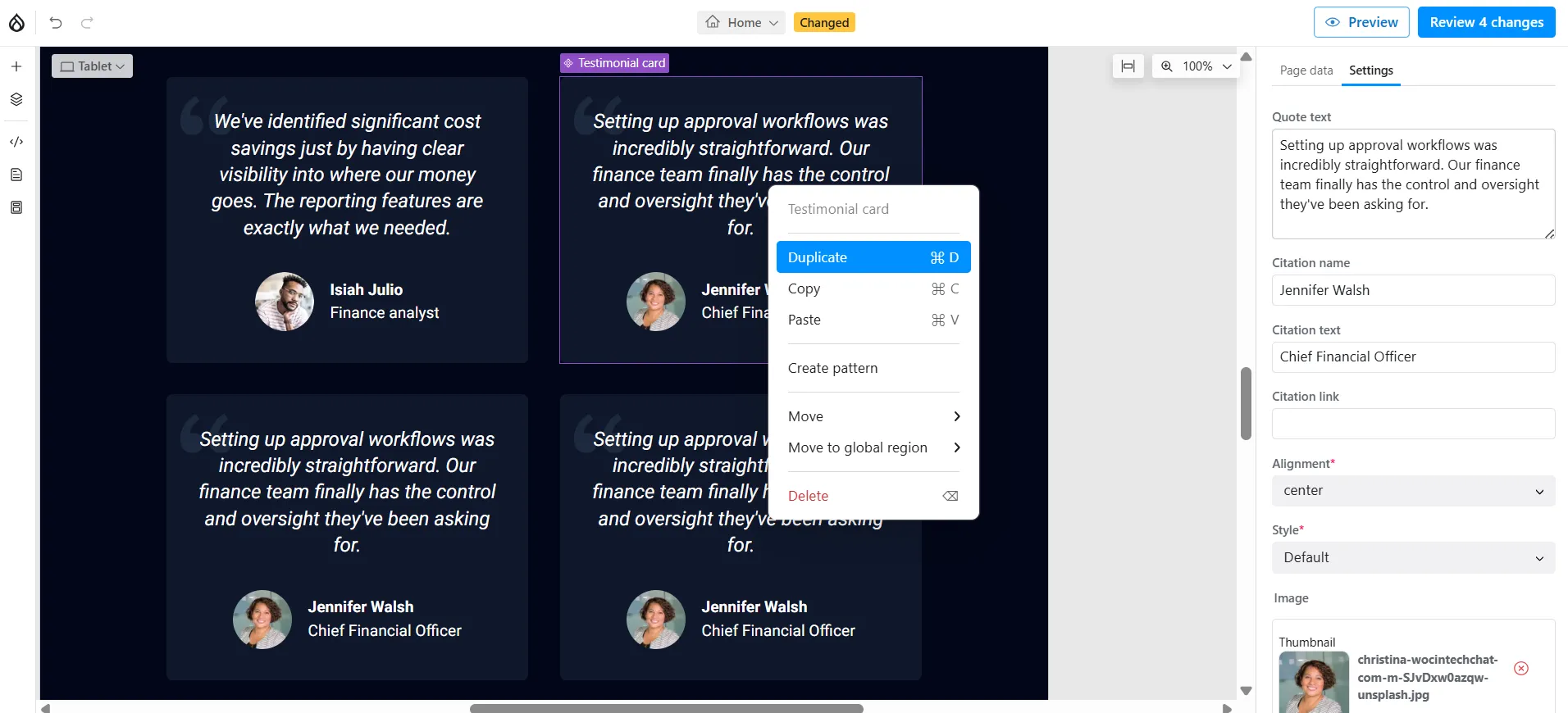
You can also re-arrange components and sections by drag-and-dropping them on the Canvas. It’s also possible to duplicate existing components or remove them without affecting the rest of the page. For example, if you need more testimonials, simply duplicate the existing testimonial cards. Drupal Canvas automatically updates the layout to accommodate the additional items, saving you from rebuilding the section manually.
Customize Canvas page data
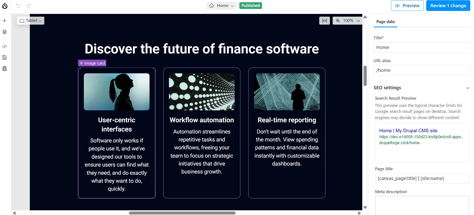
You can customize the key page information by switching to the “Page data” column, which is also in the right sidebar, to the left of the settings. In our Byte demo, the Page data panel lets you edit the page title, URL alias, featured image, and SEO metadata. The exact fields available depend on your site’s content model and configuration.
Preview every screen size in Drupal Canvas
Drupal Canvas supports responsive page layouts and lets you preview them across multiple devices, including:
mobile phones
tablets
desktops
large desktops
Simply switch between the viewport preview options to see how the layout and components adapt to different screen sizes, giving you confidence that your content will look great before you hit “Publish.”
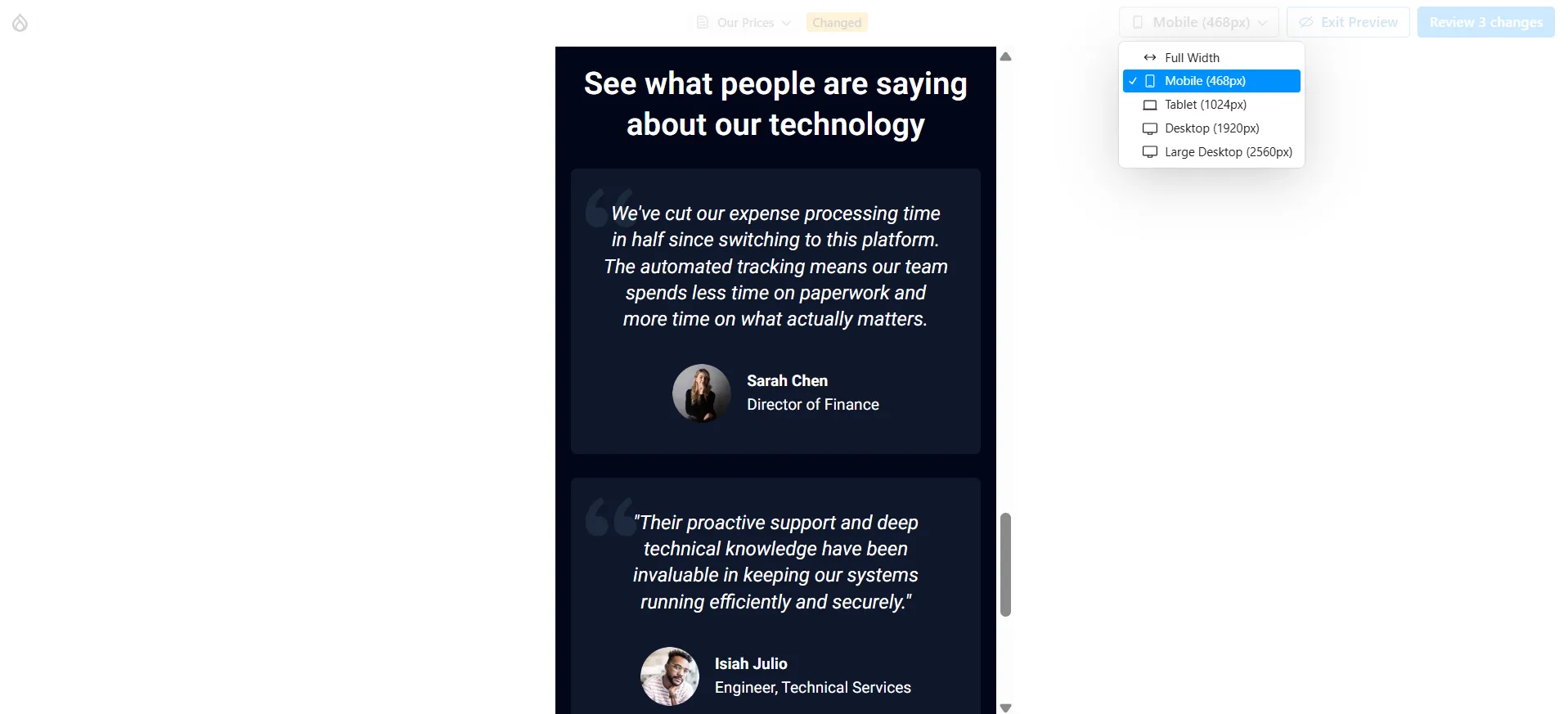
You can see how the page looks across devices in two ways:
While editing (top left). Switch between device sizes to see how the responsive layout adapts without leaving the editor.
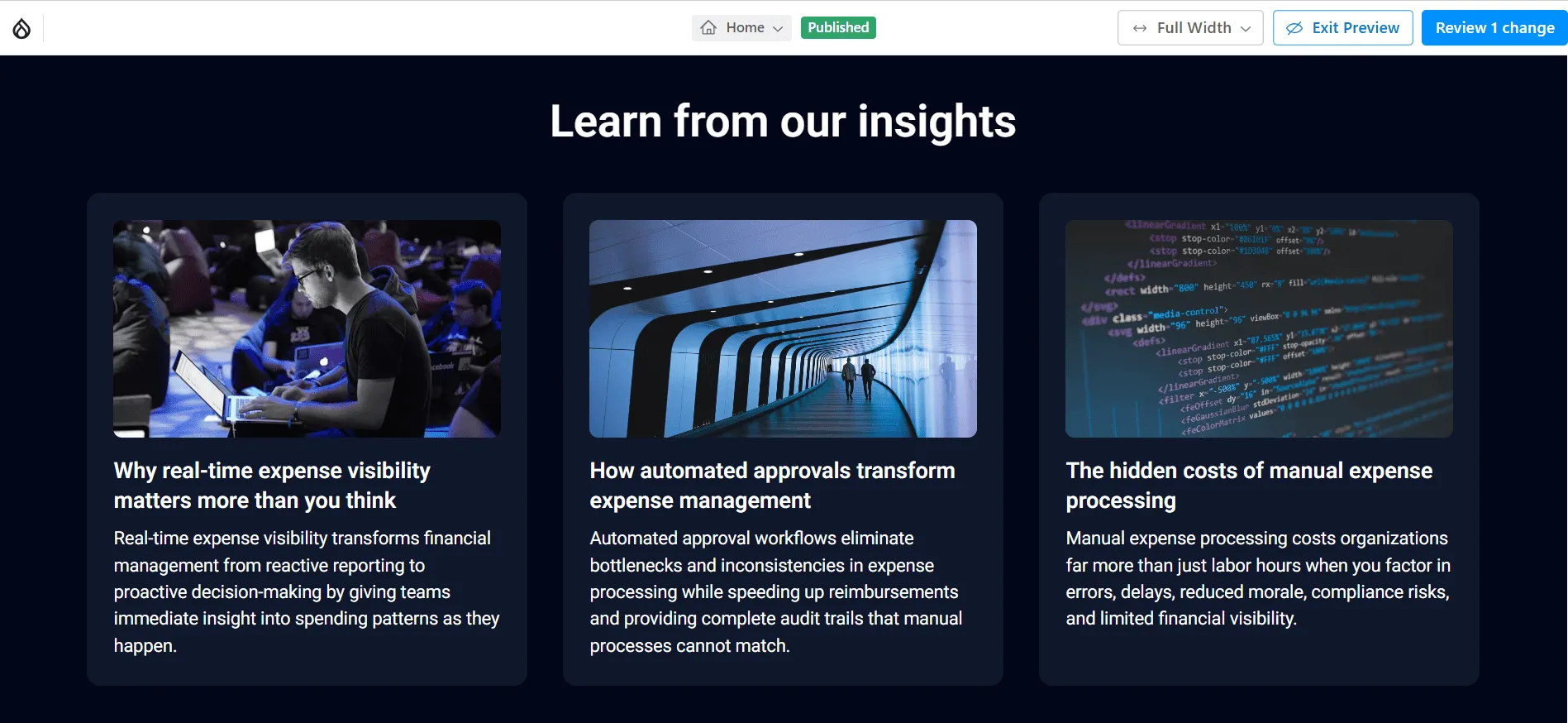
As a visitor (top right). Click “Preview” and see the layouts for different screens as your visitors will.
Customize content while staying on brand
It’s great that Drupal Canvas lets editors customize components by exposing a set of curated design options. This helps marketing teams create engaging landing pages while maintaining a consistent brand identity. At the same time, developers can extend components or introduce additional options to support an organization’s unique design system.
Review and publish all changes at once
Drupal Canvas lets you prepare multiple changes in the background and review them together before they go live. Simply click “Review changes” in the top-right corner to see all pending updates and publish them in one step. This capability is powered by Drupal’s Workspaces module.
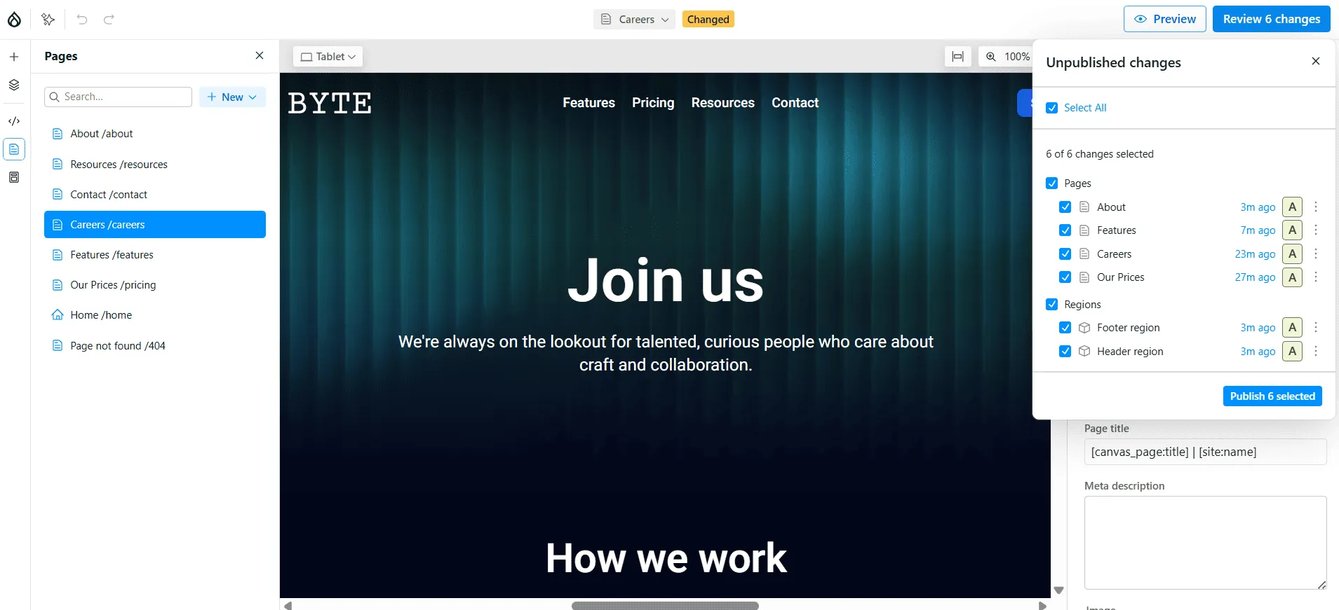
Undo and redo your changes
Editors can safely experiment with layouts and content using familiar undo and redo controls (arrows in the top-left corner of the screen), making it easy to iterate without worrying about losing changes.
Save customized patterns for future use
Beyond inserting ready-made components, Drupal Canvas lets you save customized versions as reusable patterns. Once you’ve configured a component or section, you can add it to the Library as a pattern.
In this example, we duplicated and renamed the feature cards and changed their grid layout so they are presented in 3 columns.
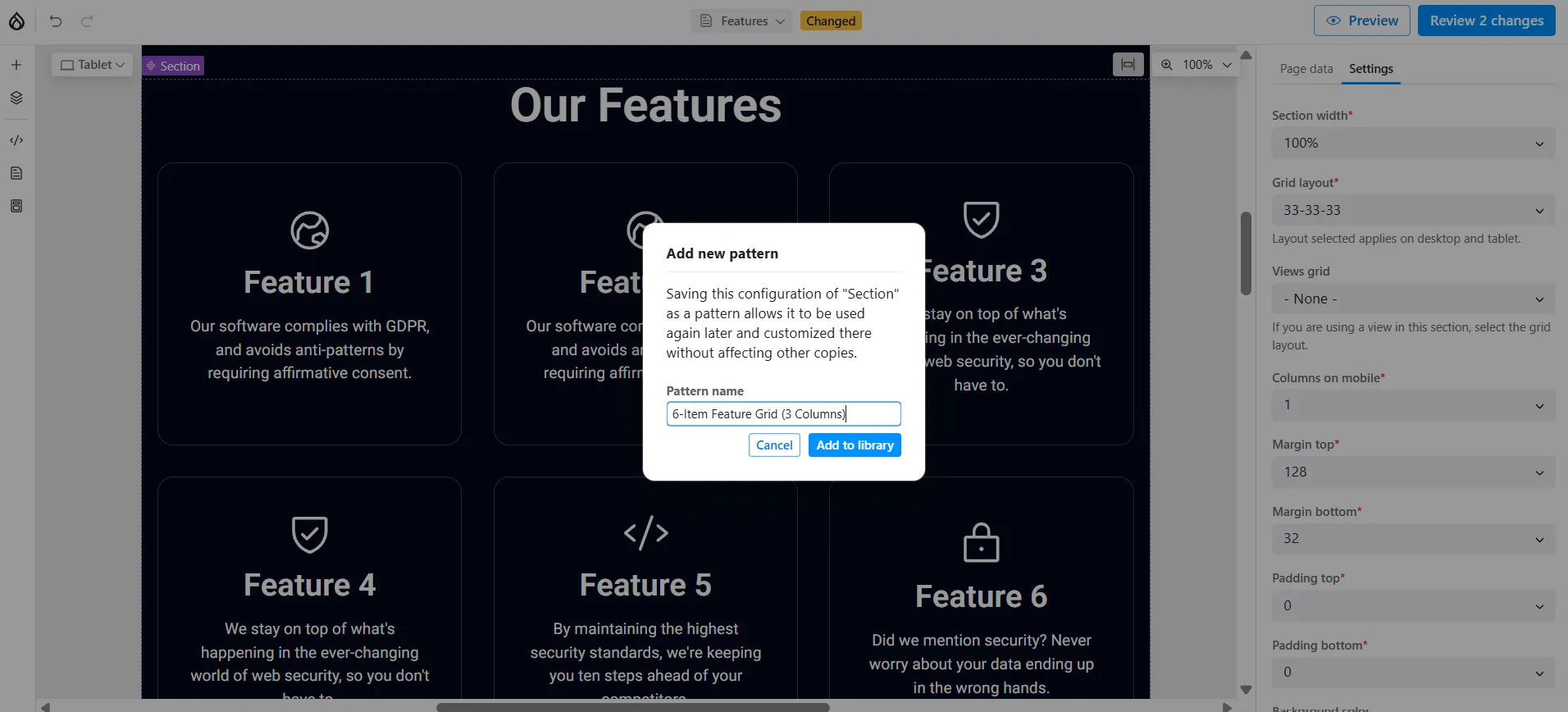
The pattern can then be inserted into other pages with a single click, helping teams recreate successful layouts without repeating the same configuration steps. Each inserted pattern remains independent, so editors can tailor the content to a specific campaign or page without affecting other instances.
This feature becomes especially valuable on content-rich Drupal sites, where organizations create reusable patterns for sections of landing pages, campaign heroes, or event promotions.
Make the best of artificial intelligence using Canvas AI
Canvas AI can help editors create and refine content without leaving the editing interface. Depending on the configured AI provider, it can rewrite text, adjust its tone, generate headlines, suggest improvements, and even create entire Canvas pages from a prompt.
To get started, click Open AI Panel in the top-left corner and enter your prompt in the chat window. In our example, we asked Canvas AI to create an “About” page with a group photo and mission statement.
Within seconds, Canvas AI generated a complete About page, populated the appropriate components, and even created the page’s SEO description. It is a very simple example with a generic prompt, and the resulting image is a placeholder. However, the generated layout and content provide a great starting point that can be further refined by the editor.
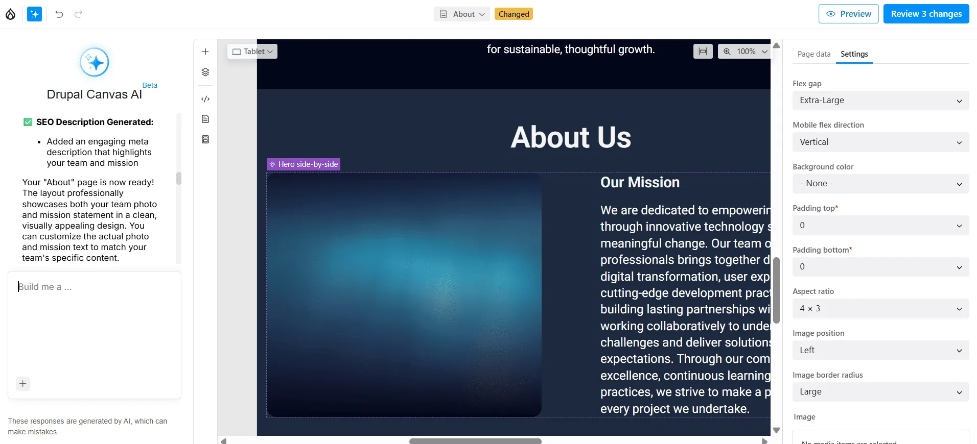
When configured to use organization-specific context through Drupal AI’s Context Control Center, Canvas AI can generate content that more closely reflects your organization’s messaging and terminology.
To use Drupal Canvas AI, make sure the AI Assistant recipe is enabled, and an AI provider has been selected and configured. Drupal CMS 2.0 makes it easy to explore AI by including built-in support for amazee.ai, allowing you to try AI-powered features without creating API keys or providing payment details. For production use, you can connect Drupal to the AI provider of your choice using your own API key.
Final thoughts
Drupal Canvas gives content teams the freedom to build engaging, on-brand pages faster, without sacrificing the flexibility, governance, and scalability Drupal is known for. But getting the most from Canvas requires the right components, design system, workflows, and AI configuration for your organization.
Whether you’re adopting Drupal Canvas on an existing site or planning a new Drupal CMS implementation, ImageX can help you create an authoring experience tailored to your team. Talk to our Drupal experts to explore what Canvas could do for your website.